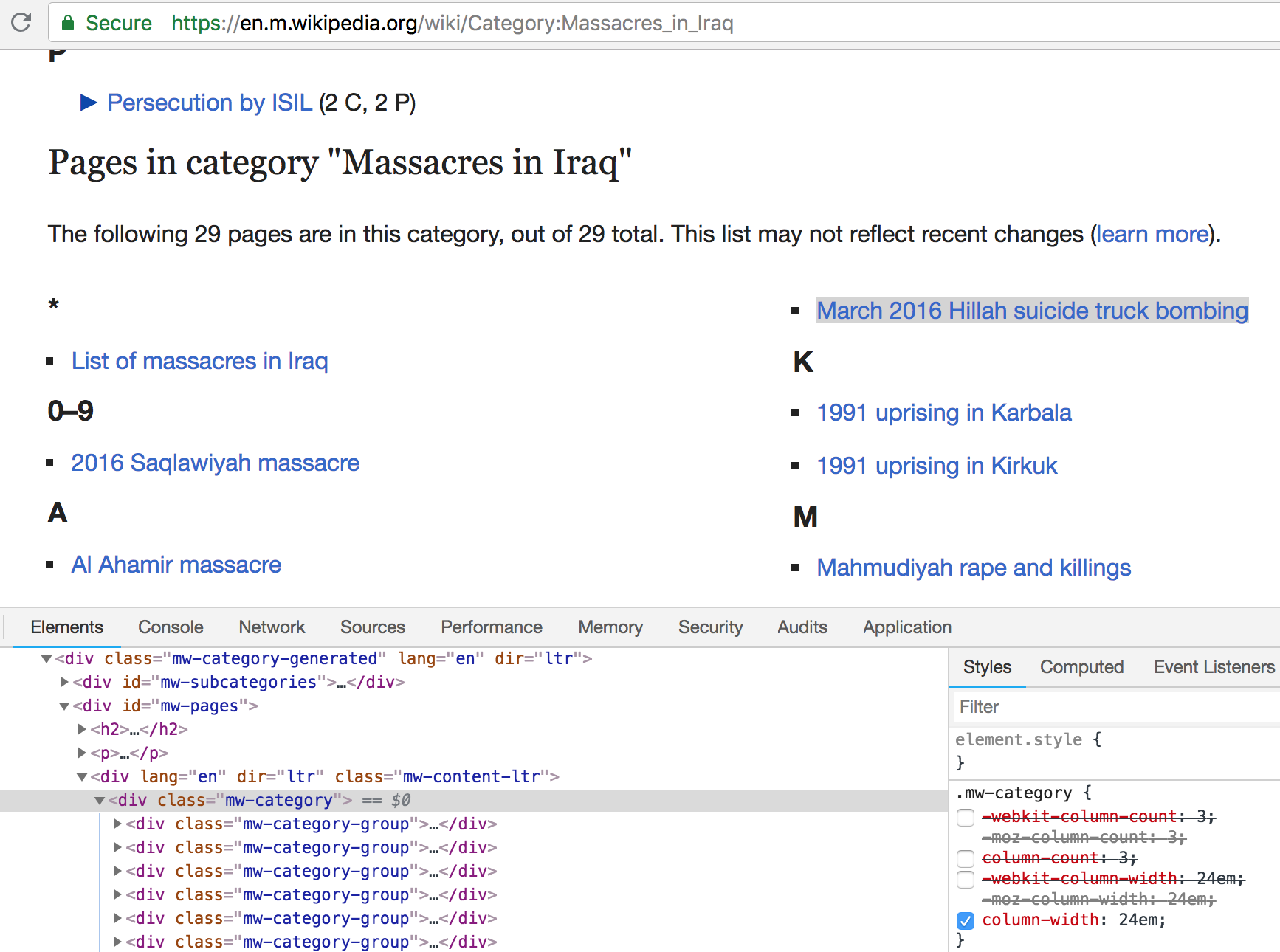
Go to:
http://en.m.wikipedia.org/wiki/Category:Massacres_in_Iraq
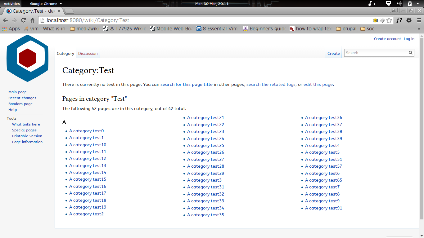
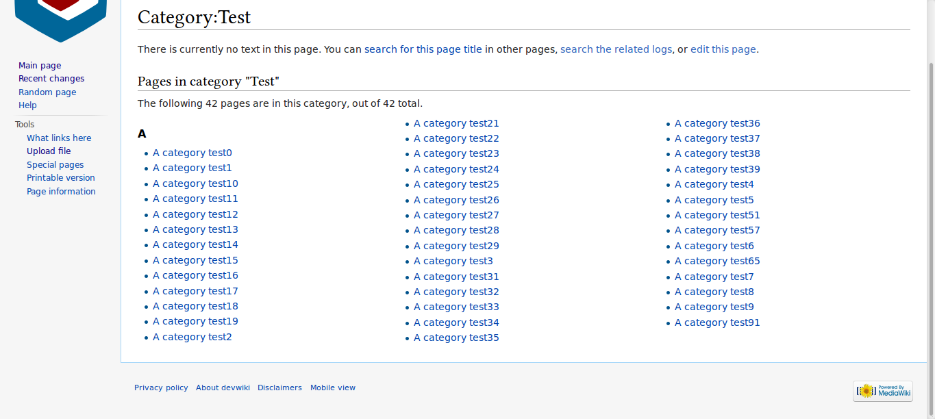
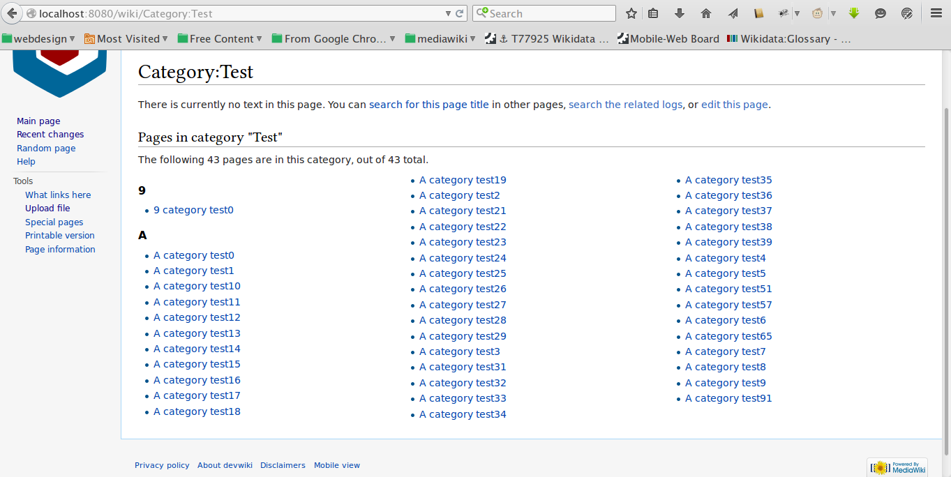
This displays terribly on a small screen as the HTML markup is a table.
If a 3 column layout is really wanted the column-count css rule should be used on a single list element.
| Jdlrobson | |
| Aug 20 2013, 9:54 PM |
| F17981742: capture.png | |
| May 6 2018, 3:03 AM |
| F112306: cat2cols.png | |
| Apr 13 2015, 1:03 PM |
| F107400: pasted_file | |
| Mar 31 2015, 12:12 PM |
| F107044: cat-firefox-2.png | |
| Mar 30 2015, 3:06 PM |
| F107034: cat-chrome.png | |
| Mar 30 2015, 3:06 PM |
| F107036: cat-firefox.png | |
| Mar 30 2015, 3:06 PM |
| F107042: cat-chrome2.png | |
| Mar 30 2015, 3:06 PM |
| F69533: After.png | |
| Mar 9 2015, 11:54 PM |
Go to:
http://en.m.wikipedia.org/wiki/Category:Massacres_in_Iraq
This displays terribly on a small screen as the HTML markup is a table.
If a 3 column layout is really wanted the column-count css rule should be used on a single list element.
| Status | Subtype | Assigned | Task | ||
|---|---|---|---|---|---|
| Declined | None | T124865 Support any default type of pages in the app | |||
| Open | None | T158181 Aim for workflow equivalence for MediaWiki on desktop and mobile web | |||
| Resolved | Goal | ovasileva | T198313 [GOAL] Advanced mobile contributions | ||
| Open | None | T24660 Display the categories on the mobile site for everyone | |||
| Resolved | Sumit | T55130 Categories should be displayed in a responsive table and be mobile friendly. |
Change 187952 had a related patch set uploaded (by Bartosz Dziewoński):
CategoryView modified to use css columns
Screenshots:
Before:
Hilariously, these four browsers provide three different renderings in total (they split columns differently). All do it correctly.
Opera 28 (like Chrome, like Safari):
Firefox 35:
IE 11:
Opera 12:
Firefox 3.6:
IE 8:
IE 6:
Reopening, because I am not quite happy with its implementation.
Why have you not used column-width instead, which changes the number of columns automatically without the need for queries? This can be combined with column-count: 3 to restrict the maximum number of columns.
wow, this totally backfired. probably not tested break inside with large categories.
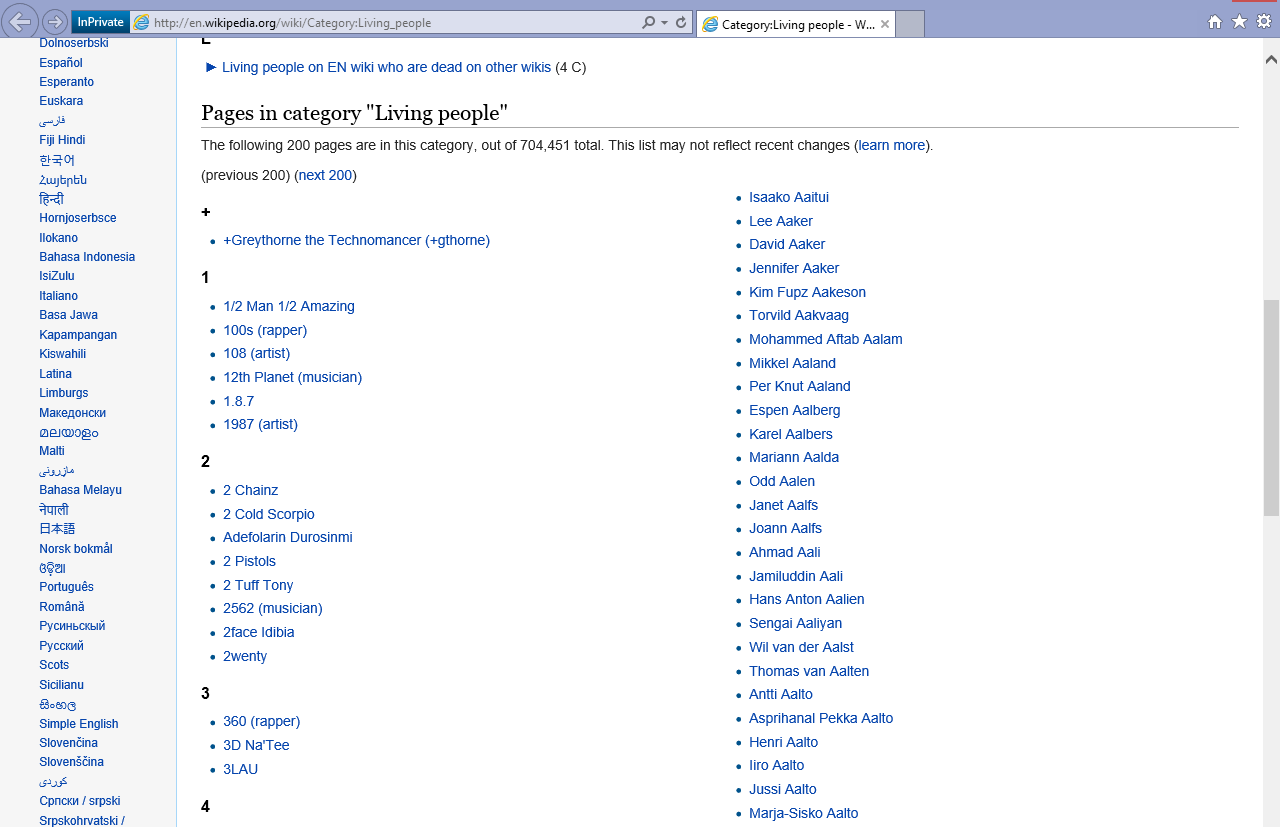
https://en.wikipedia.org/w/index.php?title=Category:Living_people&from=9th%20W
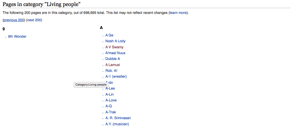
The third column is empty because it is made up of only 'A'.
-webkit-column-break-inside: avoid is the cause. Also would prefer column-width,
Removing "-webkit-column-break-inside:avoid", would cause continuing subcategories to go over to next column, but doing that in the following patch, since the above issue is more important. Also, adding a width of 300px as column width in the first patch
Change 194512 had a related patch set uploaded (by Sumit):
Category view modified to use column width
@Sumit, What determined the break between columns when tables were used? That same algorith can be used to allow/force a column break as well by inserting an element that has page-break-before: always; property set.
It was a pretty lame algorithm that had several bugs filed against it – it just tried to fit the same number of links into every column, not taking headings into account at all. Let's try not to use it.
The purpose of the break-inside: avoid is to avoid line breaks directly following headings (and preferably also line breaks before/after first/last element of a list). That would be better implemented with break-after and break-before, but support for column content is generally spotty (outside of the commonly trod areas), so this would have to be tested in various browsers. Anyone wants to try implementing?
I recommend at least the set of browsers I tried before, preferably with better test categories, since mine were clearly lacking. :)
@Edokter, the previous table implementation simply divided the categories into 3 parts, one for each column, and in case of a subcategory going over to next column, it added a "...contd" text. See here https://gerrit.wikimedia.org/r/#/c/187952/10/includes/CategoryViewer.php , Removing "column-break" here would achieve the same result except for the "...contd" message in case of overflow of subcategory
If we can do without the "...contd" message, I guess, restricting break-inside to just list would do
In that case, the avoid-break code should be aplied to the individual list items, and not the entire block.
@matmarex, the break-before/inside/after properties enjoy a wider support then columns, so I foresee no problems there.
That hurts... :)
https://developer.mozilla.org/en-US/docs/Web/CSS/page-break-before
https://developer.mozilla.org/en-US/docs/Web/CSS/page-break-after
https://developer.mozilla.org/en-US/docs/Web/CSS/page-break-inside
Supported since IE4(!)
Only page-break-inside was a bit late, being introduced in IE8, but we don't need that anyway.
Thanks for that example @TheDJ - i wish we had better test pages for this sort of thing. I'm agnostic to what we do to fix this as long as we don't bring back tables :-) Even with a long column like that, we are serving mobile users a lot better!
/me dreams of a future when beta labs master runs on english wikipedia for any mediawiki dev :-)
[...]
The third column is empty because it is made up of only 'A'.
-webkit-column-break-inside: avoid is the cause. Also would prefer column-width,
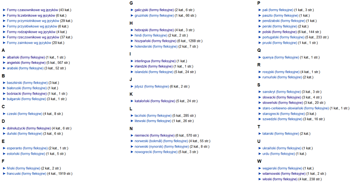
For comparison, in Firefox 31 ESR this category looks like this:
Three columns are used, but the first only contains one entry.
These only apply to page breaks (when printing), not column breaks (except sometimes on Firefox, which is a browser bug).
https://developer.mozilla.org/en-US/docs/Web/CSS/break-before
https://developer.mozilla.org/en-US/docs/Web/CSS/break-after
Supported pretty much nowhere. I made a quick test page: http://jsfiddle.net/9rb5wtj1/1/ and indeed, only Opera 12 and IE 11 worked. Newest Chrome and newest Firefox failed. If you can make it work, I'd love it.
…as I said, I'll believe it when I see it.
It works in so far that the paragraphs are not broken up. In the context of pagebreaks, columns are treated as pages. Anyway, we should just avoid breaks in the list items for the time being.
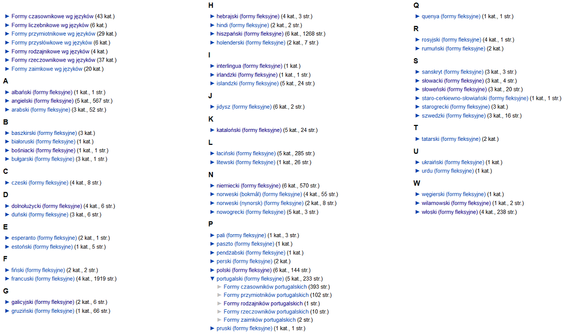
I may have spotted another issue: expanding subcategories make other elements "jump" between columns, sometimes even the expanded entry itself. Test page, Firefox 36.
Before:
That is somewhat expected; columns actually behave as one long page, which have basically been cut into three pieces. So when content is added, anything 'below' is pushed 'down' to the next column.
Should this bug be renamed or a new bug created? The issues seem to be around the desktop experience now and I'm having difficulty following it...
We really need to find a way around this. It looks so broken to some users that they ask on the Help desk: "I wanted to add columns to the list but could not figure out how or where to do it."
Anyone got ideas, other than revert ?
Cause this proves once more that column support in browsers is just not working yet as it should.
The most evident problem here is that of columns not breaking when a single category is too long. The patch set https://gerrit.wikimedia.org/r/194512 addresses this problem and here's its output on latest Chrome and Firefox, with this test case(a single long category). The patch atleast seems to improve upon the problem
Chrome 40:
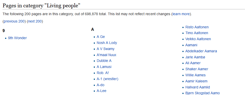
https://en.wikipedia.org/w/index.php?title=Category:Living_people&from=9th%20W
Chrome 40:

I don't see how it would be possible to fix the CategoryTree problem (mentioned above in T55130#1102370 and reported by another user as T92767) while still using CSS multi-column layout (as opposed to, e.g. multiple divs styled as table cells) for this. How would you tell the browser to keep the entire tree view in a single column and not rebalance the columns, yet not put everything into a single column and not constrain the column height either? (At least without some ugly hack like copying the remaining links in the column into a separate "overlay" element I don't think so.)
Are there other ways we can reduce this to one column without column count on mobile? A full revert would mean it being extremely broken on mobile again so if we do decide this is a failed strategy I'd like to find a better approach (float: left but not on mobile? other? ).
I'm still having trouble understanding exactly what the bugs are.
What does this mean? Can you illustrate this with a before/after screenshot and point me at some links? I'm struggling to understand exactly what right now is causing issues for our users.
Thanks @matmarex
I imported this to beta labs and http://en.wikipedia.beta.wmflabs.org/wiki/Category:Living_people?pagefrom=Aarnes%2C+Tom+Aage%0ATom+Aage+Aarnes#mw-pages is indeed looking better.
Are there any other problems we need to resolve?
Headings can be "orphaned" at the end of a column with all their pages being in the next column. But we should think about that in a separate bug.
(I am not sure if I should open another bug, reopen this, or what.)
On cs.wikipedia, we’ve had a number of complaints regarding a reduction of the number of columns on category pages. And indeed, it seems the current version seems to reduce the number of columns on category pages from 3 to 2 at least in Firefox&IE on a 1280px screen:
The current column definition seems to be column: 3 25em, which for the 14px font translates to 350px of column width, plus 1em of column-gap, and therefore, 1078px of space required for three columns. However, a 1280px screen seems to have only 1038px left for content, so it displays only two columns. The column width would need to be reduced to 24em to fix that.
I agree... I choose 25em initially, but failed to test it 'live'. 24em seems like a good value.
(edit) I'll add that luckily, it is now possible to adjust the columns locally by adding the following to Common.css:
.mw-category {
  -webkit-column-width: 24em;
  -moz-column-width: 24em;
  column-width: 24em;
}Change 206394 had a related patch set uploaded (by Mormegil):
Fix category column count regression
Change 206419 had a related patch set uploaded (by Bartosz Dziewoński):
Fix category column count regression
Rather than CSS multi-column blocks, may be we should use CSS flex layout (which can still have a fallback to multicolumn), to give consistant presentation of cells without undesired column-breaks (flex layout is on a grid but with implicit rows which can be vertical or horizontal, and where full cells can be wrapped and still maintain their alignment.
The fFlex layout is very used on mobile sites (and implemented in all mobile browsers) as it allows a great flexibility of formats, and better accessibility for touch. They have the clean layout of tables, but without forcing a static number of columns or rows, and allow designing the UI so it will get only one scrollbar (horizontal or vertical), never two and it is well suited for mobile phones which can be easily rotated between paysage and portrait. They work magically for all the builtin UI of the OS (e.g. in config menus) and for most apps.
The only problem is flex layout is still new on desktop browsers and some old desktop browsers (and some old browsers for smartTVs that don't rotate and frequently have antique renderers) don't have it (but the same devices also have problems for multicolumn and support of tables is frequently full of bugs/caveats or require device-specific developments and severe degradation of UI features, so I doubt Wikis are even usable on these devices; I think that users that have these device don't use it really to browse the net, and will still have more recent and decent smartphones or tablets; given the lifetime of mobile devices which is roughly 3 years, and flex design and modern browsers implementing it on these mobiel devices have been on market since more than 5 years, I don't think the flex layout will cause compatibility problems; in fact there's probably now a better support for flex layout than multicolumn which was intended for paged devices, i.e. printing, or desktop on large screens in landscape mode).
The flex layout (where the inline progression is still horizontal but cells align vertically on successive rows is better: it allows reading the content entirely in one direction, without having to rollback to top of the next column on long lists: multicolumn layout works well only when the maximum height reached when the width is restricted: it is poor when there are 2 or 3 columns that can fit). With a flex layout, you should render cells with small horizontal margins, but large vertical margins to give a correct visual cue on the expected direction of reading, but also to allow better touch accessibility, you can enhance this layout using thin horizontal rulers between rows, i.e. horizontal borders at top/bottom, but no side border at all on left and right.
If using CSS multicoluln layout, prefer using column-width rather than column-count (even if the specified value 3 is small). And please avoid specifying the width in absolute units, use font-size relative units according t othe text content (this is also needed for accesbility, as users may want to have larger font sizes).
This was done, years ago, on both mobile and desktop, in the way you specified (column-width, using ems).
https://en.wikipedia.org/wiki/Category:Fruit
https://en.m.wikipedia.org/wiki/Category:Fruit
Nowadays, I would suggest to update the .column-break-inside-avoid() mixin with:
.column-break-inside-avoid() {
	page-break-inside: avoid; /* older browsers */
	break-inside: avoid-column;
}
(as an example, Pale Moon browser doesn't support break-inside yet)
Note that on newer browsers, the break-inside: avoid-column; will entirely override the page-break-inside: avoid; (i.e. page break not avoided, which is the desired behaviour, as when printing references are on a single column), because these properties are now aliases actually (refs on MDN: Page break aliases).
Reference: https://www.smashingmagazine.com/2019/02/css-fragmentation/
Update: break-inside: avoid-column; is supported since 2020 by all browsers except Firefox and Pale Moon, and since September 2021 by Firefox. See compatibility table. Therefore, the legacy page-break-inside can be dropped. Ah, and still not supported by Pale Moon.
By the way, many CSS rules should be updated from page-break-inside to break-inside.
Code search for "page-break-inside".
Notably, see this documentation on MDN.