Page MenuHomePhabricator

h3 should not be more prominent than h2 headings
Closed, DeclinedPublic

Description

Depending on platform and language, H3 headings may appear to be the same size as, or larger than, H2 headings. Because H3 headings are also bolded, this also causes them to appear more prominent than H2 headings on these systems.

In latin scripts, this is caused by the serif font stack for the H1 and H2 headers including several fonts with very inconsistent metrics, and also not accounting for the fact that there are multiple sans-serif sets of metrics these need to accommodate - in particular, Helvetica-like fonts (common) and Verdana-like fonts (default on some distributions of Linux), which are wider. Similar happens in others as well.

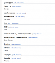
Compare a Linux using DejaVu sans, with Linux Libertine installed:

image.png (1×928 px, 78 KB)

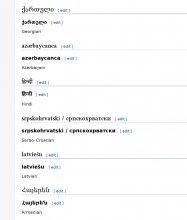
To Windows, using Arial and no Linux Libertine, thus falling back to Georgia:

image.png (722×629 px, 46 KB)

The solution, thus, is to consolidate the fonts specified in @content-heading-font-family to use only fonts with consistent metrics to each other, and then scale them appropriately to account for the common variance in the sans-serifs, including the H3- headers.

Current stack: 'Linux Libertine', 'Georgia', 'Times', serif;
Suggested stack: 'Linux Libertine', 'Times New Roman', serif; possibly with Times also in there somewhere (I don't actually know because I don't have it because I'm not on a mac)

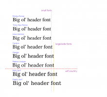
Basically, for comparison:

image.png (812×887 px, 93 KB)

We like the small fonts because they basically match Linux Libertine (although Nimbus is pushing it), so if Times is somewhere between Nimbus and Libertine,, that's good too. Georgia, however, is much larger, and thus not something we should be including. I don't even know what's going on with Noto and DejaVu serif, though they are apparently possible 'serif' matches. Let's just hope everyone matches something before then.

To account for the fact that there are two sizes of sans-serifs, we must make the serif headers large enough to work with both - essentially, size them to the large fonts, DejaVu sans and Verdana. By doing this, they will still work with the smaller, helvetica-derivative fonts, but this is also why it is so important not to have larger serifs mixed in as well: when a large serif, sized for a small serif to work with a large sans-serif, shows up with a small sans-serif, the size difference can become very jarring indeed.

Related tasks

T71998: Vector: h3 should not appear as heavier weight than h2
T71999: MonoBook: h3 should not appear as heavier weight than h2
T72004: h4, h5, and h6 headers should not have the same styling
T73240: Re-evaluate serif font stack for headers
Event Timeline

There are a very large number of changes, so older changes are hidden. Show Older Changes

If it has to do with typography refresh, component shouldn't be OOjs... unless I'm missing something

Thanks for taking the time to report this!
Which browser and URL and operating system is this about?
Needs clearer steps to reproduce...

dalilae wrote:

its not a private matter - its a collective complain, and not local, for all he.wiki. for URL just select a random article - i attached screenshots of this one: [https://he.wikipedia.org/wiki/%D7%9E%D7%A8%D7%97%D7%91-%D7%96%D7%9E%D7%9F]
we havent got enough responses to narrow it to one kinda browser or operating system. in general PC, different windows version, most use google chrome...
tnx,
~~~~

dalilae wrote:

if thats not the place to report it, then could u pass them this file please or direct me there?
tnx,
~~~~

I can confirm https://commons.wikimedia.org/wiki/File:H3_more_has_more_presence_then_h2.png with Firefox 28 on Fedora 20.

On https://he.wikipedia.org/wiki/%D7%9E%D7%A8%D7%97%D7%91-%D7%96%D7%9E%D7%9F#.D7.9E.D7.95.D7.A9.D7.92.D7.99_.D7.99.D7.A1.D7.95.D7.93 comparing
מושגי יסוד
with
מערכת קואורדינטות ארבע-ממדית,
h3 is more bold than h2, however h3 is also slightly more narrow than h2.

dalilae wrote:

the slightly narrow isn't enough to set hierarchy characteristics right. in a general look at a page, h3 catches the eye more then all other headings, it jumps up. i suppose cause right now it uses the most noticeable hebrew font type (among all other different fonts (functions type)- it's clear, contrastic, and also bold. h2 is a less clear and paler font family.

Andre can you inspect the h2 element and work out what font is being used? If you remove the fonts at the front of the list when does the problem fix itself? I cannot replicate this on a Mac.

dalilae wrote:

i was asked to file a different bug report on 3 related issues (fonts problems) - maybe i was wrong not to mention here before. u should consider checking this bug also [https://bugzilla.wikimedia.org/show_bug.cgi?id=63843] - it's referring to h2. h2 is times new roman - not suppose to be in use... maybe fixing times new roman appearance would solve both problems. (the firth has to do with lost of font size proportion on zooming - so probably not affecting or affected by these two).
tnx again for ur efforts.

Jon: Hmm, not sure if h2 is the problem here instead of h3, but as you ask:
Using Firefox 28's Developer Tools (right-click on the heading and choose "Inspect Element", then switch from tab "Rules" to tab "Fonts") for h2:

Linux Libertine O        system
Used as: "Linux Libertine O"

That's as expected, as I'm on a Linux system. h3 does not seem to have a font specificed (inherits font from body plus additionally setting it to bold):

DejaVu Sans Bold        system
Used as: "DejaVu Sans"
Nimbus Sans L Bold        system
Used as: "Nimbus Sans L"

which (except for bold) are the same fonts as for the text of the sections.

See https://gerrit.wikimedia.org/r/125760 - this could hopefully help with choosing a better font stack for the Hebrew language - although what the font stack is I'm not sure.

Krinkle renamed this task from Typography Refresh: h3 is more noticeable than h2 for Hebrew to h3 should not be more prominent than h2 headings.Jan 5 2015, 1:54 AM
Krinkle updated the task description. (Show Details)
Krinkle edited projects, added Design; removed I18n, Browser-Support-Google-Chrome.
Krinkle set Security to None.
Krinkle removed a subscriber: Unknown Object (MLST).

Change 216028 had a related patch set uploaded (by Isarra):
Make headers use the same fonts as the rest of the content

https://gerrit.wikimedia.org/r/216028

Change 216028 abandoned by Isarra:
Make headers use the same fonts as the rest of the content

https://gerrit.wikimedia.org/r/216028

That should be fixed by special treatment of Korean, Hebrew and Japanese introduced in https://gerrit.wikimedia.org/r/#/c/217707/ and released in
https://phabricator.wikimedia.org/diffusion/SVEC/browse/wmf%252F1.28.0-wmf.10/

It's necessary to get feedback from Hebrew readers.

can anyone give me more information of this issue? Is this about changing the font-family of the header h3 and set it to different so that h2 appears more predominant than h3?

Rammanojpotla: The issue is caused by the font stack for the h2s having inconsistent metrics with each other (linux libertine and times new roman are similar, but Georgia is much larger), and the 'sans serif' the rest use also resulting in inconsistent metrics depending on the system in question (for english, windows generally winds up with arial and macs with helvetica, which are comparable, but various linux distributions wind up with everything from nimbus sans (also comparable) to dejavu sans (larger)). Across these, linux libertine, times new roman, arial, helvetica, and nimbus sans all work reasonably well together. The issue primarily shows up on linux due to the combination of linux libertine (or times new roman as a fallback), which are small, and dejavu sans, which is much larger, but can also potentially show up on any platform depending on user settings (such as use of dyslexia-friendly fonts).

Correction: it's actually 'times' instead of 'times new roman', which also results in some variation as not all fonts matching 'times' are consistent either. Times new roman specifically is, but is not what's specified.

Essentially if we specify any fonts, we need to specify all of them in order to maintain consistent metrics, or allow for some fairly wide margins between their other attributes to account for the differences (which results in georgia being VERY large). But these fonts also need to work properly in the first place. My recommendation for english was thus to just lose georgia entirely (as it was also causing some other problems due to ligatures) and make the h2s bigger to account for the sans serif variation.

can anyone give me more information of this issue? Is this about changing the font-family of the header h3 and set it to different so that h2 appears more predominant than h3?

Yes, that's one possible solution, as described by Isarra. Another would be to have all headers use the same font family (e.g. by specifying just "sans-serif" or "serif" for everything). It's not clear what's the "least expensive" choice though.

Another would be to have all headers use the same font family (e.g. by specifying just "sans-serif" or "serif" for everything).

This is by far the easiest and most thorough solution (for instance also resolving all the language-specific issues as well without requiring special casing), but unfortunately I think the design change has stuck at this point.

@Isarra is it better to remove georgia from the heading -font-family of the "linux libertime" or to add sans serif for everything, I think of removing georgia from the line is it better? submitted a patch set at https://gerrit.wikimedia.org/r/#/c/349438/ has run properly on my localhost can you review it please?

Jdlrobson changed the task status from Open to Stalled.May 23 2017, 9:11 PM
Jdlrobson added a subscriber: Amire80.

I'm sorry I missed the above conversation, but this is not ready to be worked on. It needs more research and it's not clear if this is even still a problem for Hebrew Wiki (see https://phabricator.wikimedia.org/T65844#2749935 ) Maybe someone from Hebrew wiki e.g. @Amire80 can update us on h3/h2 differences.

It needs more research and it's not clear if this is even still a problem for Hebrew

This bug is not specific to Hebrew, but I guess you mean this:

That should be fixed by special treatment of Korean, Hebrew and Japanese introduced in https://gerrit.wikimedia.org/r/#/c/217707/ and released in
https://phabricator.wikimedia.org/diffusion/SVEC/browse/wmf%252F1.28.0-wmf.10/

All the other languages and scripts need to be tested, on a variety of browsers and OS. Maybe taking some automatic screenshots of a simple test case like https://www.mediawiki.org/wiki/Typography_refresh/Header_test can help?

Amire80 claimed this task.

The current fonts look OK to me.

Please reopen if anything looks wrong.

Isarra removed Amire80 as the assignee of this task.
Isarra updated the task description. (Show Details)

I've clarified the description to explain what the actual problem is. Please tell me if anything about that isn't clear.

Does anyone disagree with the proposed solution?

From the screenshot, it seems that at least Hindi is problematic. I agree we need a failproof solution, such as choosing sufficiently different font-size or sufficiently similar fonts for h3 and h2.

Bear in mind that both screenshots are the status quo on different platforms, each demonstrating the currently possible extremes, at least with the latin fonts.

Other scripts are using different fonts, or matching in different orders, which would explain why we're seeing the opposite effect with Hindi, marathi, and nepali on windows. Given this, it might be worth filing a specific task about them so that they can get more eyes.

Change 349438 abandoned by Rammanojpotla:
h3 should not be more prominent than h2 headings.

https://gerrit.wikimedia.org/r/349438

Since Vector will be frozen (at least on the short term) as part of the desktop improvements project. I think now is a good time to discuss typography for the new version of Vector.
Let's discuss that here https://www.mediawiki.org/wiki/Talk:Reading/Web/Desktop_Improvements#Will_there_be_any_changes_to_typography? and be proactive this time rather than reactive.

Change 573052 had a related patch set uploaded (by Aron Manning; owner: Aron Manning):
[mediawiki/skins/Vector@master] [Typography] Fix sizes and consistent font usage of headings h1-h6.

https://gerrit.wikimedia.org/r/573052

Change 573052 abandoned by Jdlrobson:
[Typography] Fix sizes and consistent font usage of headings h1-h6.

https://gerrit.wikimedia.org/r/573052

Change 573052 restored by Aron Manning:
[Typography] Fix sizes and consistent font usage of headings h1-h6.

https://gerrit.wikimedia.org/r/573052

Change 576109 had a related patch set uploaded (by Aron Manning; owner: Aron Manning):
[mediawiki/skins/Vector@master] [POC] [Typography] Fix sizes and consistent font usage of headings h1-h6.

https://gerrit.wikimedia.org/r/576109

Change 576109 abandoned by Jdlrobson:
[POC] [Typography] Fix sizes and consistent font usage of headings h1-h6.

Reason:
No changes to typography are planned in the near future and associated tasks have been declined. Removing this from the review queue. The link to this will continue to be preserved if we decide to pick this up in future.

https://gerrit.wikimedia.org/r/576109

Change 576109 restored by Aron Manning:
[mediawiki/skins/Vector@master] [POC] [Typography] Fix sizes and consistent font usage of headings h1-h6.

https://gerrit.wikimedia.org/r/576109

Some problems are best solved by simplification rather than complexification. Appears to be the situation here. Multiple browsers with various font selections. Multiple skins. JavaScript playing behind the scene. Multiple human preferences: "I don't want to see serifs.", "There's no bold font for the character set I use." ... etc., etc.

(MediaWiki is developing a bad case of embelishmentosis. If I had the choice, there would be only one skin, probably Monobook [correction: Minerva]; although I don't know how to find page history there. Rather than be crucified as a heretic, I won't mention this. =8~)) )

My suggestions.
(1) Simplify, simplify, simplify.
(2) In documentation, answer the obvious questions before fussing the details. "Browser notes" has nothing about headings. Fonts are only mentioned under "Console and text-based web browsers". What about the other 99+% of usage?

Regards, ... Peter E.