Page MenuHomePhabricator

Update Global preferences UI
Closed, ResolvedPublic13 Estimated Story Points

Assigned To
Authored By
Quiddity
Jun 20 2014, 8:47 AM
Referenced Files
F9716274: globalprefs-ungreyed-withheader.png
Sep 22 2017, 6:26 AM
F9708381: Global_preferences_radio_buttons.png
Sep 21 2017, 9:13 PM
F9681527: use-globally.png
Sep 21 2017, 1:38 AM
F9680913: 2017-09-21 GlobalPreferences Chrome.ogg
Sep 21 2017, 1:00 AM
F9390849: 2017-09-08 GlobalPreferences form demo.mov
Sep 8 2017, 8:42 AM
F8886975: Global preferences skin buttons.png
Jul 28 2017, 8:54 PM
F8886984: Global preferences radio buttons.png
Jul 28 2017, 8:54 PM
F8876386: Global preferences skin buttons.png
Jul 27 2017, 11:35 PM
Tokens
"Mountain of Wealth" token, awarded by Elitre.

Description

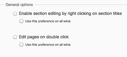
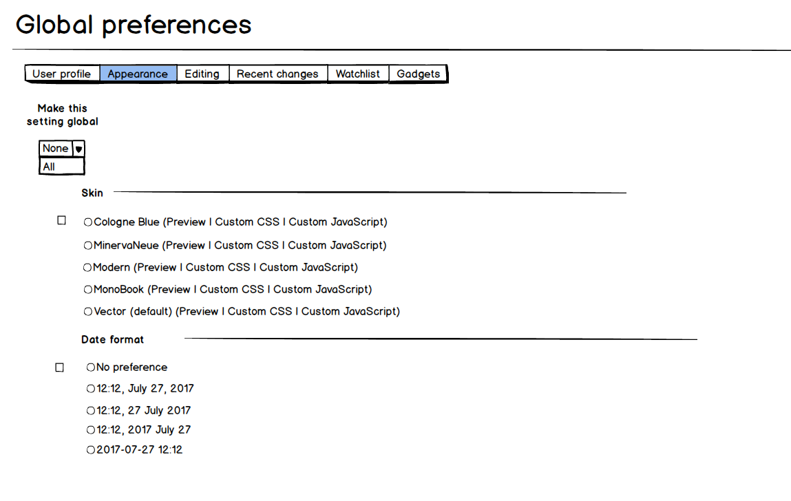
mockup of suggestion

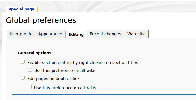
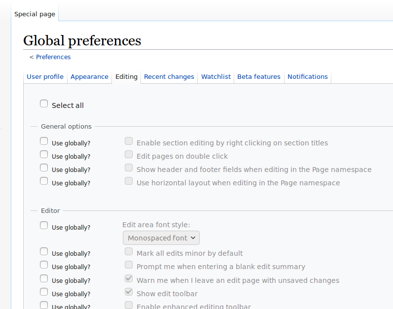
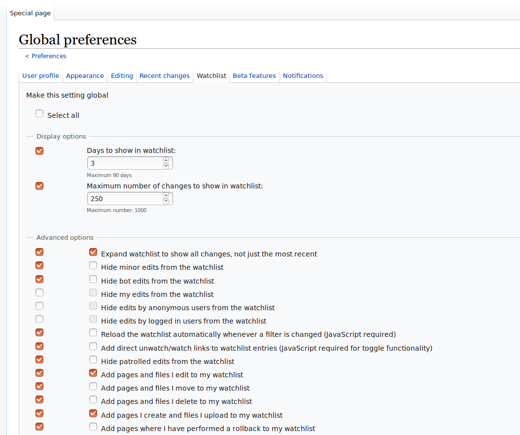
The checkboxes/text for the "Use this preference on all wikis", appear directly in line with the parent-preference that they're associated with.
This makes it unclear, that they will only affect the item above.

Suggestion: Indent those lines, so that they are more intuitively linkable with their parent-preference. (rough mockup attached, but other stylings are possible)

legoktm.wmflabs.org_2014-06-20_01-42-53.png (324×634 px, 29 KB)

Event Timeline

bzimport raised the priority of this task from to Needs Triage.Nov 22 2014, 3:25 AM
bzimport set Reference to bz66869.
bzimport added a subscriber: Unknown Object (MLST).

My suggestion: Indent, then have a different shape for that checkbox (radio button, maybe?)

(In reply to Elitre from comment #1)

My suggestion: Indent, then have a different shape for that checkbox (radio
button, maybe?)

(You mean a "circular-styled checkbox".) Yes, that'd be a reasonable addition, to further emphasize the different nature of these toggles. Or some sort of dotted line in an L-shape.

(@Elitre: Checkboxes are for [on/off] binary toggles. Whereas Radio buttons are for "pick only one of these multiple-options" selections. See this page, for a 1 sentence explanation and example, of each: http://www.w3schools.com/html/html_forms.asp :)

Created attachment 15691
mock of suggestions

I don't think adding the L shaped line is necessary. Taking Quiddity and Elitre's suggestion a little further I've made the size of the text smaller and increased the space between the two options to show the grouping.

Attached:

Screen_Shot_2014-06-21_at_11.41.57_am.png (192×422 px, 19 KB)

Don't do different shapes. If this is really the best way to implement it, just indent it (making it slightly smaller also probably wouldn't hurt, but it's less important). That makes the relationship clear without confusing the functionality with different kinds of inputs, in this case due to radial ones being circular.

(In reply to Isarra from comment #4)

If this is really the best way to implement it, just indent it.

I am sure there are better ways, this is just the one that I (we) could think of.

That makes the relationship clear without confusing the functionality with different kinds of inputs, in this case due to radio ones being circular.

Agreed, no point making a circular checkbox and causing confusion. Lets make the second one a checkbox too but keep the margins and sizes that are seen in attachment 15691 ?

(In reply to Prateek Saxena from comment #5)

Agreed, no point making a circular checkbox and causing confusion. Lets make
the second one a checkbox too but keep the margins and sizes that are seen
in attachment 15691 [details] ?

Margin yes, Size no.

Something Bigger is needed. (that mockup attachment uses smaller text). The whole point of this GlobalPreference page is for editors to checkmark those "Use this preference on all wikis" boxes - We want to highlight them (just without overwhelming the page). :)

I'd suggest a CSS class on the checkbox, and a CSS class on the repeated message, so that we can experiment with options by ourselves. (Perhaps with slightly larger text as a default.)

(In reply to Quiddity from comment #6)

I'd suggest a CSS class on the checkbox, and a CSS class on the repeated
message, so that we can experiment with options by ourselves. (Perhaps with
slightly larger text as a default.)

Ok, did that in I2f70d8763be7081466b7a25b77537ff77ffa3fe9.

Prtksxna triaged this task as Medium priority.
Prtksxna set Security to None.

The whole point of this GlobalPreference page is for editors to checkmark those "Use this preference on all wikis" boxes - We want to highlight them (just without overwhelming the page). :)

I see your point. If people are going to come to this page to set Global preferences, then maybe there shouldn't be a separate checkbox to actually do so. Keeping the design the same we could make the label "Don't use this preference on all wikis", reducing one step. Would that make more sense?

I see your point. If people are going to come to this page to set Global preferences, then maybe there shouldn't be a separate checkbox to actually do so. Keeping the design the same we could make the label "Don't use this preference on all wikis", reducing one step. Would that make more sense?

It depends on what default we have - checked or unchecked - and the assumptions behind that decision...
I would guess that we're assuming that most editors only want to change a "few" options globally. Therefore, they'd only check (opt-in) a few boxes at the GlobalPreferences page.
If instead, we were to assume that most editors will want to use GlobalPreferences as their primary preferences panel, then I guess we'd either start with all boxes checked (everything opted-in), or, turn the checkbox into an "opt-out" or "Don't set this preference globally" parameter.
However, doing that would cause local-overrides for everyone, and make things more complicated for the (vast majority of) users who only edit at a single wiki, who'd then have to go to Meta to set their primary preferences. Hence, I think we want to leave it the way it is.
(This is generally a power-user feature for editors who interact with a large number of wikimedia wikis.)

I think you were going in the right direction before, with attachment 15691 (but with the square checkbox).


(In reply to Quiddity from comment #6)

I'd suggest a CSS class on the checkbox, and a CSS class on the repeated
message, so that we can experiment with options by ourselves. (Perhaps with
slightly larger text as a default.)

Ok, did that in I2f70d8763be7081466b7a25b77537ff77ffa3fe9.

Note, this was https://gerrit.wikimedia.org/r/#/q/I2f70d8763be7081466b7a25b77537ff77ffa3fe9,n,z
and added .mw-globalprefs-global-check - for our experimental pleasure. :-)

However, doing that would cause local-overrides for everyone, and make things more complicated for the (vast majority of) users who only edit at a single wiki, who'd then have to go to Meta to set their primary preferences. Hence, I think we want to leave it the way it is.

The GlobalPreferences form is available on all wikis on which its used, so there wouldn't be any need to go to Meta. If GlobalPreferences was to be the main preferences interface (and the other one maybe renamed 'LocalPreferences' or something?) then perhaps the 'Preferences' link in the user menu could go straight to it.

But that's a bit off topic, what I wanted to say that perhaps it'd be good to disable the associated preference until the opt-in checkbox is ticked? That might help make it clearer that the option has to be "turned on for all wikis". And it could even go above the option as well, or near the label.

Change 367874 had a related patch set uploaded (by Samwilson; owner: Samwilson):
[mediawiki/extensions/GlobalPreferences@master] Disable prefs in GlobalPreferences unless they're enabled

https://gerrit.wikimedia.org/r/367874

I had a crack at making the global preferences slightly more obvious when they're disabled, and on hover when they're being enabled. It might be better to highlight the whole relevant table rows on hover, rather than just the labels.

@Quiddity here's a demo (but I think more of the non-active bits should be hidden until they're activated; not sure how though):

That looks great, Sam! Just what I was imagining.
I hesitantly suggest that it is sufficient, and no further work on this aspect is needed. (Just because there are more complex and important features/bugs to work on).
Thanks for the video. :-)

How's this as an alternate idea? Put all the "make this global" radio buttons down the left side, so you always know where they are. There's a None/All dropbox at the top of that column if you want to switch all of them to global at once.

Global preferences radio buttons.png (652×1 px, 69 KB)

Here's one that shows the global radio buttons next to more radio buttons, for extra radio button action.

Global preferences skin buttons.png (702×1 px, 66 KB)

I agree with Isarra that it's a bit confusing using radio buttons as checkboxes (i.e. for a cumulative selector rather than an exclusive selector).

Yes, surely these have to be checkboxes? And the idea of lining them up at the side is great! I like it.

There are other parts of the form that need to be removed too, I think (such as email address and gadgets, which can't be global). And parts (like timezone offset) that are currently not global-selectable.

@Quiddity: do you mean about local-overrides? I think we need more tickets about the other parts that need to be done for GlobalPreferences! But it does sound like the UX is a big issue about how it's all going to be structured and work (although, that's more than just this ticket, certainly).

Yeah, you're right -- checkboxes, rather than radio buttons.

Global preferences radio buttons.png (675×921 px, 67 KB)

Global preferences skin buttons.png (728×1 px, 73 KB)

Change 367874 merged by jenkins-bot:
[mediawiki/extensions/GlobalPreferences@master] Disable prefs in GlobalPreferences unless they're globally-enabled

https://gerrit.wikimedia.org/r/367874

kaldari set the point value for this task to 13.Aug 1 2017, 11:56 PM

I think that's a good idea, but please at some kind of line between the columnds to make the ui more clear.

Change 370152 had a related patch set uploaded (by Samwilson; owner: Samwilson):
[mediawiki/extensions/GlobalPreferences@master] [WiP] Move the enable-globally checkboxes to the side of the form

https://gerrit.wikimedia.org/r/370152

I've got most of the new form layout working, and am sorting out the section header bit (the toggle all drop-down). How does one add a section header to every section? Can anyone tell me how to tell SpecialPreferences class that I want to use a custom PreferencesForm class for the form? At the moment I'd have to override SpecialPreferences::execute() and only change one line of code in it. The better option I see is to alter that class in core to allow subclasses to provide their own forms; is that worth doing?

I feel like there must be a more appropriate place for those questions, Sam, if we want to achieve timely progress :)

Change 371081 had a related patch set uploaded (by Samwilson; owner: Samwilson):
[mediawiki/core@master] Make it possible for subclasses to provide a different form

https://gerrit.wikimedia.org/r/371081

@Elitre: good point. But where? I've gone ahead and created a patch for core anyway, to show what the idea is.

I'll go ahead and get the all-checkbox toggle dropdown done.

Change 371081 merged by jenkins-bot:
[mediawiki/core@master] Make it possible for subclasses to provide a different form

https://gerrit.wikimedia.org/r/371081

How important is it that the GlobalPreferences checkboxes for BetaFeatures are OOUI?

The BetaFeatures preferences are OOUI, but they are the only ones (at least, I can't find any other extensions doing something similar), and I'm just wondering if it's worth the hassle of handling these in a whole separate way to the rest of the global preferences form. The select-all checkbox at the top has to be modified as well, just for this one form tab.

There's T117781: Convert Special:Preferences to OOUI that will happen at some point, and when it does we'll have to update GlobalPreferences.

I'm not (only) being lazy: I'd like to get the minimal version of this issue completed before working on making it also work more smoothly for non-core preferences. I've got a bit of the OOUI-for-BetaFeatures working, but it's proving to complicate things and I suspect (especially with local overrides coming soon) that things will just have to be refactored anyway.

The form is currently looking like this:

After discussion, we've decided to leave the OOUI-compatibility stuff for a separate issue.

@DannyH: What do you think? See movie above.

Hi, sorry I missed this.

I don't think the global preferences page should look totally grayed out. It looks like the only thing that's live is the "select all" checkbox. People should be able to tell which preferences are global and which aren't, but I don't think graying is the way to go.

In the demo at 0:08, when you switch on Select all on the Recent changes tab, the "Group changes by page in recent changes and watchlist" has two orange checkboxes in a row -- the "make this global" checkbox, and the actual "group changes" preference checkbox.

On current preferences, the actual preference checkboxes are smaller, and white-on-blue. I like the idea of using the orange checkboxes for the "make this global" boxes, which will help people visually separate which ones are global and which aren't. What do you think?

The appearance of the orange (or white-on-blue) checkboxes are down to different browsers and operating systems, unfortunately (e.g.). They're all just native checkboxes and so there's not all that much we can do with them.

Perhaps we get rid of the greyed-out-edness and instead have a background color to draw attention to the ones that are globalized?

And/or we have a label next to the globalization checkbox. At the moment there is one but it's hidden; it reads Use this preference on all wikis but that's a bit long for the space. Perhaps just Make global??

Anyway, here's what it looks like just without the reduced opacity on the text (this time in Chrome):

Use Globally? sounds better imo.

Re: checkbox color. All of these will soon be OOUI style anyway.

@Quiddity that's true. Although, then they'll still all look the same. Or are we allowed to change their colour (I guess doing so is possible with OOUI)? I'd have thought not.

Re: changing OOUI color for just the "global" row of checkboxes, I don't know if that is possible, or how strongly it might be discouraged. @Volker_E ?

Re: having the string "Use global?" (or similar) after each checkbox: The main potential problem is translated-string lengths - e.g. that string might need to be longer than we expect in some languages.
e.g. like this string,
Blocked globally
vs
உலக அளவில் தடை செய்யப்பட்டுள்ளது

The "make this setting global" text is on the wireframes... it should be at the top, above select all/none.

Global_preferences_radio_buttons.png (675×921 px, 67 KB)

That's too bad about the colors. I think we can just use the checkbox to say whether it's actually set as a global preference of not.

Oh, and I really like the use of the background color to show what the checkbox is related to. That works great.

From a UX perspective it's not convincing that coloring the checkbox backgrounds would provide a useful improvement. Altering a well-learnt user interface widget to signalize section affiliation might result in confused users too.
Also, we would then probably move away from our Web Content Accessibility Guidelines conforming, high color-contrast default widget appearance to one, that could be a problem for users with visual impairments again.
And last, but not least, color shouldn't be the only way to convey information.

I'd rather emphasize the affiliation with gestalt principle of proximity or connectivity in different terms. Coming late to this task, there's still need for me to clarify what the current issues with the interface are, which we need to overcome.

It now looks like this:

globalprefs-ungreyed-withheader.png (882×1 px, 84 KB)

And you can try it out on the Community Tech wiki at https://commtech.wmflabs.org/wiki/Special:GlobalPreferences (you'll need to register an account).

I think it would be great to invite the folks who've been commenting on the project page to check this out, and see what they think. @Samwilson would that work for you?

DannyH renamed this task from The "Use this preference on all wikis" lines are unclearly associated to Update Global preferences UI.Sep 22 2017, 11:15 PM

@DannyH yes, great idea! People can register on commtech wiki (they just need to know that our IRC channel is #wikimedia-commtech, as that's the dreadfully secret spam-preventer word).

Change 370152 merged by jenkins-bot:
[mediawiki/extensions/GlobalPreferences@master] Switch to using PreferencesFactory, and improve UI

https://gerrit.wikimedia.org/r/370152

Samwilson moved this task from Needs Review/Feedback to Q1 2018-19 on the Community-Tech-Sprint board.

Checkboxes are now at the side in a column, and there's a select-all at the top. Further improvements to the UI already have tickets, so this I think can be closed. Huzza!