Description
| Status | Subtype | Assigned | Task | ||
|---|---|---|---|---|---|
| Resolved | Dbrant | T104487 Measure app installs directed from a mobile web banner. | |||
| Resolved | • Tnegrin | T103896 Serve the Download App banner from mobile web (restricted to Finland only) | |||
| Resolved | Dbrant | T103460 Implement intent handler for Install Referrer. | |||
| Resolved | Dbrant | T105561 Review Finland banner testing strategies |
Event Timeline
@Deskana fundraising the way we do would be in violation of finnish laws, so we dont fundraise there...so experimentally moving traffic to apps is risk free from that perspective.
That being said, there might not be enough fins on line to drive meaningful results...5M people....means 2M mobile WP users a month? With a CTR of 0.1% (Which is pretty good for an install), we would have 2000 clicks to the app store, and maybe 1000 installs?
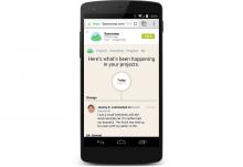
Sample Pattern for Android
Link about banners on Android (Doesn't seem to be a heavily used pattern on Android since Google provides app download entry points in search)
https://signalvnoise.com/posts/3717-google-play-banner-design
Created https://phabricator.wikimedia.org/T105561 to make sure we sync up with Research on methodology.
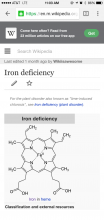
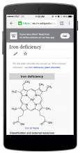
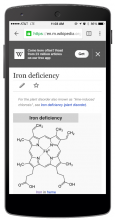
This is the current design we are working with. I plan to add two color options and the full page version.
Yep, all fundraising banners include a close X. We will also have a close on these Finland banners and will limit the number of times they are shown to each reader.
Here are links to the banners from the last time we did this (June 2014) from @Tbayer:
https://en.m.wikipedia.org/w/index.php?title=Jimmy_Lewis_(surfer)&banner=Wpapp2014Androidmobile_2&uselang=en&force=1
https://en.m.wikipedia.org/w/index.php?title=Jimmy_Lewis_(surfer)&banner=Wpapp2014Androidmobile_2&uselang=en&force=1
And the commons app in 2013: https://en.m.wikipedia.org/w/index.php?title=Guna,_India&banner=AndroidCommonsApp&uselang=en&force=1
https://meta.wikimedia.org/wiki/Special:CentralNoticeBanners/edit/CommonsAppnonmobilewp
https://meta.wikimedia.org/wiki/Special:CentralNoticeBanners/edit/CommonsAppnonmobilecommons
do we have updated banners for this year? I'd love to see a slightly darker/more prominent background color, even just a #f5f5f5, because those look like plain links as opposed to something we're trying very hard to point out. thoughts?
f5f5f5 is actually pretty light.
the proposed set of greys is
@colorGray4: #333;
@colorGray4: #444;
@colorGray5: #555;
@colorGray6: #666;
@colorGray7: #777;
I wouldn't recommend going any darker than #333 for the background.
I initially imagined that the banner just dissolves if the user starts scrolling, that is what we do on the android app for onboarding banners.
If we want an explicit button, we need to increase the height of the banner to have safe click areas of 45 px with adequate padding between actions.
Agreed that f5f5f5 is pretty light; I didn't know if there was a desire for a super-light look for some reason (since the old design shows completely white) or what, so that was a compromise suggestion. :)
Love the idea for dissolving. I just feel there could be some feeling of trickery/entrapment if there is no way to permanently get rid of banners....after the dissolve, would the banner reappear if you scroll back up?
Let's do some quick testing of these ideas...dissolve vs. buttons.
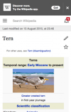
Here's a preview of the first banner. I've still to add the link and the logic that hides it after 1 view.
https://en.m.wikipedia.org/wiki/Tern?banner=Aug2015_app_banner_1&force=1
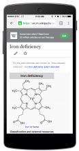
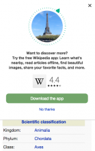
And the second banner design (minus the geolocation image, which I need from @Vibhabamba):
https://en.m.wikipedia.org/wiki/Tern?banner=Aug2015_app_banner_2&force=1
@Pcoombe these look great! Can we make some minor text updates?
Banner 1 - "Discover more.
Try the free Wikipedia app."
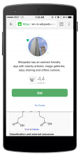
Banner 2 - "Want to discover more?
Try the free Wikipedia app: Learn what’s nearby, read articles offline, find beautiful images, share your favorite facts, and more."
I've got the Finnish translation requests in, I'm guessing we'll get them on Monday.
Hi Peter,
Attaching the SVG file for the ring around the image.
The image itself is a 124 px mask of any prominent location in the world.
I was thinking Eiffel tower - https://commons.wikimedia.org/wiki/Category:Eiffel_Tower
Now I know that picking one location as a global is not a great idea, but we can't ask for location permissions to actually show something nearby, so in this one case I think its ok.
Hey @Pcoombe - a copy update from what's up there vs. what's in the doc:
English: https://en.m.wikipedia.org/wiki/Tern?banner=Aug2015_app_banner_1&force=1
should say "Try the free Wikipedia App" instead of "Try the Wikipedia App"
@Vibhabamba could you confirm that the design looks good?
Actually, looks like the button for the banner 2 is good. Updating my previous comment to clarify.
First Style Tweaks
Need more vertical padding between the label and the button edges so it feels like a comfortable target.
Increase top and bottom padding by 10 px.
2nd Style Tweaks
Button color is #00AF89
Need 20 px padding/margin between the app icon and the star rating.
Thanks team. I'm not sure what the normal Reading process is for closing tickets - but I think we can probably close this one. @Vibhabamba will you update if there's anything else that's required to close?
These look great. A question about the URL parameters though: Do we really need to store the page name where the user clicked the banner? (referrer_url : window.location.href , in this example: https://en.m.wikipedia.org/wiki/Tern )
In case nobody is planning to use that data, I would suggest removing it for privacy reasons and just using the project name instead (e.g. via $wgDBname).
@Tbayer There is actually a significant benefit to passing the page name in the URL parameter. This way, after the user installs the app, it will be possible for the app to navigate directly to the page that the user was browsing in Mobile Web, without the user having to search for it again.
I recall studies from several "open web" type organisations that banners like these are annoying to users. Especially because most websites tend to implement them in a way that produces poor user experience (it's hard to get right).
At least for iOS – Safari has a standardised way that is more native and integrated without disturbing the page flow and in a location and style that the user expects. It also takes care of not showing it every time, not showing it if the user has it already, not having it bump down the page like most central notices do, etc.
Related:
http://googlewebmastercentral.blogspot.com/2015/09/mobile-friendly-web-pages-using-app.html
http://davidwalsh.name/apple-itunes-app
http://www.hongkiat.com/blog/itunes-meta-tag/
https://developer.apple.com/library/ios/documentation/AppleApplications/Reference/SafariWebContent/PromotingAppswithAppBanners/PromotingAppswithAppBanners.html
Interesting related news item: Google will demote mobile sites that use terrible app install ads
Wow. This is a terrible, terrible thing that is happening.
Please don't become another one of "those sites" where you try to force people into a shittier version of the website. Just. . . just please don't.
Considering this question was not answered and T105561: Review Finland banner testing strategies has no answer w.r.t. how this is being measured...I'm not sure what's to be gained out of this. It seems awfully rushed...
@Tnegrin: I'd appreciate it if you could respond to the propriety concerns raised in this task and elsewhere.
Learn from others.
The current implementation looks like it heavily obscures the page contents, so you're likely to drive users away at a large rate while getting a very small percentage to install an app that's regularly less featureful than the mobile version.
Seriously. Did anyone do any research about interstitials like this before it moved into the "let's do it" phase?
In terms of features for readers, I think the app is better and has more features. It has lead images and descriptions in production, tables are collapsed, it's been more optimised for speed, has a nifty implementation of nearby, and so on. A lot of effort has gone in to honing it. Web has none of this. For editors, it's unlikely that the app really offers anything substantial, and as you point out; many crucial editing features are missing.
I agree with you on the obscuring of content. That doesn't make sense to me.
Imagine if a quarter of the effort spent on a closed-platform project (which, as far as I can tell, is mostly about . . . well, I'm not sure. I've never heard a good business case for writing apps) - imagine if a quarter of that effort had been spent on improving the mobile web!
We'd not be having this conversation and there'd be a whole team freed up to work on other toys.
And at the same time there's also a privacy loss. We're now sending what page the user was on to Google for them to track the user however they see fit.
Folks -- I'm going to respond to the wikitech thread; let's continue the discussion about the why's behind this project there. It's more accessible and it would be better to have a single discussion thread.
-Toby
For the sake of completeness, could the results of the analysis (i.e. the outcome of this task) be posted here?
We're going to post publicly -- ticket should not be closed until this
happens. Anne/Jon are point since they both worked on the analysis.
To keep the archives happy:
https://www.mediawiki.org/wiki/Wikimedia_Apps/Finland_Banner_Test
announced 2015/11/10
http://www.gossamer-threads.com/lists/wiki/wikitech/651066#651066

