Page MenuHomePhabricator

Provide a Preview panel that doesn't obscure the wikitext box and maybe the skin's sidebar (?)
Open, MediumPublic8 Estimated Story Points

Assigned To
None
Authored By
dialmove
Jan 19 2017, 1:15 PM
Referenced Files
F8119442: wikitext-2017-mockup-splitted-view.png
May 24 2017, 6:33 PM
F8119433: wikitext-2017-mockup-editor-dropdown.png
May 24 2017, 6:33 PM
F8119439: wikitext-2017-mockup-frame-dropdown.png
May 24 2017, 6:33 PM
F8119451: wikitext-2017-mockup-splitted-frame-dropdown.png
May 24 2017, 6:33 PM
F7218328: Snímek z 2017-04-04 20-14-07a.png
Apr 4 2017, 7:22 PM
F7218397: Snímek z 2017-04-04 21-05-44.png
Apr 4 2017, 7:22 PM
F7218380: Snímek z 2017-04-04 20-22-46.png
Apr 4 2017, 7:22 PM
F7218325: Snímek z 2017-04-04 20-14-07.png
Apr 4 2017, 7:22 PM
Tokens
"Love" token, awarded by He7d3r."Like" token, awarded by Izno.

Description

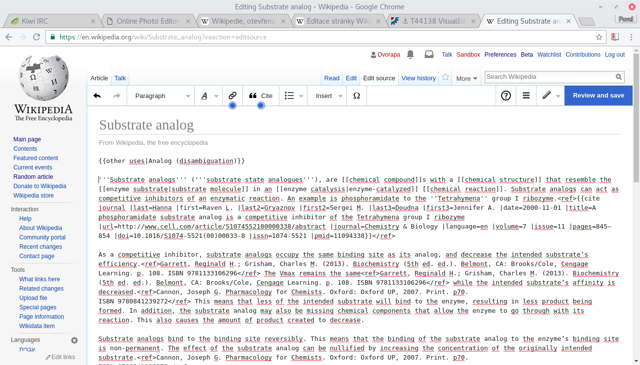
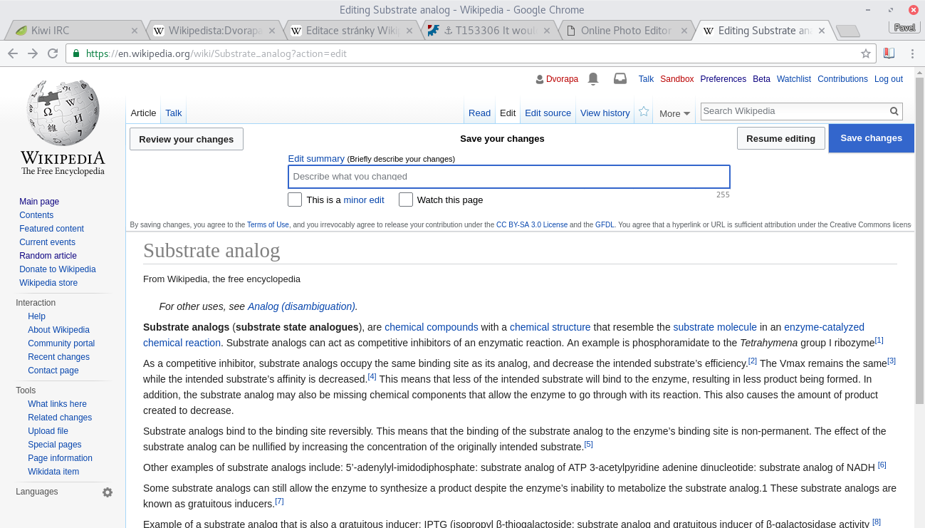
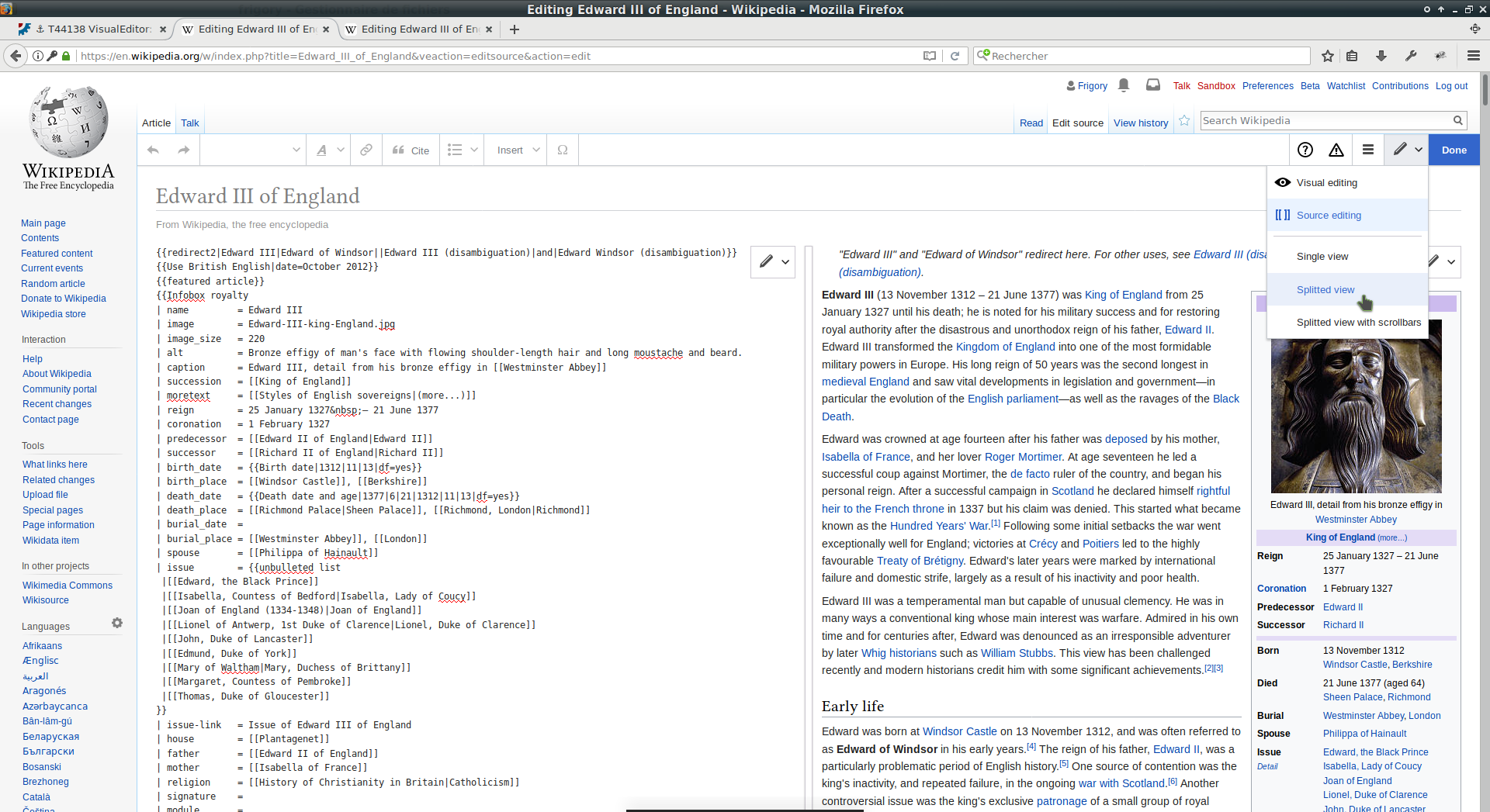
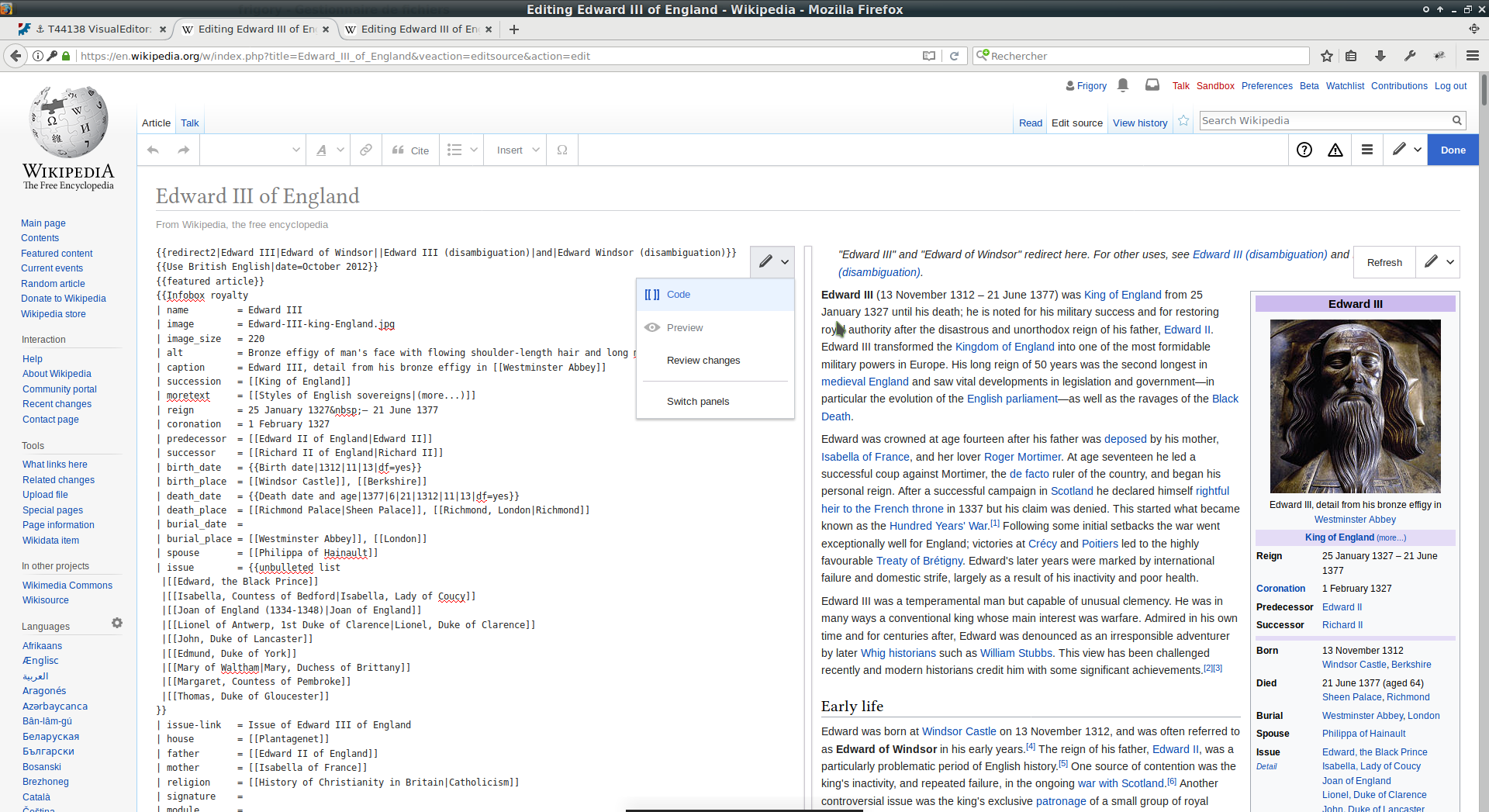
As discussed at this thread, a very important feature of the classic Wikitext editor is the possibility to see the Preview results and the wikitext edit box in the same page at the same time.

The Visual Editor obviously doesn't need this; but the 2017 Wikitext Editor has copied the flow of the "Review your changes" panel, obscuring the edit box below it, which is completely inadequate for wikitext - as it makes it impossible to compare the code and the result it produces. (Heck, even this very Phabricator edit box gets it right, showing an instant preview of this code I'm writting below it). Please, PLEASE change the layout of the Preview panel so that it shows above, below or alongside the wikitext code, instead of floating and obscuring it.

Related feature request: T153306 - A more accesible Preview button.

Event Timeline

at the same time.

For a non-stub page this is already not possible, you can't see the wikitext and the preview at the same time (although the preview could be easier to switch to).

I haven't used the new wikitext editor yet, but doesn't preferences have an option for live preview?

I haven't used the new wikitext editor yet, but doesn't preferences have an option for live preview?

This task is trying to make new wikitext editor show preview next (/above/under) the code, as old wikitext editor does. The new wikitext editor shows preview in place of wikitext, therefore an editor can not compare code with preview at all.

at the same time.

For a non-stub page this is already not possible, you can't see the wikitext and the preview at the same time (although the preview could be easier to switch to).

As stated in the description, the creator of this task is familiar with possibilities of NWE and this is exactly what he wants to change.

Maybe "Show preview" button could just switch to VE with disabled editation and categories+TOC added, It would be easier to maintain and many of bugs/issues/tasks like e.g. T155774, T153413, T153535 (basically T155863 for those three) would be solved, it could also resolve T153306 and T155732.

Note: I am aware of some flaws of this suggestion, but maybe this inspires another contributor to have some better idea. Or at least it just helps to start a discussion about possible solutions at all.

Don't do this, please. It's awful in flow.

Izno rescinded a token.
Izno added a subscriber: Izno.

Don't do this, please. It's awful in flow.

No, there needs to be a way to preview the text side-by-side--changing a little text a/b/c needs to be easily previewed. "awful in flow" doesn't help bound the solution to this task.

at the same time.

For a non-stub page this is already not possible, you can't see the wikitext and the preview at the same time (although the preview could be easier to switch to).

But both are displayed in the same page, which means that at least I can quickly find them by scrolling up and down, which can be done really fast using one of the most tried and tested standard controls of the browser. With the current approach, I have to keep looking for the "switch preview on/off" buttons, and wait several seconds for the application to switch context between the two views.

Probably a good approach in the browser, at least for the desktop, would be to put the preview in a sidebar. There was an extension to the classic wikitext editor which did that, although unfortunately it wasn't very robust.

Don't do this, please. It's awful in flow.

I agree, don't merely create a way to switch to the VE. The need is to be able to compare the final result and the wikitext that produces it, and this can't be done if you hide the wikitext.

If you didn't understand, @Izno, my problem is beeing preview editable.

But both are displayed in the same page, which means that at least I can quickly find them by scrolling up and down, which can be done really fast using one of the most tried and tested standard controls of the browser. With the current approach, I have to keep looking for the "switch preview on/off" buttons, and wait several seconds for the application to switch context between the two views.

On a reasonably sized article, scrolling between the wikitext and the preview is not quick, each time you have to find your place again. We have a separate bug to make the show preview action more discoverable, and the preview is cached when no changes are made to the wikitext, so once that bug is resolved it will be just as easy to open/close the dialog. We also already have a shortcut (alt+shift+p) that will instantly launch the preview dialog if you prefer keyboard access.

On a reasonably sized article, scrolling between the wikitext and the preview is not quick, each time you have to find your place again.

In the most common environment for editing articles, a browser on a desktop machine with a mouse dragging the scrollbar, that operation is quick. Finding the precise spot is a matter of muscle memory, and the time required can be literally predicted using Fitts's Law. Alternatively, a given word or sentence may be searched with Ctrl+F, and alternating between the precise spot in the code and the preview can be done instantly by pressing F3 or the prev/next search buttons (I often use both methods when previewing content).

The key point is, having the code and the preview available in the same page at the same time, provides the required flexibility for the user to define their own flows and use their preferred tools to access the information, meanwhile hiding the code when showing the preview imposes arbitrary constraints. I'm not saying that the current layout in the classic editor is the best possible way; likely, it would be best having a floating panel with independent scrolls for the code and the preview, or side-by-side panels that could be kept syncronized to show the same part of the article.

We have a separate bug to make the show preview action more discoverable, and the preview is cached when no changes are made to the wikitext, so once that bug is resolved it will be just as easy to open/close the dialog. We also already have a shortcut (alt+shift+p) that will instantly launch the preview dialog if you prefer keyboard access.

Having a shortcut would alleviate the problem (although the current preview in the 2017 editor still forces you to find the right spot each time you preview, so it's not a solution); as well as having the show/hide preview at a fixed point of the screen so you don't have to hunt for the button at different places in order to quickly activate/desactivate the preview with the mouse.

Yet it still doesn't solve the problem that hiding the code when you show the preview is a failure in the juxtaposability of the notation. The current preview in the 2017 editor is objectively worse than the old one in that regard, in a way that won't be solved merely by making the access button more visible.

Jdforrester-WMF renamed this task from Feature request - A Preview panel that doesn't obscure the wikitext box to Feature request - A Preview panel that doesn't obscure the wikitext box and maybe the skin's sidebar (?).Apr 4 2017, 7:10 PM
Jdforrester-WMF triaged this task as Medium priority.
Jdforrester-WMF added a project: Design.
Jdforrester-WMF set the point value for this task to 8.

What about a solution like this:
Editation:

Snímek z 2017-04-04 20-22-46.png (741×1 px, 266 KB)

>Preview and save:
Snímek z 2017-04-04 20-14-07.png (741×1 px, 182 KB)

>Done:
Snímek z 2017-04-04 21-05-44.png (741×1 px, 244 KB)

This solution is inspired by a comment in T153306#3153250 from @TheDJ:

i'd say that for wiki text,, we should actually encourage people to always go through preview. Maybe we could make that the default for the 'Save' button, and have the button behave as a dropdown, like on the editor switcher as well ?

and by a comment in T44138#3153365 from @dialmove:

A very typical wording would be "Review and save" (or "Review and publish"). It shouldn't be merely "Save" or "Publish", since the page is not immediately saved when pressing it.

and it would help to resolve both T153306 and T44138 as well

In detail, in red is the save part and in green is the preview part of the page:

Snímek z 2017-04-04 20-14-07a.png (741×1 px, 180 KB)

Note: I prepared the preview quickly, therefore I didn't care much about details and therefore it could look a little bit messy, just take it as a first concept.

Hi,

I’m suggesting a splitted view.

  • In the editor dropdown, in source editing mode, additional options to enable having frames (possibly with a scrollbar for each):
    wikitext-2017-mockup-editor-dropdown.png (1×1 px, 231 KB)
  • A dropdown in the top right-hand corner of each frame to choose its content:
    wikitext-2017-mockup-frame-dropdown.png (1×1 px, 225 KB)
  • The splitted view:
    wikitext-2017-mockup-splitted-view.png (1×1 px, 511 KB)
    (the bar at the middle can be moved)
  • In the content selection, a ‘Switch panels’ option (I don’t know if the correct word should be ‘frame’ or ‘panel’), and the content of the other panel is grayed in the dropdown; also, a ‘Refresh’ button for the preview:
    wikitext-2017-mockup-splitted-frame-dropdown.png (1×1 px, 524 KB)

Of course there should be other icons (‘Refresh’ should be an icon).

I provided more ideas/screenshots in T44138#3266236.

With the current editor it doesn't matter how long the article is. Everything is on one long screen. I simply highlight some unique text and use the browser search on it. Pressing F3 then jumps back and forth between article text and the matching wikitext.

With the current editor it takes milliseconds to skip between article text and matching wikitext, as often as I want.

With the NewEditor it takes me over half a minute to preview United_States just once, and over five minutes staring at the blue VE-loading-bar if I want to jump between article-text and preview ten times.

The NewEditor design was a massive error from the start. Shoving our primary editor inside a bloated Visual engine is a disaster. I have a reasonably powerful computer, and the NewEditor is slow on small articles and unusable on large articles. There were comments on French wiki that the developers need to break out of the California bubble, much of the world the world doesn't have a fraction of the computer power that you and I do. The NewEditor is not a viable substitute for our current primary editor.

With the NewEditor it takes me over half a minute to preview United_States just once, and over five minutes staring at the blue VE-loading-bar if I want to jump between article-text and preview ten times.

Did you try Shift-Alt-P to see preview? This way it loads without the blue VE-loading-bar.

The NewEditor design was a massive error from the start. Shoving our primary editor inside a bloated Visual engine is a disaster. I have a reasonably powerful computer, and the NewEditor is slow on small articles and unusable on large articles. There were comments on French wiki that the developers need to break out of the California bubble, much of the world the world doesn't have a fraction of the computer power that you and I do. The NewEditor is not a viable substitute for our current primary editor.

It’s also the case for me, the VE can take more than ten seconds to load with long articles.

There’s still much work to do but I don’t think merging the designs is a bad idea.

With the NewEditor it takes me over half a minute to preview United_States just once, and over five minutes staring at the blue VE-loading-bar if I want to jump between article-text and preview ten times.

Did you try Shift-Alt-P to see preview? This way it loads without the blue VE-loading-bar.

Offtopic of me: Someone needs to file a task to improve discovery of shortcuts (whether by simple documentation, by hovering over a button to display the key code, or some other improvement). Most of us have no idea what keys we can or need to press to do anything in either VE or in WTE17. Ctrl + Enter got something to spit out at the Save modal panel, but there are lots of other things that I'm sure would be handy...

@Izno, Control-Enter or Command-Enter does what you want in a lot of dialog boxes (Save, Insert > Template, and more). There is a list of keyboard shortcuts in the editor, next to the link to the user guide and feedback box. It is doubtless incomplete, but I believe that it covers the most popular ones.

Aklapper renamed this task from Feature request - A Preview panel that doesn't obscure the wikitext box and maybe the skin's sidebar (?) to Provide a Preview panel that doesn't obscure the wikitext box and maybe the skin's sidebar (?).Jun 26 2017, 5:20 AM

With the NewEditor it takes me over half a minute to preview United_States just once, and over five minutes staring at the blue VE-loading-bar if I want to jump between article-text and preview ten times.

Did you try Shift-Alt-P to see preview? This way it loads without the blue VE-loading-bar.

I was a little sloppy, preview shows moving gray stripes instead of a blue loading bar. It's the same problem though. Previews appear to be cached, so if you aren't actually editing then repeat previews "only" takes ~8 seconds (~4 seconds to switch ~4 seconds to switch back). However if you're actually working, each keypress kills the cache. A preview takes ~30-35 seconds to load, plus ~4 to switch back. So ten previews is over 6 minutes. Usually I just use one preview before saving, which is still an appalling and unusable performance. But yeah, sometimes we easily hit ten or more previews while working. Having preview on the same screen as the wikitext matters a lot.

I just wanted to note another discussion that I started (before the one that started this task) at this feedback discussion.

at the same time.

For a non-stub page this is already not possible, you can't see the wikitext and the preview at the same time (although the preview could be easier to switch to).

"at the same time" means that is available in the same page, even if the page is longer than the screen.
Hence you can easily: read the preview, look for typos and correct it using the "find" option of the browser. If you your typo is e.g. "aplle" instead of "apple" you can find aplle fix it, jump back to the point where you were checking the rpeview and go ahead. All of this is impossibile with the new VE. And if you are checking a long article is very useful to have "at the same time" preview and edit area.