Page MenuHomePhabricator

Consider changing mobile site header height (and overlay header height) from 3.35em (53.6px) to 3em (48px)
Closed, ResolvedPublic5 Estimated Story Points

Description

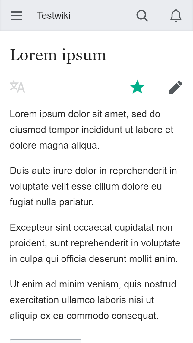
I would like to propose changing the mobile site header height (and overlay header height) from 3.35em (53.6px) to 3em (48px).

This would affect the main site header (with the logo and search box) and headers of all overlays (e.g. talk, editor, etc.).

Current height is larger than necessary to support mobile interaction, and instead (in case of fixed headers) takes too much screen space. Additionally, the weird fractional pixel height makes positioning stuff within headers with CSS awkward and can result in off-by-one-pixel positioning errors (e.g. due to different browsers rounding values differently, or dimensions defined with height+padding giving different results than position+top). I don't think the exact value 3.35em is intentional, but rather it seems to be a historical accident resulting from various refactorings over the years.

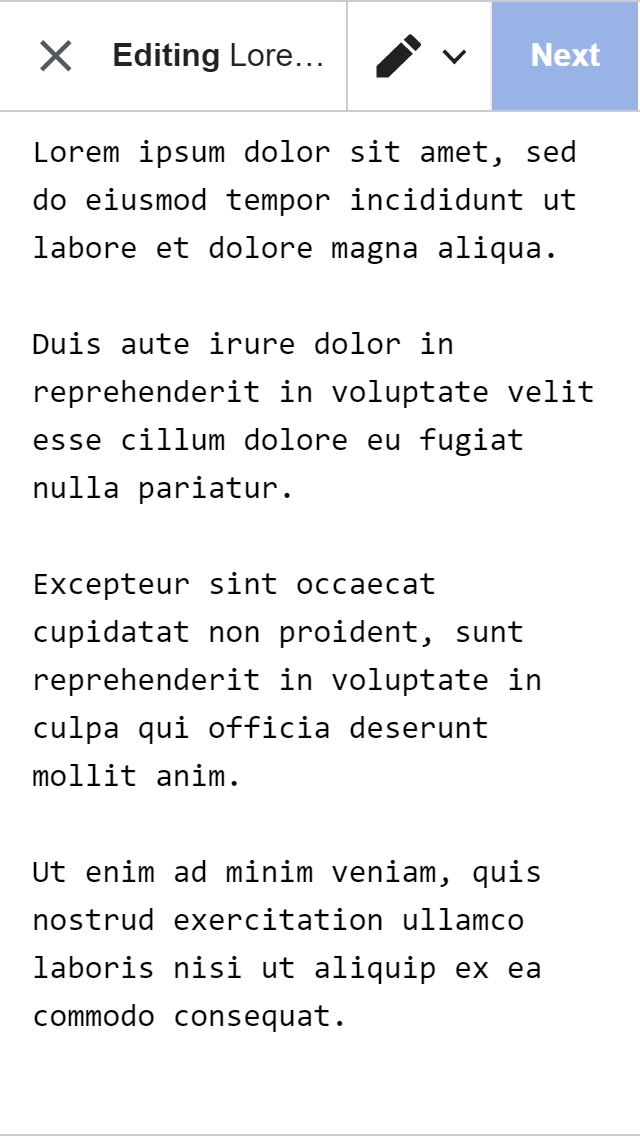
Proposed height 3em is currently used by the VisualEditor overlay on mobile for its header/toolbar. It is also a bit of a historical accident (OOUI toolbars are specified with height of 3em, but in the context of desktop Vector skin, that means 42px and not 48px). But since overriding this for mobile only is difficult (see discussion on T190596), it would be convenient if everything else was adjusted instead.

I'm proposing this now because new VE toolbar animations we plan to introduce per T210630 make the difference painfully obvious:

  • VE toolbar is smaller than the site navigation bar by a few pixels (and also than the wikitext toolbar). It looks weird when we slide it in (you can see a small piece of the grey site navigation below it). AFAIK the toolbar height was an intentional decision, but we might have to change it, since now with the animations it looks even weirder than before.

(Note that T209015 proposes making the VE toolbar even smaller, but I think it's more important to make all headers use the same height)

Things to discuss

  • main menu entry height now matches the header - these seems good
  • VE consistency

Possible problems

  • Changes needed for the height of the Minerva logo?
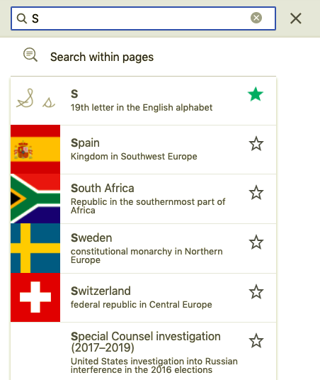
  • Search input vertical padding may need to change
  • Search: The clear search icon in search overlay becomes misplaced
  • Review the overlay footer of the Notifications overlay - does the height of that need adjusting?

Event Timeline

There are a very large number of changes, so older changes are hidden. Show Older Changes

This turns out to be an easy change to make, so I prepared patches in advance, to make it easier to discuss. Screenshots for comparison:

OverlayBeforeAfter
(none)
before (2).png (1×640 px, 98 KB)
after (2).png (1×640 px, 98 KB)
Talk
before (3).png (1×640 px, 37 KB)
after (3).png (1×640 px, 37 KB)
Editor
before (4).png (1×640 px, 95 KB)
after (4).png (1×640 px, 95 KB)
VisualEditor
before (1).png (1×640 px, 89 KB)
after (1).png (1×640 px, 89 KB)

(note that VisualEditor overlay already uses 3em)

Change 488478 had a related patch set uploaded (by Bartosz Dziewoński; owner: Bartosz Dziewoński):
[mediawiki/skins/MinervaNeue@master] Change height of all page and overlay headers to 3em

https://gerrit.wikimedia.org/r/488478

Change 488479 had a related patch set uploaded (by Bartosz Dziewoński; owner: Bartosz Dziewoński):
[mediawiki/extensions/MobileFrontend@master] Change height of all page and overlay headers to 3em

https://gerrit.wikimedia.org/r/488479

@alexhollender @Volker_E would love your thoughts on this

On skimming only, I agree with @matmarex proposal, we still meet our touch target requirements and unifying the headers is stronger than only reducing VE's toolbar (I started the other way round) as in T209015.
Seems good to go from my perspective!

@ovasileva: This is in Triaged but Future in our backlog but doesn't appear to have a priority.

@alexhollender please design review this when you have a change- it's live on https://reading-web-staging.wmflabs.org/wiki/Special:MobileOptions
I've given Bartosz permission to +2 once you've approved.

ovasileva triaged this task as Medium priority.Feb 15 2019, 8:12 AM
MBinder_WMF set the point value for this task to 5.Feb 20 2019, 6:18 PM

Risk of this change is high as it touches all pages. Right now our Overlay headers are tied to the header and I'm not confident changing the header height in one place would impact other headers. Changing the header height would also potentially mean changing the logo image in the header.

We're waiting on some design review from @alexhollender so we want to set the expectation that we need a bit more time on this change. Please ping if this is taking too long.

The most critical point here from my perspective is to make sure overlay height decrease (if we gonna go for a 48px based header) to normal branded header is well addressed.

@alexhollender are you adjusting this on read and edit mode or just read mode?

This will be resolved with T211255

That task is isn't just for VE. This task is for all headers in MobileFrontend.

@alexhollender are you adjusting this on read and edit mode or just read mode?

My proposal would affect read mode and wikitext edit mode – visual edit mode already uses the proposed header height. See screenshots above: T215426#4931874.

We're waiting on some design review from @alexhollender so we want to set the expectation that we need a bit more time on this change. Please ping if this is taking too long.

Is there a timeline for this? The change in height is most noticeable when switching editors so we'd like to get it resolved.

Risk of this change is high as it touches all pages. Right now our Overlay headers are tied to the header and I'm not confident changing the header height in one place would impact other headers. Changing the header height would also potentially mean changing the logo image in the header.

Are there logos that are particularly taller than 'Wikipedia', because that logo looks fine at 3em:

image.png (80×429 px, 4 KB)

The first thing to do is T195795: Use a clearly intended height on MinervaNeue header

Once that's resolved I will talk to Alex about this change and get everything we need.

Looking at this more closely, a 48px header looks small and therefore imbalanced to me.

From the description:

Current height is larger than necessary to support mobile interaction

There is an additional consideration of the visual balance of the page. The header is an anchor of sorts that establishes a certain rhythm for the layout. To illustrate, here is the header at 44px tall:

en.m.wikipedia.org_wiki_Adesmus_guttatus(iPhone 6_7_8).png (1×750 px, 128 KB)

This is exaggerated (you're suggesting 48px, not 44px) but the point is to show how at a certain height it looks imbalanced. At what height exactly does it begin to look imbalanced is somewhere around 50–52px, as far as I can tell. We certainly could spend more time on a clear rationale and system for the header height and its relationship to the spacing/layout of other elements on the page, however my initial instinct is that 48px looks small. For reference, Material Design suggests 56px, link.

and instead (in case of fixed headers) takes too much screen space.

Good point. Whether or not we want a consistent height for all headers (including the main site header) seems like a good design question, cc @iamjessklein @RHo @Volker_E. One solution I've seen is for headers to get less tall when they become fixed.

In the editors (VE & MF editor) we have toolbars with full height buttons that have a minimum width of the click target size (48px). In this case if the toolbar was set to a taller height the tools would look vertically stretched, so making the editor toolbars taller does not seem like a good option either.

Personally I think the 48px is acceptable to solve our consistency problem with read mode, edit mode and OOUI dialogs.

I'd also take the Material Design guideline in this context with a grain of salt. In their example it includes the “Page title”. That would translate to the article title in my understanding. If we agree on putting content first, I think the header bar can be sufficient at 48px.

For reference:

current (53px)proposed (48px)
en.m.wikipedia.org_wiki_Kalu,_Gorgan(iPhone 6_7_8).png (1×750 px, 178 KB)
en.m.wikipedia.org_wiki_Kalu,_Gorgan(iPhone 6_7_8) (1).png (1×750 px, 178 KB)

It will also depend on device resolution, so what looks "thin" on a iPhone XS Max may not be so bad on an iPhone 5.

I agree with this proposal. It actually matches the design T211255 that I currently have for the mobile VE toolbar which looks like this:

Disabled View:

toolbar-container - disabled.png (96×720 px, 8 KB)

That said, I would maintain the larger size for desktop as this would look very slender in that setting.

I think the option @alexhollender proposes of going up to 56px from 53.6px is preferable to going down to 48px *for the main header*.
Mainly because that the wordmark does look cramped when there is this reduction in white space (perhaps more evident in languages with denser scripts like BNwiki or HEwiki).

48px
48px height.png (719×850 px, 258 KB)
56px
56px height.png (719×850 px, 254 KB)

It also seems less risky to increase the height slightly than decreasing it, in terms of ensuring the many existing different headers elements are not broken from the change.

I do also support the suggestion to reduce to 48px on scroll so that the point about consistency across toolbar heights in various modes is addressed, but keeping the taller 56px height for the main site header would be better for brand prominence and visual hierarchy.

I do also support the suggestion to reduce to 48px on scroll so that the point about consistency across toolbar heights in various modes is addressed, but keeping the taller 56px height for the main site header would be better for brand prominence and visual hierarchy.

I'm not sure I understand this proposal - the site brand toolbar is not fixed on mobile, so when you scroll it just goes off the page.

Another thing to keep in mind on iOS devices is that there is a shortcut built in to scroll to the top when a user taps on the status bar (https://developer.apple.com/documentation/uikit/uiscrollview/1619421-scrollstotop). Just something to keep in mind with tighter tap targets towards the top of the screen.

Another thing to keep in mind on iOS devices is that there is a shortcut built in to scroll to the top when a user taps on the status bar (https://developer.apple.com/documentation/uikit/uiscrollview/1619421-scrollstotop). Just something to keep in mind with tighter tap targets towards the top of the screen.

On iOS web the scroll to top is done by double tapping the collapse address bar, which we can't change the size. The main contention is around the reading toolbar which isn't visible when you are scrolled, so wouldn't interfere with this action.

@Esanders, Ah sorry to clarify this came up in a design review of the editing toolbar, where I could see this applying, likewise the '<back' status bar button when navigating to an app via search.

I do also support the suggestion to reduce to 48px on scroll so that the point about consistency across toolbar heights in various modes is addressed, but keeping the taller 56px height for the main site header would be better for brand prominence and visual hierarchy.

I'm not sure I understand this proposal - the site brand toolbar is not fixed on mobile, so when you scroll it just goes off the page.

Oh soz, to clarify, I was agreeing with the idea to shrink it down to 48px size when fixed, which is in a future design iteration proposed in the AMC work.

In the Humans of the Web meeting it was determined that all of the changes that needed to happen on the Editing side did (it was shrunken down). At this point, the ball is in Readers Web court to either shrink it on their end as well or determine you all feel comfortable with the inconsistency.

Other consensuses reached/not reached in HotW:

  • Fix all overlay headers to be 3em to match editing and simplify code, e.g. Talk overlay, Language overlay
  • Leave grey site-header as 3.35em for now, in the absence of a consensus to shrink it.

Discussed with @alexhollender and we're both okay with the inconsistency. Thus, closing this for now.

That's fine for the grey site-header, but there are a few overlays still to fix:

Fix all overlay headers to be 3em to match editing and simplify code, e.g. Talk overlay, Language overlay

The overlay fix, is it for the Editing team to fix or Readers Web @Esanders ?

Change 488478 had a related patch set uploaded (by Bartosz Dziewoński; owner: Bartosz Dziewoński):
[mediawiki/skins/MinervaNeue@master] Change height of overlay headers to 3em, keep site header unchanged

https://gerrit.wikimedia.org/r/488478

Change 488479 had a related patch set uploaded (by Bartosz Dziewoński; owner: Bartosz Dziewoński):
[mediawiki/extensions/MobileFrontend@master] Change height of overlay headers to 3em

https://gerrit.wikimedia.org/r/488479

I have updated my earlier patches to implement this.

Change 488478 merged by jenkins-bot:
[mediawiki/skins/MinervaNeue@master] Change height of overlay headers to 3em, keep site header unchanged

https://gerrit.wikimedia.org/r/488478

Change 488479 merged by jenkins-bot:
[mediawiki/extensions/MobileFrontend@master] Change height of overlay headers to 3em

https://gerrit.wikimedia.org/r/488479

This appears to have caused a minor regression in the search overlay - the vertical padding is off. It looks like a padding-top: 3em needs updating

Before:

Screenshot 2019-09-11 at 3.46.07 PM.png (536×452 px, 65 KB)
:
Now:
Screenshot 2019-09-11 at 3.45.38 PM.png (647×465 px, 83 KB)

@Jdlrobson The height of that header has not changed, so I don't think that's because of these changes. It might be caused by the icon changes from T229440.