Page MenuHomePhabricator

Replies v1.0: Create mockups
Closed, ResolvedPublic

Authored By
ppelberg
Oct 16 2019, 6:22 AM
Referenced Files
F30935015: Editing-1@2x.png
Oct 31 2019, 1:58 AM
F30935023: final@2x.png
Oct 31 2019, 1:58 AM
F30935018: Editing-2@2x.png
Oct 31 2019, 1:58 AM
F30934990: reading@2x.png
Oct 31 2019, 1:58 AM
F30935021: Highlight@2x.png
Oct 31 2019, 1:58 AM
F30935031: Revision History@2x.png
Oct 31 2019, 1:58 AM
F30878939: version B.png
Oct 24 2019, 9:26 PM
F30878938: version A.png
Oct 24 2019, 9:26 PM

Description

Rationale

We are striving to make contributing to talk pages easier and more intuitive. Where "easier" means requiring less effort and where "intuitive" means obvious, not requiring context or specialized knowledge about how to do something

Two key ways of contributing to/participating on talk pages is starting a new discussion/topic or replying to an existing one

Trouble is โ€“ as the Talk Page consultation and the team's research over the past couple of weeks uncovered โ€“ contributors, across experience levels, find replying to specific comments on Talk pages to be challenging.

This initial version will involve building the basic reply functionality we anticipate existing contributors will expect and value while making minimal changes to talk pages' visual appearance.


User stories

As a contributor I can...

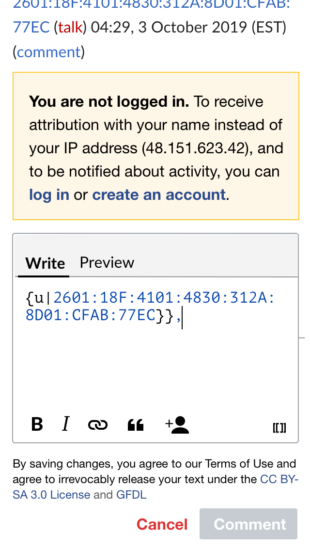
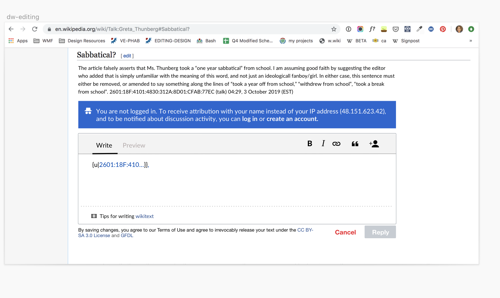
  • Know my IP address will be published along with my comment if I do not log in or create an account
  • Reply to specific comments within a discussion without changing the state of the page
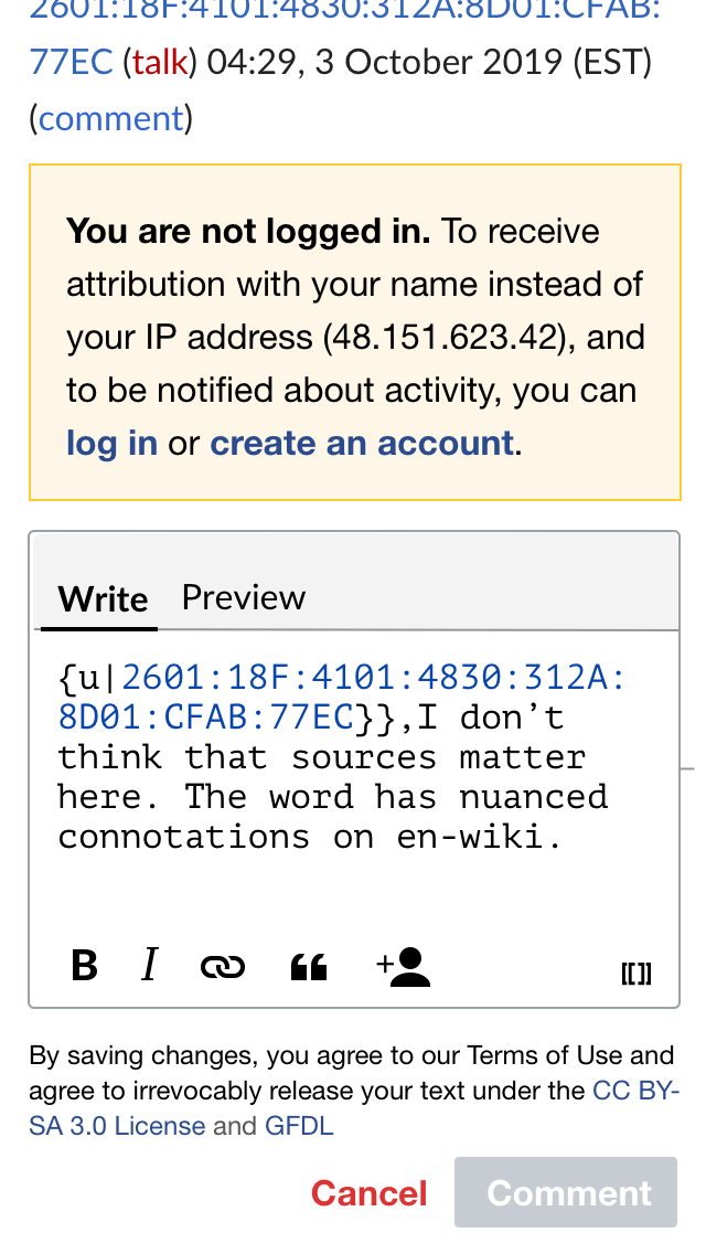
  • Draft a reply in a text field using wikitext while being able to see the comment(s) I am replying to
  • Discard a reply without publish it
  • Preview how my reply will appear once it's posted to the talk page
  • Have my edit summary created automatically
  • Have my reply indented/outdented to the proper depth automatically
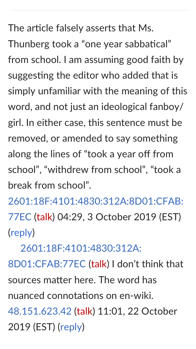
  • Know my comment was posted successfully (new reply should be temporarily highlighted)
  • Have the time and date of my post, a link to my user page and a link to my talk page included with my reply automatically
  • Delete a reply I've already posted on a talk page
  • See the date and time a comment was made, in my local timezone and preferred date format
  • Attempt to post a comment with notation for signing my name or indenting/outdenting my comment without breaking the experience
  • Click "Cancel" and not need to worry my drafted comment will be discarded without confirming my intent
  • Navigate away from web page (e.g. clicking browser's "back" button or closing browser tab) and not need to worry my drafted comment will be discarded without confirming

Mockups

ReadingTap on replyEditPublish and highlightfinalrevision history
reading@2x.png (1ร—640 px, 153 KB)
Editing-1@2x.png (1ร—640 px, 167 KB)
Editing-2@2x.png (1ร—640 px, 187 KB)
Highlight@2x.png (1ร—640 px, 209 KB)
final@2x.png (1ร—640 px, 203 KB)
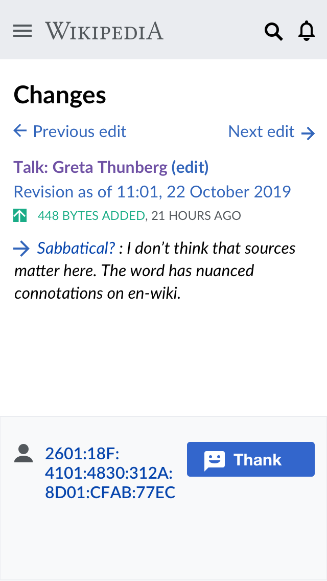
Revision History@2x.png (1ร—640 px, 132 KB)

Mobile and Desktop Mockups

Event Timeline

ppelberg renamed this task from Create mockups for v1 of talk page replies to Replies V1.0: Create mockups.Oct 16 2019, 6:22 AM
ppelberg renamed this task from Replies V1.0: Create mockups to Replies v1.0: Create mockups.
ppelberg created this task.

To start off this work. I made a userflow of the existing workflow. The goal of this for us is to review and make sure that we agree that this is the workflow that we are improving this sprint. Please thumbs up or down and comment on this ticket @ppelberg @Esanders

To start off this work. I made a userflow of the existing workflow. The goal of this for us is to review and make sure that we agree that this is the workflow that we are improving this sprint. Please thumbs up or down and comment on this ticket @ppelberg @Esanders

These look like the right workflows for replying to comments on talk pages on mobile and desktop, assuming these workflows are consistent across Wikipedia 16 talk pages namespaces (which I think they are).

I created a first draft of mobile and desktop mockups for v1.0. I will share these at the mid-sprint show and tell and at the design review. Please add meta comments here and anecdotal feedback on Invision.

Notes:

  • We need to make a decision if V1.0 will be wikitext only. (I made two iterations: 1 ve and 1 wikitext)
  • I added a modal for signed out users to slow folks down, this is potentially controversial because it takes more clicks to get in to the chat editor

Yesterday I received a few bits of feedback which I've integrated into the latest flow that is up on freehand.

Notes:

  • I integrated the IP notification into the content and also added copy to the message
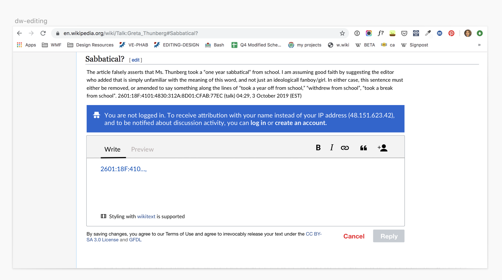
  • I have two versions of the editor itself. One of these versions is VE first but will handle wikitext if written
  • I changed the confirmation message to confirmation highlighting
  • I expanded out the text styling options in the toolbar because there's room

Version that is only Wikitext - note "tips for writing wikitext" copy

version A.png (1ร—1 px, 245 KB)

Version that integrates Wikitext into rich text editor - note "styling with wikitext is supported" copy

version B.png (970ร—1 px, 237 KB)

Updates to task description

  • Removing Delete a reply I've already posted on a talk page from "User Stories" โ€“ we will revisit this workflow in later versions.

These are coming along nicely, @iamjessklein. Some comments/questions below...

Questions

  • 1. Where and when do you think we should communicate to contributors they don't need to manually indent /outdent their replies? What happens when a contributor attempts to post a comment/reply with this notation included? cc @Esanders
    • I appreciate we talked about this during Wednesday's team meeting and you've represented this point in the Freehand itself; I'm raising it here and adding it to task description so we hold ourselves accountable to addressing it.
  • 2. What do you think is the role of the "Reply" label on the button that publishes/posts a contributors comment?
  • 3. Related to "2.": what do you think changing the "Reply" button label to "Comment" in *non-user talk* namespaces does?
    • I wonder if "Comment" [1] subtly reinforces the purpose of these spaces: to improve the "artifact" (articles, help pages, files, templates, etc.) to which these discussion pages are adjoined.
    • My thinking: "Comment" seems to be the verb/noun used most commonly in โ€“ what I'm coming to see are โ€“ the products that are most similar to non-user talk pages (e.g. Github and Gitlab, ). Whereas, "Reply" seems to be the verb/noun used in products intended to help people talk without an intention/expectation of producing something together (e.g. Telegram, WhatsApp, Messenger).
    • More broadly, I think naming conventions such as these serve as important cues that can sum to have a significant impact on how people perceive and behave in these spaces.

Comments

  • "I have two versions of the editor itself. One of these versions is VE first but will handle wikitext if written"
    • I think it's valuable you are thinking/designing these reply boxes with both editing "modes" in mind. What we end up releasing in v1 is still to be decided. I'd like for you and I to revisit this conversation next week.

  1. "Comment": assuming we follow this path, we'd then need to find similar words in other languages.

@iamjessklein

I have two versions of the editor itself. One of these versions is VE first but will handle wikitext if written

Building Flow around VE was the core cause of failure. The community is adamant that wikitext is primary. It will not be possible to deploy the product unless the initial/default input box properly handles and previews wikitext. (Note: Running it through the VE's parser is not proper wikitext support.)

@ppelberg:

  1. Where and when do you think we should communicate to contributors they don't need to manually indent /outdent their replies?

I think that messaging would be clutter. Brand new users don't expect manual-indentation, they don't need the message. Experienced editors will figure it out as soon as they play with the new interface - generally with the Preview button.

Depending on the design, the interface might make this information directly visible. The task essentially involves combining three chunks of text. There's the indentation string, then a generic text blob comment, and finally the signature. The comment-entry-box could show the indentation string at the beginning, possibly in gray, possibly with a hover-tip, and possibly click-to-edit. It could also show the ~~~~ signature at the end, again possibly in gray and possibly with a hover-tip and possibly click-to-edit. The comment box would then show exactly what is going to be inserted on the page. Excellent for both new users and experienced ones.

What happens when a contributor attempts to post a comment/reply with this notation included?

I'm about 90% sure the markup should be applied. It's almost certainly either genuinely intended to apply, or it's a trivial one-off mistake trying out the new interface.

Related to "2.": what do you think changing the "Reply" button label to "Comment" in *non-user talk* namespaces does?

I think changing the buttons by namespace would be unexpected. Either always use a single term, or use "Reply" for clicking to respond to a specific comment (i.e. indented) and label the button "Comment" or "New Comment" for a zero-indent comment to the section itself.

Another common case is that we use a single-bullet-indent comment for many of our workflows. (RFCs, AFDs, RFAs.) If the previous top-level comment was a bullet, then "New Comment" probably should continue as another bullet. However the first person to New Comment will to need to type the * at the start of their Comment. I think this pretty much confirms the answer to the last question - the user needs to be able to add or modify the indent-markup. You don't want to make them go to the full Edit button for this.

assuming these workflows are consistent across Wikipedia 16 talk pages namespaces

The workflow is also consistent when we discuss in non-talk namespaces.

Thanks for your input @Alsee I'll defer to @ppelberg to comment.

Regarding the next iteration of the mockups, I incorporated feedback and made the following changes:

  • for v1, the wikitext - only version will be used as rich text editing is a new feature
  • error messaging now aligns with OOUI
  • reply is now written as "comment"
  • highlighting style adjusted from line per line to text block

Once this is approved, I will post the finals to this ticket.

Thank you, @iamjessklein and hi, @Alsee โ€“ some comments in-line below...

  1. Where and when do you think we should communicate to contributors they don't need to manually indent /outdent their replies?

I think that messaging would be clutter. Brand new users don't expect manual-indentation, they don't need the message. Experienced editors will figure it out as soon as they play with the new interface - generally with the Preview button.

We share a similar assumption that newer users will not expect to have to do anything manually so their published comments appear on the page in a way they expect and is legible to other contributors seeking to understand the conversation. As for how this functionality ought to be communicated to more experienced contributors, see my next comment (below)...

Depending on the design, the interface might make this information directly visible. The task essentially involves combining three chunks of text. There's the indentation string, then a generic text blob comment, and finally the signature. The comment-entry-box could show the indentation string at the beginning, possibly in gray, possibly with a hover-tip, and possibly click-to-edit. It could also show the ~~~~ signature at the end, again possibly in gray and possibly with a hover-tip and possibly click-to-edit. The comment box would then show exactly what is going to be inserted on the page. Excellent for both new users and experienced ones.

This seems like the kind of decision that depends on trying out an approach and seeing whether contributors find it to be useful and clear.

For this first iteration, the software will make sure contributors' comments are published with the proper indentation and signature, even if they attempt to manually include characters to indent/outdent and/or sign their comment.

Related to "2.": what do you think changing the "Reply" button label to "Comment" in *non-user talk* namespaces does?

I think changing the buttons by namespace would be unexpected. Either always use a single term, or use "Reply" for clicking to respond to a specific comment (i.e. indented) and label the button "Comment" or "New Comment" for a zero-indent comment to the section itself.

Mmm, got it. Have you seen a place where these different naming conventions, across projects, are discussed?
The closest thing to the above I can think of is this guide: Communicating with your fellow editors.

For the time being, the button label to reply to a specific comment will be "Reply"

Another common case is that we use a single-bullet-indent comment for many of our workflows. (RFCs, AFDs, RFAs.) If the previous top-level comment was a bullet, then "New Comment" probably should continue as another bullet. However the first person to New Comment will to need to type the * at the start of their Comment. I think this pretty much confirms the answer to the last question - the user needs to be able to add or modify the indent-markup. You don't want to make them go to the full Edit button for this.

Are you able to share a link to a conversation where we can observe this convention?

I've updated the ticket description with the mockups and final links. I'm moving this over to pm review.

@iamjessklein these look good. Some minor comments and questions below...

Comments

  • Timestamps should be localized ("d-Reading" shows them in UTC).
    • This is more of an implementation note that anything.
  • On mobile, the button for publishing a reply is "Comment"; this should be "Reply" (as it is on desktop)
    • Again, more of an implementation note.

Questions

  • 1) What happens when a contributor taps/clicks to "Preview" their reply? What will be shown/appear in the text box?
  • 2) What happens when a contributor taps/clicks "[[ ]]" on mobile and "[[ ]] Tips for writing wikitext" on desktop? What will a contributor see?
  • 3) What happens when a contributor taps/clicks "quotes" in the toolbar? What will be shown?
  • 4) What do you think about changing the legal disclaimer that appears in "Editing-2" an "d-Editing 2" to something more discussion-specific? E.g. switching to "By posting, you agree to our Terms of Use and..." from "By saving changes, you agree to our Terms of Use and..." [i]

i. Legal disclaimer: This seems like the kind of change that depends on approval from legal.

I think it's possible that the inline "reply" button might not be visible enough, since it just looks like a normal link enclosed in parentheses. Perhaps it could be given different formatting to allow it to be distinguished more easily?

I think it's possible that the inline "reply" button might not be visible enough...Perhaps it could be given different formatting to allow it to be distinguished more easily?

Thank you for saying something, @Jc86035; we suspect this might be true.

Although, our current thinking is to first make sure the basic workflow behaves in ways contributors expect (e.g. Are we handling indenting/outdenting and multi-line comments properly? What should the edit summary workflow look like? How should we handle contributors attempting to include tables in indented replies?) and then in a later version, revisit the visual appearance of the page to make sure the affordance itself is obvious and intuitive.

If you have thoughts about ways to approach making the reply button more visible, we'd value your input here: T236918

And if you're curious about the overall thinking around versioning, this ticket is a good place to start: T233443

Another common case is that we use a single-bullet-indent comment for many of our workflows. (RFCs, AFDs, RFAs.) ...I think this pretty much confirms the answer to the last question - the user needs to be able to add or modify the indent-markup.

Are you able to share a link to a conversation where we can observe this convention?

Here's a random RFA. In the sections for Support, Oppose, or Neutral, each !vote begins with a # and replies begin with #: and #:: etc. Most other voting-processes begin each !vote with * and (ideally according to guidelines) replies should begin *: and *:: etc. However people can be a bit sloppy and random in reply formatting, some people replying with :: and others using ** or even :*

If you look at the read-view of this random RFC you should get a good idea of how voting and replies should look, but if you view the wikitext you'll see the reply formatting can be rather inconsistent and not conformant with preferred formatting. We're not picky about that.

Here's a random AFD. One reply used :* which preferably should have been *:

For this first iteration, the software will make sure contributors' comments are published with the proper indentation and signature, even if they attempt to manually include characters to indent/outdent and/or sign their comment.

I think I understand why you're inclined in that direction - in typical forum software the user input is safely contained in a programmer-defined-box in a strict programmer-defined structure. The user can't move that box and can't reach outside that box. But the more I think about it the more certain I am that isn't the right answer here. I have a few reasons/explanations to offer:

First, don't look at talk pages as a bad-kludge-database for a new forum project. The community truly wants to keep wiki-talk pages as a first-rank entity. We would merely like a quality-of-life tool to ease the majority of routine talk edits: (1) Avoiding the need to search for the right spot in the wikitext (2) providing the string of :*# that we (probably) want for indentation and (3) default inclusion of ~~~~. It's three rather small and rather basic bits of functionality.

You're presuming what the "proper" indentation is. As the links above show, the user needs to be able to add an indentation. There's no reliable software-detectable cue for that.

Due to the way talk pages work, you'd actually have to add complexity to your code to fight natural talk page behavior if you want to prevent the user from adding indentation. If the comment has non-zero indentation you could neutralize any :*# characters by front-padding the comment with a space. However that blows up badly on a zero-indent comment. To get consistent behavior you'd have to special case the zero-indentation case and pad it with a gross <nowiki/> or something.

The characters :*# need to work in the middle of a comment, if the comment includes a bullet list or something. If the markup works in the middle of the comment, it would be a strange and confusing complication for it to not work on the first line.

People will use :*# intending to get indentation for whatever reason, and they will be unhappy when they discover the software is actively fighting what they're trying to do.

see the date and time a comment was made, in my local timezone / Timestamps should be localized

Wiki timestamps are UTC, and that value appears directly in the wikitext. Trying to display localized time would be quite complicated, and it would make a mess of copy-pasting and searching and comparing with other people's timestamps. Local time is not often useful for us. Note: There's a preference to display diffs and history and stuff in local timezone. I tried it, but quickly had to turn it off because I could no longer copy/search/compare with everyone else's timestamps. You could try checking what percentage of active-editors have that timezone preference turned on. I expect it would be rather low.

  1. Where and when do you think we should communicate to contributors they don't need to manually indent /outdent their replies?

I think that messaging would be clutter. Brand new users don't expect manual-indentation, they don't need the message. Experienced editors will figure it out as soon as they play with the new interface - generally with the Preview button.

I would prefer having some kind of a message. To avoid clutter, I'd make it appear only after the user tries typing * or : at the beginning of the text, or ~~~~ at the end.

Alternatively, we could make the preview appear immediately (like when typing a comment here on Phabricator, for example), so that the user can notice this before they post? (I'm assuming folks won't use the preview unless the comment they're writing has a lot of markup.)

I'm a bit concerned about an experienced editor's first contact with the new interface resulting in a "broken" talk page comment, and the impression that's going to leave on that person and everyone else. :)

What happens when a contributor attempts to post a comment/reply with this notation included?

I'm about 90% sure the markup should be applied. It's almost certainly either genuinely intended to apply, or it's a trivial one-off mistake trying out the new interface.

For this first iteration, the software will make sure contributors' comments are published with the proper indentation and signature, even if they attempt to manually include characters to indent/outdent and/or sign their comment.

I agree with @Alsee here though. If the user skips past all our attempts to tell them not to do this and does it anyway, we should do what they're asking for.

Depending on the design, the interface might make this information directly visible. The task essentially involves combining three chunks of text. There's the indentation string, then a generic text blob comment, and finally the signature. The comment-entry-box could show the indentation string at the beginning, possibly in gray, possibly with a hover-tip, and possibly click-to-edit. It could also show the ~~~~ signature at the end, again possibly in gray and possibly with a hover-tip and possibly click-to-edit. The comment box would then show exactly what is going to be inserted on the page. Excellent for both new users and experienced ones.

We've been thinking of making this visible by "indenting" the reply textbox on the page, so that it appears where your comment is going to appear. This might be awkward on small mobile screens though, hmm.

I don't think it would be convenient to show the indentation string, even for experienced users โ€“ it doesn't correspond to the visual of indentation well IMO, and it doesn't usually need to be changed anyway (except for the last character, maybe). And we're trying to save the world from having to count indents, after all.

Having the signature characters moving with your cursor as your type sounds annoying. And you never need to change it.

Here's a random RFA. In the sections for Support, Oppose, or Neutral, each !vote begins with a # and replies begin with #: and #:: etc. Most other voting-processes begin each !vote with * and (ideally according to guidelines) replies should begin *: and *:: etc. However people can be a bit sloppy and random in reply formatting, some people replying with :: and others using ** or even :*

If you look at the read-view of this random RFC you should get a good idea of how voting and replies should look, but if you view the wikitext you'll see the reply formatting can be rather inconsistent and not conformant with preferred formatting. We're not picky about that.

Here's a random AFD. One reply used :* which preferably should have been *:

(โ€ฆ)

You're presuming what the "proper" indentation is. As the links above show, the user needs to be able to add an indentation. There's no reliable software-detectable cue for that.

I think there are two distinct situations we're talking about โ€“ replying to the initial comment (or directly under a section heading), and replying to another reply.

When replying to another reply, I think it's never wrong to indent the new reply with one more :.

When replying to the initial comment, the conventions you describe come into play, and there's indeed no software-detectable cue to decide if :, * or # is appropriate. We might need to allow customizing the indentation type in this case.

But also, there's no cue that you can reply there at all, and we won't display a "Reply" button there. We rely on user signatures to decide where we should add the replying interface. After someone else replies (and signs their comment), we can just follow their indentation style.

Ideally we'd add some cue that you can reply to those places, and ideally it would also describe the expected way to indent (imagine a template like {{replywith|#}} that generates some invisible marker), and then the user won't have to know what to do beforehand. I don't think we've thought this through yet (I certainly haven't).

Wiki timestamps are UTC, and that value appears directly in the wikitext. Trying to display localized time would be quite complicated, and it would make a mess of copy-pasting and searching and comparing with other people's timestamps. Local time is not often useful for us. Note: There's a preference to display diffs and history and stuff in local timezone. I tried it, but quickly had to turn it off because I could no longer copy/search/compare with everyone else's timestamps. You could try checking what percentage of active-editors have that timezone preference turned on. I expect it would be rather low.

I agree, I think it would actually be more useful to display the "relative time", e.g. "15 minutes ago" (in addition to the original timestamp).

However, wiki timestamps are only UTC on English Wikipedia, multilingual wikis, and other projects that have worldwide reach. If you check out the Polish Wikipedia, they're in CET/CEST, and if you check out the Thai Wikipedia, they're in ICT, and so on. I think respecting that preference to use the local timezone could still be useful to stewards and other users who often deal with foreign-language wikis.

Depending on the design, the interface might make this information directly visible....

We've been thinking of making this visible by "indenting" the reply textbox on the page

I still like showing the indent string and sig string for several reasons:
(1) Indenting the box would consume X characters of whitespace at the beginning of every line, whereas showing the indent-characters only consumes X characters on the first line of the reply box. This is particularly significant for mobile. (2) Experienced users will be instantly comfortable seeing exactly how the new interface works. (2) The new interface becomes an actively helpful on-ramp. New users will passively absorb how the underlying page works, especially if the shown characters have a tip appear on mouseover. If the new user sticks around they will sometimes need to use the edit button to directly edit the page for various reasons. (3) Making indent characters visible and click-to-edit allows people to replace the indents with an {{od}} outdent or otherwise alter the indentation for various reasons, without having having to leave the new interface. The community likes the power, flexibility, and control they have on talk pages. We should't hardcode-lock the indentation string if we don't have to.

Having the signature characters moving with your cursor as your type sounds annoying.

Agreed. Instead I picture it attached to the bottom-right corner of the text entry box.
While I expect it would be rare to want to delete or change the sig portion, if the indent-characters are click-to-edit then this part should work the same.

[posting in places that aren't a reply]

Ideally we'd add some cue that you can reply to those places, and ideally it would also describe the expected way to indent (imagine a template like {{replywith|#}} that generates some invisible marker), and then the user won't have to know what to do beforehand. I don't think we've thought this through yet (I certainly haven't).

I'm picturing a reply link after each signature, plus a link at the bottom of every section. I think the section-link should say something like "Add comment" or "Add new comment" instead of "Reply". It would add a zero-indent post. The user can supply the * or # if appropriate. Note: For the zero indent case the software will need to prepend a blank line unless one of the following is true: (1) There's already a blank line or section heading directly above (2) the user starts their reply with one of :*# (3) any other known-safe case I missed.

In the anon warning we say "your IP address (12.34.56.78)" however we currently don't have access to the IP address in the client. We could make this available, but I don't know if this was done deliberately?

In the anon warning we say "your IP address (12.34.56.78)" however we currently don't have access to the IP address in the client. We could make this available, but I don't know if this was done deliberately?

Documenting what @Esanders, @iamjessklein and I talked about during our meeting this morning:

  • For v1.0, the tool will present logged out contributors with a message that informs them their IP address will be shared upon posting the comment they are composing. Although, this message will *not*, for the time being, contain a contributor's actual IP address. Said in a different way, the anon message presented in v1.0 will contain all of the information shown in this screenshot minus a contributor's actual IP address.

Task description update*

  • ADDING: "...know my comment was posted successfully." to the "User stories" section. We have discussed and planned for this [1]. Although, I am just now realizing it was not documented explicitly in the "User stories" section.

  1. "..discussed and planned for this": See the mockup titled "Publish and highlight" in the task description

Task description update

  • ADDING: Click "Cancel" and not need to worry my drafted comment will be discarded without confirming my intent
  • ADDING: Navigate away from web page (e.g. clicking browser's "back" button or closing browser tab) and not need to worry my drafted comment will be discarded without confirming

Task description update

  • ADDING: Know my IP address will be published along with my comment if I do not log in or create an account [1]

  1. The above has already been designed and built.
JTannerWMF subscribed.

@ppelberg will check against the user stories here to determine if everything has been implemented.