Page MenuHomePhabricator

Make the affordances for responding to specific comments easier to notice
Closed, ResolvedPublic

Description

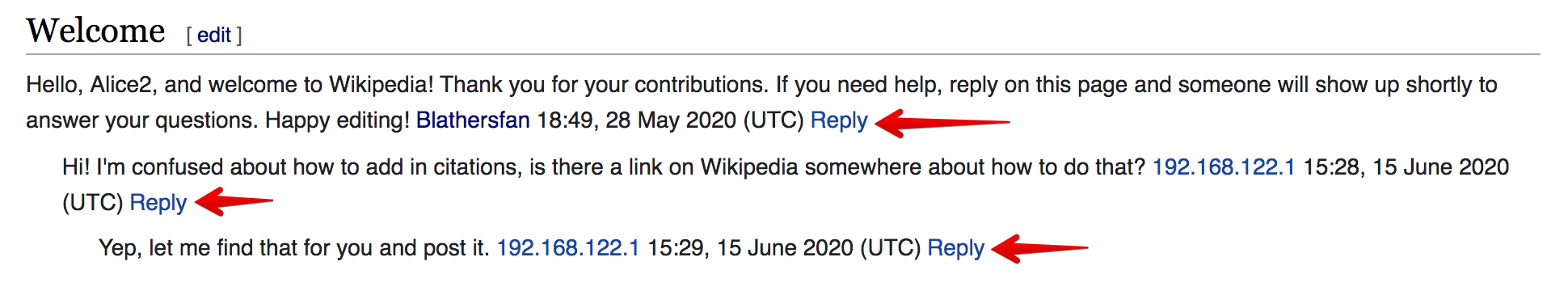
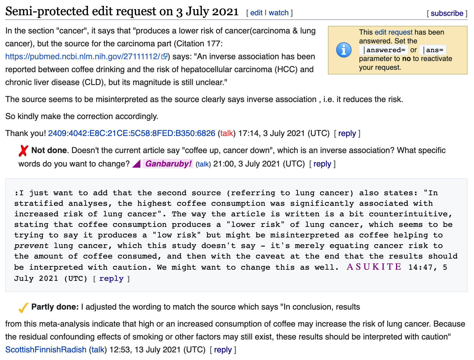
This task involves the work with iterating upon the initial implementation of the [ reply ] affordances to make them easier for people to notice, and as a result, become more clear about what to do add a comment in an existing discussion.

User Stories

Primary

  • As a Junior Contributor who does not have much experience reading or participating in conversation on talk pages, I want to be able to easily identify and understand the "reply affordances", so that I can know what to do to respond to something someone else has said.
  • As a Junior Contributor who is wanting to respond to something specific someone else has said, I want to know what action to take in order to do so, so that I can be sure the comment I post will be received by the person I wrote the comment to/for.

Problem

Junior Contributors

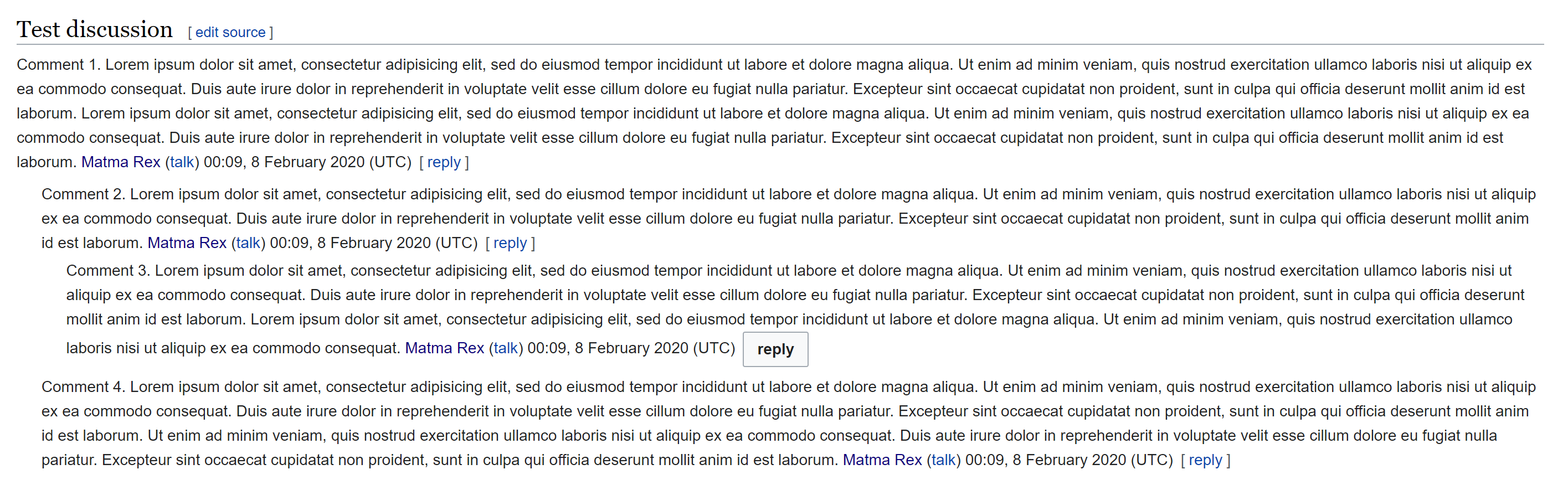
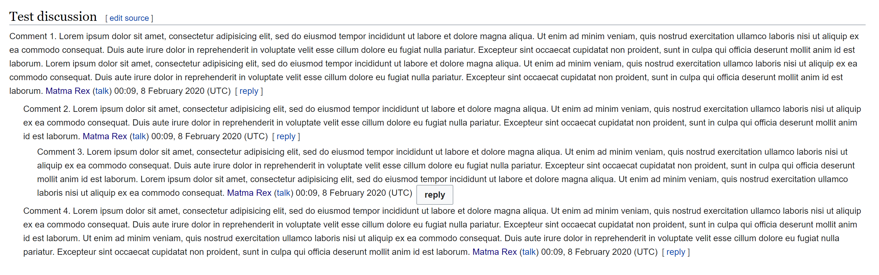
  • Previous usability tests revealed that Junior Contributors have a difficult time noticing/identifying the [ reply ] links on Talk pages. [i][ii]

Senior Contributors

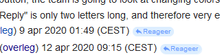
  • "The positioning and styling of the "Reply" links look a little odd, though. It would be nice if it could be a little more distinguished from the actual text possibly by italicizing it or something like that." - @Kaartic writing here.

Requirements

  • Platforms: Mobile and Desktop
  • Reply affordance should not distract people from the content of the conversations themselves or negatively impact their ability to understand what people in a conversation are talking about.
  • The new treatment of the Reply affordances being introduced in this task should compliment the visual language/style being introduced via the Desktop Improvements Project.
  • Any design we introduce as part of this task will need to be able to be extended to accommodate other comment-level actions we might implement in the future.
    • Where "other comment-level actions" means capabilities like: "Thanks" (T249893), comment editing (T249893), comment permalinking (T275729), etc.

Possible Solutions


i. Reply affordances w/o brackets (not deployed)ii. Reply affordances w/ brackets (deployed)
replying.png (360×1 px, 128 KB)
Screen Shot 2021-08-27 at 9.59.08 AM.png (1×1 px, 461 KB)

Related Objects

Event Timeline

I actually experimented with this when working on T249915: the main problem was that OOUI buttons are kind of big, and they affected the line-height of the text when we put them there (causing a "gap" before the last line of the comment). If we force the line-height not to change, then the buttons nearly overlaps the text on the previous and next line.

Here's a mockup of that problem:

image.png (885×2 px, 381 KB)

image.png (885×2 px, 381 KB)

I might need you or @Volker_E to tell me how you'd like the buttons to look when we make them smaller. The design guide doesn't have smaller or bigger buttons, and the existing OOUI code actually tries hard to give the buttons a minimum size that we can't override.

Since the beginning of my awareness of the Reply Tool, I use some css to style the 'reply' links. My considerations:

  • a background color and rounded corners to give it a button-ish look,
  • overall light colors to prevent it from being too prominently in view (too intrusive),
  • a reply icon in front of the text to make it better recognizable and more easy to spot (also for languages with a very short translation of 'reply').

Screenshot (with user language Dutch) from April 30, so before the square brackets were added:

reply tool - button example.png (80×320 px, 5 KB)
CSS
span.dt-init-replylink-buttons {
  margin-left: 0.5em;
  font-size: 70%;
}
span.dt-init-replylink-buttons > a {
  color: #6699ff;
  background-color: #ddeeff;
  border: 1px solid #ddeeff;
  border-radius: 8px;
  padding: 0px 4px 1px;
}
a.dt-init-replylink-reply::before {
  content: "";
  padding: 0 8px;
  margin: 0 -2px 0 -4px;
  background-color: #6699ff;
  mask: no-repeat center/80% url("//upload.wikimedia.org/wikipedia/commons/9/95/Ic_reply_48px.svg");
}

Thanks @Marc and @matmarex - I want to consider this as part of our larger EPIC focused on the visual refresh. My thinking here is that we need to design a holistic UI treatment for the Talk page UI.

ppelberg renamed this task from Make reply links more discoverable to Make the affordances for responding to specific comments easier to notice.Dec 11 2020, 4:48 PM

User:LittleGun (sv.wiki) had some helpful feedback to share about their impressions of/experience with the way [ reply ] links currently appear on talk pages:

What I meant was as a heads-up to new users. I am very fond of the new ReplyTool especially after improvemnts such as adding the "summary bar" and realizing how easy it is to "ping" and reuse links by dragging them to the dialogue. When enthusiatically informing and asking ecerybody to try the beta, it was a heads upp that every signature will become more prominent with the addition of [svara]. When looking at an discussion page it will look different and, as with almost everything that is different, it catches your eye in the beginning before you are used to it and instinctively ignore it until you want to use it (and quite soon will miss it when someone forgets to sign).

I think it is impossible to the design the [svara] link so it will not give a "messy" look before you get used to it. How it should be best shown for ultimate UX (usefully visible, distinctive and explainatory without dominating the comment) I have no idea of. I am now used to [svara]. I do know every change from now on will make me react, and think it is more or less messy before I am used to it. So I have no input on how to optimize it. Sorry. LittleGun (diskussion) 17 juni 2021 kl. 05.55 (CEST) | Source

Change 785171 had a related patch set uploaded (by Bartosz Dziewoński; author: Esanders):

[mediawiki/extensions/DiscussionTools@master] Make reply links into buttons

https://gerrit.wikimedia.org/r/785171

Change 785171 merged by jenkins-bot:

[mediawiki/extensions/DiscussionTools@master] Make reply links into buttons when visual enhancements enabled

https://gerrit.wikimedia.org/r/785171

EAkinloose subscribed.

Tested on cswiki
✅ Reply links should be displayed as buttons
Desktop:

Screenshot 2022-08-03 at 03.50.52.png (1×2 px, 147 KB)

Mobile:
IMG_613BA8A3BEF3-1.jpeg (2×1 px, 683 KB)