Page MenuHomePhabricator

Create design concepts for clearer talking affordances and page frame
Closed, ResolvedPublic

Description

To date, we have talked about the Usability Improvements portion (T249579) of the Talk Pages Project as being comprised of three core elements:

  1. Topic Containers (T269950)
  2. Clearer Talking Affordances (T255560 + T267444)
  3. Page Frame (T269963)

The assumption being that the combination of the three elements mentioned above will be effective at doing the following:

  • Helping Junior Contributors instinctively recognize and use talk pages to communicate with other volunteers
  • Helping Senior Contributors easily decide what talk pages, and the discussions within them, are worth focusing on.

This task is an effort to decide how – if at all – the scope of these three elements ought to be changed to increase the likelihood that we'll be able to deliver on the project objectives.

Requirements

  1. Create design concepts for clearer talking affordances (T255560 + T267444) and talk page frames (T269963) and
  2. Combine the design concepts for clearer talking affordances (T255560 + T267444), talk page frames (T269963), and topic containers (T296119) into one cohesive design

Phased roll-out annotated designs
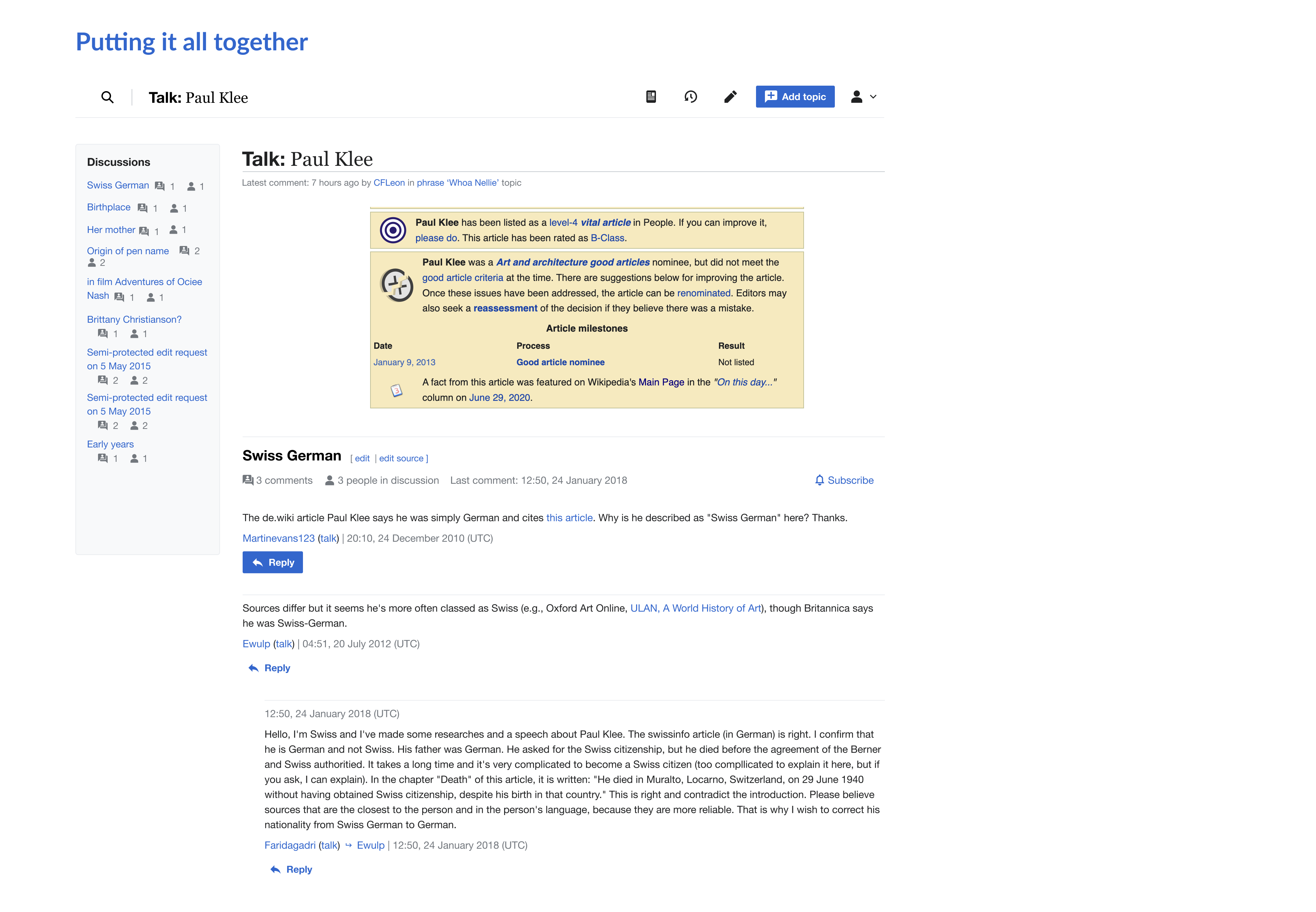
Topic Containers

Figma link
Our first experiment aims to improve the junior and senior contributor’s discussion - level reading experience. We are also trying to make the visual cues for contribution more obvious, should readers desire to increase their engagement.

  • ==H2== Styling
  • Discussion metadata
  • Collapsible discussions
  • Prioritize actions (e.g. Subscribe with overflow menu)

Topic container features@2x.png (1×3 px, 78 KB)

Topic container features - mobile@2x.png (2×3 px, 330 KB)

Clearer Visual Cues (aka Talking Affordances)

Figma link

  • Replying to a specific comment
  • Starting a new discussion
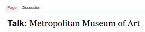
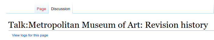
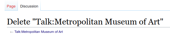
Clearer Visual Cues.png (2×3 px, 269 KB)

Clearer Visual Cues - Mobile.png (2×3 px, 308 KB)

Page Frame

Figma link
Evolve organizing elements to guide contributors to the appropriate actions or spaces around the page .

  • Sticky Header
  • Table of Contents
  • Page title styling
  • Actions

Page Frame features.png (2×3 px, 412 KB)

Page Frame mobile_.png (2×3 px, 305 KB)

What it should look like when it's all put together

Figma link (this includes mobile views)

Put it all Together2 – desktop.png (1×1 px, 220 KB)

Related Objects

StatusSubtypeAssignedTask
OpenNone
OpenNone
OpenNone
OpenTrizek-WMF
Resolvedppelberg
OpenNone
OpenNone
Resolvedppelberg
Resolvedppelberg
Resolved iamjessklein
Resolvedppelberg
ResolvedEsanders
Resolved iamjessklein
Resolvedppelberg
Resolved iamjessklein
Resolvedmatmarex
Resolved iamjessklein
OpenNone
Resolvedppelberg
Resolved iamjessklein

Event Timeline

Here's the latest version of the scaled back mockups.

Desktop designs have removed:

  • intro text
  • avatars
  • styled signatures
  • signature placement

Mobile designs have all of the above +:

  • overlay text is now incorporated directly into the expanded view of the topic
  • "read as wiki" has been added in as a sticky footer
  • removed the "editing" tool in toolbar on all pages minus view as wiki view
  • added expand/collapse icons back in

I've left a few comments on the mockups themselves. Please review and drop in your own incremental feedback in the mockup and high level thoughts here on the ticket.

desktop | mobile

Put it all Together-desktop@2x.png (2×3 px, 492 KB)

Putting it all Together - Mobile.png (2×3 px, 319 KB)

Here's the latest version of the scaled back mockups.

Thank you, @iamjessklein. I've added feedback + questions in the form of comments within the Feature Rollout page of the Talk Pages Visual Improvements Figma file.

In general, I think the mockups you shared in Figma are almost there. Although, there are a few changes that I'd value seeing made, all in an effort to help us get a sense for what the initial version of the three improvements we have planned [i] are likely to look like once deployed.

Remaining edits

  • Remove horizontal line differentiating comments from one another
  • Change type treatment of timestamp within signature to what's currently shown on-wiki
  • Remove | from timestamp
  • Remove the from within comments/signatures

i. T269950, T293522 , and T269963,

Meeting outcomes

Yesterday (17 March), we met as a team to discuss the latest iteration of the designs @iamjessklein is made in Figma: Talk Page Visual Improvements.

And today, Jess and I met to discuss the feedback the team had to share and decide which of these changes we will implement. These changes and decisions are listed below...

Decisions and changes for iteration

  • Decisions
    • Page actions (mobile): for now, we are not going to make any changes to the affordances that do/do not appear within the page actions toolbar. [i]
      • Note: if/when we come to learn, through usability testing (T293520), that Junior Contributors find the page actions toolbar to be confusing/distracting, we will revisit this decision.
    • Avatars (mobile): for now, we are not going to introduce the person icon/avatar within peoples' signatures. Although, we are going to introduce the person icon/avatar within the "freshness indicator" that will appear beneath the page title.
  • Changes
    • Mobile
      • Remove avatar icon from peoples' signatures
      • Add avatar to the freshness indicator that appears beneath the page's title
      • Continue iterating on a more condensed version of the mobile Topic Container design, so that people can see a greater number of discussions on a single page when all topics are collapsed. great spot, @dchan.
      • Create mockups of the following talk page states:
        • Logged Out
        • Logged In + AMC off
        • Logged In + AMC on

i. Page actions toolbar:

IMG_219434709E3E-1 2.jpeg (2×1 px, 911 KB)

I've updated the mockups.

desktop | mobile

The changes reflected here include:

  • Logged in state view
  • Logged out state view
  • Advanced Mobile Contribution logged in and out
  • Condensed view (the metadata has also been indented)
  • The avatar has been added to the freshness feed
  • Avatars have been removed from discussions

One thing to note is that the AMC mockup includes a horizontal overflow to match the desktop design. I have confirmed with @alexhollender_WMF that there isn't a reason to NOT to do this.

Screen Shot 2022-03-21 at 10.16.51 AM.png (505×975 px, 267 KB)

Screen Shot 2022-03-21 at 10.18.42 AM.png (521×988 px, 280 KB)

moving this over to ready for sign off for @ppelberg to review.

I've updated the mockups...
moving this over to ready for sign off for @ppelberg to review.

Per the conversation @iamjessklein and I had on 22 March, Jess is going to make the edits listed below to the mockups.

Once the edits below are implemented, we will consider this round of design finished and ready to be shared with Junior and Senior Contributors by way of T293524, T293523, and T293520 or some combination thereof.

Edits: 22 March

Desktop

  • REVISE signatures such that they appear in-line with the comment as opposed to on a new line
  • REDUCE the amount of whitespace between comments

Mobile

  • EXPERIMENT with how the 🔔 Subscribe and ••• buttons are shown so that the Topic Container as a whole (read: section title + metadata + actions) feels a bit tidier
  • REVISE signatures such that they appear in-line with the comment as opposed to on a new line

I've updated the task description with the mockups. In our team discussion I would like to call out a few topics:

  • Logic behind threading - These mockups incorporate the initial comment to a discussion directly below the initial comment which is not what is done on wiki currently (it's indented) but it is more in line with traditional forum patterns.
  • Permalinks - this design incorporates them, if we don't move forward with them, the design will need to be adjusted

I've updated the task description with the mockups.

@iamjessklein, a question:

  • Within the **Clearer Visual Cues (aka Talking Affordances) section, what is meant by Highlight signature? I ask this having been operating with the understanding that we decided NOT to make changes to how and where peoples' signatures are presented.

In our team discussion I would like to call out a few topics...

Sounds good; we'll host this discussion within Editing Scratch and update this ticket with the outcomes of that discussion.

@ppelberg - yes, that bit of text is a remnant from old designs, I will strike it out to not be confusing.

Having implemented the bold namespace change feature of page frames, I'm documenting some resulting inconsistencies we get with action pages. We may decide this isn't a problem, but just making a note of them anyway:

Talk page:

image.png (109×480 px, 10 KB)

action=history:
image.png (134×701 px, 16 KB)

The following are only available to admins:
action=delete:
image.png (118×590 px, 14 KB)

action=move:
image.png (135×557 px, 14 KB)

action=protect:
image.png (169×890 px, 33 KB)

@Esanders regarding the space that appears to be added between the namespace (e.g. Talk:) and the page title:

  • in search you can do, for example, User:Ed, however User: Ed would be a different search. how are you taking into account people's expectations regarding the way namespace prefixes appear in page titles, and the way they are usable for searches?
  • @Quiddity has told me that people often copy & paste page headings to use as links when editing. so for example if I want to link to Wikipedia:Copyrights I would copy that page title. but with the space the copy+paste to link workflow will break. how are you planning to address that?

also, smaller note, reminder to consider pages like history pages of talk pages, which look like this currently:

Screen Shot 2022-04-21 at 12.55.49 PM.png (133×975 px, 29 KB)

Re: spaces and copying - To elaborate a bit more:
The concern is that some users will either copy&paste, or manually type the title with the space(s), and we want to confirm that nothing will break from that.

I.e. I believe there's a technical way (CSS?) to make the text display with a space, but that won't be captured by a clipboard copy-action.
Plus, I believe the software currently auto-removes spaces after Namespace-prefixes if we manually type it that way.
(e.g.1. In a search: https://en.wikipedia.org/wiki/Special:Search?search=user:%20quiddity will correctly send us to that userpage)
(e.g.2. In both editing modes, if I type it manually with a space then it still links to the correct location)
However, we need to verify that this is reliable in all situations where a title might be manually typed out.

Additionally, I believe someone once mentioned the idea of adding these legibility-improving-spaces on either side of subpage-slashes,
i.e. User talk: Quiddity / Archive 1
and that will definitely break things if users try to search for it or manually type it.
(e.g.1. searching for User talk: Quiddity / Archive 1 does not correctly go to User talk:Quiddity/Archive 1)

@Quiddity regarding search, I'm seeing two different sets of results depending on whether or not a space is there:

without spacewith space
Screen Shot 2022-04-21 at 2.50.39 PM.png (289×314 px, 21 KB)
Screen Shot 2022-04-21 at 2.50.57 PM.png (148×307 px, 11 KB)

@Quiddity regarding search, I'm seeing two different sets of results depending on whether or not a space is there:

This is strange and I’d consider it as a bug. The extra space doesn’t count when linking, it doesn’t count at some search results, then why does it count at others?


On Patch Demo I see the following:

Screenshot 2022-04-27 at 00-05-10 Talk DiscussionTools - Patch demo (778316,7 773661,1 784297,2 780895,4 779527,4 779528,4).png (54×291 px, 4 KB)

(Cyan line added by me.) The sans-serif font is noticeably taller, even though both fonts should be 28.8px according to the CSS inspector. This is unexplainable from a user perspective (if anything, the page title should be larger than the namespace, not the other way round), but cannot be fixed as it’s caused by the inconsistency between fonts. Is the different font really needed? The spacing is okay (especially if the inconsistent search field is fixed), but I’d avoid using multiple fonts in the title. Either serif or sans-serif, but not a mix of both.

Thanks for highlighting this @alexhollender_WMF and for the added context @Quiddity.

My concern from a visual point of view with how it currently looks, is that the lack of a space looks like a typo which to me gives a poor impression. The example you gave @alexhollender_WMF of the history page of talk pages only compounds this further as there is no space after the first colon but there is a space after the second.

Screen Shot 2022-04-21 at 12.55.49 PM.png (133×975 px, 29 KB)

So I’d be very keen to find a solution where we can introduce a space visually but that won’t negatively impact the copy/paste action. Is this something you think would be possible @Esanders?

I appreciate the second issue of people typing in the text (as opposed to copying and pasting) may be trickier to deal with. From my understanding of what @alexhollender_WMF @Quiddity have said in your last comments, if a user types in the “User: Name” with a space, the correct result won’t appear in the suggested results list but when they submit the search they will be taken to the correct user page.

If this is the case then I guess the question are:

  • is there a way for us to make the correct result to appear in the suggested search results even when the user types a space?
  • if not, how big an issue is this when compared with the visual improvement?

I appreciate the latter question may be difficult to answer without making the change and then monitoring it somehow.

In the current implementation the space is implemented as a margin, so will not be present if the title were copied.

On Patch Demo I see the following:

Screenshot 2022-04-27 at 00-05-10 Talk DiscussionTools - Patch demo (778316,7 773661,1 784297,2 780895,4 779527,4 779528,4).png (54×291 px, 4 KB)

(Cyan line added by me.) The sans-serif font is noticeably taller, even though both fonts should be 28.8px according to the CSS inspector. This is unexplainable from a user perspective (if anything, the page title should be larger than the namespace, not the other way round), but cannot be fixed as it’s caused by the inconsistency between fonts. Is the different font really needed? The spacing is okay (especially if the inconsistent search field is fixed), but I’d avoid using multiple fonts in the title. Either serif or sans-serif, but not a mix of both.

We had a simliar discussion on Figma, reposting here:

@Esanders: Mixing fonts may produce results of different quality depending on the OS and fonts available. If you're lucky the two fonts will have similar glyph heights and alignment, but in edge cases this could look weird (text different sizes and not vertically aligned)

@KieranMcCann: Good point @Esanders but I think this will be fine in the vast majority of cases. One other aspect I’m aware of is that some scripts don’t have a serif/sans-serif distinction so the visual difference in that instance will just be created by the bold and regular styling (Japanese would be an example of this)

@Tacsipacsi what browser/OS are you using?

Firefox ESR on Debian 10. According to the font inspector, the sans-serif font is DejaVu Sans Bold, the serif is Linux Libertine O. I did play a bit with my font settings (years ago), but I think these two happen to be the defaults.

Next step(s)

  • @ppelberg to file ticket for evaluating talk page title treatment across browsers/operating systems/fonts. Note: this exploration depends on us moving forward with design that places sans serif and serif fonts next to each other.

Next step(s)

  • @ppelberg to file ticket for evaluating talk page title treatment across browsers/operating systems/fonts. Note: this exploration depends on us moving forward with design that places sans serif and serif fonts next to each other.

Done in T307727.