Page MenuHomePhabricator

Talk page notification alert bar: revised styling to meet WCAG color contrast AA requirements
Open, Stalled, LowPublic

Assigned To
None
Authored By
KStoller-WMF
Jul 6 2023, 11:45 PM
Referenced Files
F57756379: image.png
Nov 28 2024, 2:54 PM
F55901549: image.png
Jun 26 2024, 8:31 PM
F37922218: New talk page message alert.png
Oct 3 2023, 12:54 AM
F37817663: Message.png
Sep 27 2023, 5:52 PM
F37730316: image.png
Sep 18 2023, 8:44 AM
F37637854: image.png
Aug 28 2023, 8:04 AM
F37637860: image.png
Aug 28 2023, 8:04 AM
F34741893: Screen Shot 2021-11-11 at 11.06.13 AM.png
Jul 7 2023, 1:34 AM

Description

User story & summary:

As a user logged into a temporary account, I want the alert bar to be easy to read and WCAG compliant

Background & research:

This task is important because we aim to meet WCAG level AA, and the current message colors are too low contrast.

Design:

Figma designs

New talk page message alert.png (100×416 px, 7 KB)

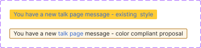
Background hex color: #FEF6E7
Border hex color: #AC6600

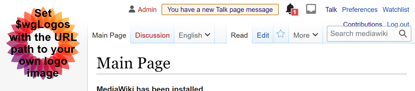
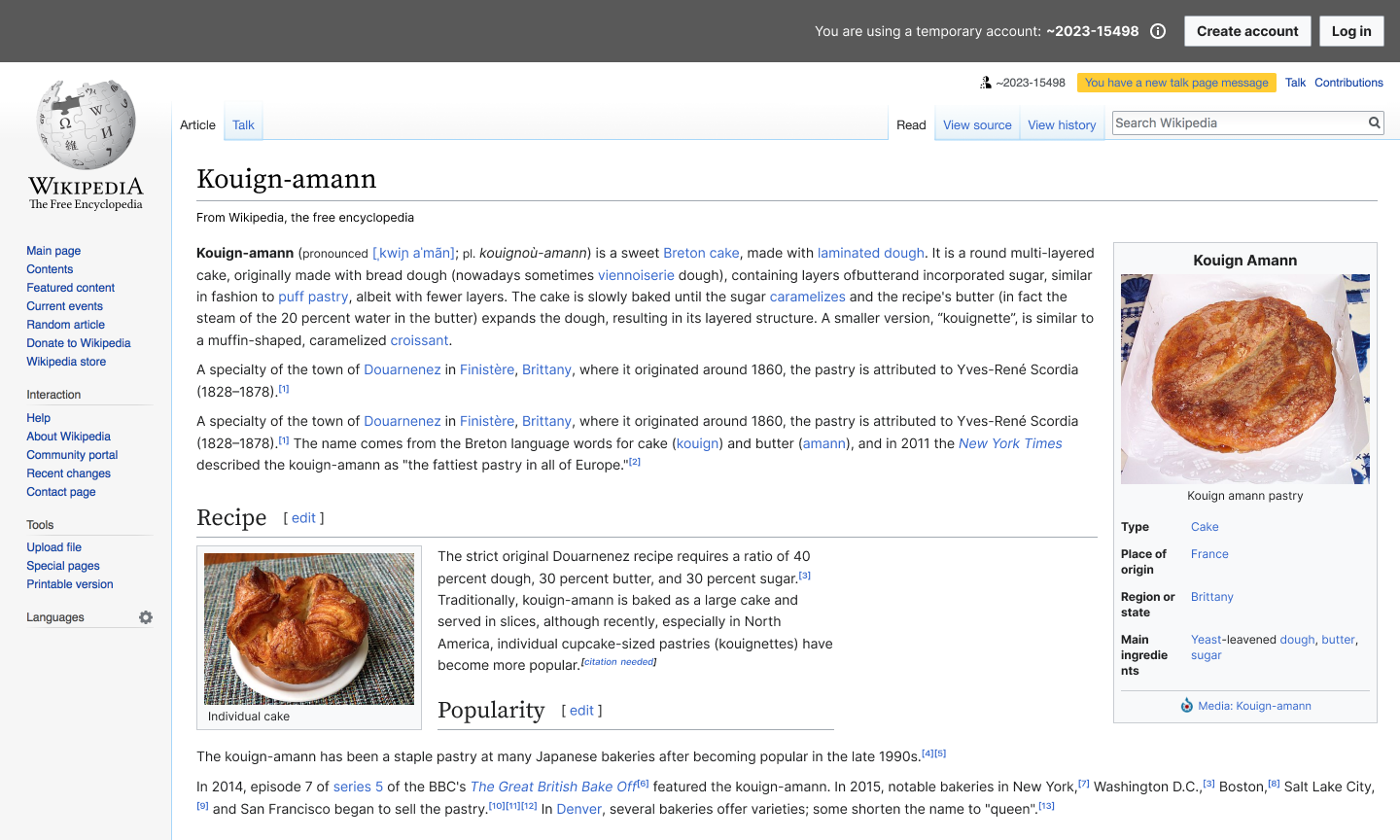
Example of current style:

04-D01b New message alert bar (Legacy Vector).png (864×1 px, 457 KB)

Acceptance Criteria:

Given I receive a You have a new talk page message alert,
Then the colors of the message are high enough contrast to meet WCAG AA requirements

Event Timeline

There are a very large number of changes, so older changes are hidden. Show Older Changes
stjn subscribed.
  1. Why only when logged into the temporary account? If this is an accessibility problem, it should be solved for everyone, this notice doesn’t look any different for users.
  2. This should probably involve a community discussion, since (IMO) the proposed design makes the notice too invisible.

FYI, it looks like something like this without Echo extension enabled AFAIK:
https://upload.wikimedia.org/wikipedia/commons/5/58/Notifications-Talk-Indicator-OptionG-OMOB-Screenshot-05-02-2013.png

See https://en.wikipedia.org/wiki/Help:Notifications/New_message_indicator (featuring, apparently, a discussion from 2013!) for more information on it

Maybe this is the time to rethink where it is located and how it looks more generally, but that would require a community consultation. The notice is the way it is because users thought that it is not noticeable otherwise, but contrast issues should obviously be solved. Maybe one way to solve it is to make the notice more prominent again in some other way.

Ah, https://meta.wikimedia.org/wiki/New_messages_notification has a more up-to-date information. Logged-out users currently get a more accessible design (good). But if you are fixing this, it should be made better for everyone.

I think one way to do it is to remove Echo modification of this message and move the box next to CentralNotice/sitenotices (above them in the same area). And maybe add an icon that indicates what this notice is about. This might fix some things in https://en.wikipedia.org/wiki/Wikipedia:Mobile_communication_bugs while we are at it.

There are also logged-out mobile notices done in T284642: Add yellow talk page message banner to non-main namespace pages on mobile that look like this:

Screen Shot 2021-11-11 at 11.06.13 AM.png (617×1 px, 67 KB)

Seems like a good version to iterate on to make the default everywhere. But currently they do not display this user notice unless user starts editing a page (which is bad and unnecessary).

Thanks for the feedback and additional context, @stjn!

Ideally we can solve this accessibility issue everywhere and use styling that is consistent with other similar messages.

@RHo What are your thoughts on styling this alert similar to the mobile banner? T284642

Thanks for the feedback and additional context, @stjn!

Ideally we can solve this accessibility issue everywhere and use styling that is consistent with other similar messages.

@RHo What are your thoughts on styling this alert similar to the mobile banner? T284642

Hi @KStoller-WMF - colour-wise the style is now matching the message warning notification styling that is in the mobile banner. The only difference is the font colour because the entire message is a link to the talk page. If there are any further changes to layout/placement/etc that is much more consequential. I would also tag in @ovasileva or @Jdlrobson from Web since I think they might technically share/own how this appears in Vector.

Change 952781 had a related patch set uploaded (by Cyndywikime; author: Cyndywikime):

[mediawiki/extensions/Echo@master] Revise styling on notification alert bar to meet WCAG color contrast AA requirements

https://gerrit.wikimedia.org/r/952781

The above patch changes the coloring of the orange bar from a bright orange to a pastel tan.

I do not associate pastel colors with urgency at all. Is there a way to meet the contrast requirement while still using a bright color? Perhaps we can change the font color to black instead?

Old:

image.png (330×1 px, 96 KB)

New:

image.png (374×1 px, 119 KB)

Thanks for the feedback, @Novem_Linguae! I agree that the new pastel bar of doom may not elicit the same degree of urgency / doom.

It would be nice to actually see how the new color scheme impacts the click through rate, but that would be hard to gather data on anytime soon.

I'll mark this as Blocked until @RHo or someone from design can review your feedback.

hi there, thanks for the ping. The proposed design is to match the Warning notice in the AA color-compliant design style guide that is already applied elsewhere in warning/alert messages, and the reason for the blue text is because link colour is in the #36c. My recommendation is to look at some data to see impact of the colour change as we move to the colour compliant and accessible styling, but agree there may be wiggle room to consider making most of the message the black shade text and only the talk page part in the link colour:

image.png (90×552 px, 11 KB)

Will pass on to @JFernandez-WMF to help move this forward in consult with Design Systems if needed.

hi, had a quick chat with @bmartinezcalvo - we concluded that maybe using the warning icon for the alert bar could probably help reinforce its urgency? We also thought that Rita's suggestion of only linking the 'talk page' copy is a great approach.

Message.png (32×539 px, 3 KB)

feedback welcome! :)

I still think that, if you are going to remove the brighter background and text colour, you should make it more prominent in other ways, like increasing font size and maybe putting it in a more prominent location. Small fixes like putting an icon wouldn’t help if the message itself is harder to notice.

Or figure out a way to keep the bright color and still achieve the contrast requirement. Perhaps by changing the font color of the text.

And I would also note that at least one community has complained that these notices aren’t consistent/prominent enough in https://en.wikipedia.org/wiki/Wikipedia:Mobile_communication_bugs so making them more prominent wouldn’t be all that controversial, whereas making them less prominent would likely cause some pushback or negative feedback.

thank you both for your feedback :) we've discussed your comments and we're taking them into consideration - we decided to implement, as the first step, making most of the text black + the link in blue as Rita pointed above, and we'll try and analyze closely if there's an impact in interactions before and after the change.

KStoller-WMF changed the task status from Open to Stalled.Nov 6 2023, 6:14 PM
KStoller-WMF moved this task from Inbox to Blocked on the Growth-Team board.

Thank you @Cyndymediawiksim for working on this.

Unfortunately, I think it's best to move this task to Blocked / Stalled for now.

I really do think we should make an accessibility improvement here, but I also want to respect the community feedback we've received so far.
Let's wait on this task until we have time to find a compromise that established editors are comfortable with.

Chiming in here because some contributors brought this up in relation to our dark mode development lately. This seems like a good opportunity to implement the Message Codex component. We could use the inline variant which would fit the space in the UI, is bold (therefore eye-catching), and has an icon. Contributors are likely to see it. It also uses the yellow colour while still remaining accessible. It also will have proper colour tokens for dark mode compatibility. Here's a quick mockup of what that would look like.

image.png (1×2 px, 1 MB)

That mock up appears to have no background color, which is a big step backward in visibility.

Not sure if folks in this thread are familiar with https://en.wikipedia.org/wiki/Wikipedia:Mobile_communication_bugs, but the TLDR of that is that each skin/app/desktop/mobile has a different way of displaying user talk message notifications to users, and most of them are not visible enough, resulting in good faith editors getting blocked because they do not see their user talk messages and therefore do not stop disruptive editing despite being asked politely.

In conclusion, I suggest any mockups preserve the high visibility of this notification, both in width and in bright background color.

image.png (1×2 px, 1 MB)

That's nearly invisible unless you're already looking for it, and will lead to innocent users getting blocked for "ignoring" their talk page. This alert has to be in-your face and hard to ignore, especially for inexperienced users. "You have new messages" is not something you might incidentally want to check out at your leisure after you're done "fixing" 100 pages. It means "look now". That's why it's so distracting and irritating. You want to make it go away, so you click on it, and discover the new messages.

In classic Vector, the alert is already at WCAG AA, and can even be made AAA by using larger text. Maybe just use the same colors in Vector-2022? No objection to new designs or ideas, but anything that looks like other parts of the page is inherently flawed.

In classic Vector, the alert is already at WCAG AA, and can even be made AAA by using larger text. Maybe just use the same colors in Vector-2022? No objection to new designs or ideas, but anything that looks like other parts of the page is inherently flawed.

That is only because currently the text colour on that link is #000, which if anything is worse (since not everyone will recognise this as a link you can go to). I do believe that you can make contrast improvements here while at the same time making this banner more noticeable to users, in the similar vein to F34741893. The inline design is sadly not a step in that direction IMO.

Yes, #000 is at AAA, but it is also not a link colour. Which is what I meant by ‘not everyone will recognise [it] as a link’.

Yes, #000 is at AAA, but it is also not a link colour. Which is what I meant by ‘not everyone will recognise [it] as a link’.

My point is that even that problem can be fixed by just using the classic Vector link colors, so long as AA is good enough. It's the "faded" Vector-2022 link colors that are the problem.

Adding @DTorsani-WMF @mwilliams for input on how to resolve with Codex palette.

kostajh subscribed.

AFAICT, this is not temporary account specific, so I'm untagging that project.

AFAICT, this is not temporary account specific, so I'm untagging that project.

It is temporary account-specific at least insofar as this is how temporary accounts receive new messages:

image.png (191×936 px, 13 KB)

It is absurd that you put this huge banner on all pages and yet do not want to solve the issue with arguably the more important banner not being shown prominently enough

hi @KStoller-WMF and @JFernandez-WMF - per comments on T375712#10369822 please consider how this task can be raised in priority for fixing. Thanks!

I don't think we should aim to make any changes to the design before the new year, but I will see if we can complete this associated task ASAP:
T381607: Talk page notification alert bar: Improve data legibility with a clear grafana dashboard