Page MenuHomePhabricator

Users sometimes struggle to select the text of the link anchor within the cartouche and so delete it on select-retype
Closed, ResolvedPublic8 Estimated Story Points

Assigned To
Authored By
maiden_taiwan
Jan 21 2016, 4:50 PM
Referenced Files
F23056313: Screen Shot 2018-06-28 at 14.45.15.png
Jun 28 2018, 1:46 PM
F22234651: image.png
Jun 14 2018, 3:46 PM
F22034546: image.png
Jun 11 2018, 8:44 PM
F22035423: image.png
Jun 11 2018, 8:44 PM
F22036873: image.png
Jun 11 2018, 8:44 PM
F22045848: image.png
Jun 11 2018, 8:44 PM
F21931183: image.png
Jun 11 2018, 5:15 PM
F21914106: image.png
Jun 11 2018, 4:53 PM
Tokens
"Haypence" token, awarded by RandomDSdevel."Orange Medal" token, awarded by Liuxinyu970226."Love" token, awarded by Elitre."Orange Medal" token, awarded by Krinkle.

Description

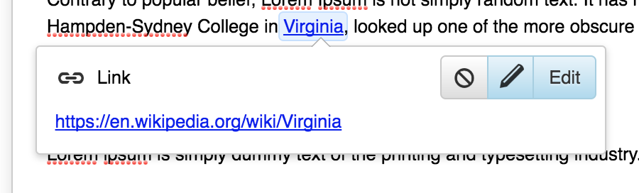
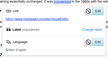
Suppose I have a wiki article that contains only this text:

http://wikipedia.org

I want to perform an edit in VisualEditor to change the link text, so I end up with this underlying wikitext:

[http://wikipedia.org Wikipedia]

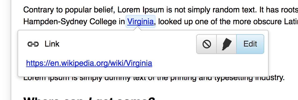
I tried this in VisualEditor 0.1.0 (MediaWiki 1.26.2), and the results are intermittent:

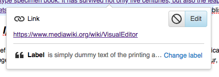
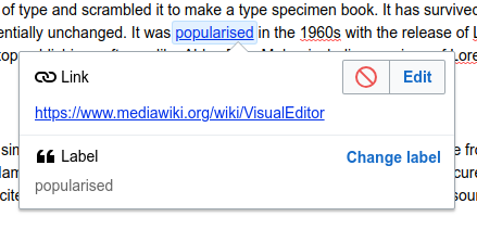
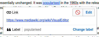
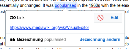
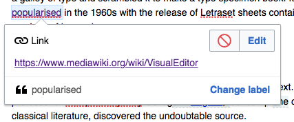
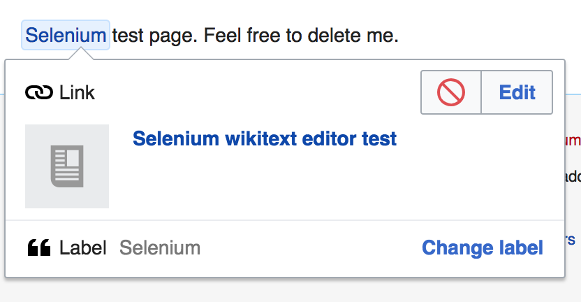
  1. Click the link so the Edit button appears.
  2. Highlight the entire link text by click-and-drag (NOT by double-clicking or typing ctrl-A)
  3. Type "Wikipedia". Notice that the word appears in the blue highlighting, indicating that it's still a link.
  4. Click away. The hyperlink is deleted and just the text, "Wikipedia", remains.

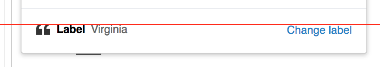
The correct replacement happens if you double-click the link text, or press ctrl-A to select the link text, but not if you click and drag. This really confused me for about 15 minutes...

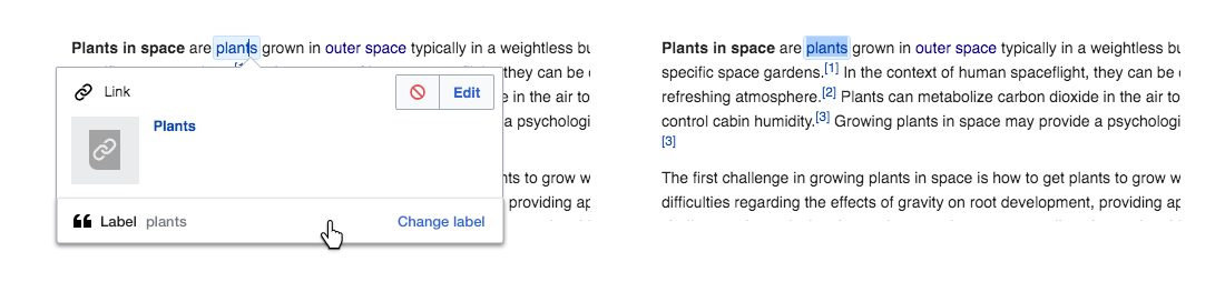
The problem seems intermittent. It seems to work better when I click on the far right side of the link text (between the rightmost character and the little "external link" icon) and drag to the far left. I get more problems when I click on the leftmost character of the link and drag to the far right.

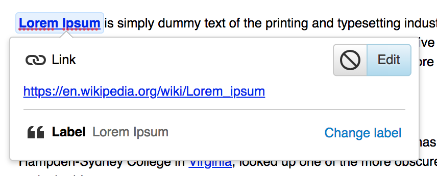
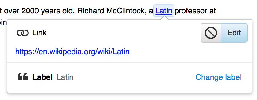
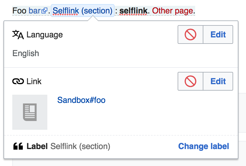
Suggestion: display an "Add Label" button like you do for links of this form:

[http://wikipedia.org]

whenever the link text equals the URL?

Event Timeline

There are a very large number of changes, so older changes are hidden. Show Older Changes

You are running an older version of MediaWiki. VisualEditor is a fast changing product and we don't yet have any supported old versions. Please make sure you test your bugs against the latest available code on our production wikis (e.g. www.mediawiki.org, or en.wikipedia.org)

Change 278284 had a related patch set uploaded (by DLynch):
LinkAnnotationInspector: add a button to edit the label

https://gerrit.wikimedia.org/r/278284

Jdforrester-WMF renamed this task from VisualEditor has difficulty replacing a bare URL with different link text to Users sometimes struggle to select the text of the link anchor within the cartouche and so delete it on select-retype.Mar 22 2016, 7:20 PM
Jdforrester-WMF assigned this task to DLynch.
Jdforrester-WMF triaged this task as Medium priority.
Jdforrester-WMF set the point value for this task to 8.
Jdforrester-WMF moved this task from To Triage to TR1: Releases on the VisualEditor board.

Change 278284 had a related patch set uploaded (by DLynch):
LinkAnnotationInspector: add a button to edit the label

What does this look like? I don't have an easy way to test this locally, and I can't make a decision about whether extra interface elements should be added without seeing it.

@Deskana Sorry, I forgot that I'd put all my screenshots in T55973. This patch makes it look like:

link labels option 2 (context).png (272×900 px, 52 KB)

The addition being that middle icon (which is actually different now -- it's the highlighter one instead), and clicking it adjusts the selection to include the entire link. If the functionality is desired (and it's situationally very useful), then the most-likely change we might want is to work out an icon which better conveys "select this text".

@Deskana: Here, the current look, for completeness:

image.png (322×954 px, 61 KB)

The functionality is useful. However, I'm hesitant to add extra interface elements that may not clearly indicate to the user what happens if they click on them. I'm also hesitant to add extra interface elements in general; it is very easy to "just add a button" for things, and slowly clutter things up and cause more problems than you had in the first place.

I'd appreciate some input from @Pginer-WMF and @Prtksxna.

I'd appreciate some input from @Pginer-WMF and @Prtksxna.

I share the concerns expressed by @Deskana.
The information and actions provided in the inspector are about the linked page, and adding an action about text selection seems a bit out of place.
It may be obvious if you have a clear idea of what you want to achieve (change the label) and how (by selecting the label text), but the relation with other elements does not seem to help with more general discovery and may be a source of distraction for the primary use of modifying the target of the link.

I'd recommend the following instead:

  • Make text selection inside the link more solid. It worked quite well when I tried, but maybe increasing a bit the safety distance on the extremes of the link can avoid some issues with this kind of selection
  • If we really want to expose both options for changing the link target and label, we can consider to present the action to edit the label and do a text selection as result for the user to type the new one. That will avoid duplicating the ways to edit the label (still happens in the document), while providing a more visible shortcut for it (which also has drawbacks). I illustrated the idea below, but as with anything related to T55973, we may want to carefully test with users first.

edit-label-and-select.png (263×1 px, 71 KB)

Here's the new state of that patch:

image.png (346×856 px, 61 KB)

Also, let's see...

For a very long label:

image.png (151×429 px, 23 KB)

A label which contains rich content (an image), which is just stripped from the preview:

image.png (308×475 px, 38 KB)

Relatedly, here we see it blending in with a multiple-annotations stack:

image.png (540×902 px, 79 KB)

@DLynch Well, cool! Nice work!

@Pginer-WMF David's work basically adheres to your design almost exactly, but I'd still appreciate explicit signoff from you. :-)

@Pginer-WMF David's work basically adheres to your design almost exactly, but I'd still appreciate explicit signoff from you. :-)

Yes, looks good to me. There is a small detail we may want to adjust: the vertical alignment of the icon, label and "change label" may need some tweaking. Currently it seems a bit off by a couple of pixels. Adjusting it will make it visually a bit more clean.

Screen Shot 2018-05-23 at 18.12.12.png (271×1 px, 43 KB)

A 1-2 pixel tweak applied to a few of these elements produces this:

image.png (328×844 px, 44 KB)
image.png (512×922 px, 77 KB)

Adding User-notice, while it will impact all wikis when deployed.

A 1-2 pixel tweak applied to a few of these elements produces this:

image.png (328×844 px, 44 KB)
image.png (512×922 px, 77 KB)

Great!

Macro votecat: looks  good

A couple of points:

image.png (225×418 px, 22 KB)

  • Currently the label is part of the link inspector, but visually it looks like a separate inspector. We should decide whether we want it to be part of the link, and if so it should be styled as such.
  • Currently it looks like we have 3 inspectors, but only one of the titles ('Label') is bold. This may look less inconsistent if it weren't styled to look like a separate inspector.

It's less apparent in the screenshot there, but in the full MW-VE experience, having that separate-section styling helps to distinguish it from the preview a bit:

image.png (584×862 px, 59 KB)

vs

image.png (572×846 px, 58 KB)

That said, I'm sure there's other ways to accomplish that goal.

Yeah there should be some separation, or maybe we build the label editor as a separate inspector (forced to the bottom).

I think building it as a separate context item which might not appear directly next to the link context item would be a bit confusing, just because it's explicitly scoped to act on the link annotation, whereas the pile-of-contexts is "all the overlapping annotations at this cursor location".

Given which... separation-but-less-separation like so?

image.png (568×842 px, 58 KB)

Or there's always having it be before the preview, rather than after.

image.png (554×852 px, 62 KB)

whereas the pile-of-contexts is "all the overlapping annotations at this cursor location".

Yes, although if we were to be consistent, then every annotation would get it's own label edit button. I also considered just making the border not edge to edge:

image.png (231×423 px, 23 KB)

(I also notice in this screenshot that the top padding and bottom padding on the label section are not equal in Apex, minor issue though)

So the other issue I raised was does 'Label' have to be bold? It looks oddly inconsistent. We could:

  • just make it normal, and hope the colour contrast is enough
  • put another delimiter in there between Label and the actual label
  • move the actual Label to the next line, like other inspectors are doing.

1:

image.png (156×424 px, 20 KB)

2:
image.png (211×439 px, 24 KB)

3:
image.png (158×424 px, 19 KB)

I actually think 2 is quite a good solution, and solves another problem where the combined length of "Label" and "Change label" in other languages may not leave much room for the actual label, for example in German:

image.png (164×434 px, 22 KB)

Be cautious of the inline solution, that will not work for super long labels (assuming that the label is always displayed for consistency).

@Trizek-WMF it truncates itself so it fits on one line.

@Esanders I do like how 2 winds up looking, particularly for longer labels. Want to wait for @Pginer-WMF to weigh in with a Design-y opinion?

My preference is for 1. I think it has the advantage of presenting the label UI elements as single unit. It also keeps the label part less prominent than the main piece of information (the link target) which should be proportional to the expected use.
The drawback of having less room for the label does not seem a big problem. The purpose of showing (part) of the label is just to give a reference about what the element refers to. The real label is fully shown as part of the document itself anyway.

Option 2 follows more rigidly the usual inspector structure, which makes it consistent with other information elements, but looking as a separate section with three separate element to process makes it too heavy for a quick shortcut to change the label. Its not a bad option, but presents the items too much as separate independent elements in my opinion.

I've updated the patch for option 1 for now. (Since it's the simple just-make-it-not-bold adjustment.)

Another option which wasn't mentioned, and also helps a lot with the long translations case, would be to remove the word "label" entirely:

image.png (177×427 px, 27 KB)

In theory the icon and "change label" button could carry some weight for conveying the meaning of the section, though there'd definitely be a clarity cost.

I've updated the patch for option 1 for now.

When will that go live (for announcements)?

@Trizek-WMF If Ed approves and merges the patch, it could all happen today. So the timeline is pretty much "once approvals come in", unfortunately.

In any case, that can be included to the next issue of Tech News. We will figure out next week if that would be on the "recent changes" or "changes this week" section. :)

The input could be:

Some users forget to change the label when they change a link target using the visual editor. The link inspector has been changed to surface the label, and offers to edit the it.

Change 440985 had a related patch set uploaded (by DLynch; owner: DLynch):
[mediawiki/extensions/VisualEditor@master] Update link contexts with label info from core

https://gerrit.wikimedia.org/r/440985

So, how do we proceed here? I would like to see this feature deployed, myself :) I reviewed the patches and this looks ready to go.

Do we need @Deskana to make a decision on when to release and announce this?

Jdforrester-WMF subscribed.

Do we need @Deskana to make a decision on when to release and announce this?

I believe so, yes.

Something like this for Tech News, when it's ready to go out?

When you edit the text in links in the visual editor this will look different. This is to make it easier to see if you edit the link or the text. This text is what is called a label in the visual editor.

I suggest:

"When you edit a link in the visual editor, there will now be separate buttons to change the link's target or its text (label)."

We do already refer to the link text as "label" in other places -- e.g. a numbered link gets an "add label" button to swap out the "[3]" for text -- that said, if people think it's unclear and needs explanation in this situation, now would be a good time to quickly change that before people spend effort on translations.

We do already refer to the link text as "label" in other places -- e.g. a numbered link gets an "add label" button to swap out the "[3]" for text -- that said, if people think it's unclear and needs explanation in this situation, now would be a good time to quickly change that before people spend effort on translations.

If it's consistent, "label" is fine. But you really should do some more testing with translations. I'm really worried that solution 1 will lead to weird looks for long links+languages where the translation for "label" is long. Some time ago there was a GSoC project for automatically translating VE screenshots. If that's still usable, perhaps you could use it to check if a 2-word link is still displayed correctly in all languages.

We do already refer to the link text as "label" in other places -- e.g. a numbered link gets an "add label" button to swap out the "[3]" for text -- that said, if people think it's unclear and needs explanation in this situation, now would be a good time to quickly change that before people spend effort on translations.

For Tech News, this would probably be explained no matter what you call it, as a lot of editors who edit in languages that aren't English still get the newsletter untranslated. In general, it's not necessarily self-evident, but I'm not sure I have a better name than "text" as an alternative – it's probably more that naming things is difficult than "label" being a bad choice.

Let's schedule it for the train next week.

OK. I added it to https://meta.wikimedia.org/wiki/Tech/News/2018/27 (feel free to improve). This week's wmf branch has been cut, so I will merge the patches now, which will make the new feaure available on Beta Cluster soon and in production next week (3-5 July).

Apparently, there will be no deployments next week due to US holidays… So I suppose we'll want to just do this the week after that, 10-12 July?

Change 272510 merged by jenkins-bot:
[VisualEditor/VisualEditor@master] LinkContextItem: add label information to the context

https://gerrit.wikimedia.org/r/272510

Change 278284 abandoned by Jforrester:
LinkAnnotationInspector: add a button to edit the label

Reason:
It was decided to go with Iad48fb55 instead.

https://gerrit.wikimedia.org/r/278284

Change 442202 had a related patch set uploaded (by Bartosz Dziewoński; owner: Bartosz Dziewoński):
[mediawiki/extensions/VisualEditor@master] Update VE core submodule to master (fab33197b)

https://gerrit.wikimedia.org/r/442202

Change 442202 merged by jenkins-bot:
[mediawiki/extensions/VisualEditor@master] Update VE core submodule to master (fab33197b)

https://gerrit.wikimedia.org/r/442202

Change 440985 merged by jenkins-bot:
[mediawiki/extensions/VisualEditor@master] Update link contexts with label info from core

https://gerrit.wikimedia.org/r/440985

The patches are merged now. This live on the beta cluster right now, and will be live on Wikipedias in two weeks. Below is a screenshot I just took on the beta cluster that shows what it looks like.

Screen Shot 2018-06-28 at 14.45.15.png (432×832 px, 47 KB)

@Deskana: Just checked this on production, and from my own first time user experience, I initially thought that the "Change label" button was not working because the context menu stayed open without any visual change. It feels that the text selection being enabled in the document is so subtle to notice, compared to an open dialog.

Later, I found out that Pau originally did propose that clicking on the Change label should hide the inspector. Have we decided not to go with that?

[..]

edit-label-and-select.png (263×1 px, 71 KB)

  • A separate section of the inspector is added about the label. The current label can be cropped if too long, it is there just for reference.
  • Clicking on the section hides the inspector and selects the text label inside the link for the user to type the new one. Temporary time-based tooltip can appear to indicate to "type the new label" if needed.

I'm reporting the same issue as @Ryasmeen. While in my workflow of changing a link, I've several clicked on "change label" to change the label, and re-clicked because nothing was happening (and re-clicked, just in case it auto-fixes). Something was actually happening: the label is selected in the text. I think I unconscious mind thought that was broken because nothing visible changed. I'm used to have a dialog to open for those actions.

Some users may have the same issue: expecting something that is not happening.

I can explain why things are the way they are, at least.

Context items display whenever the selection changes, as appropriate to wherever the cursor is. (I.e. The context popup gets displayed on the initial selection, and then again with every character you type.) We don't currently have a way to suppress them from doing that, and the exact question of when we should runs in to some edge cases. Most obviously, there's the case where multiple contexts are appropriate to the current cursor location like so:

image.png (231×423 px, 23 KB)

...in which case we'd have to decide whether we're suppressing just the link context, or all contexts, and if so when they should all come back. If we only suppress the link context, we're left with that same lack of attention drawn to the selection change.

Suppressing the context popup also has one usability issue, which is that it makes it a lot easier for people to not realize they're not changing the link target. And, for that matter, harder for them to go "oh yeah, I also want to change where this link points", because they'd have to work out how to make the context popup reappear after they'd finished changing the label. (With "move the cursor outside the link, and then back in" not being too intuitive.)

In summary: keeping the popup was behaviorally consistent with you manually selecting the entire link, and also avoided us having to think about complicated interactions.

That said, a relatively simple change would be to suppress the popup just for that initial select-all, and have it reappear the moment you start typing anything or move the cursor within the link. Much easier than any idea of keeping it hidden for the entire label-changing interaction, at least.

I'm reporting the same issue as @Ryasmeen. While in my workflow of changing a link, I've several clicked on "change label" to change the label, and re-clicked because nothing was happening (and re-clicked, just in case it auto-fixes). Something was actually happening: the label is selected in the text. I think I unconscious mind thought that was broken because nothing visible changed. I'm used to have a dialog to open for those actions.

Some users may have the same issue: expecting something that is not happening.

I did exactly this when I encountered this issue - I expected to be editing the label in the dialog box and didn't even think to look on the main editing surface. When clicking on the "change label" text did nothing I then tried clicking on the display of the current label - again, nothing. I assumed it was broken somehow and went back to the old way of doing things (delete the link and text, type the new label, add the link again).

I'm not sure that the dialog box just disappearing would make it obvious I just needed to type on the editing surface. I suspect that I'd assume it had crashed and try again. When testing again, I changed it on the editing surface, then clicked the "change label" again thinking it would act as a confirmation to save the change.

The most obvious (to me) solution would be to make the "change label" change the text after "label from display to a text box (maybe with an expand button for long labels) where it could be edited (as well as on the surface). Or possibly just always have it as a text box.
I guess that would be significant work though, so in the mean time maybe a tooltip explaining you need to edit on the editing surface? (but I don't have a good suggestion for wording that).

@DLynch, what about editing the label for real? In a dedicated textarea?

@Trizek-WMF: You'll find extensive discussion of that approach in T55973, if you want to see the arguments. I had a patch which worked that way as well, and it was less popular than the one which we went with in the end.

Let's see if there is more feedback about that, that would allow us to reconsider the input method.

Well, from your mocks I also thought the label will be editable in the pop-up. By the time I tested, I already knew how to expect, but it still felt strange (mostly because the selection was done above the button, which is kind of counter-intuitive)