Page MenuHomePhabricator

Page previews should display custom preview for disambiguation pages
Closed, ResolvedPublic5 Estimated Story Points

Description

Background

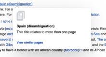
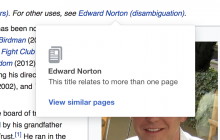
Preview for disambiguation pages should be able to display relevant information, including a list of the most common disambiguations

Most lead paragraphs/summary/intro paragraph of disambiguation pages is non-empty and 1 sentence about what the primary article topic. which is actually repeat of the hatnote.

for e.g. i read this hatnote >

image.png (58×374 px, 8 KB)

and then the first sentence of disambiguation is

image.png (50×662 px, 12 KB)

this is a common pattern in all the cases I have seen so far.

The other prominent use case is this

image.png (486×1 px, 205 KB)

here, another page tells what this page is about. it's a twisted joke on content design :)

in most cases finding useful and non-redundant content from disambiguation page is difficult. a generalized approach would be explaining what the link will do as shown in the mockup.

Proposed design

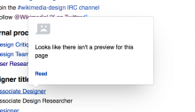
Use our empty state like page preview to convey that this link is about a page that relates to multiple pages

Thinking: WMF design principle says "Content first"
Here's how it might look. similar format as the empty page previews

disambiguation-previews.png (1×2 px, 1 MB)

Zeplin spec and SVG asset https://zpl.io/Z25qbra

Note: Use the same styles from empty page previews like this -->

image.png (538×936 px, 96 KB)

Acceptance criteria

  • When a user hovers over a disambiguation page, a page preview should appear including the following elements:
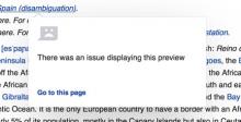
    • Text: "This link may refer to multiple pages. The disambiguation page will provide a list of these pages"
    • Link: "View disambiguation page"
  • Add disambiguation as a previewType in popups schema
  • Update schema to 17807993 and update previewType sent for disambiguation previews

Developer notes

The REST summary will return type for non-cached pages.

e.g.

"type": "disambiguation",

https://en.wikipedia.org/api/rest_v1/page/summary/John_Smith can be used for testing.

Open questions

Q: From Jan: Is a disambiguation page preview a "virtual page view" given there is no summary displayed?

Related Objects

Event Timeline

There are a very large number of changes, so older changes are hidden. Show Older Changes

most disambiguation pages have the wikidata description "Wikipedia disambiguation page". Have you considered falling back to wikidata description when no extract is available? This would also help any pages where there is no lead paragraph and would be a much more general solution. If not why?

Most lead paragraphs/summary/intro paragraph of disambiguation pages is 1 sentence about what the primary article topic. which is actually repeat of the hatnote.

for e.g. i read this hatnote >

image.png (58×374 px, 8 KB)

and then the first sentence of disambiguation is

image.png (50×662 px, 12 KB)

this is a common pattern in all the cases I have seen so far.

The other prominent use case is this

image.png (486×1 px, 205 KB)

here, another page tells what this page is about. it's a twisted joke on content design :)

in most cases finding useful and non-redundant content from disambiguation page is difficult. a generalized approach would be explaining what the link will do as shown in the mockup.

Jdlrobson updated the task description. (Show Details)
ovasileva updated the task description. (Show Details)

Do the open questions in the description need answers?

Second one is good to go, @Tbayer - any thoughts on the first question?

Since that the REST endpoint returns "type": "disambiguation" now, it seems like this feature could be implemented by using the approach suggested by @Jhernandez in T186129. In my opinion, I think that makes T186129 a prerequisite for this task. Thoughts?

I think this task is a part of the rendering of the type page preview, since it uses the same data source and the same of the rest of the pipeline (logging stuff, gateways, etc).

So in my opinion this is independent from T186129: Set up Extension:Popups to support multiple preview types, as it is a different rendering view for the page preview type that uses the summary data source (like the no preview available view).

I'd hope the tasks compliment each other. Definitely consider T186129 when working on this task (to help future Jan if he works on it ;-)) but agree with Joaquin - no need to block on it.

Change 416925 had a related patch set uploaded (by Jdrewniak; owner: Jdrewniak):
[mediawiki/extensions/Popups@master] [WIP] Custom page preview for disambiguation pages

https://gerrit.wikimedia.org/r/416925

@Nirzar not everyone has access to the Zeplin project. Can you make it public or attach the svg to the task?

Jdlrobson updated the task description. (Show Details)

@Jdrewniak Zeplin doesn't allow public boards unfortunately, I have added you to the board.
you can now get the asset

Change 416925 merged by jenkins-bot:
[mediawiki/extensions/Popups@master] Custom page preview for disambiguation pages

https://gerrit.wikimedia.org/r/416925

Jdlrobson added subscribers: ABorbaWMF, Jdrewniak.

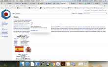
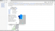
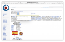
@ABorbaWMF I've updating staging with the latest code and set it up so that it uses real world content
http://reading-web-staging.wmflabs.org/w/index.php?title=Spain
If you hover over the disambiguation link at the top of the page you will be able to see the new treatment.

Can you please do a generic QA of other page previews types (e.g. normal links; empty previews when the connection drops) to verify this task hasn't broken anything? Thank you!

> Can you please do a generic QA of other page previews types (e.g. normal links; empty previews when the connection drops) to verify this task hasn't broken anything? Thank you!

@ABorbaWMF - did you also get a chance to go through these as well?

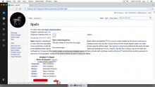
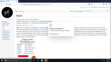
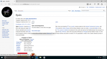
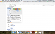
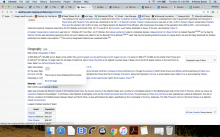
Looks good to me on staging. Did some testing of various previews on different browsers/OS's.

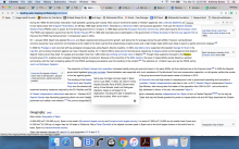
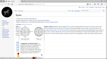
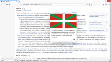
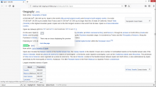
Screen Shot 2018-03-15 at 12.36.00 PM.png (1×2 px, 1 MB)

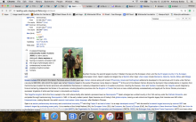
Screen Shot 2018-03-15 at 1.03.50 PM.png (1×2 px, 1 MB)

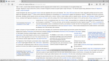
Screen Shot 2018-03-15 at 12.47.17 PM.png (1×2 px, 1 MB)

Screen Shot 2018-03-15 at 12.39.34 PM.png (1×2 px, 1 MB)

image.png (768×1 px, 239 KB)

image.png (768×1 px, 135 KB)

image.png (768×1 px, 179 KB)

image.png (768×1 px, 199 KB)

image.png (768×1 px, 144 KB)

looks great, thanks all!

This did not go through design!!!

the icon size does not match the spec given!

please assign designer for sign off for user facing changes

ovasileva added a subscriber: alexhollender_WMF.

My bad on this one - thought this was done as part of development. Let's note to make this more explicit. Over to you @Nirzar. Or should it go to @alexhollender?

@Jdrewniak can you sync with nirzar regarding https://phabricator.wikimedia.org/T168392#4057519 ? I'd be most grateful as this is train bound!

I think the discrepancy in icon size is due to switching to resourceLoader's image feature for the icons. The icons were switched to used a standardized mw-ui-icon-large icon size, which coincidentally matched the size of the "empty" icon, but made the icons for the disambiguation preview larger than it should be.

I have a feeling that resourceLoaders mw-icon feature shrinks wide icons more than high icons, but I haven't investigated this too deeply. I guess the icon can be shrunk down manually.

Also just noticed, the mock calls for large padding above the icon. Since I re-used the existing "empty" preview, which doesn't have this padding, the white space is missing. Please confirm that we should add this padding to the disambiguation preview and not the empty preview .

empty preview (current)disambiguation previewdisambiguation mock
current empty.jpg (221×433 px, 29 KB)
disambig.jpg (234×433 px, 27 KB)
Screen Shot 2018-03-19 at 16.39.00.png (532×832 px, 232 KB)

Also one more thing. I noticed the grey was different on the mock than on the empty preview, so I changed the color to match the current "empty" icon color, @Nirzar can you confirm which is the right color (or if their should be two?)

Fyi there is a small icon size - mw-ui-icon-small and regular (don't use large or small modifiers)

btw this is what I mean about different icon sizes with .mw-icon

Screen Shot 2018-03-19 at 17.13.21.png (1×2 px, 760 KB)

Screen Shot 2018-03-19 at 17.14.04.png (1×2 px, 760 KB)

Change 420396 had a related patch set uploaded (by Jdrewniak; owner: Jdrewniak):
[mediawiki/extensions/Popups@master] Icon sizes for generic/disambiguation previews made smaller

https://gerrit.wikimedia.org/r/420396

Change 420424 had a related patch set uploaded (by Jdlrobson; owner: Jdlrobson):
[mediawiki/extensions/Popups@master] Disambiguation icon should be regular mw-ui-icon size

https://gerrit.wikimedia.org/r/420424

Change 420424 merged by jenkins-bot:
[mediawiki/extensions/Popups@master] Disambiguation icon should be regular mw-ui-icon size

https://gerrit.wikimedia.org/r/420424

For icon sign off! You have 30 mins! ;-)

Change 420396 abandoned by Jdrewniak:
Icon sizes for generic/disambiguation previews made smaller

Reason:
Abandoned in favour of 420424

https://gerrit.wikimedia.org/r/420396