Page MenuHomePhabricator

Design a "Publish" component
Closed, ResolvedPublic

Assigned To
Authored By
gengh
Dec 16 2020, 3:31 PM
Referenced Files
F35627980: image.png
Oct 26 2022, 2:08 AM
F35620016: image.png
Oct 24 2022, 12:32 PM
F35620014: image.png
Oct 24 2022, 12:32 PM
F35620012: image.png
Oct 24 2022, 12:32 PM
F35620009: image.png
Oct 24 2022, 12:32 PM
F35620007: image.png
Oct 24 2022, 12:32 PM
F35620004: image.png
Oct 24 2022, 12:32 PM
F35620262: image.png
Oct 24 2022, 12:32 PM

Description

Preamble

Currently the publishing component is being displayed at the bottom of the page, most of the times off-screen (below the fold).

Design proposal

This design proposal wants to improve the accessibility of the "Publish" button, and provide a cohesive publishing experience across pages and devices.

The annotated designs can be consulted both on Figma or via the screenshots below.

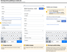
The publishing workflow on mobile web

image.png (1×3 px, 565 KB)

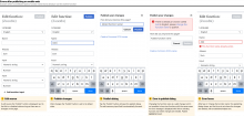
The publishing workflow on larger screens

image.png (2×1 px, 406 KB)

Errors and warnings on mobile web

Leave page while editing

image.png (1×750 px, 134 KB)

Warnings before publishing

image.png (1×2 px, 466 KB)

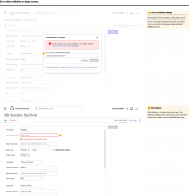
Errors after publishing

image.png (1×3 px, 594 KB)

Errors and warnings on larger screens

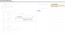
Leave page while editing

image.png (1×3 px, 292 KB)

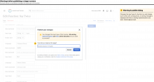
Warnings before publishing

image.png (1×3 px, 372 KB)

Errors after publishing

image.png (3×3 px, 628 KB)

Additional notes

  1. This proposals gives the ability to manually enter an edit summary. We will focus on programmatically generated edit summaries separately.
  2. During this design work, we understood that the "header" (page title and "Publish" button) in edit mode needs additional care. We will address this product area separately.

Related Objects

Event Timeline

gengh renamed this task from Save component should be according to mediawiki standards to Create a "Save" component according to mediawiki standards .Dec 16 2020, 3:31 PM
gengh created this task.
gengh updated the task description. (Show Details)
Jdforrester-WMF renamed this task from Create a "Save" component according to mediawiki standards to Create a "Publish" component according to MediaWiki standards (minor edit, edit summary, watchlist state, etc.).Dec 16 2020, 6:17 PM
Jdforrester-WMF renamed this task from Create a "Publish" component according to MediaWiki standards (minor edit, edit summary, watchlist state, etc.) to Create a "Publish" component according to MediaWiki standards (minor edit, edit summary, copyright warning, watchlist state, etc.).
Jdforrester-WMF updated the task description. (Show Details)
Jdforrester-WMF changed the task status from Open to Stalled.Jun 2 2021, 5:00 PM
Jdforrester-WMF subscribed.

Stalled on our wider Design strategy work.

AAlhazwani-WMF changed the task status from Stalled to In Progress.Sep 6 2022, 10:12 AM
AAlhazwani-WMF claimed this task.

Here's a first proposal for the publish component, but before diving in, let's set some context. This proposal merely focus on the publish component, it does not touch on where to display the "Publish" button in the current UI. It also focuses on mobile only. If we then think this is a good approach, we can start to scale the UI for larger screens too.

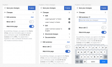
  1. When editors tap on the "Publish" button in the current UI (button position TBD) a full-screen modal is displayed. In this modal, editors can:
    1. Publish their changes
    2. View their changes
    3. Add an edit summary
    4. Mark their edit/s as minor, or touch the "Info" button that redirects them to Help:Minor edit
    5. Watch the page (this option is ON by default if they set their preferences to watch all pages they edit by default)
    6. Read the terms of use
  2. When they tap on changes, the accordion opens.
    1. We could organize changes by type (add, edit, structural changes, documentation) as mentioned on T275940
    2. When editors open a specific section they can review, and undo specific changes via the cancel icon
      1. We could explore together how to display this information, eg. {Verb} + {Subject} + {Language}
  3. When they open the edit summary (or touch "Add") the text field is automatically focused and the keyboard is displayed
    1. When this section is open, we can display an "Info" button next to the section title that redirects editors to Help:Edit summary, thou the displayed UI on that page is the one from Wikipedia
    2. If we manage to dynamically generate an edit summary, see T297464 and T290205, we should probably open this section by default
    3. A character counter is displayed under the text field. The limit is set to 500 as for Wikipedia projects, but in the context of Wikifunctions I would suggest limiting to 50/100 chars.
  4. When editors type an edit message, the chars counter is automatically updated
  5. If the edit message is too long, the text filed is set to an error state (red border), and the char counts is set to bold and red too

Screen Shot 2022-09-13 at 12.36.36 PM.png (1×2 px, 459 KB)

Additional things that need to be explored:

  • Publish button position in the current UI
  • Layout on larger screens/viewports
  • What happens after tapping/clicking the "Publish" button in the full-screen modal
  • What happens if publishing fails
  • Other?

Wanted to provide some updates on the publish component. After a great design session with Pau, I've been exploring how we can simplify the publishing flow, but also how might we try to make the publishing experience more joyful and celebratory.

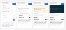
This was the state of the art

image.png (998×1 px, 234 KB)

I started then to explore the use of icons and color to mark each change (add, edit, structural change, and documentations)

image.png (1×2 px, 310 KB)

I then felt it being a bit too much, so I took a step back, and explored if we can use a bolder font style to highlight the changes

image.png (1×1 px, 161 KB)

And finally combined the two directions into one.

image.png (1×1 px, 244 KB)

Some question I have for the team:

  • Can we separate/group changes by category (add, edit, structural change, and documentations)?
  • Can we provide a session-wide publishing experience instead of publishing changes per page?
  • If we're able to organize changes by type, are edit summary and minor edit still necessary?
  • Can we remove the "Watch this page" from the publishing flow? And let editors decide this globally under their user preferences, or under each page they intend to "follow"?

Section “Changes”

I like having this idea and being able to display it like this in the future, but for the moment this section is not possible without a big big time investment on 1) reworking the whole front-end data flow to extract atomic changes or 2) involving the backend to analyze and return atomic changes.

Section “Edit summary”

I would encourage users to write a summary, so would probably show the section expanded by default. Is there a mediwiki-wide practice to show this collapsed in mobile? Or a reason for us to not do it?
Default: If there is no summary given by the user, the backend has the ability to craft one using the diff information (captures add, remove and change operations), but it might be difficult and not very descriptive at times.

Errors and notifications

The user gets warning and error notifications at different moments, we should include some of these things in the Publish component designs.

  1. Pre-submission warnings: Currently we have the following pre-submission dialogues:
    • If input number, input type or output type changes, we tell the user that their changes will affect the behavior of the function and that the connected implementations and testers will be disconnected. We need this notification, so we should include pre-submission warning space in the Publish component designs.
    • In mobile, when pressing publish, there’s a dialog saying “This will publish your changes to the Internet”. Considering that the publish component accomplishes the function of making the user aware of their changes, I believe this warning message is not necessary.
  2. Post-submission backend-returned errors:
    • In some cases the back-end will return errors with the reason why the ZObject could not be saved. This will probably contain a general message and the user needs to read it, and go back to the main site to fix their ZObject and submit again:
      • Is this message gonna be shown in the Publish component window? In this case, when the user clicks close and goes to the ZObject page to correct it, they don’t have the error message at hand and they can’t re-read it.
      • Shall we, instead, close publish window and show the errors in the context of the ZObject page? I fear this might be confusing for the user, that might not know why they navigated to another place (generally the users expect to be automatically redirected elsewhere only when the submission is successful)
      • Or we show the error in both contexts? This way the user can read it in the publish component, willfully close the window and still have the error message present when correcting the data in the ZObject page.

To your questions:

Can we separate/group changes by category (add, edit, structural change, and documentations)?

We do this in the back-end. Repeating this in the front-end will be problematic and I would advice against it. We can ask the backend to give this information to us with a new API call, but sometimes the changes detected are not very human friendly. Currently the changes detected atomically are: add, remove and change. Documentation change will be possible after Phase iota.

Can we provide a session-wide publishing experience instead of publishing changes per page?

I am not sure I understand this question. Could you provide an example user story?

If we're able to organize changes by type, are edit summary and minor edit still necessary?

Replied above: the backend could craft a message, but it might not be very descriptive at times. About minor edit: I am not sure, would love @Jdforrester-WMF and @Quiddity take on this.

Can we remove the "Watch this page" from the publishing flow? And let editors decide this globally under their user preferences, or under each page they intend to "follow"?

Same, I'll let @Jdforrester-WMF and @Quiddity reply to this.

Thanks for the thorough feedback @gengh! I’ll try to summarize your suggestions:

  1. Will remove the section changes and maybe add it to the digital garden.
  2. Will keep the edit summary open by default. More on this just below!
  3. Will add examples of pre- and post- publishing warnings and examples, after touching base with Sandy.

I will post an updated design proposal to this very task!

To your questions:

Can we provide a session-wide publishing experience instead of publishing changes per page?

I am not sure I understand this question. Could you provide an example user story?

Yes, I was wondering if we can have an overarching publishing experience, for example you add a label for an object, you add another object, you write an implementation for another one, and only then you publish all of this changes together. Similarity to how you can edit multiple files and commit them all with git. I was wondering if this might be useful as long as we keep definition, implementation, and testers separated. So, rather than having to publish 3 times, you can publish only once. The current publishing experience is inspired by Wikipedia, which provides a bespoke solution for publishing single articles, but on Wikifunctions content (and changes) can be much more fragment, and you might need to change multiple objects (aka pages) to get to a desired result.

If we're able to organize changes by type, are edit summary and minor edit still necessary?

Replied above: the backend could craft a message, but it might not be very descriptive at times. About minor edit: I am not sure, would love @Jdforrester-WMF and @Quiddity take on this.

Some more background on this question. The current publishing proposal is very much inspired by Wikipedia, where an edit summary is useful to summarize your potentially extended textual changes. What I’m questioning is if the same usefulness is valid for Wikifunctions, where content is more structured, and where the changes can actually be the “edit message”, or where we can potentially programmatically understand if an edit is a minor edit. I’m trying to explore ways to reduce the friction of the publishing experience (especially if you have to publish every edit to different objects), and provide a more bespoke solution for Wikifunctions where the content is very different from Wikipedia content.

The same argument applies to the watch feature, where I’m proposing to remove it from the publishing experience, and only make it available on the object page (star icon) or under the user preferences. I’m trying to reduce the publishing experience to its essence, where you can (view and) save your edits, without having to provide much details, or without potentially distracting the flow with secondary features.

Section “Changes”

If we're able to organize changes by type, are edit summary and minor edit still necessary?

Replied above: the backend could craft a message, but it might not be very descriptive at times. About minor edit: I am not sure, would love @Jdforrester-WMF and @Quiddity take on this.

This is what Wikidata does – every edit is just auto-described with no opportunity to explain what you're doing. They can get away with this in part because edits are pretty atomic (you can't change a label and add a new statement in the same edit unless you're using a special tool, etc.). Even so, as Geno says, the message might not be very descriptive,

There are some kinds of edits you might make that you'd want to justify as you make them – e.g. un-approving a function's implementation, and saying "removed because this is causing too much load on the system" etc. – and this is probably a harder issue for us that for Wikidata given that you can make complex edits (like approving a new implementation and three new testers in one go), so the auto-describing might not be very readable?

Can we remove the "Watch this page" from the publishing flow? And let editors decide this globally under their user preferences, or under each page they intend to "follow"?

Same, I'll let @Jdforrester-WMF and @Quiddity reply to this.

Yes, it's possible; that's how Wikidata does it too. It's a change to the standard way the MediaWiki feature works – that you have a default, but you can choose to alter it on each page as you edit. On talk pages and other wikitext pages it'll show up, which might be a bit confusing, but I suppose if it's OK for Wikidata it's OK for our users?

Thank you all for your insightful feedback! After reviewing your comments, presenting different proposals to the wider design team, and chatting about this workflow with Julia, Denny, and other folks, I would like to propose a first candidate for implementation.

Preamble

The goal of this proposal is to "detach" the publish component from a specific view, eg. function definition, and provide a cross-page, cross-feature experience that is consistent throughout the product.

Flow on mobile

  1. Open an object page, tap "More", and tap "Edit source" to go into edit mode
  2. Edit mode opens in a fullscreen modal. The modal has a sticky header with a close "X" button, and a disabled "Publish..." button
  3. Once edits have been made the "Publish..." button is enabled
  4. Tapping on the "Publish..." button opens the publish modal. It has a sticky header with a "< Back" button, and a "Publish" button. The edit summary input field is focused by default, thou it's not mandatory to provide a summary.
  5. Publishing your changes will redirect you to the view/read mode of said object.

image.png (1×2 px, 278 KB)

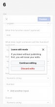
  1. If a contributor tries to close the edit modal before publishing, we display a warning dialog.

image.png (1×716 px, 103 KB)

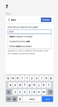
  1. (Optional / Nice to have) While typing an edit summary we could fetch existing edit summaries for inspiration.

image.png (794×436 px, 53 KB)

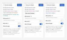
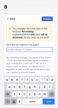
  1. Warnings are displayed before publishing, in the example below a contributor has changed the input type of a function. We can use the same design proposal for other types of warnings.

image.png (1×750 px, 146 KB)

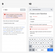
  1. While errors are displayed after tapping on the "Publish" button. In this case a contributor is trying to create a function in English whose name already exists. The error message provides links to existing objects or ways to address the issues. We can use the same proposal for other types of errors.

    9a. This is not an ideal solution. A contributor might prefer to be aware of existing function names while creating the function, not after trying to publishing it. Would it be possible to:
    • Run a validation on the function input field when a contributor moves the focus to another input field or,
    • Turn the function name input field in a lookup component that displays functions with a similar name, similarly to how the GitHub new issue UI displays issues with a similar title
  1. Clicking on the link in the error message will bring the contributor back to editing mode, where the inputs that need additional edits are going to be focused with the error state, plus an additional helper text below.

image.png (1×1 px, 236 KB)

Flow on desktop

The flow on desktop is pretty much similar to what we have on mobile, with only minor changes.

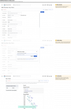
  1. While on edit mode on desktop, the "Publish..." button is displayed in the tab bar
  2. Clicking on "Publish..." it opens the publish dialog, content is the same as the mobile full-screen modal

image.png (1×2 px, 255 KB)

  1. Warnings are displayed in the dialog before publishing
  2. While errors are displayed in the dialog after publishing, notice the disabled "Publish" button after having tried to publish.

image.png (1×2 px, 287 KB)

Suggestions

If this proposal is comprehensive enough, I would then go ahead and prepare the design specs for implementation, and update the task description. I also would like to suggest detaching this task from T297464, where we might want to try at a later stage to design how to programmatically generate useful edit summaries.

If you have any feedback or suggestion, you can comment here indicating the specific screen number, or leave a comment on Figma if you prefer that method.

If you want to explore the design proposal in Figma, you can do it here.

If you have any feedback or suggestion, you can comment here indicating the specific screen number, or leave a comment on Figma if you prefer that method.

This looks great. I'm slightly nervous about putting the edit summary behind a button for desktop users as well as mobile (some users complain that they like to write the summary as they go), but I think that's minor.

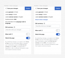
Note that the text approved by Legal is a little different from the placeholder you've got in your specs – this is the one for almost everything, including Functions; this is the one specifically for Implementations; and this is the shorter one for mobile – whereas your mocks use the general one).

Looks awesome! I just want to point out one thing:

The mobile screens in this proposal parts from the premise that the "edit" screen is a modal over the view screen which currently is not the case: the "edit" page is a completely independent page to which we navigate.
Even if we could change that (I am not sure that we can) for the flow [view a ZObject -> press "Edit" -> edit info -> save], we also need to think about the flow [go to Create New ZObject screen -> add info -> save], which is always going to be a whole page and not a modal.

Can we see how the top "Publish" bar would look in a mobile Create New ZObject page?

gengh renamed this task from Create a "Publish" component according to MediaWiki standards (minor edit, edit summary, copyright warning, watchlist state, etc.) to Design a "Publish" component according to MediaWiki standards (minor edit, edit summary, copyright warning, watchlist state, etc.).Oct 21 2022, 8:36 AM

@Jdforrester-WMF Regarding the legal texts, does this mean that the mobile version will only have the link https://creativecommons.org/licenses/by-sa/3.0/ CC BY-SA 3.0 without any supporting text?

Thanks YOU @Jdforrester-WMF and @gengh, I'll work on your feedback and share updates asap!

@Jdforrester-WMF Regarding the legal texts, does this mean that the mobile version will only have the link https://creativecommons.org/licenses/by-sa/3.0/ CC BY-SA 3.0 without any supporting text?

I'm also puzzled by the different legal texts (for the same view) between desktop and mobile web. If something (shorter!) is valid for mobile web why isn't that the case for desktop? Just a thought, happy to trust the legal team on this one :)

AAlhazwani-WMF renamed this task from Design a "Publish" component according to MediaWiki standards (minor edit, edit summary, copyright warning, watchlist state, etc.) to Design a "Publish" component.Oct 24 2022, 12:32 PM
AAlhazwani-WMF updated the task description. (Show Details)

@gengh @Jdforrester-WMF I updated the task description following your inputs and suggestions! This first iteration is now ready to implement. As always, feel free to leave me any feedback here on Phab or on Figma if you prefer.

@Jdforrester-WMF Regarding the legal texts, does this mean that the mobile version will only have the link https://creativecommons.org/licenses/by-sa/3.0/ CC BY-SA 3.0 without any supporting text?

I'm also puzzled by the different legal texts (for the same view) between desktop and mobile web. If something (shorter!) is valid for mobile web why isn't that the case for desktop? Just a thought, happy to trust the legal team on this one :)

I believe that for most wikis and generic namespaces (like talkpages), MobileFrontend combines the (equivalent of the) string that James linked to, into this sentence/string. I.e. Only slightly shorter than the desktop version, by dropping the final sentence about "hyperlink or URL".
However, Wikidata's content namespaces appear to use this custom string (for both desktop & mobile - I tested), which also comes with a link to dismiss it permanently:

image.png (226×380 px, 23 KB)