Page MenuHomePhabricator

Notifications dropdown obscured in Timeless, Monobook, new Vector at small resolutions
Closed, ResolvedPublicBUG REPORT

Assigned To
Authored By
Izno
Jul 21 2021, 11:31 PM
Referenced Files
F36762528: image.png
Feb 6 2023, 6:40 PM
F36762526: image.png
Feb 6 2023, 6:40 PM
F36762519: image.png
Feb 6 2023, 6:40 PM
F36762533: image.png
Feb 6 2023, 6:40 PM
F36762523: image.png
Feb 6 2023, 6:40 PM
F36762535: image.png
Feb 6 2023, 6:40 PM
F35825906: image.png
Nov 30 2022, 10:38 PM
F35825903: image.png
Nov 30 2022, 10:38 PM

Description

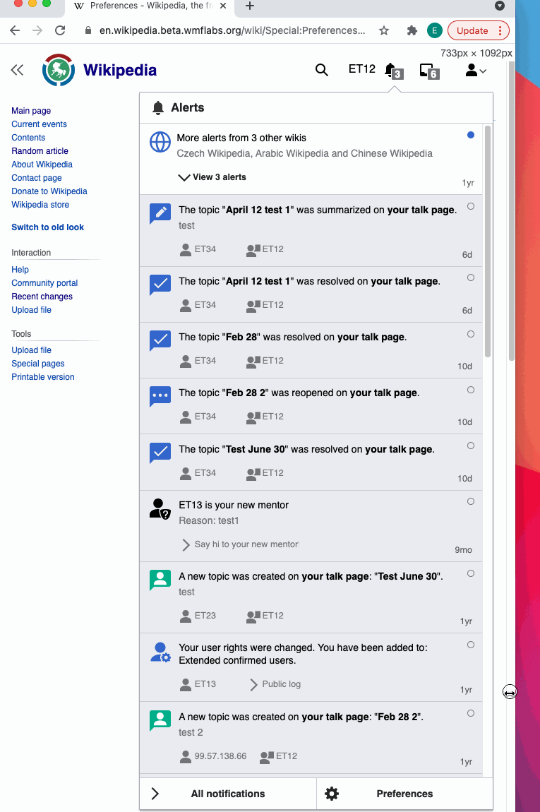
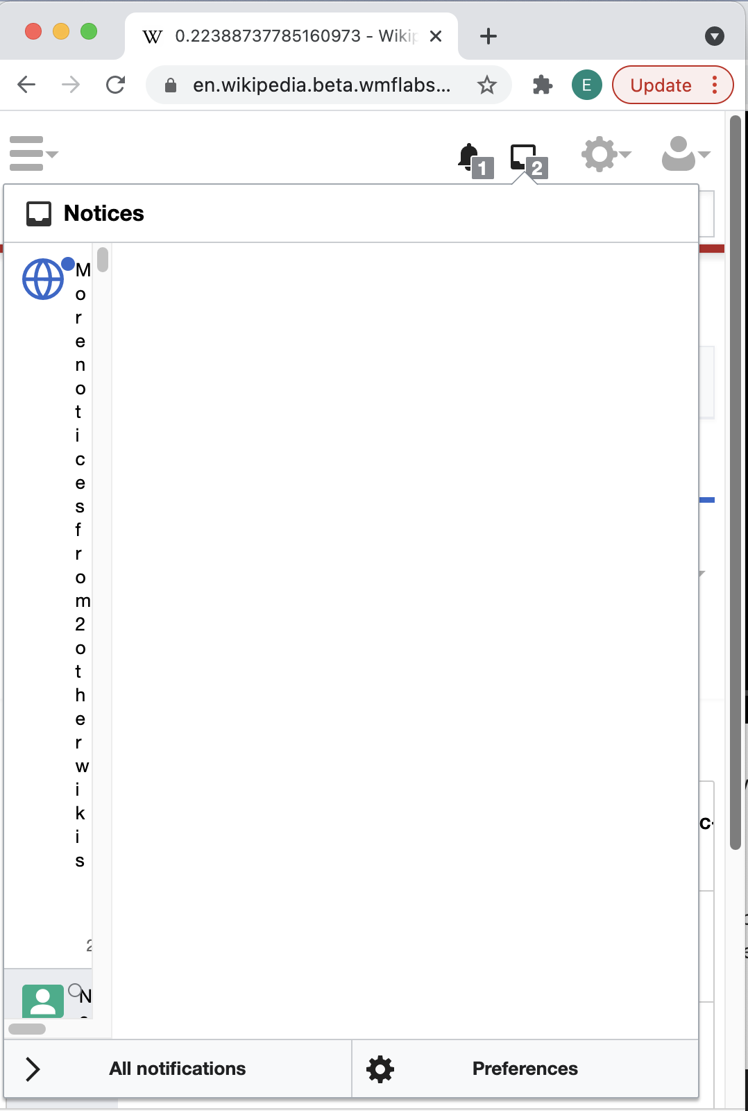
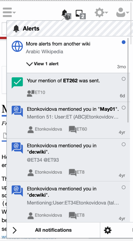
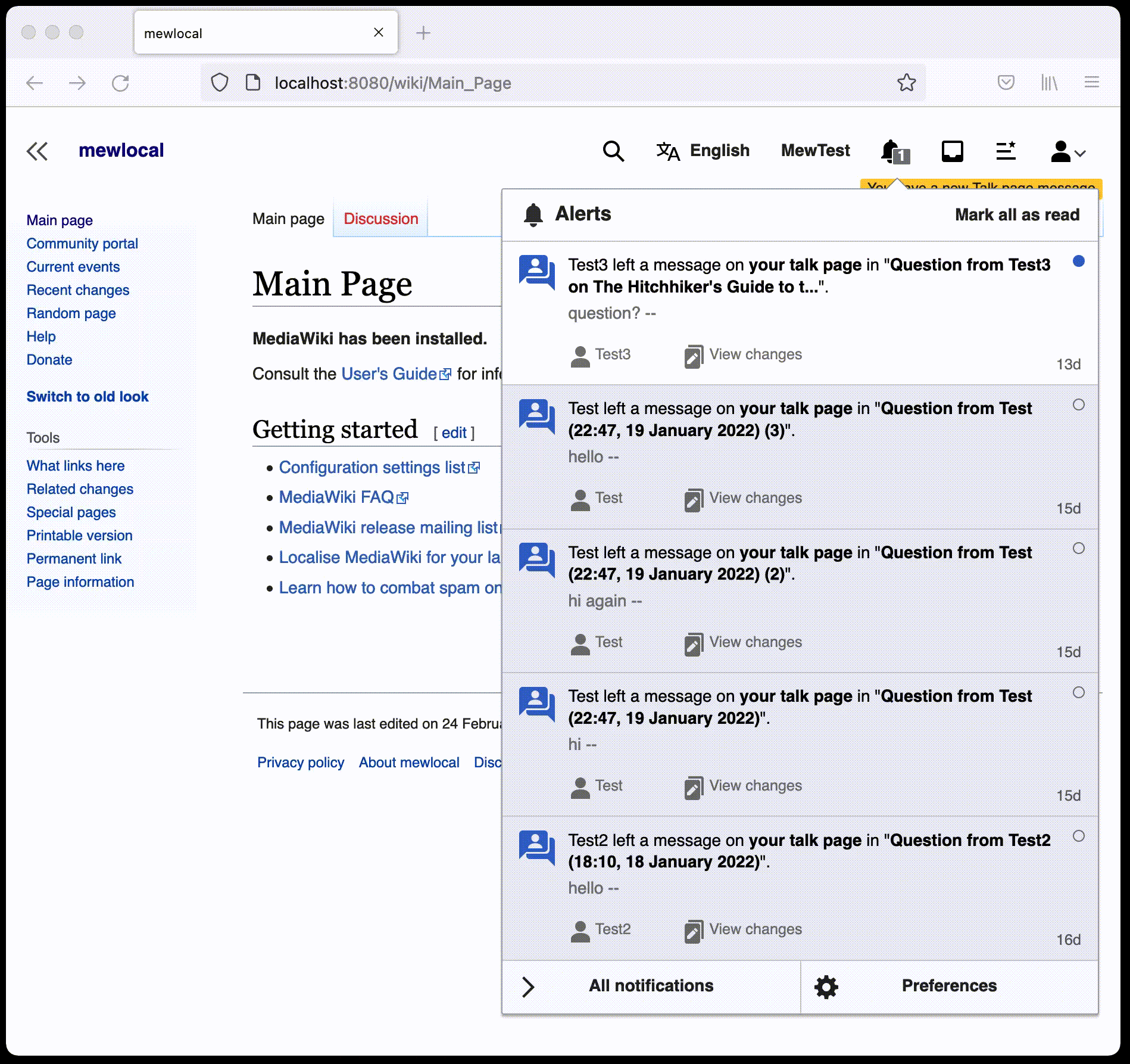
List of steps to reproduce (step by step, including full links if applicable):

  • Use Firefox (haven't tested Chromium)
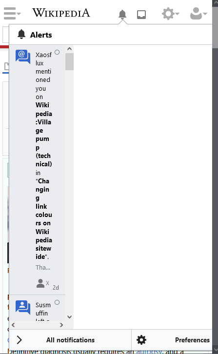
  • Make resolution mobile size give or take.
  • Click on the notifications icon.

What happens?:

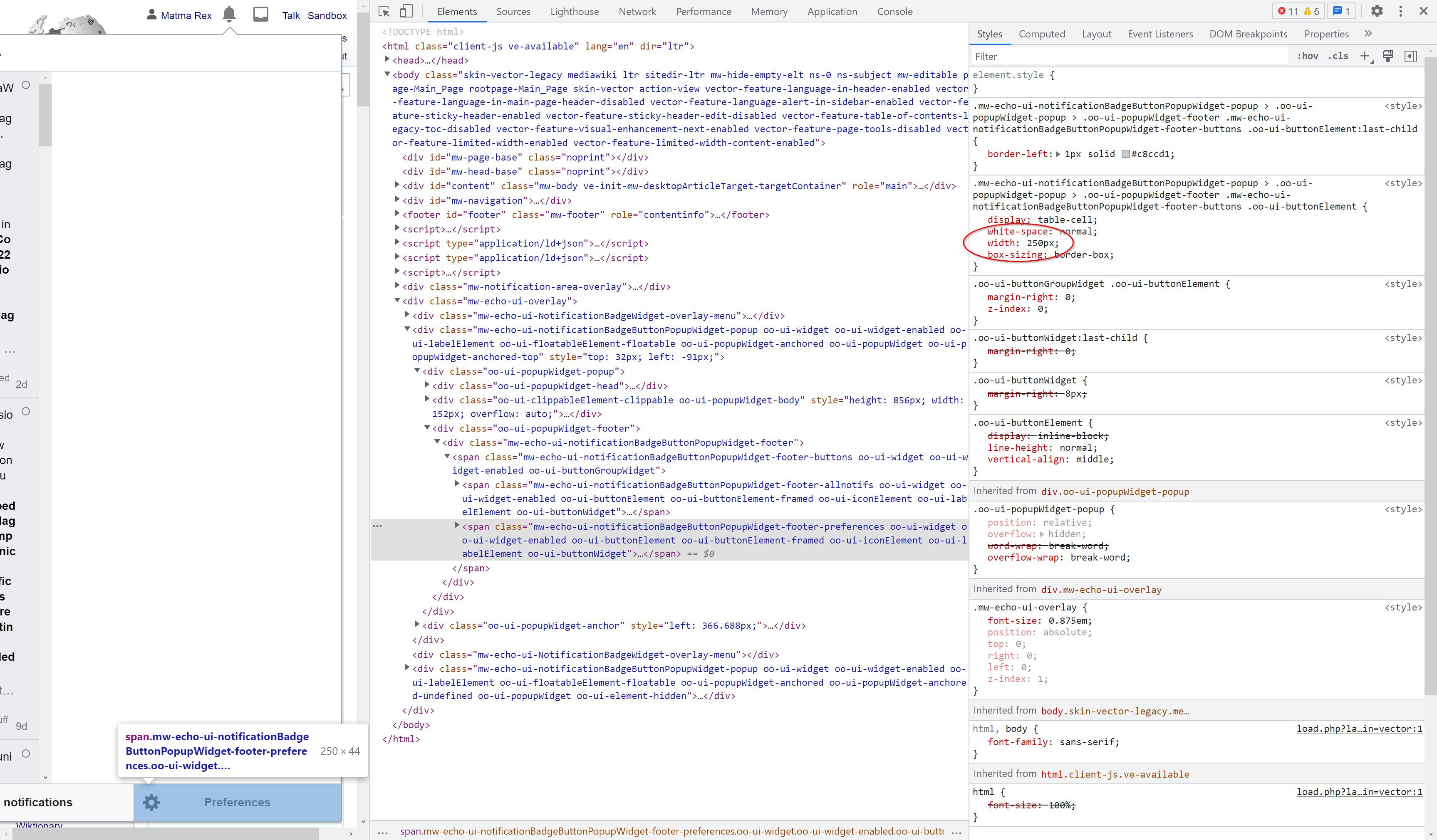
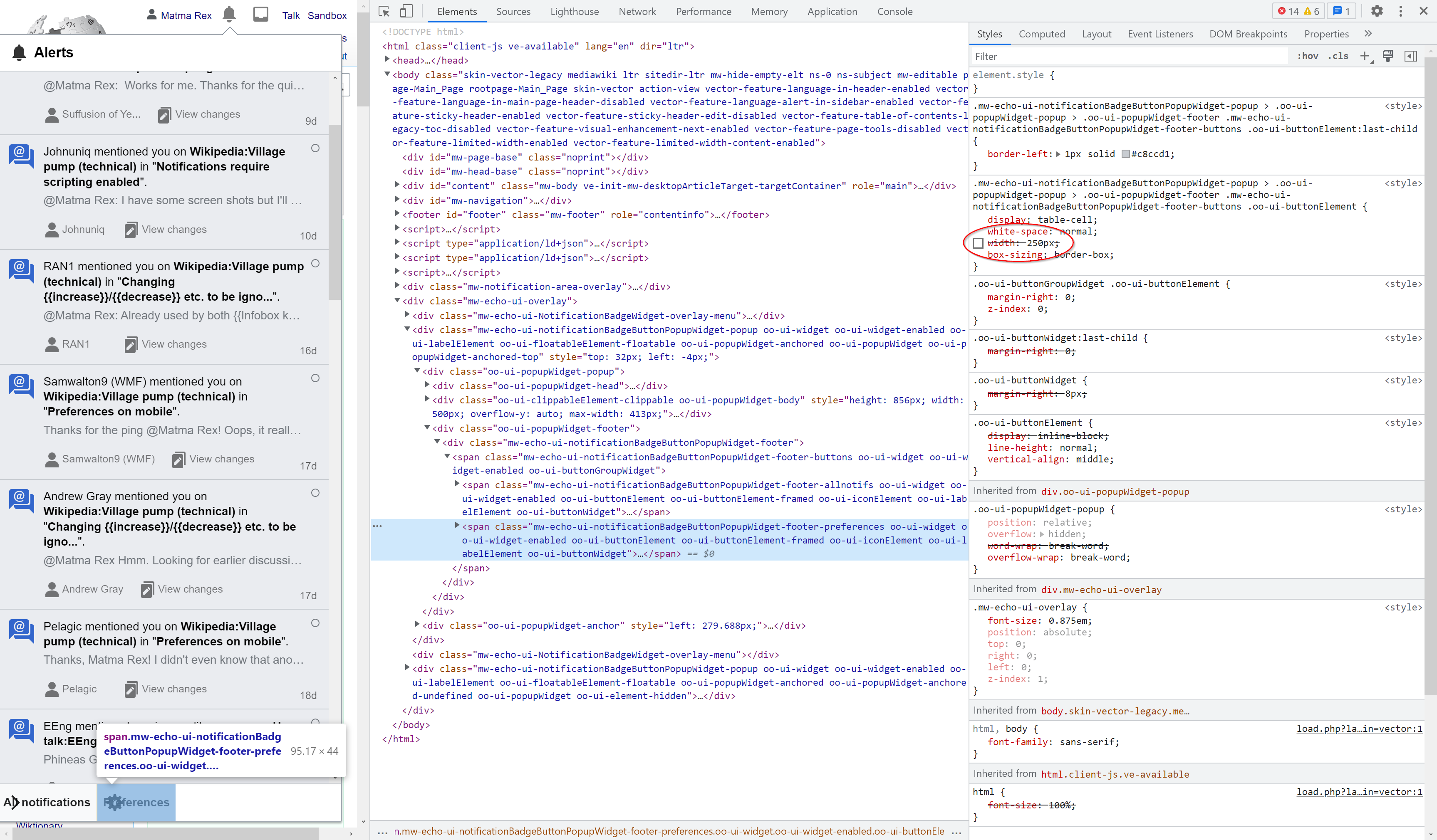
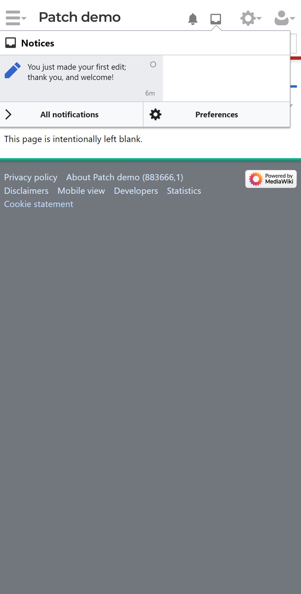
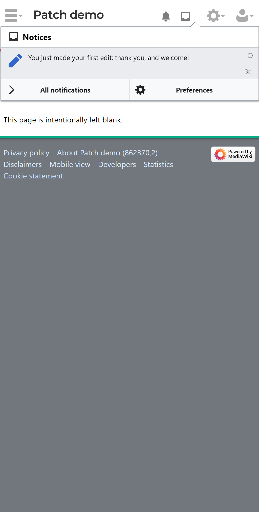
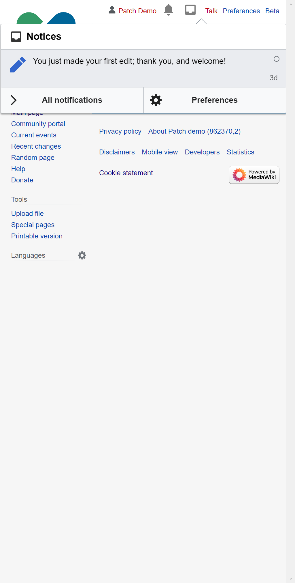
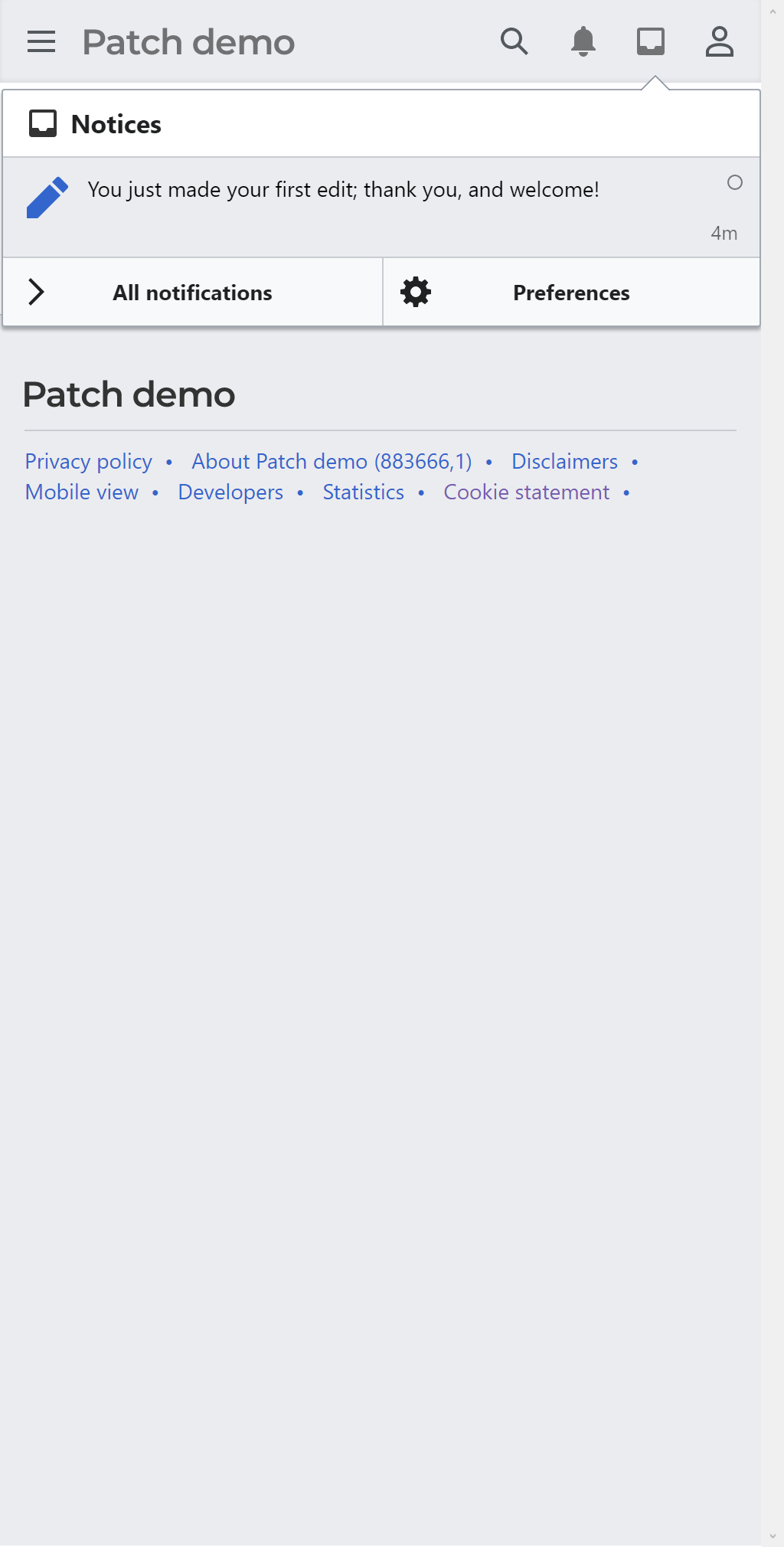
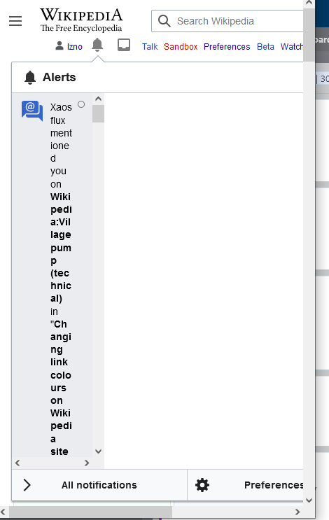
  • For small screens, the notifications dropdown is totally obscured by a white area.
  • For small-medium screens, the notifications dropdown is squished by a similar white area.
  • Minerva seems to be handling this mysterious whitespace decently, relative to the other two skins

What should have happened instead?:

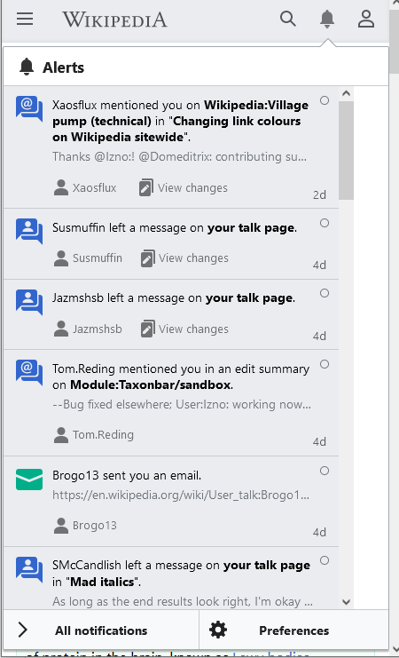
  • Notifications pane displays at full mobile width

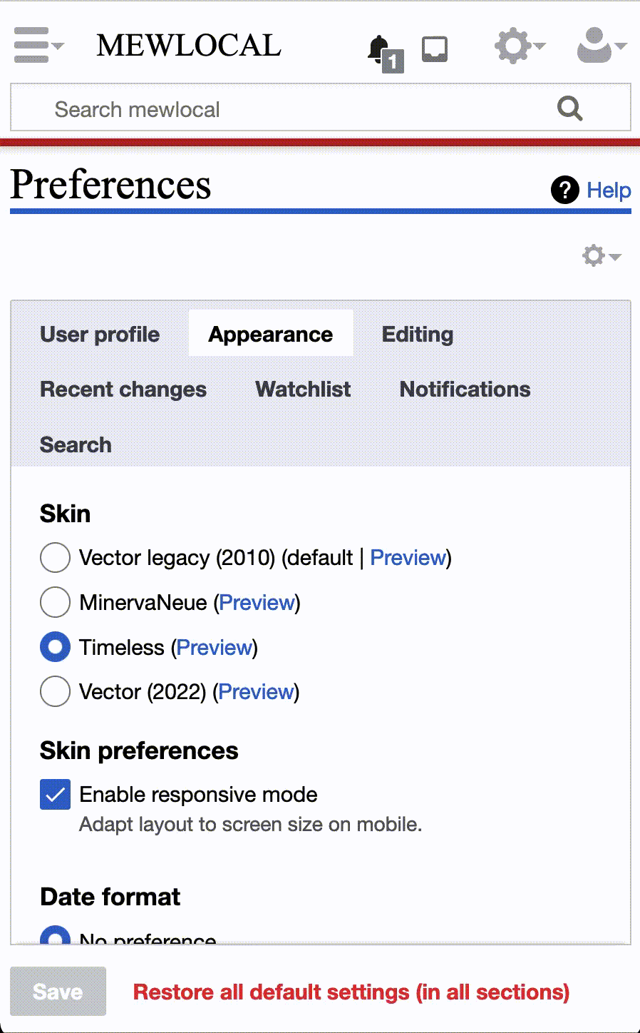
Software version (if not a Wikimedia wiki), browser information, screenshots, other information, etc:

Images are from minimum desktop resolution.

TimelessVectorMinerva
image.png (726×447 px, 19 KB)
image.png (743×470 px, 20 KB)
image.png (741×450 px, 29 KB)

Event Timeline

Restricted Application added a subscriber: Masumrezarock100. · View Herald Transcript

I'm not sure what would have made this regress, but the reason this is not such a problem in Minerva is these hacky styles:
https://github.com/wikimedia/mediawiki-extensions-Echo/tree/master/modules

The fix lies in Echo, perhaps it's time to address the issue at the source at the component level and remove the need for these Minerva hacks?

Fixing this would ideally be done by the Growth team, as the web team has only a small amount of experience of working with Echo.

cc @ovasileva @alexhollender

@ovasileva @Jdlrobson -- thanks for pointing this out. I have a couple questions:

  • It sounds like this is in production now, right?
  • @Jdlrobson -- I heard you might have a patch for this. If you do, could you please add it to the task?
  • @Etonkovidova -- could you please check this and reproduce?

I think we can look at a patch or otherwise help during next week. Does that sound okay to everyone?

CC @DMburugu @kostajh @Tgr @mewoph @RHo

It sounds like this is in production now, right?

Yup.

@Jdlrobson -- I heard you might have a patch for this. If you do, could you please add it to the task?

Nope. I don't have a patch, just a rough idea of how it might be fixed based on work we've previously done in Minerva. I can help with one next week if you need the additional support.

Thanks, @Jdlrobson. I'm having trouble reproducing this on my own, so it would be helpful if you could give me a sense of how pervasive and impactful this issue is. What do you think?

It impacts users who resize their window on a desktop browser (in Minerva (rare), Timeless or Vector) or use the desktop site on their mobile phone (while using Minerva desktop (very rare) or Timeless (more commonly).

replication steps are:

It impacts users who resize their window on a desktop browser (in Minerva (rare), Timeless or Vector) or use the desktop site on their mobile phone (while using Minerva desktop (very rare) or Timeless (more commonly).

replication steps are:

There are several issues for the Timeless skin.
(1) Timeless, Vector (default), and legacy Vector small screens on Desktop (as described in the comment above). The issue is present when the screen size is <530.

vector_small_screen8.gif (1×765 px, 2 MB)

(2) Timeless skin - using Desktop on mobile - the notifications are not displayed. ("Enable responsive mode" is enabled).
Tested on mobile emulators and real devices (iPhone 6s, Samsung Galaxy S8 - screen width 375px). The echo notifications are not displayed (see the screenshot below and the screen recording from iPhone 6s).
Screen Shot 2021-07-26 at 1.02.19 PM.png (1×1 px, 139 KB)
}

This animated gif shows that Timeless Desktop on mobile loads the notifications and immediately replaces it with the blanc. It was recorded on Galaxy S5 browser emulator but the behavior was checked and confirmed on a real device - Galaxy 8:

chrome_small_screen3.gif (805×447 px, 275 KB)
`

@Etonkovidova Thanks for the additional tests. I appreciate your effort and diligence in digging into this. Given that the Timeless skin is more likely to be used, we can schedule it for a bug fix for it.

Jdlrobson renamed this task from Notifications dropdown obscured in Timeless, new Vector at small resolutions to Notifications dropdown obscured in Timeless, Monobook, new Vector at small resolutions.Aug 14 2021, 2:49 PM
Jdlrobson added subscribers: Writ_Keeper, Aklapper.
kostajh triaged this task as Medium priority.Aug 18 2021, 7:54 AM

I don't investigate the cause, but the appearance looks similar to T180173.

Some quick and dirty CSS I added to en:User:Evad37/timeless.css

/* Ensure notifications can be seen on mobile! */
@media (max-width: 850px) {
	.mw-echo-ui-notificationBadgeButtonPopupWidget-popup > .oo-ui-popupWidget-popup > .oo-ui-popupWidget-body {
		width: unset !important; /* overrides inline style */
	}
	
	.mw-echo-ui-notificationBadgeButtonPopupWidget-popup > .oo-ui-popupWidget-popup {
		width: unset !important; /* overrides inline style */
	}
	.mw-echo-ui-notificationBadgeButtonPopupWidget-popup {
		left: 5px !important; /* overrides inline style */
		width: calc(100% - 10px) !important; /* overrides inline style */
	}
	
	/* Hide the little triangle at the top */
	.mw-echo-ui-notificationBadgeButtonPopupWidget-popup > .oo-ui-popupWidget-anchor {
		display: none;
	}
}

(850px is where Timeless changes from mobile to tablet view)

Doesn't address the root cause, but at least makes notifications usable for me with Timelss skin (desktop site) on a mobile phone / small browser width

Change 759626 had a related patch set uploaded (by MewOphaswongse; author: MewOphaswongse):

[mediawiki/extensions/Echo@master] Prevent the content of NotificationBadgeWidget from being clipped

https://gerrit.wikimedia.org/r/759626

From what I can tell, it doesn't look like the notification content itself (notificationItemWidget) needs to be clipped since the content takes up the entire width of the container. This patch adds a hacky fix to override the clippable element, but maybe I'm missing some use case for why the clipping is needed. This seems to address the issues @Etonkovidova identified (animated GIFs below).

Vector

notifications_vector.gif (1×1 px, 3 MB)

Timeless

notifications_timeless.gif (1×898 px, 1 MB)

kostajh changed the task status from Open to In Progress.Feb 4 2022, 3:38 PM

From what I can tell, it doesn't look like the notification content itself (notificationItemWidget) needs to be clipped since the content takes up the entire width of the container.

The clipping is to ensure the popup fits into the viewport. If the viewport is small, the size of the notification list in the popup is reduced, so the popup itself gets smaller, and fits in the screen (with a few pixels of extra space preserved so it looks like a popup and not an overlay). Except the logic seems broken - the left edge of the popup is positioned outside the screen. (As @Lens0021 noted, this is probably the same issue as T180173: PopupWidget is not correctly clipped with left/right edge (other ClippableElements work fine).) That then causes the whole narrowing weirdness: every time clip() runs, the width is reduced by a few pixels. Here's the abridged source code:

//[set viewportRect to the browser window's dimensions]
//[shrink viewportRect by buffer=2*7 pixels to preserve a 7-pixel "frame"]

$item = this.$clippableContainer || this.$clippable;

itemRect = $item[ 0 ].getBoundingClientRect();
availableRect = rectIntersection( viewportRect, itemRect );

desiredWidth = Math.max( 0, availableRect.right - availableRect.left );
extraWidth = $item.outerWidth() - this.$clippable.outerWidth();
allotedWidth = Math.ceil( desiredWidth - extraWidth );

//[use allotedWidth as a the clippable body width]

$clippableContainer is the element that's dynamically sized by reducing the size of $clippable as needed (the two are different to allow for a static header/footer/sidebar). In this case the whole popup is the $clippableContainer and the list of notifications inside is the $clippable.
The basic idea is: take the viewport rectangle (shrunk by a few pixels for safety), intersect with the clippable container, that's the desired target area. Check the difference between the size of $clippable and $clippableContainer - that's the extra width that needs to be preserved for the sidebar. Reduce the desired target width / height with the size of the extra space, that's the size to set for $clippable.

So on a small screen allotedWidth = viewport width - buffer - extra space. But, because of the left edge of the container is outside the viewport, that will be a bit smaller than the container width. That means the extra space (initially 0 - the popup does not have a sidebar) grows a little. The next time the algorithm runs, $clippable will again shrink with that amount of pixels, and so on.

I guess the real question is, why doesn't the container (.oo-ui-popupWidget) shrink when its child element is set to a smaller size? The OOUI logic seems reasonable. First FloatableElement positions the popup so that the popup aligns to the right viewport edge (since NotificationBadgeWidget gives it an absolute width, this will result in the left edge being outside the viewport). Then ClippableElement shrinks the content's width so it's small enough to fit into the screen. (It would need to be re-positioned since the positioning happens via an absolute left attribute but that's a separate problem.) But the container doesn't shrink with it. I would think the problem is that the clipping happens on $body but config.width gets applied to $popup; but changing that doesn't fix the issue (although it becomes somewhat less buggy, the container is still stuck at 500px width event though there doesn't seem to be any reason for it).

kostajh added a project: OOUI.

@mewoph assigning to you as you've posted the patch. AIUI, we need a patch to fix upstream. OOUI, though.

While testing a notification task I came across this issue. If I click "All notifications", on the resulting page, then I click the gear pull-down, the resulting list is off the screen. I'm not sure if this is related to this task or not.

all-notifications.mov.gif (1×888 px, 741 KB)

While testing a notification task I came across this issue. If I click "All notifications", on the resulting page, then I click the gear pull-down, the resulting list is off the screen. I'm not sure if this is related to this task or not.

That is T280839: Preferences link in mobile notifications is broken on phones, not related.

I can still reproduce this:

Vector 2022, FirefoxVector 2022, Chrome

(It seems Chrome doesn't allow decreasing the width below some limit.)

Yeah, this didn't get fixed by the OOUI fix in the subtask, somewhat surprisingly to me.

It looks like now the problem is caused by the two buttons in the footer – each of them has a hardcoded width of 250px, preventing the popup from being clipped to width smaller than 500px. Turning that off improves the situation greatly:

image.png (2×3 px, 579 KB)
image.png (2×3 px, 740 KB)

(the clipping still seems to be a bit funky, but at least you can see the notifications now)

I'll try to find a way to remove the hardcoded widths without breaking the layout of the buttons.

Change 862370 had a related patch set uploaded (by Bartosz Dziewoński; author: Bartosz Dziewoński):

[mediawiki/extensions/Echo@master] Avoid hardcoded width for the popup's footer buttons

https://gerrit.wikimedia.org/r/862370

Change 862370 merged by jenkins-bot:

[mediawiki/extensions/Echo@master] Avoid hardcoded width for the popup's footer buttons

https://gerrit.wikimedia.org/r/862370

matmarex claimed this task.

@Jdlrobson also tweaked my patch to apply some styles on narrow widths that were previously only applied in the Minerva skin. Together these changes give a nice result:

BeforeAfter
Timeless
image.png (2×1 px, 87 KB)
image.png (2×1 px, 84 KB)
Vector
image.png (2×1 px, 99 KB)
image.png (2×1 px, 107 KB)
Minerva
image.png (2×1 px, 71 KB)
image.png (2×1 px, 72 KB)

I consider the issue resolved. It may not be perfect (not sure why the little arrow doesn't line up… I only noticed that when taking these screenshots), but the skins are not really designed for these screen resolutions anyway.

Change 759626 abandoned by Bartosz Dziewoński:

[mediawiki/extensions/Echo@master] Prevent clipping of NotificationBadgeWidget's content

Reason:

Superseded by https://gerrit.wikimedia.org/r/c/862370

https://gerrit.wikimedia.org/r/759626

Amousey subscribed.

Superseded task https://gerrit.wikimedia.org/r/759626 has been abandoned.

Issue still current (MW1.39.2) when (Responsive user preference on)

Also affects Pivot unmaintaned skin. Desktop Improvements (Vector 2022) Timeless

Patch https://gerrit.wikimedia.org/r/759626 got superseded by https://gerrit.wikimedia.org/r/c/862370.
1.39.2 is an outdated version. Please try 1.40.x and comment if this still happens - thanks.