Page MenuHomePhabricator

Layout Guidelines for Forms
Closed, ResolvedPublic

Description

Background/Goal

Currently, Wikimedia projects use different form layouts and there is no clear way to design form pages:

Captura de pantalla 2022-05-03 a las 12.10 1.png (699×1 px, 62 KB)
Form items (and buttons) with fixed or full-width.
3054.png (916×1 px, 77 KB)
Form items with autosized (growing with the length of the text).
Enable Registration Form.png (1×1 px, 86 KB)
Vertical layout of form page instead of using the entire horizontal space.
Screenshot 2022-07-22 at 11.53 1.png (695×1 px, 144 KB)
Form page using the entire horizontal space in the page.
image (3).png (914×1 px, 138 KB)
image (2).png (732×1 px, 170 KB)
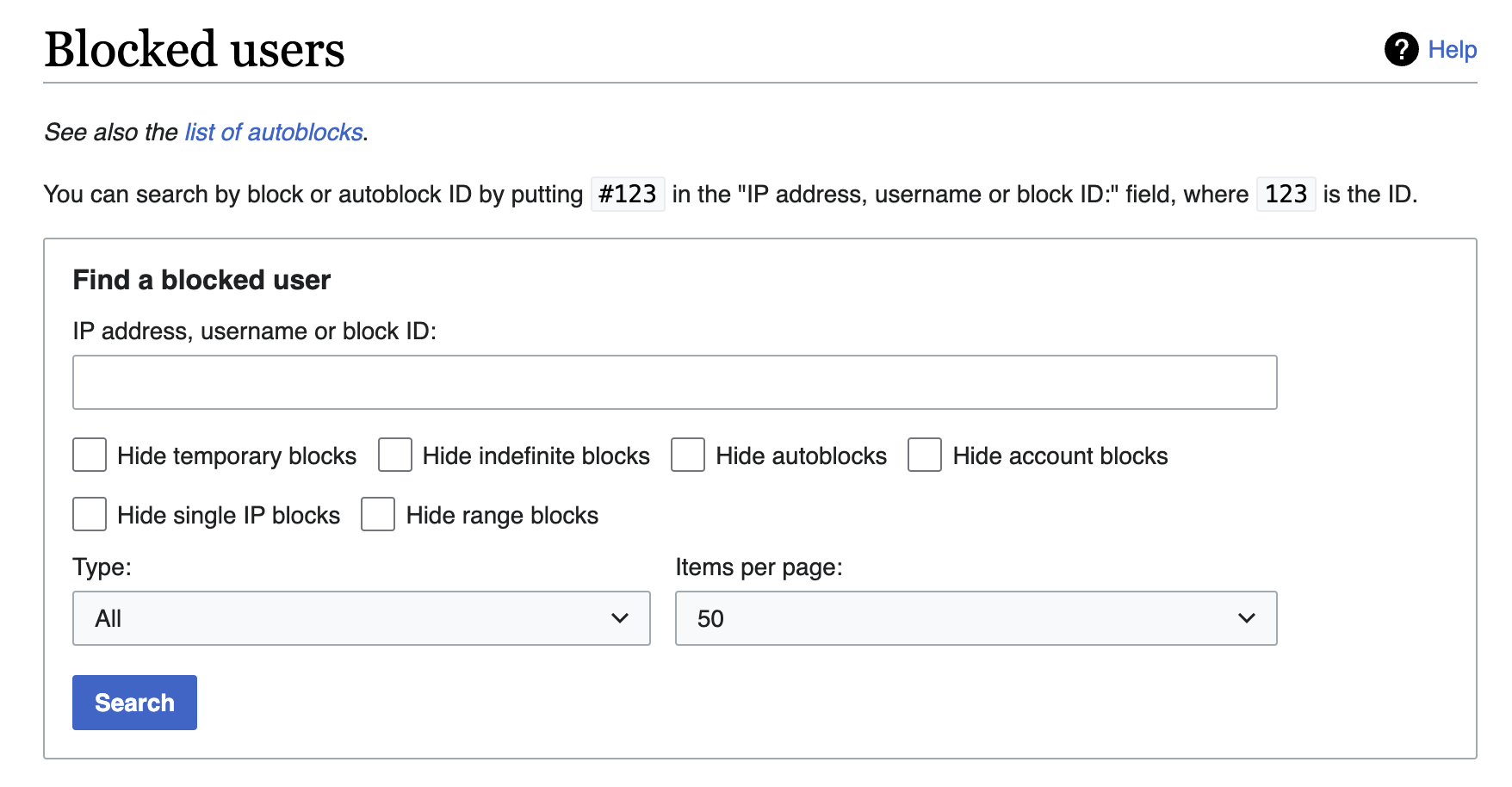
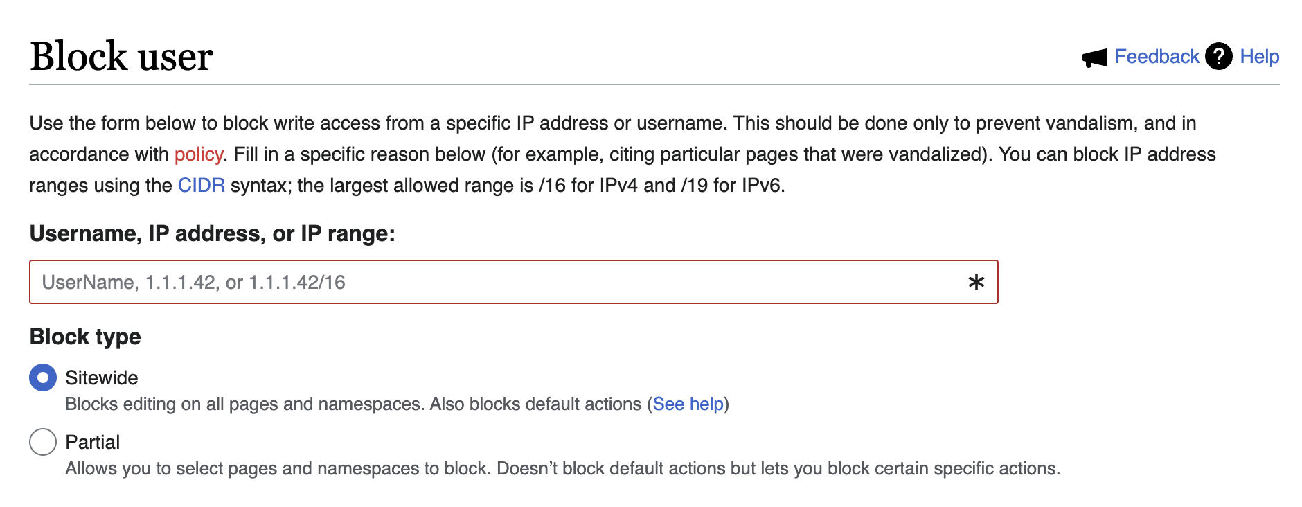
Form items within a Content Box and form items without box.
image.png (620×528 px, 69 KB)
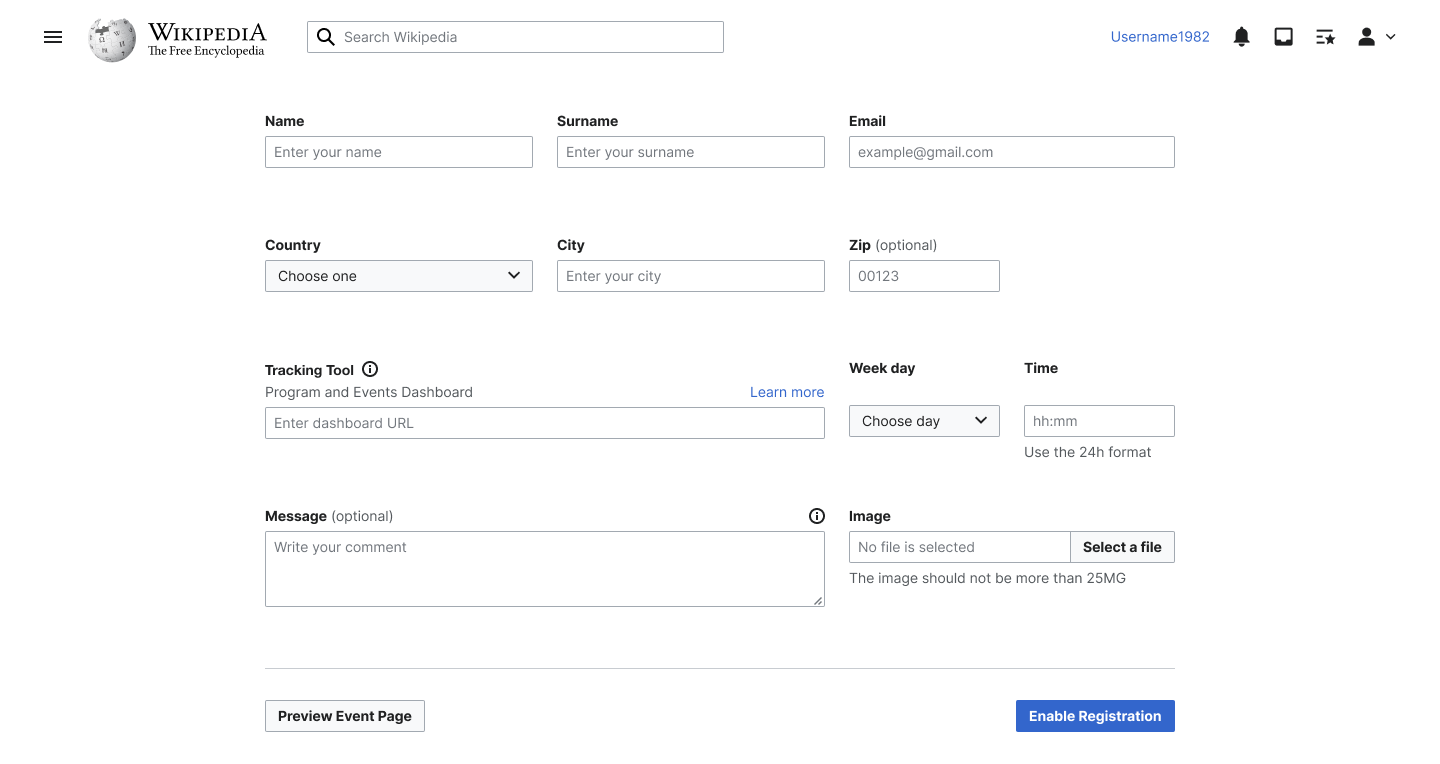
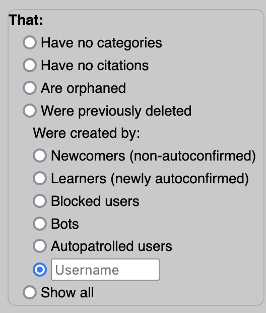
Layout with multi-input fieldsets, including radios/checkboxes where a text input is required.
Captura de pantalla 2023-09-28 a las 16.46.00.png (1×554 px, 112 KB)
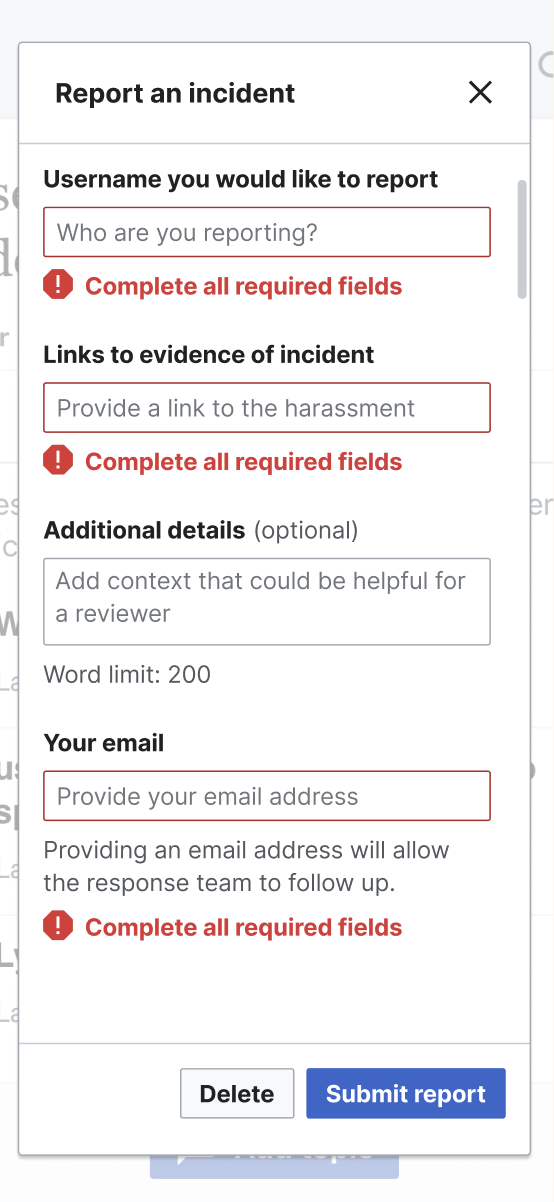
Form within a dialog in Trust & Safety tools.

We need to define guidelines to standardize all Wikimedia forms according to the following:

  1. How to combine form items to best use the entire page space (horizontally and vertically)
  2. How many items could we include on each row
  3. Define the width of the form items (fixed, full or auto size)
  4. Define guidelines to use fieldsets, including radios/checkboxes where a text input is required.
  5. Define guidelines for desktop, tablet and mobile form pages
  6. When is it appropriate to display a form within a dialog and when should it be presented on a new page? (e.g. long forms on a new pages and short forms within a dialog)
  7. When should we include the forms within a content box?

User stories

  • As a user, I need to know how to create forms in the best way and on different screen sizes.

Open questions

  • Should form items be fixed width, full width or grow with the length of the text?

Design proposals

  1. What if we use the entire horizontal space in the page?

Form_A.png (764×1 px, 54 KB)

Acceptance criteria (or Done)

  • Define and document the guidelines for the different use cases described above
  • Represent/Implement guidelines in Codex

Event Timeline

Should this task also cover layout of multi-input fieldsets? This came up during the migration of Special:NewPagePatrol to Vue, which has:

  • A single radio group that also contains a fieldset of related radios
  • A radio with a hidden label that requires filling in a text input

image.png (620×528 px, 69 KB)

Agreed, guidelines should cover all aspects of forms, including this use case. So including this case in the task description.

bmartinezcalvo updated the task description. (Show Details)
CCiufo-WMF moved this task from Backlog to Up Next on the Design-System-Team board.

Change 1007338 had a related patch set uploaded (by Dtorsani; author: Dtorsani):

[design/codex@main] docs: Add forms guidelines to Codex style guide

https://gerrit.wikimedia.org/r/1007338

@DTorsani-WMF I have some feedback about the latest patch:

Token references

I don't think we should be referring to options tokens in these guidelines, especially knowing that night mode is coming. A good example is from https://1007338--wikimedia-codex.netlify.app/style-guide/constructing-forms.html#frames:

The most common style of frames use a border-radius of 2px, or border-radius-base, a transparent background, and a border color of border-color-muted, or color.gray200. Others use no border color and a light gray background color, usually background-color-interactive-subtle, or color.gray100 to emphasize the inputs within the frame.

Codex users don't have direct access to the options tokens, and suggesting they use them would cause problems with other color modes.

Relatedly, for https://1007338--wikimedia-codex.netlify.app/style-guide/constructing-forms.html#spacing, should we refer to decision tokens here instead of pixel values?

Side note: I also think there's a typo/formatting issue with the token references is the opening paragraph of https://1007338--wikimedia-codex.netlify.app/style-guide/constructing-forms.html#table-of-contents.

Footer actions

Is there a reason the screenshots use the large button size for the form footer actions? Although this isn't documented, we're generally limiting usage of the large size until we resolve T338021.

Example below, although all the screenshots with footer actions seem to use the large size:

image.png (244×700 px, 13 KB)

Inline validation

I'm not sure about the definition of inline validation here. It's common for forms to provide validation "inline" (meaning somewhere close to the field itself) after form submission. I agree it's ideal to have the validation appear immediately (on blur or on input), but in some cases forms will not be using JavaScript and the error will come after some validation happens server-side. A good example of this would be if the entire form is entirely CSS-only.

I think I would revise the definition to focus less on the immediacy of the feedback. IMO, the validation being inline is more about having the right context to correct/adjust.

Thanks for leaving this feedback Chris.

  1. Good point about the options tokens. Those have been removed.
  2. Re: using spacing tokens instead of pixels. I will update this to do so, and reference the way we are writing this elsewhere, noting what the pixel value is in the default Codex theme.
  3. Re: typo/formatting issue with the tokens. Already taken care of!
  4. Re: large buttons. I was not aware of this task. I had used the large button in a design, which was received well by a few people including @bmartinezcalvo, and so I wrote the guidance in the way to support this. That's one side of it. The other reason is that since the screenshots can get so small, @Volker_E suggested we use larger, or more so the mobile versions of components so increase the text size to make the images more legible. While technically this means in the screenshots that mobile components are being used in a desktop layout, that tension is being overwritten by the desire to make the images more legible. Happy to discuss this more if we feel it is a big enough issue.
  5. Great point on the inline validation. The intention here is actually not to suggest this as the way to go, but that it is an option if you can/want to use it, but to first rely on validation upon submit. I will rewrite to capture this notion better, because I agree, that is not clear.

Thank you again for going through this patch and leaving some very helpful feedback.

Re: large buttons. I was not aware of this task. I had used the large button in a design, which was received well by a few people including @bmartinezcalvo, and so I wrote the guidance in the way to support this. That's one side of it. The other reason is that since the screenshots can get so small, @Volker_E suggested we use larger, or more so the mobile versions of components so increase the text size to make the images more legible. While technically this means in the screenshots that mobile components are being used in a desktop layout, that tension is being overwritten by the desire to make the images more legible. Happy to discuss this more if we feel it is a big enough issue.

Yeah, unfortunately we haven't resolved how we want to approach sizing in the system yet. We tried to decouple sizing (T338021) from the work around responsiveness (T341192) but it was always really sticky. We introduced the large size specifically to support icon-only buttons on Minerva, where there are accessibility concerns about the touch target. We hint at some of this in https://1007338--wikimedia-codex.netlify.app/components/demos/button.html#button-sizes. There were ideas about larger (or smaller!) buttons to call out relative importance, but we never made any decisions. I leave it to you and @bmartinezcalvo to determine what's best in this case, I just wanted to call out the original intention.

Although the default button size on desktop is 32px (medium button), I think we could use this large button for this specific case. These guidelines are not suggesting that we want to change the base button size on desktop from medium to large. They just recommend using large buttons only in the footer of forms to make them stand out more from the rest of the form items, which I think is a good recommendation. Even though T338021 is not resolved, we could still recommend this use of large buttons only for this specific case and adjust these guidelines after completing T338021 if necessary.

Anyway, if there is a problem for this recommendation for now, we could update the Form guidelines with medium buttons (32px) and create a task to update them once the responsiveness task T338021 is completed.

Thanks for weighing in @CCiufo-WMF and @bmartinezcalvo. It sounds like, based on Bárbara's response, that we should keep the guidelines as they are, and we will suggest using the Large Buttons in forms. Unless there is an objection to that, I will move forward with this decision. Otherwise, I am happy to update the guidelines and images.

Change 1007338 merged by jenkins-bot:

[design/codex@main] docs: Add forms guidelines to Codex style guide

https://gerrit.wikimedia.org/r/1007338

Change 1008950 had a related patch set uploaded (by LWatson; author: LWatson):

[mediawiki/core@master] Update Codex from v1.3.3 to v1.3.4

https://gerrit.wikimedia.org/r/1008950

Test wiki created on Patch demo by ATomasevich (WMF) using patch(es) linked to this task:
https://patchdemo.wmflabs.org/wikis/cd11cbf23a/w

Change 1008950 merged by jenkins-bot:

[mediawiki/core@master] Update Codex from v1.3.3 to v1.3.4

https://gerrit.wikimedia.org/r/1008950