Page MenuHomePhabricator

Very long discussions (horizontal axis) on talk pages become unreadable
Open, LowPublic

Assigned To
None
Authored By
Florian
Oct 26 2015, 11:00 PM
Referenced Files
F36938407: image.png
Apr 3 2023, 8:05 PM
F36899233: image.png
Apr 3 2023, 8:01 PM
F36899231: image.png
Apr 3 2023, 8:01 PM
F36899236: image.png
Apr 3 2023, 8:01 PM
F36899229: image.png
Apr 3 2023, 8:01 PM
F3337094: Unbenannt.PNG
Feb 12 2016, 6:03 PM
F2878249: Talk page
Oct 26 2015, 11:00 PM
Tokens
"Burninate" token, awarded by Sj.

Description

For an experienced or very interested reader of Wikipedia, you will, from time to time, read a talk page (e.g. following the recent unread changes from the watchlist). If the talk page discussion is very very long you'll sometimes get this great view (not scrollable to the left/right):

Talk page (1×1 px, 42 KB)

We should at least find a better readable hack/workaround to make a talk page at least readable in some way, right? :D


From T331624:

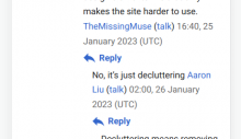
Threads can easily go 8 or more replies deep when users back-and-forth. Although mobile reduces indentation from 1.6em to 1em (22px to 16px), by the type you get to 8 or more replies this can take up half the width of the screen, depending on device resolution:
(e.g. https://en.m.wikipedia.org/wiki/Wikipedia:Requests_for_comment/Rollback_of_Vector_2022/Discussion?dtenable=1#General_discussions)

image.png (242×418 px, 26 KB)

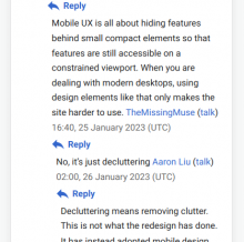
Possible solutions:

  1. Reduce the indentation, e.g. to 0.5em / 8px
    image.png (417×419 px, 56 KB)
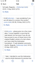
  2. (variant of 1.) Use reduced indentation with a line to emphasise which comments are at the same level, as done in the iOS app
    image.png (911×512 px, 230 KB)
  3. Use no indentation, or decreased indentation beyond some fixed depth (e.g. 4 or 5)
  4. Remove all indentation and connect sub-threads with a single line, as done in Android app
    image.png (911×410 px, 149 KB)
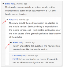
  5. Something something collapsible threads?
    image.png (1×949 px, 133 KB)
  6. ???

Event Timeline

Florian raised the priority of this task from to Needs Triage.
Florian updated the task description. (Show Details)
Florian added a project: MobileFrontend.
Florian added subscribers: Florian, Jdlrobson.
Jdlrobson triaged this task as Medium priority.Oct 26 2015, 11:50 PM

Can I suggest using the :nth-child(even) selector to align these right and align others left?

You mean like a messenger app does it? Would make sense, but let me test, how it looks :)

Hmm, I like your idea Jon, but it seems that the talk page structure is very very complicated to style :/ Example:

Unbenannt.PNG (727×1 px, 108 KB)

Jhernandez moved this task from Incoming to Needs Prioritization on the Web-Team-Backlog board.

@Nirzar How do we want to solve this?

Stop indenting after a certain depth?

Reset indentation after a certain indentation?

What is the ideal design for this case?

Jdlrobson lowered the priority of this task from Medium to Low.Jun 23 2017, 9:44 PM

See https://en.wikipedia.org/wiki/Template:Outdent , which is already used to solve this problem on desktop.

One option would be to duplicate that with CSS, editing length and depth as necessary:

div > dl > dd > dl > dd > dl > dd > dl > dd > dl > dd > dl > dd > dl > dd {
    margin-left: -6.4em;
}
div > dl > dd > dl > dd > dl > dd > dl > dd > dl > dd > dl > dd > dl > dd::before {
    display: block;
    height: 12px;
    width: 8.4em;
    background: url( /* some equivalent image */ );;
    content: '';
}
Jdlrobson renamed this task from Very long talk pages unreadable to Very long discussions (horizontal axis) on talk pages become unreadable.Nov 6 2019, 7:12 PM
Jdlrobson changed the task status from Open to Stalled.Mar 26 2021, 10:19 PM

Stalled per T278590

@Yair_rand a max indent, after which everything starts there, seems the simplest idea; outdenting seems a lovely if more complex one. Either would be a great improvement.

@Jhernandez an oldie but goodie :)

I can't tell why this is stalled from looking at the umbrella ticket. What's the current status?

The mobile app seems to cap talk page indents at level 1 -- which is almost no threading at all (the "reply-to" icon doesn't link to the section it is replying to), but never unreadable.
Desktop on mobile seems to use a single em for each indent, which works a bit better, but still breaks down at high indents.

A combination of the two that caps at sth like level 6 would work for most cases.

Jdlrobson added subscribers: ppelberg, matmarex.

Yep. Not sure what the latest on this is. @matmarex @ppelberg - is this on your radar?

This is very much not a demonstration of something that works better for deep discussions on mobile, but it might be a useful visualization: https://en.wikipedia.org/wiki/Special:DiscussionToolsDebug?pagetitle=Wikipedia%3AVillage_pump_%28technical%29

That shows the data that's available to something using the DiscussionTools APIs (as the mobile-apps do now), rearranged into something akin to a reddit-like thread display. Given that it mostly works well, we actually have a lot of flexibility going forwards to reformat talk pages in highly constrained environments...

(@ppelberg is on a break)

The plan is to replace the entire feature with the https://www.mediawiki.org/wiki/Talk_pages_project

In T116686#8751874, @Sj wrote:

@Jdlrobson : still the plan?

That plan has in fact been completed: T298060: [RELEASE TICKET] Offer Mobile DiscussionTools at All Wikis

It didn't include a fix for the indentation problems though. We've brainstormed some ideas about indentation on T331624 (looks like we forgot about this task – I'll merge them), but as far as I know we're not planning to implement any of them right now.

matmarex changed the task status from Stalled to Open.Apr 3 2023, 8:01 PM
matmarex updated the task description. (Show Details)
matmarex added subscribers: Esanders, Tacsipacsi.

Oh, @DLynch and I we were commenting at the same time :D

I like a combination of 2 / 3 / 5:

Use reduced indentation with a line to emphasize which comments are at the same level, as done in the iOS app; cap indents at some depth (5-6); collapsible threads.

The collapsing makes the greatest improvement to reading experience.

@DLynch that's a very cool viz indeed, thank you for sharing. That can be quite useful on desktop too (see also: how well used the collapse templates are!)
I hope we can get some indentation solution on the roadmap.