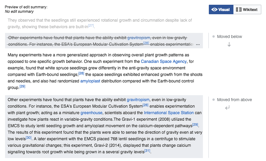
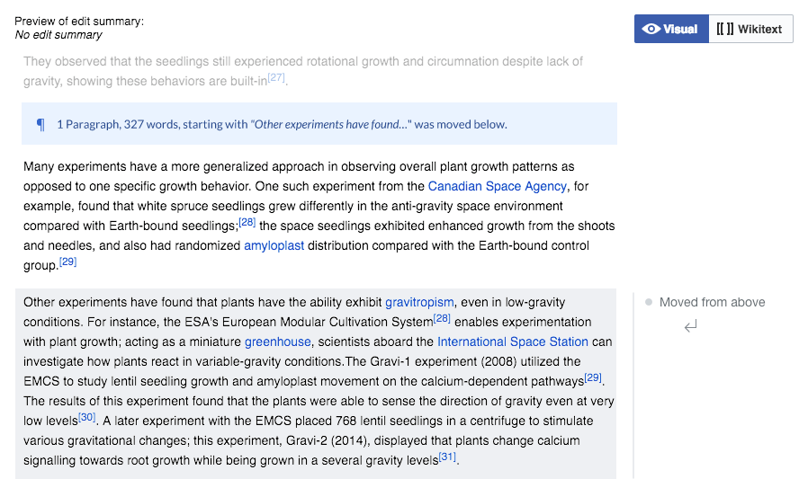
Based on the analysis that @Prtksxna, I captured some ideas about the following points (illustrated with a mockup below):
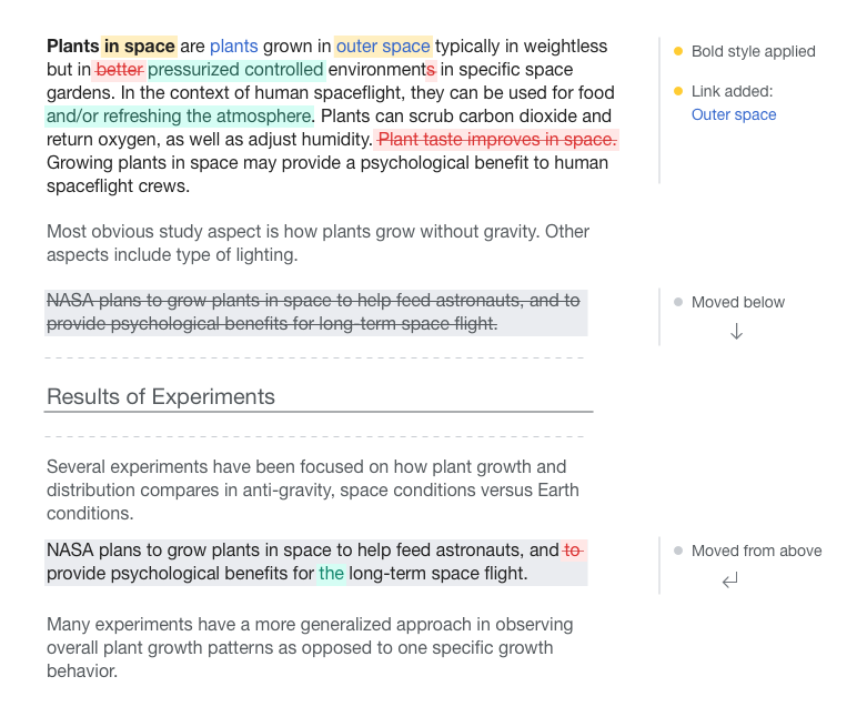
- Show formatting and link changes as side notes. This can help to avoid content edits become too verbose. That is, tell the user that a link was added instead of showing a word deleted, the same word with a link, and let the user figure out what changed. This helps to focus the red/green comparisons for content changes, while style and other information is captured at the side. In the examples I used a different color (yellow) to signal those annotations.
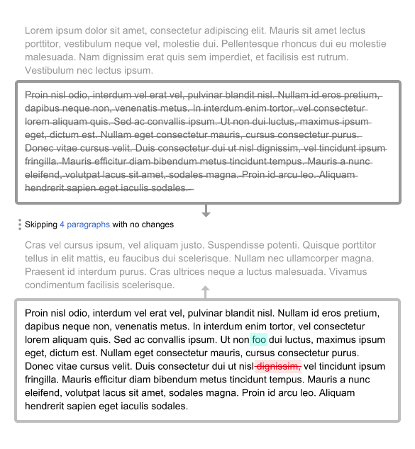
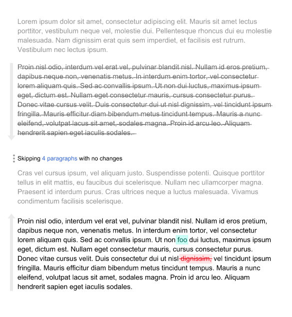
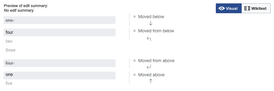
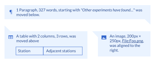
- Make it clearer how the paragraphs were moved. The current triangles are not obvious to understand where a paragraph was removed from and added to. In the example, I used the stroked text to show the place where content was (stroked but not in red since the content has not disappeared completely from the document) and green to show where it has been inserted. side annotations help to connect the dots: hovering will highlight both, an clicking on one may scroll to the other (in which case we may make arrows in blue to convey interactivity). Intermediate paragraphs that just move up because another paragraph was moved, are not signaled.