Page MenuHomePhabricator

[Investigate] Should some OOUI-icons be different on ar-wiki?
Closed, ResolvedPublic

Assigned To
Authored By
Charlie_WMDE
Oct 19 2017, 12:01 PM
Referenced Files
F22191593: image.png
Jun 13 2018, 2:38 PM
F22191590: image.png
Jun 13 2018, 2:38 PM
F22190837: image.png
Jun 13 2018, 2:07 PM
F18064511: image.png
May 7 2018, 11:44 PM
F18064514: image.png
May 7 2018, 11:44 PM
F10428838: Screenshot_20171024_145624.png
Oct 25 2017, 1:00 PM
F10428834: Screenshot_20171024_135420.png
Oct 25 2017, 1:00 PM
F10428836: Screenshot_20171024_142631.png
Oct 25 2017, 1:00 PM

Description

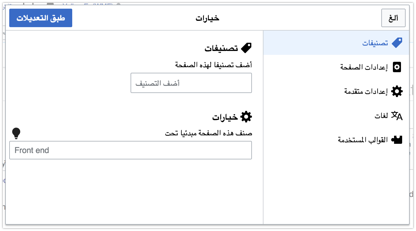
We have gotten feedback that the OOUI "i"-icon is not a common symbol used on arabic wikipedia and is generally not a relevant symbol in arabic. Instead it was suggested to use a sun-symbol for example but I couldn't find any examples of that being used anywhere.

Are the any guidelines whether the i-icon should be used throughout the wikis, regardless of it's understanding in different languages in favor of a uniform design or do we prioritize recognition?

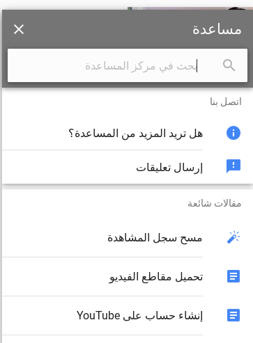
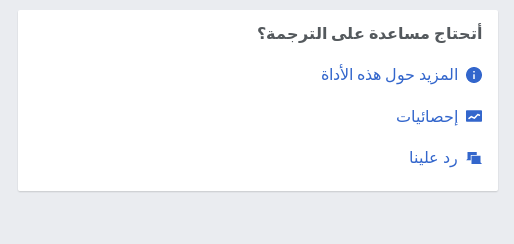
I tried finding examples of its usage or the lack thereof on ar-wiki and could only find one example of it being used

Screenshot_20171019_112548.png (244×514 px, 8 KB)

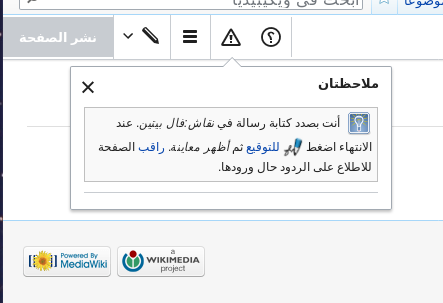
and one where it seems like an i-icon should have been used but I couldn't find the equivalent dialog in de-wiki or en-wiki

Screenshot_20171019_112056.png (303×443 px, 24 KB)

A second issue raised was that the questions mark icon is sometimes turned around and sometimes isn't. Is that something mediawiki-related or do the developers need to manually set a direction for the icon? Since there are many inconsistencies on ar-wiki I assume the latter although I really hope I'm wrong and it's just some weird bug.

Any help or information would be appreciated.

Event Timeline

Restricted Application added a subscriber: Aklapper. · View Herald Transcript

First things first, icon selection is based on user interface language (except in rare cases inside VisualEditor where it needs to be based on content direction too). So we can't change things for arwiki, but we could change things for Arabic interface users. Intentionally, it'd be consistent in all experiences.

Instead it was suggested to use a sun-symbol for example but I couldn't find any examples of that being used anywhere.

It was never used anywhere, and was finally deleted last week.

and one where it seems like an i-icon should have been used

Do you mean the odd blue-grey light bulb? That's a community-created template being displayed with an icon selected from Commons and nothing to do with the interface (sadly).

A second issue raised was that the questions mark icon is sometimes turned around and sometimes isn't. Is that something mediawiki-related or do the developers need to manually set a direction for the icon? Since there are many inconsistencies on ar-wiki I assume the latter although I really hope I'm wrong and it's just some weird bug.

The "help" icon (see https://doc.wikimedia.org/oojs-ui/master/demos/?page=icons for the whole list) is horizontally flipped in rtl languages except he and yi, yes.

So to clarify, it should always be turned around on ar.wp. If in some place it isn't, that's a bug.

@Charlie_WMDE Also to clarify, where was the feedback received and where was it “Instead […] suggested to use a sun symbol”?

Thanks everyone for your feedback!

First things first, icon selection is based on user interface language (except in rare cases inside VisualEditor where it needs to be based on content direction too). So we can't change things for arwiki, but we could change things for Arabic interface users. Intentionally, it'd be consistent in all experiences.

So if the arabic-interface-using community would voice and interest in replacing the info icon with another symbol, would that be possible?

Do you mean the odd blue-grey light bulb? That's a community-created template being displayed with an icon selected from Commons and nothing to do with the interface (sadly).

Yes. This was one example I could find where I assume an info icon would have been sensible but the community opted to use something more relatable to them.

@Charlie_WMDE Also to clarify, where was the feedback received and where was it “Instead […] suggested to use a sun symbol”?

This was feedback we asked for from a community member to figure out potential RTL issues with the advanced search feature we're currently working on.

So to clarify, it should always be turned around on ar.wp. If in some place it isn't, that's a bug.

This was the observation of the community member that he shared in the email as well as mine when browsing ar-wiki, trying to find instances of the help icon myself.

The "help" icon (see https://doc.wikimedia.org/oojs-ui/master/demos/?page=icons for the whole list) is horizontally flipped in rtl languages except he and yi, yes.

Yes, the mirrored question mark is only found in arabic-script languages today.

The idea of a different icon for 'information' goes for all non-latin script languages. A light bulb (or a sun) seems pretty universal.

Perhaps we should entirely remove the "info" icon, since the current symbol is indeed quite language-specific? We already have the "help" and "alert" icons (represented by a question mark and an exclamation mark), which are a lot more language-neutral, and which could probably replace it in most cases. A "hint" icon represented by the lightbulb could maybe be added, or perhaps a "guide" represented by a book or something.

Icon nameImage
info
info.png (24×24 px, 282 B)
help
help-ltr.png (24×24 px, 483 B)
help-rtl.png (24×24 px, 494 B)
alert
alert.png (24×24 px, 388 B)

While it is possible to maintain different versions of the icon for different languages, in this case it would require us to create a list of all Latin-script or non-Latin-script languages we support, and keep it up to date forever as MediaWiki adds support for new languages.

I wonder how this is handled in other products for a global audience relying on the “information” icon like Firefox, Google Chrome or GMail. See GMail screenshot below with “i” on Updates:

image.png (215×2 px, 18 KB)

Any ar user able to give insights?

I have done a little research yesterday, which should definitely be taken with a grain of salt since I can't read arabic and my search was probably not very representative. Therefore I would still appreciate any feedback from someone comfortable with ar websites. I'd like to share my findings anyway:

The first thing I foud was this quora question from 2014 which points towards the i-icon being a regular symbol, even if there's no connection drawn to the latin letter i much like the floppy disk is unfamiliar to many users nowadays but is recognized as the save-symbol anyway.

I couldn't find any other discussions of this topic online so I researched popular websites in arabic and started browsing them in hopes of finding the i-icon.

I must have searched through at least a dozen pages and only found 4 which used the icon, two of which were airline websites:

Screenshot_20171024_135420.png (564×1 px, 55 KB)

Screenshot_20171024_142631.png (481×952 px, 50 KB)

Screenshot_20171024_150851.png (354×344 px, 20 KB)

This is youtube.

Screenshot_20171024_145624.png (493×363 px, 23 KB)

Most Latin language websites that offer an Arabic language version will just use the same symbols and if necessary mirror them. Since most of the popular -originally Latin language- websites, like twitter/facebook/youtube/google etc are also some of the most popular pages in Arabic speaking countries, that might explain the familiarity with the icon.

Since I couldn't support the claims of the community member with my findings, I will contact them again, to find out more about their perception of the symbol and what compelled them to ask for a change, and will report back here.

I do think, whether the usage of Latin letters in iconography is sensible, is generally an important discussion to be had so no matter the outcome for this case, I'd like to continue that discussion.

I do think, whether the usage of Latin letters in iconography is sensible, is generally an important discussion to be had so no matter the outcome for this case, I'd like to continue that discussion.

We do agree on this, we've not only stated this clearly in our Design principles as first and foremost matter, but also in the icon principles under “Universal rather than culturally-specific”.
In certain cases there's a clear need for widening the discussion to involve affected people as you've stated above.

@Volker_E

So seeing that there is a notion to change or at least investigate the i-icon or rather what it represents and in the interest of maintaining integrity with out icon principles, I think it would make sense to ask more non-Latin-language speakers what their stand on this issue is.

I'm not familiar with the best approach to find this out. Maybe you have experience with this already?

@Bmueller Would you mind putting your input from the Stockholm workshop in here? Thanks!

@Bmueller Would you mind putting your input from the Stockholm workshop in here? Thanks!

We didn't discussed this in detail in Stockholm. Goal of the session was to explore what hinders/helps diversity from a technology/user's point of view, and to discuss how we can bring more local expertise into the Wikimedia software development (e.g. from different language communities), and why this is important.
We used the info icon as one example (among others) to illustrate potential gaps in our technology, design work, communication and collaboration processes.

Citing user @Zack (from Moroccan user group) from M229#4124

  • The Question mark - in Arabic-script languages (Farsi, Urdu, Modern Arabic...) it's mirrored
  • Bell 🔔 and language 文A icons, I know everyone can guess what they mean. But, the Wiktionary logo was changed from "W" to one with nine different-language characters, more like the Wikipedia logo. People react better to familiar signs. here here and here we can see examples of language icons. For notifications, a "sound" icon - like this concept - is universally more familiar. It's harmonious with other non-real objects like the speech bubbles icon for alerts.
  • The checkmark is strangely okay to this right-handed Arabic Wikipedia user and doesn't need mirroring
  • The open book icon, I share Amire80's feeling, that it looks better mirrored

Change 423808 had a related patch set uploaded (by VolkerE; owner: VolkerE):
[oojs/ui@master] icons: Provide RTL 'help' icon for Arabic, Farsi & Urdu

https://gerrit.wikimedia.org/r/423808

@Zack

I can't speak to bell being culturally insufficient, but I need to say, that 'sound' is a concept often used with volume and that's fairly different from our interaction concept of notifications. Similarly globe is used in various websites as indicator for different country/language selections, f.e. changing from adobe.com to adobe.com/de. This is not the usage case for the language switcher. It changes the interface language, but doesn't provide a switch from let's say de.wikipedia.org to cn.wikipedia.org.
Therefore those icon suggestions might fall short on the metaphoric meaning.
I'd like to invite @Pginer-WMF to chime in on the case of the 'language' icon's universality as he's responsible for the language team's design quests.

@Zack would you also provide us with feedback on the questions originally stated in this task, for example the latin “i” icon?

I'd like to invite @Pginer-WMF to chime in on the case of the 'language' icon's universality as he's responsible for the language team's design quests.

Language is a very abstract concept. Common representations include (a) characters, (b) the earth globe, (c) a speech bubble or (c) a combination of them. All of them have their own issues:

  • Characters, relies on text on icons, although it is not intended to be read in this case since it is just used to illustrate the diversity of scripts.
  • The globe is also associated with geolocation. Users finding an icon-only version of it may expect to get the map/coordinates associated with the content.
  • Speech bubbles are also associated with discussion. Users finding an icon-only version of it may expect to find the discussion page about the content.
  • A combination of the above may result in too dense shapes, making it not suitable for small sizes.

Given the above, the characters option seems the less problematic. If we need to represent the Wiktionary project at a similar size, we may want for it to have a distinctive look, but I don't see this as a major concern considering the issues of the alternative options.

Change 423808 merged by jenkins-bot:
[oojs/ui@master] icons: Provide RTL 'help' icon for Arabic scripts

https://gerrit.wikimedia.org/r/423808

Perhaps we should entirely remove the "info" icon

I'm think it's more sustainable a solution

to create a list of all Latin-script or non-Latin-script languages

.

I wonder how this is handled in other products

Localisers tend to keep icons as is. Literal translation or sticking to the origin: it's what translators do when they don't have the equivalent in mind (many non-Latin Wikipedias have "B" as the editing toolbar icon for bold by default -- I still remember the first time I saw "B", I didn't know what it did).

The point is that all language-based icons perhaps should be language-relevant.

Back to the info icon, in AdvancedSearch, it's an 'i' in German Wikipedia but a light bulb in the Arabic. Having an alternative representations for language icons makes the interface seem more suitable.

@Zack We could achieve something like this in OOUI interfaces:

image.png (800×1 px, 78 KB)

Do you see this as improvement over

image.png (806×1 px, 81 KB)

?

@Zack Would you clarify, what icon are you referring to here:

image.png (708×1 px, 99 KB)

GlobalPreferences for the win.
@Zack ok, so just a different variation of the lightbulb. I assumed you point to a different icon metaphor.

Change 454421 had a related patch set uploaded (by VolkerE; owner: VolkerE):
[oojs/ui@master] icons: Use 'lightbulb' in Arabic and Farsi in place of 'info'

https://gerrit.wikimedia.org/r/454421

Volker_E triaged this task as Medium priority.Aug 21 2018, 9:47 PM
Volker_E moved this task from Backlog to Reviewing on the OOUI board.

Change 454421 merged by jenkins-bot:
[oojs/ui@master] icons: Use 'lightbulb' in Arabic and Farsi in place of 'info'

https://gerrit.wikimedia.org/r/454421

Volker_E claimed this task.

This will go out in v0.28.1 of OOUI. Thanks @Zack for the helpful feedback!

Volker_E edited projects, added OOUI (OOUI-0.28.1); removed OOUI.
Volker_E removed a project: Patch-For-Review.
Volker_E removed a subscriber: gerritbot.

One thing that sometimes leave me frustrated is the assumption that Arabic and Persian are the same language, these two share a similar script (practically the same but still a little bit different) but Persian is an India-European language and Arabic is a Semitic language. Persian is way closer to Turkish (Turkish before Atatürk used to use the same script), Sanskrit or even German than it is to Arabic. And Arabic is closer to Hebrew than it is to Persian. Anything about them should not be considered the same. This is one of the cases. If you look at the most used files in Persian Wikipedia, the "i" icons have been used extensively while the light bulb icon has not been used at all. I have no memory of seeing the light bulb as an information indicator in my life.
Please remove Persian. "i" icon is okay but if you think you really need to change it to something else, the "?" icon seems okay (judging by website of Tehran airport website and Iran air website)

@Ladsgroup Thanks for clarifying! I was actually mentioning you here and on the patch in order to receive feedback about the assumption. The merge was accomplished very quickly this time, but hasn't seen light of production yet. Sorry and fix is on the way.

Change 454462 had a related patch set uploaded (by VolkerE; owner: VolkerE):
[oojs/ui@master] icons: Revert and only use 'lightbulb' in Arabic

https://gerrit.wikimedia.org/r/454462

Change 454462 merged by jenkins-bot:
[oojs/ui@master] icons: Revert and only use 'lightbulb' in Arabic

https://gerrit.wikimedia.org/r/454462

Comment above still stands true, this last change on current task targeting Arabic language icon representing “info” with a lightbulb metaphor, will roll-out with OOUI v0.28.0.

Restricted Application added a subscriber: alaa. · View Herald TranscriptJan 7 2022, 2:48 PM