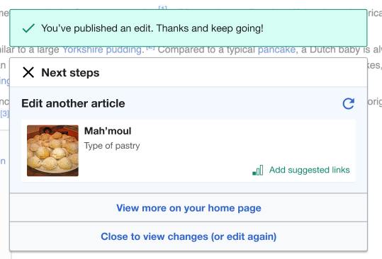
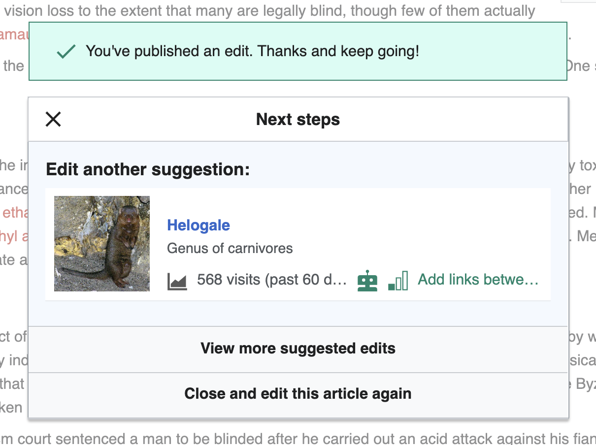
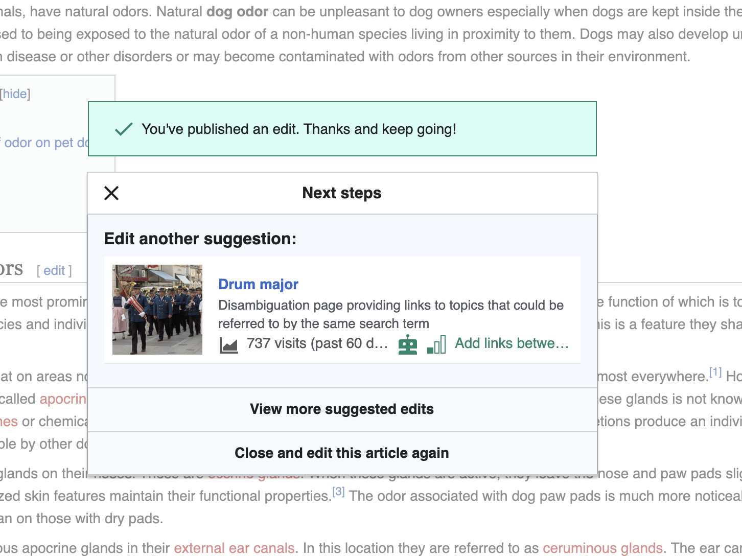
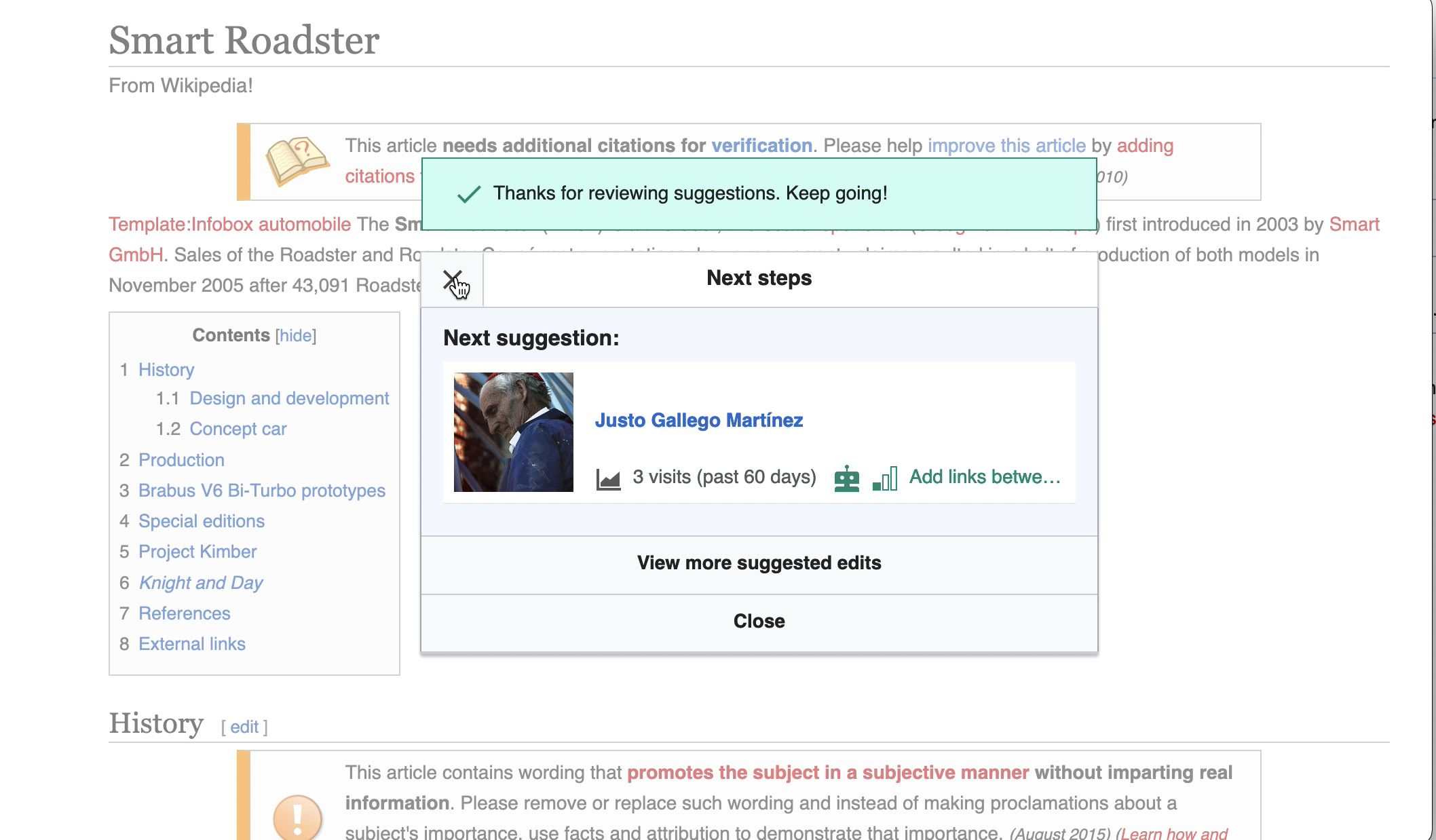
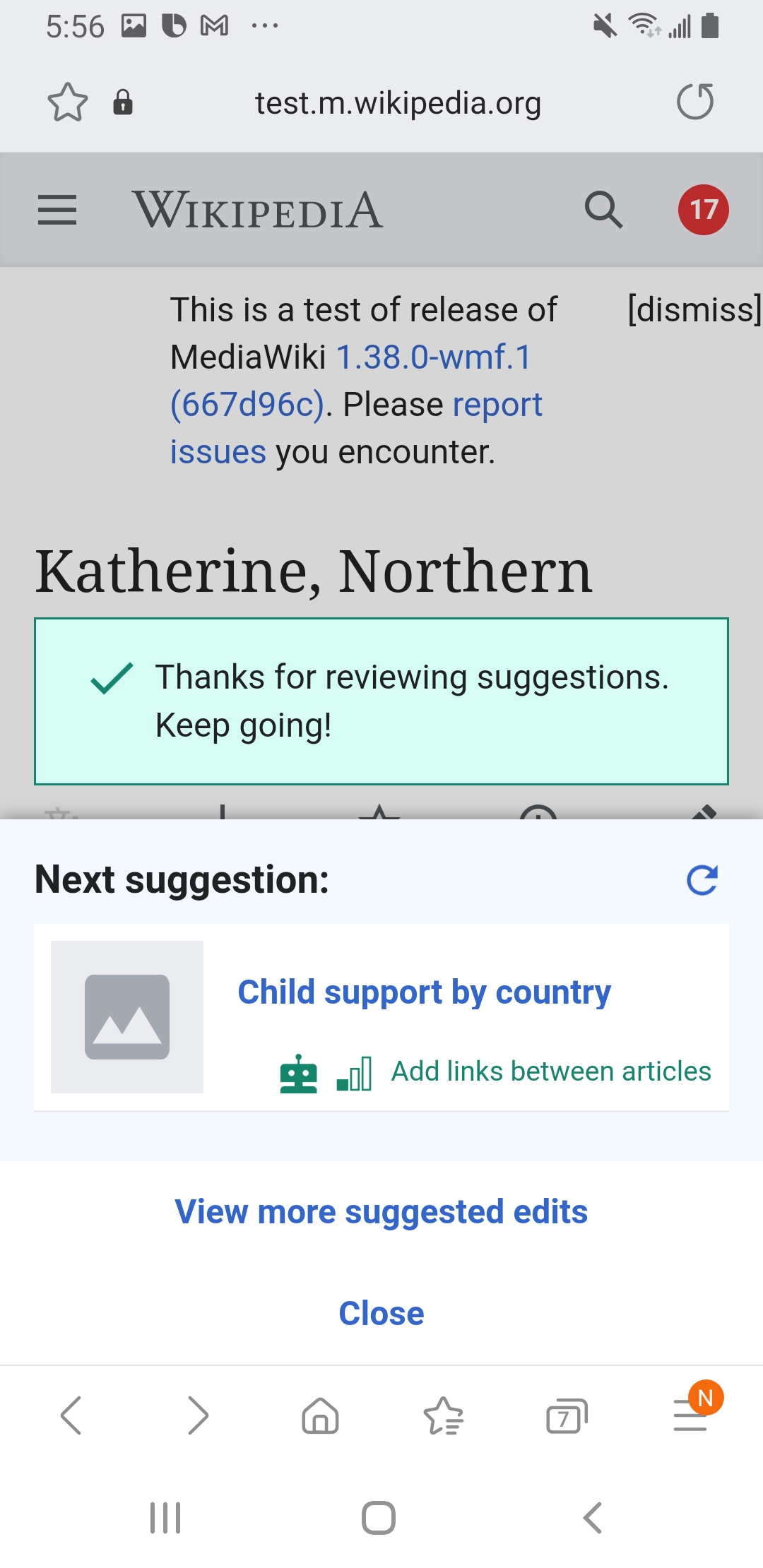
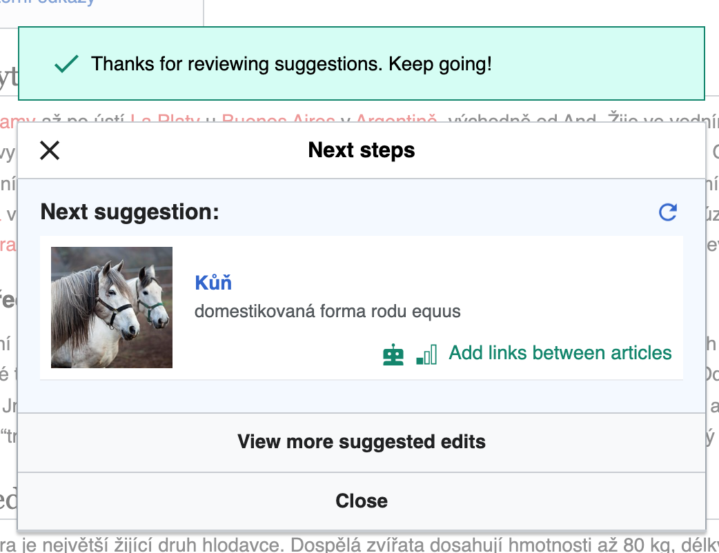
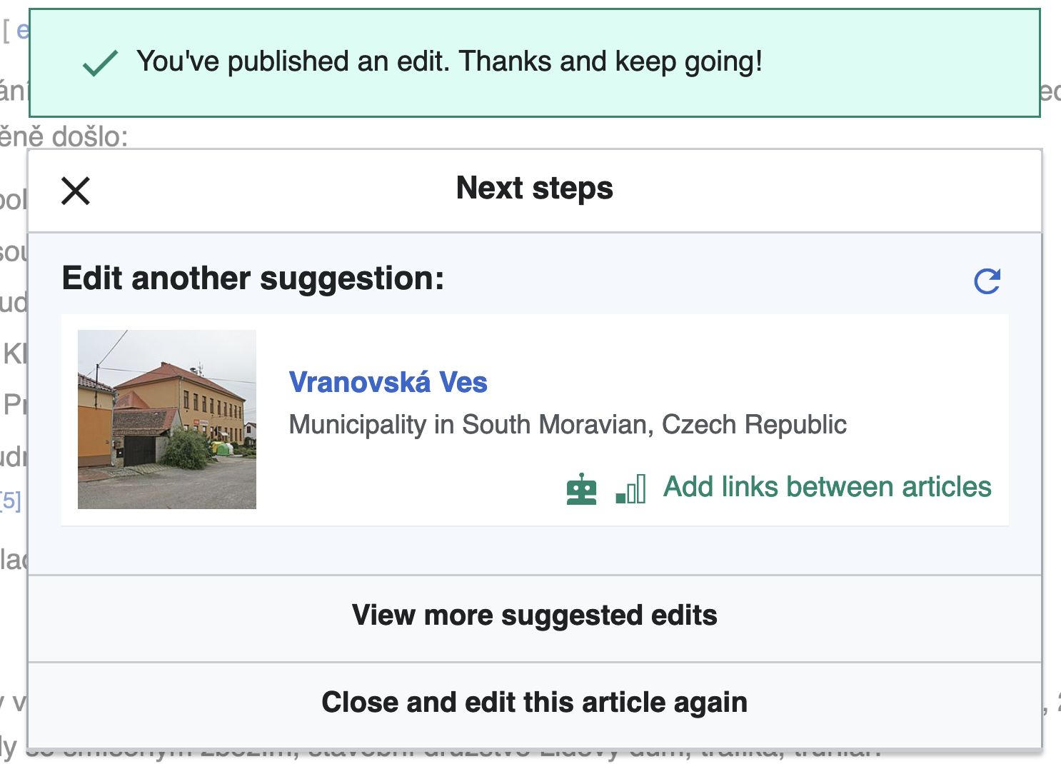
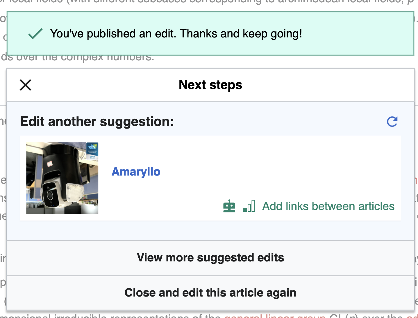
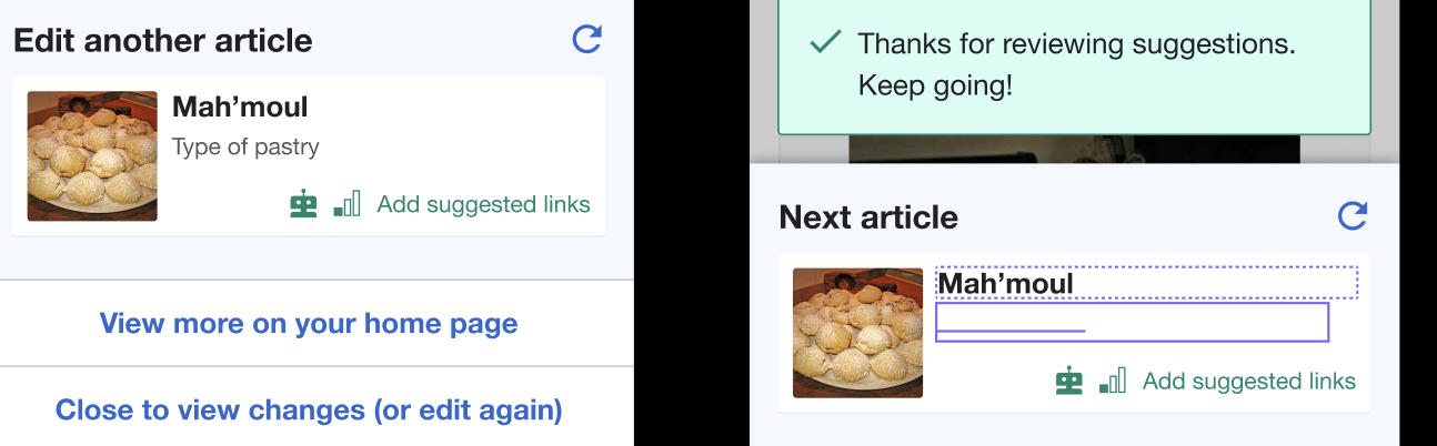
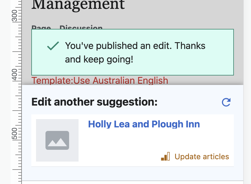
After the user publishes (when they have chosen "yes" at least once) or submitted (when they have not chosen "yes" at least once), they go to the post-edit dialog state. This is almost exactly the same as the post-edit dialog we built for the "guidance" effort in T245790: Newcomer tasks: post-edit dialog, with a few changes.
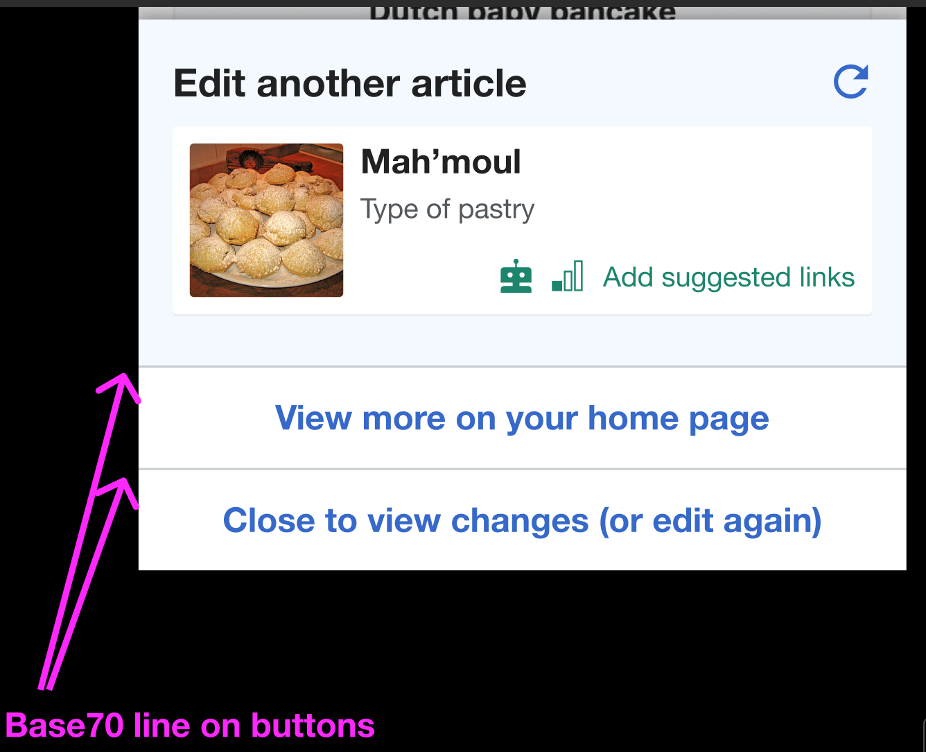
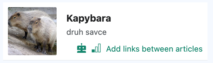
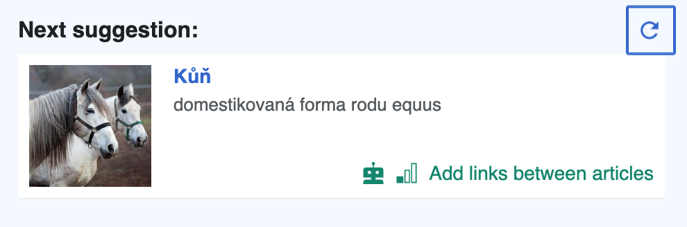
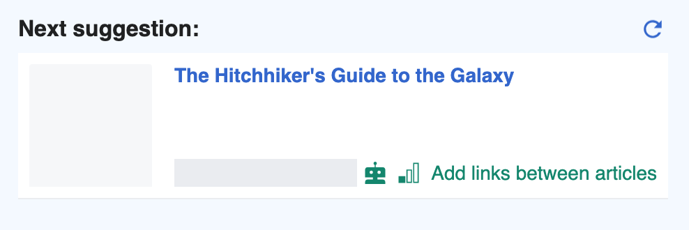
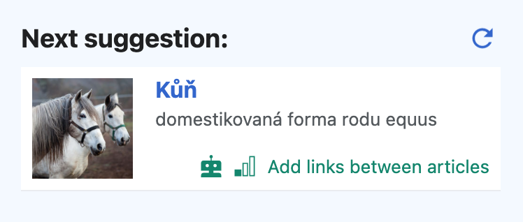
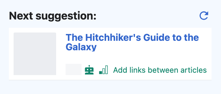
- The suggested task should be another "add a link" task from that user's selected topics of interest.
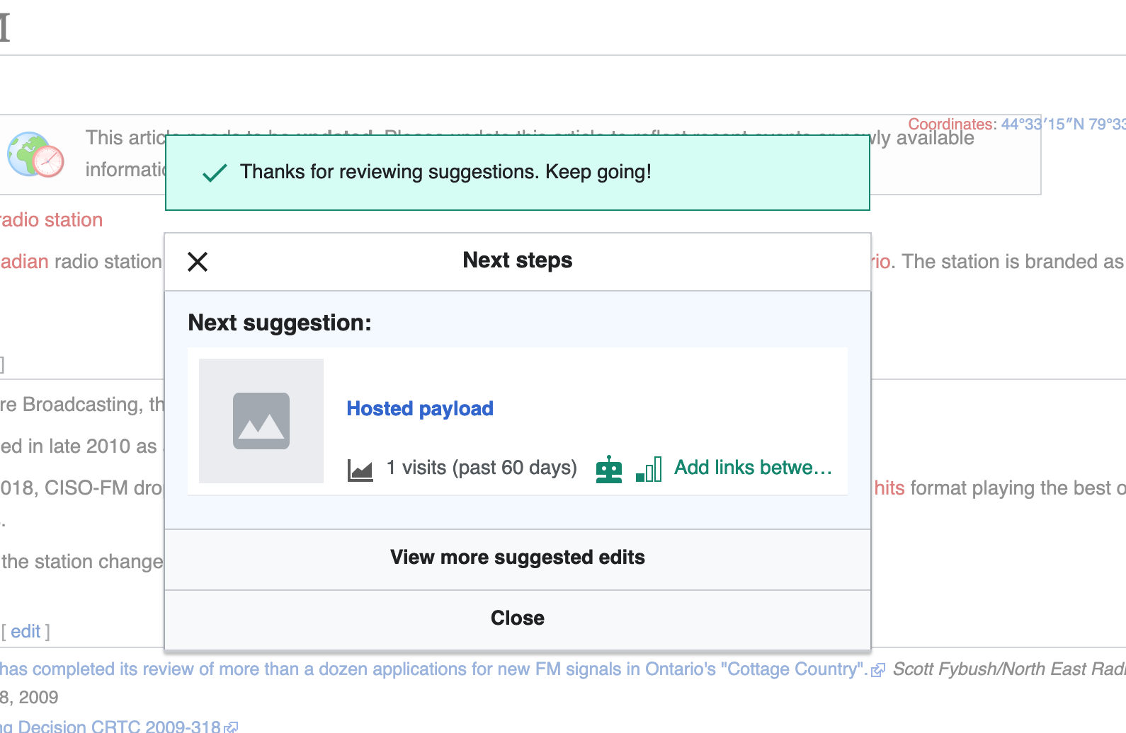
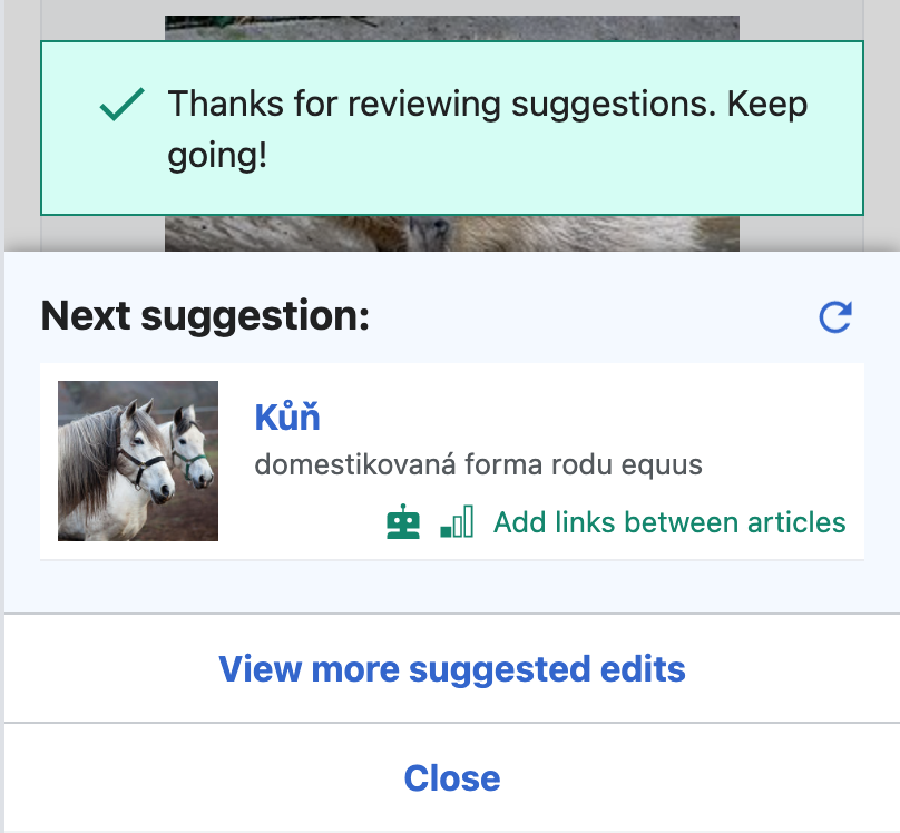
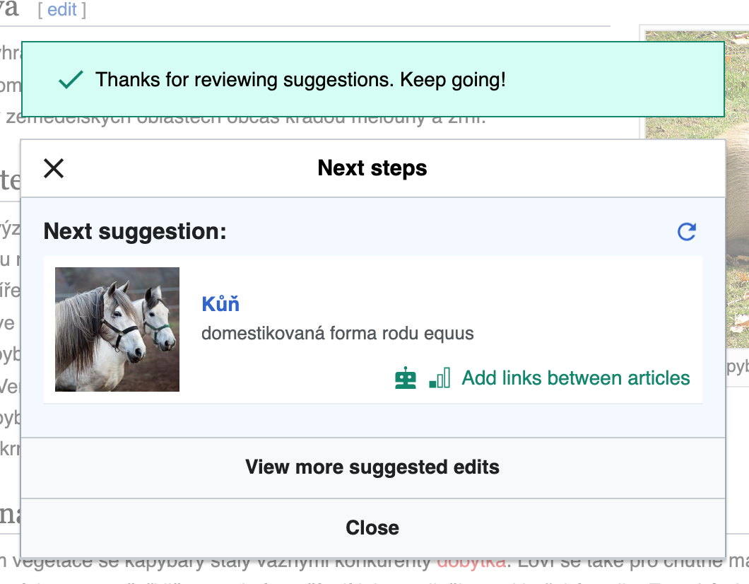
- If the user had not chosen "yes" at least once:
- The banner above the dialog should read: "Thanks for reviewing suggestions. Keep going!"
- Instead of "Edit another suggestion:", the header in the body should read: "Next suggestion:"
- The bottom button on the dialog, which reads, "Close and edit this article again", should just say "Close".
- If the user dismisses the dialog, they should be in read mode.
Mobile mockups as of 2021-01-12:  | Desktop mockups as of 2021-01-12:  |
NOTE: Refer to Figma for up-to-date detailed redline mocks and specs:
Mobile: https://www.figma.com/file/2SONd8P1tsexIB5coMOp8h/Growth-Structured-tasks?node-id=181%3A65
Desktop: https://www.figma.com/file/2SONd8P1tsexIB5coMOp8h/Growth-Structured-tasks?node-id=112%3A0