User Story
As someone who is using a temporary account,
When I decide to Create an account or Log in,
I want to know if the temporary account edits will be associated with the user account,
So that I can proceed to account creation/log in being assured temporary edits will be separate.
Figma MVP mocks here: https://www.figma.com/file/xECM2hD7vEemP91M9YAQBC/IP-Masking?type=design&node-id=1020-26694&mode=design&t=sKS7HcUAXz97VCel-4
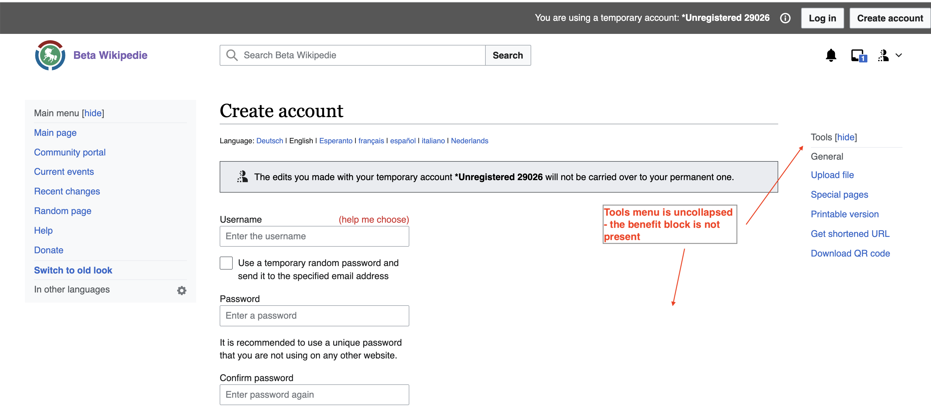
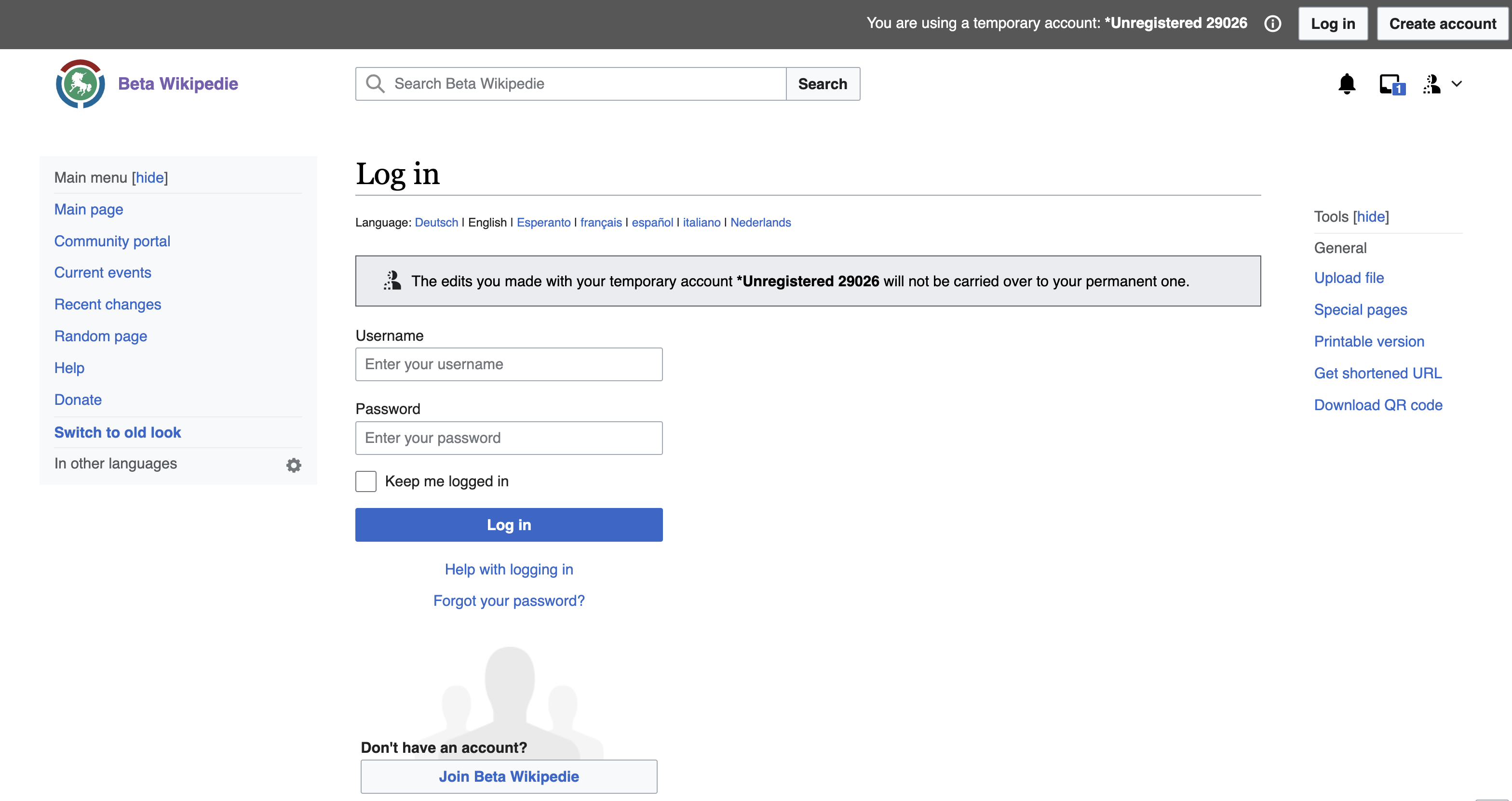
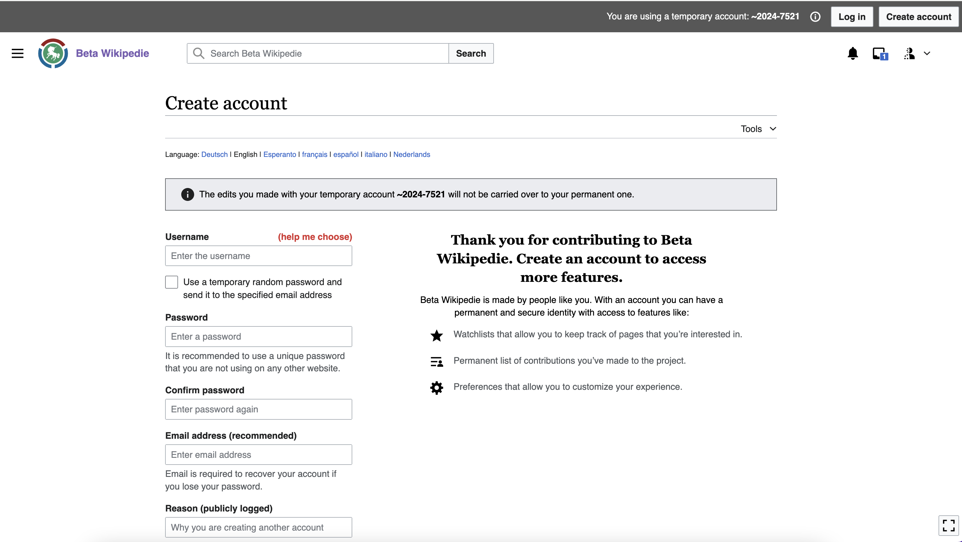
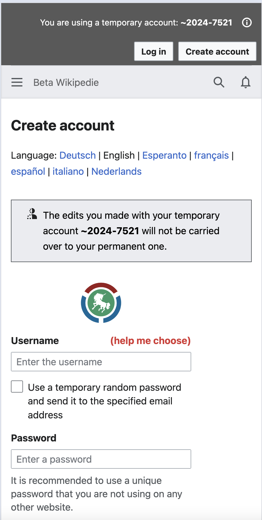
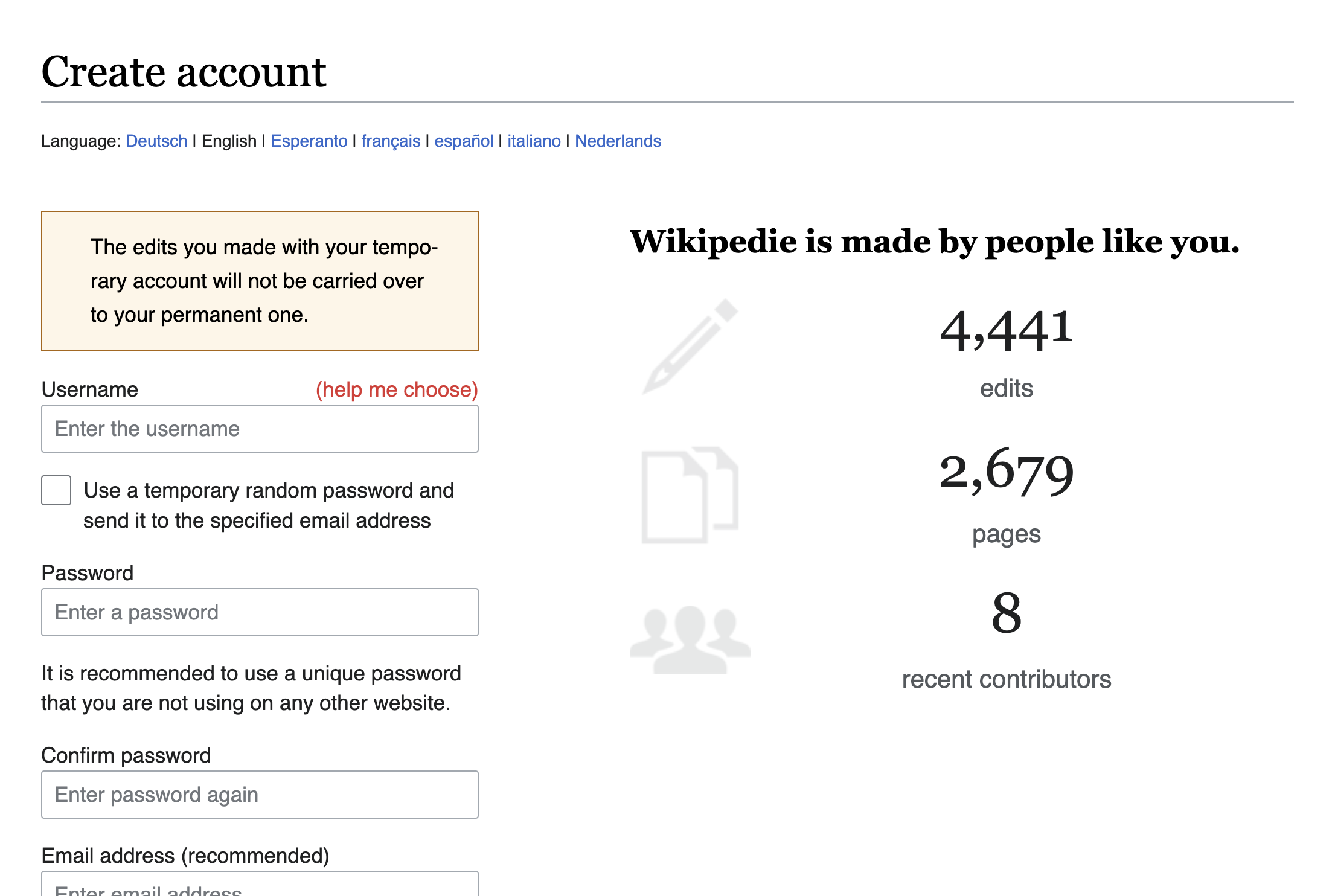
Currently, when a temp user clicks on Create account or Login, the following banner is displayed, which uses the incorrect warning style message and also outdated copy:
Acceptance Criteria:
Given I'm logged into a temporary account,
When I navigate to create an account or Login,
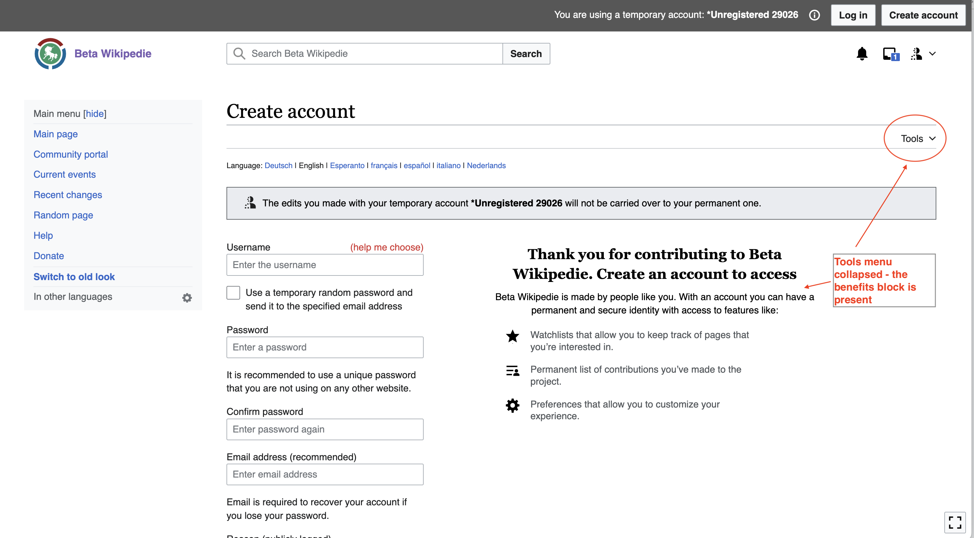
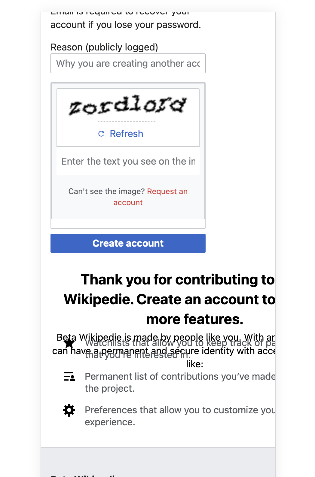
Then the create account form displays a message as shown in the designs below
- Updated styling of the notice (The edits made with this temporary account .... will not be connected to your new account)
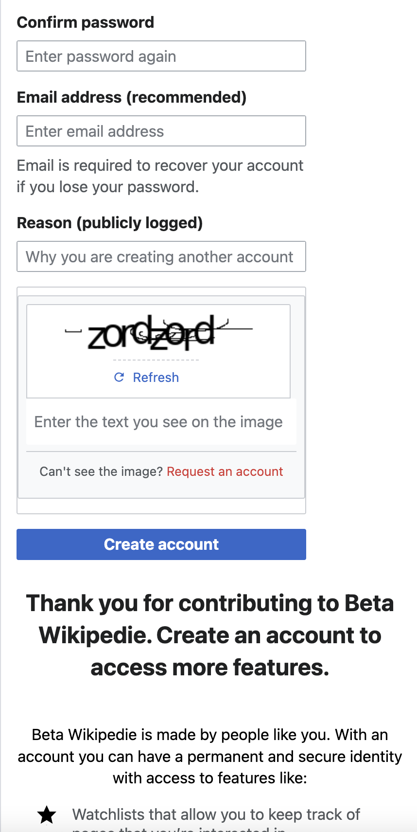
- Updated styling of the benefits block (Thank you for contributing to Wikipedia. Create an account to access more features...)
- Instrumentation: ensure we can track impressions, success, and abandonment rate on this form tracked in T346327
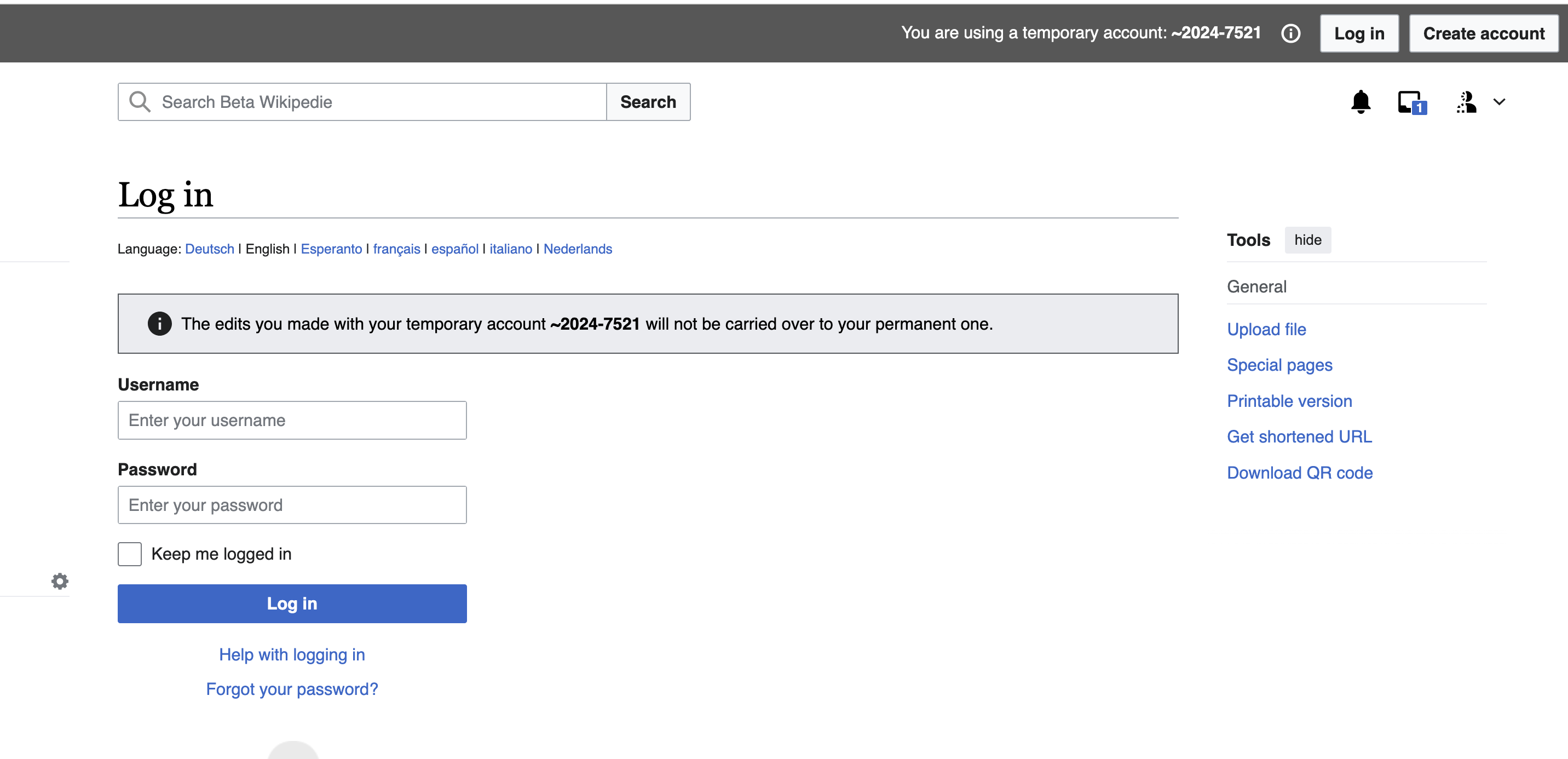
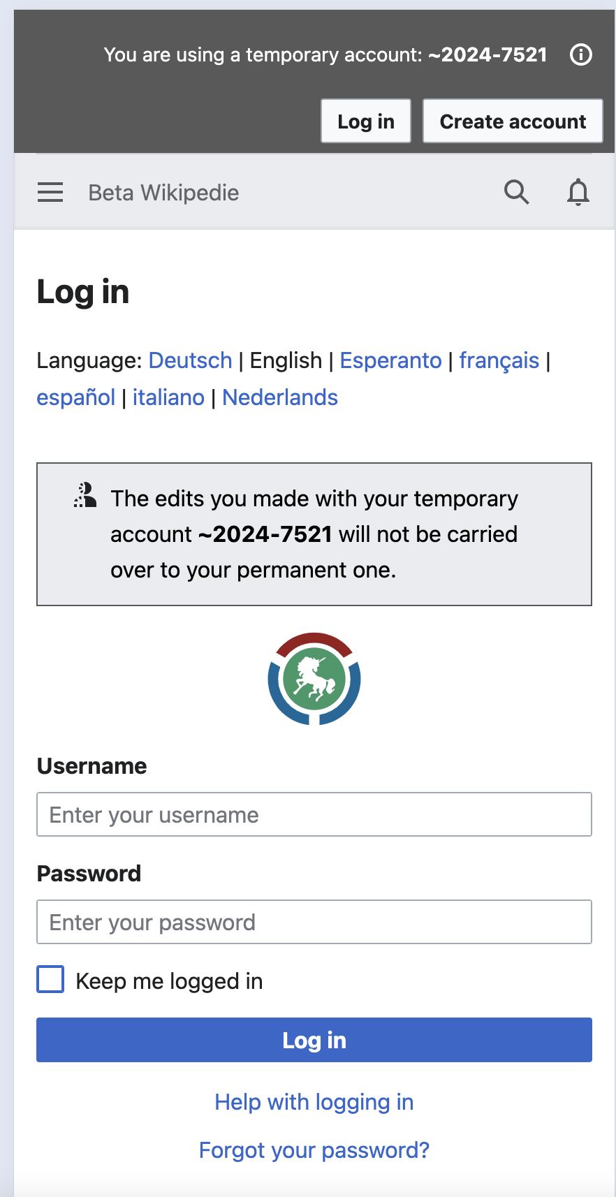
| Create account | Desktop 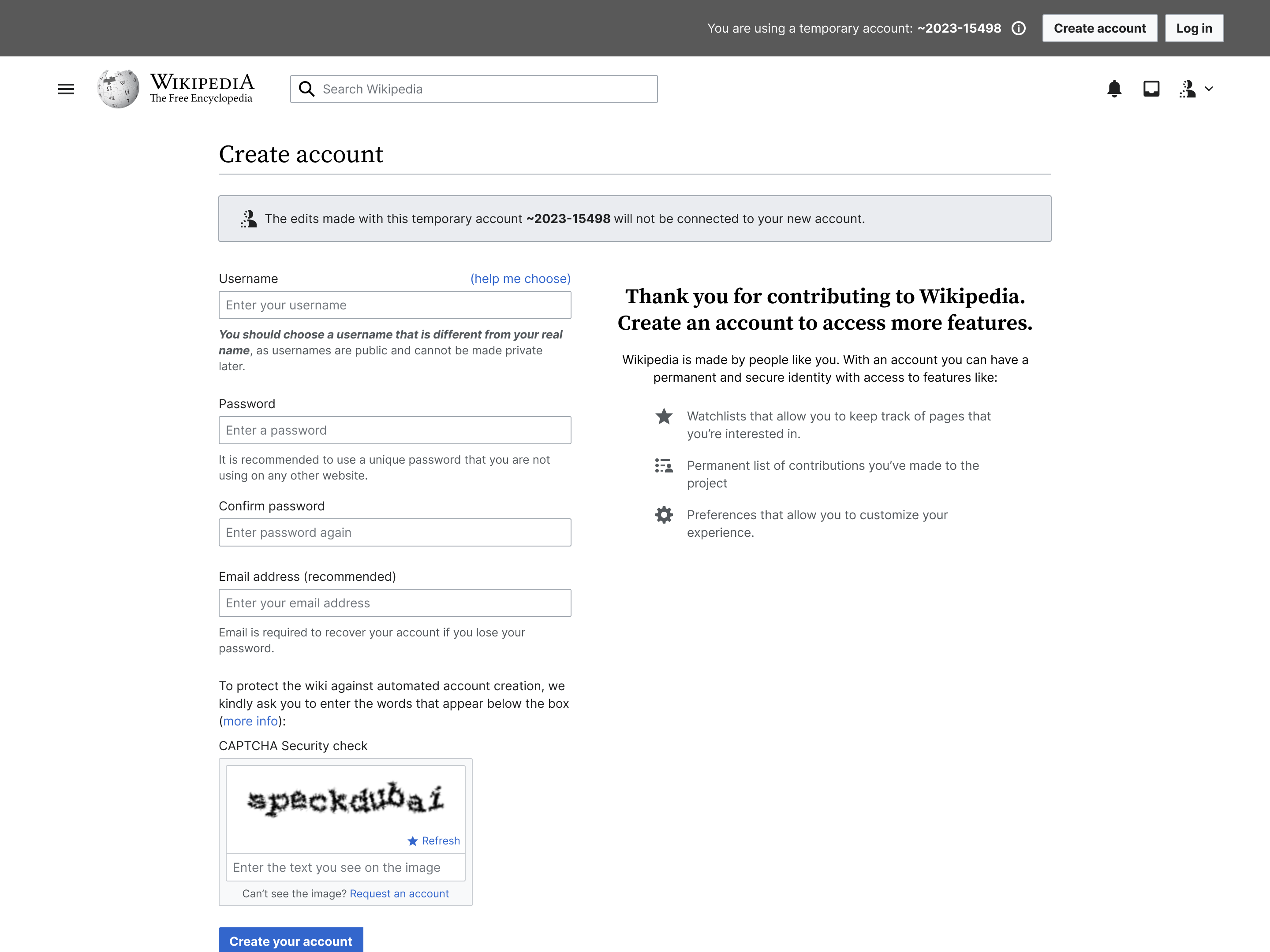 | Mobile 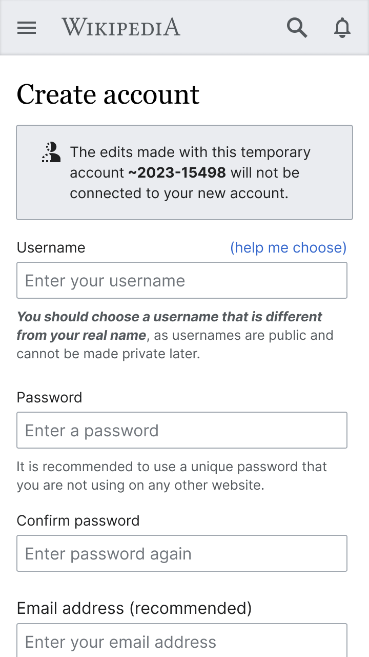 |
| Log in | Desktop 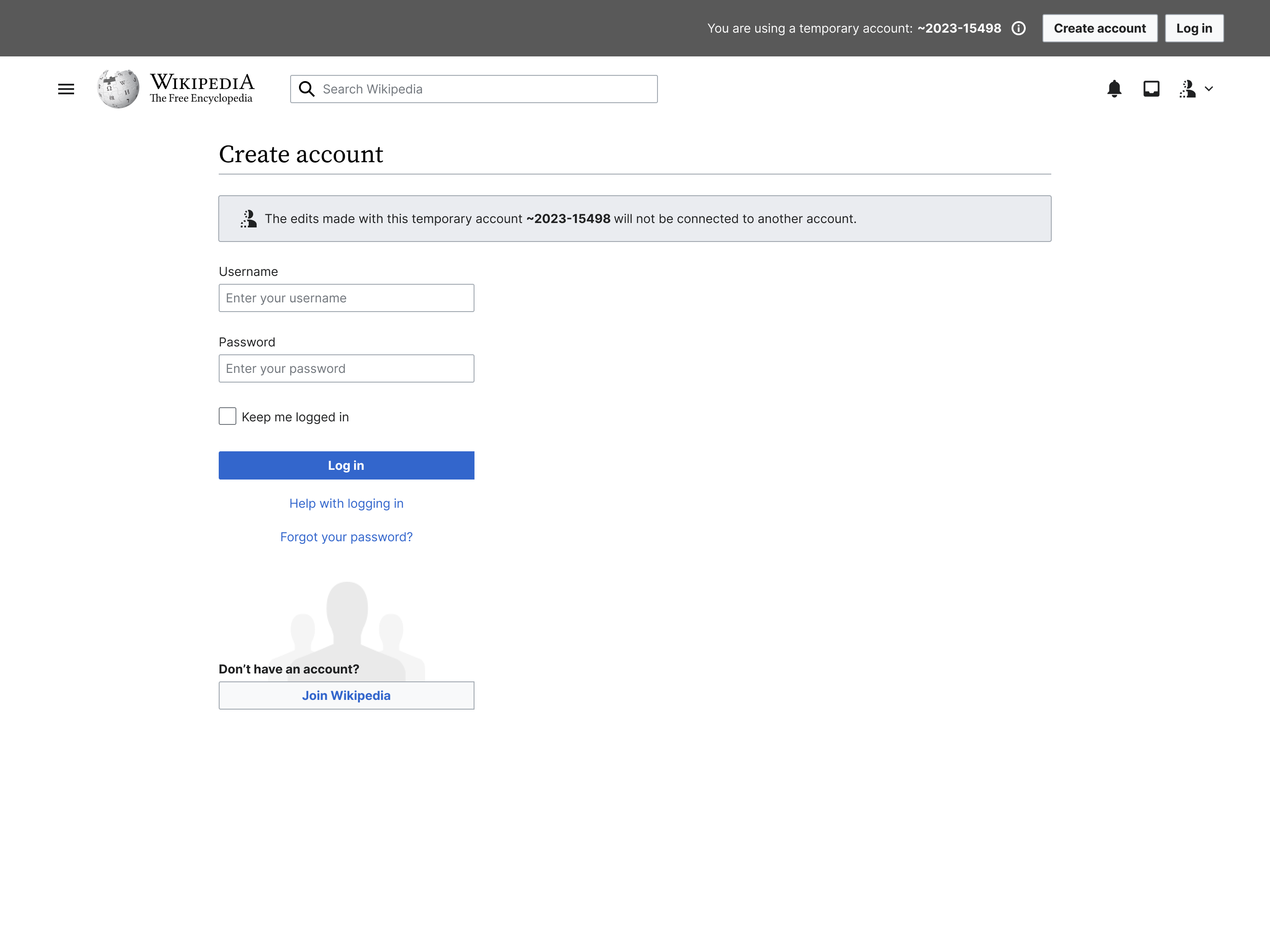 | Mobile  |