Page MenuHomePhabricator

Homepage: Improve newcomer understanding of mentors
Closed, ResolvedPublic

Description

This ticket is an epic for multiple tasks related to improving the mentor module.

Background

Homepage mobile user testing showed that users are looking for more info about their assigned mentor in the mentorship module.

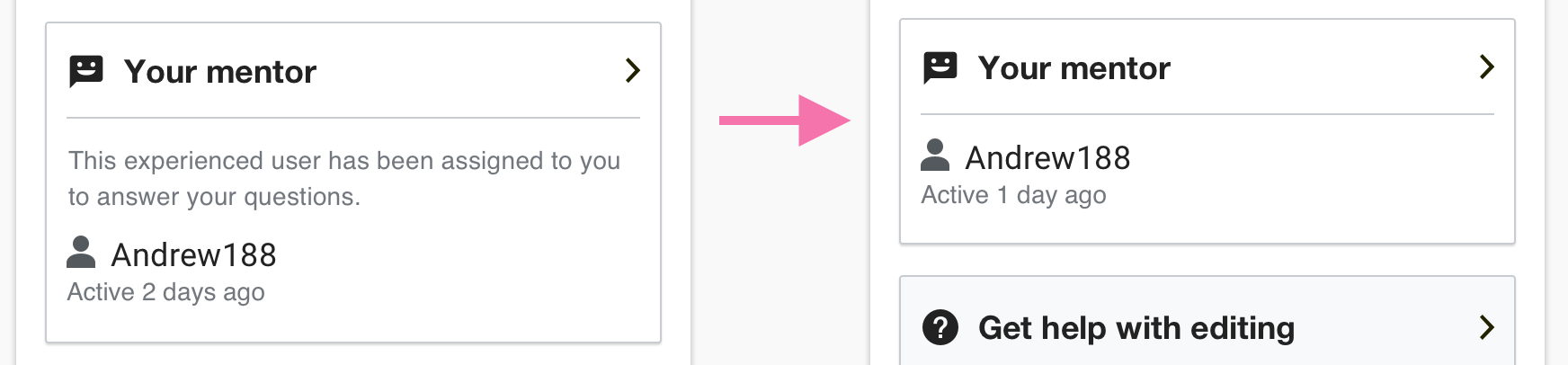
The mentorship module already shows some mentors data:

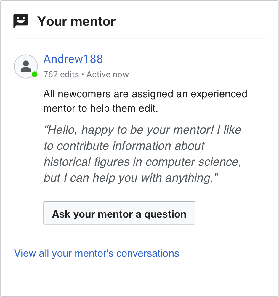
  • mentor's name (with link to mentor's user page)
  • mentor's overall edit count
  • mentor's last time active data

Indeed users showed an interest in knowing more about their mentor, and an attention to more in-depth data:

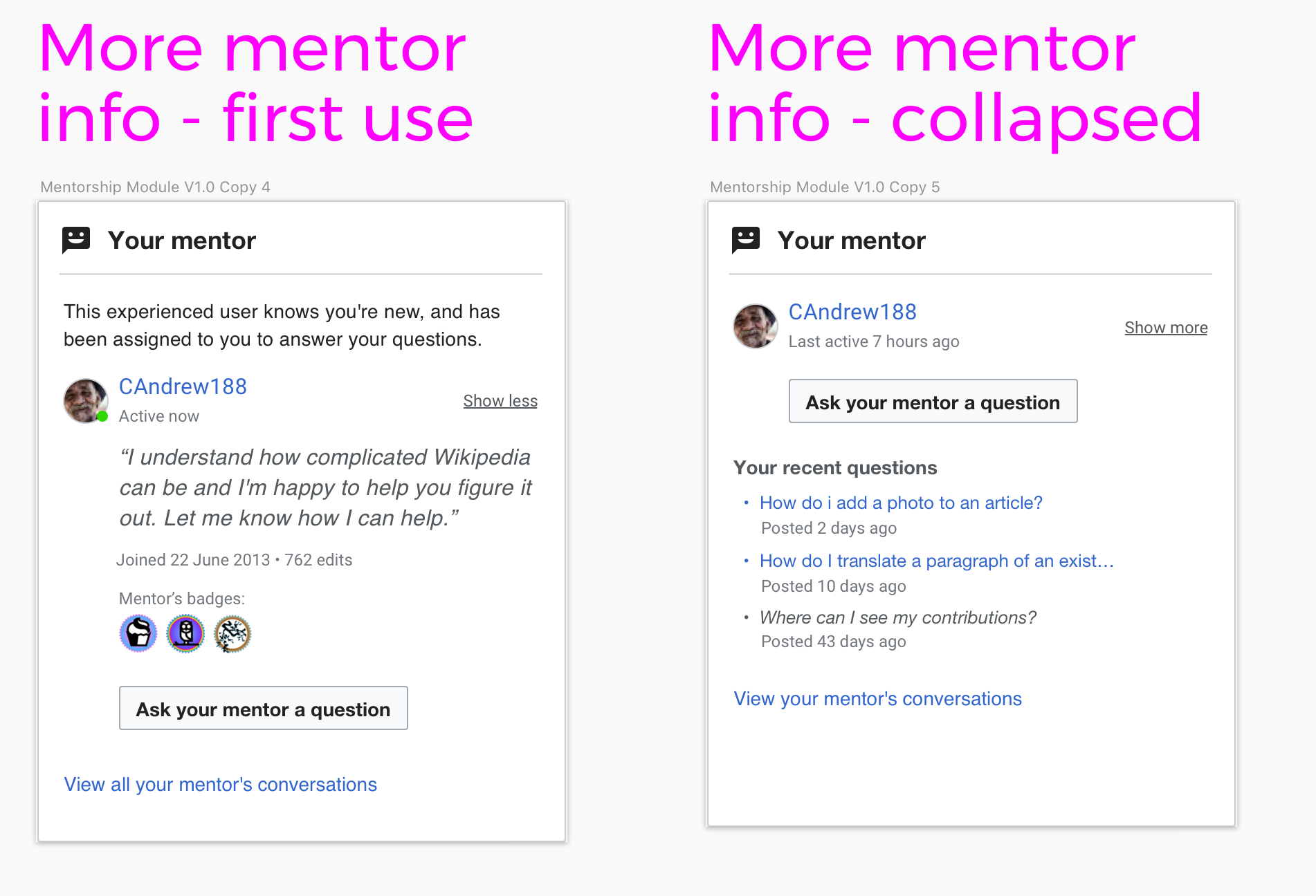
  • details about who their mentor is, what their mentor likes, why their mentor is on wiki
  • recent mentor's contributions to wikipedia
  • mentor's impact on wikipedia
  • why is this mentor assigned to them? is it self-assigned? is it random?
User job story

When I arrive at my newcomer homepage and see a "mentor" module...
I want to know what a mentor is for, and some information about my mentor...
So that I feel comfortable and invited to contact them for guidance.

Proposed solutions

The following are proposed changes/additions to the mentor module in aid of newcomer understanding and comfort of their assigned mentors:

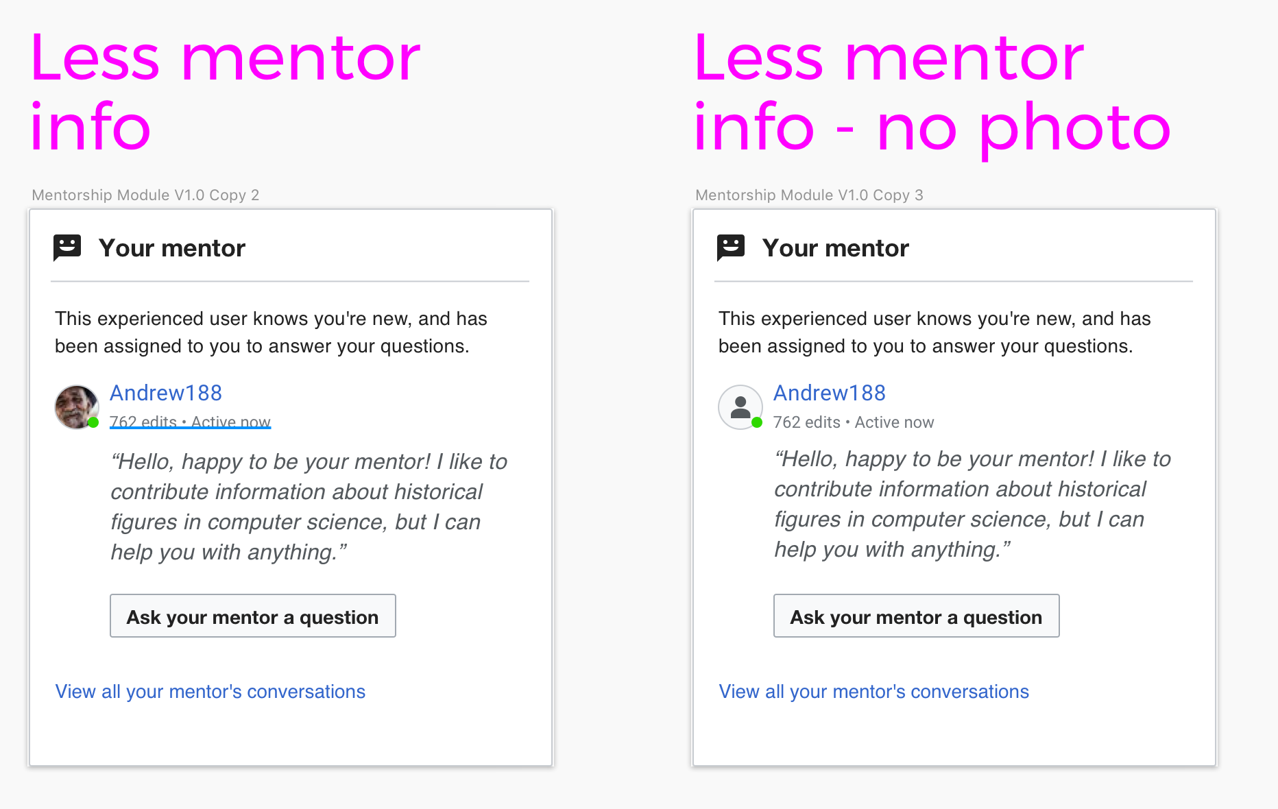
  • T220145 Allow mentors to personalize the message shown to their assigned mentee (enabling the mentor to give personalized, more inviting message written in the first person)
  • T229558 All mentors to add an personal image instead of the standard logged in user avatar (giving the mentor a friendlier, more human presence for contact)
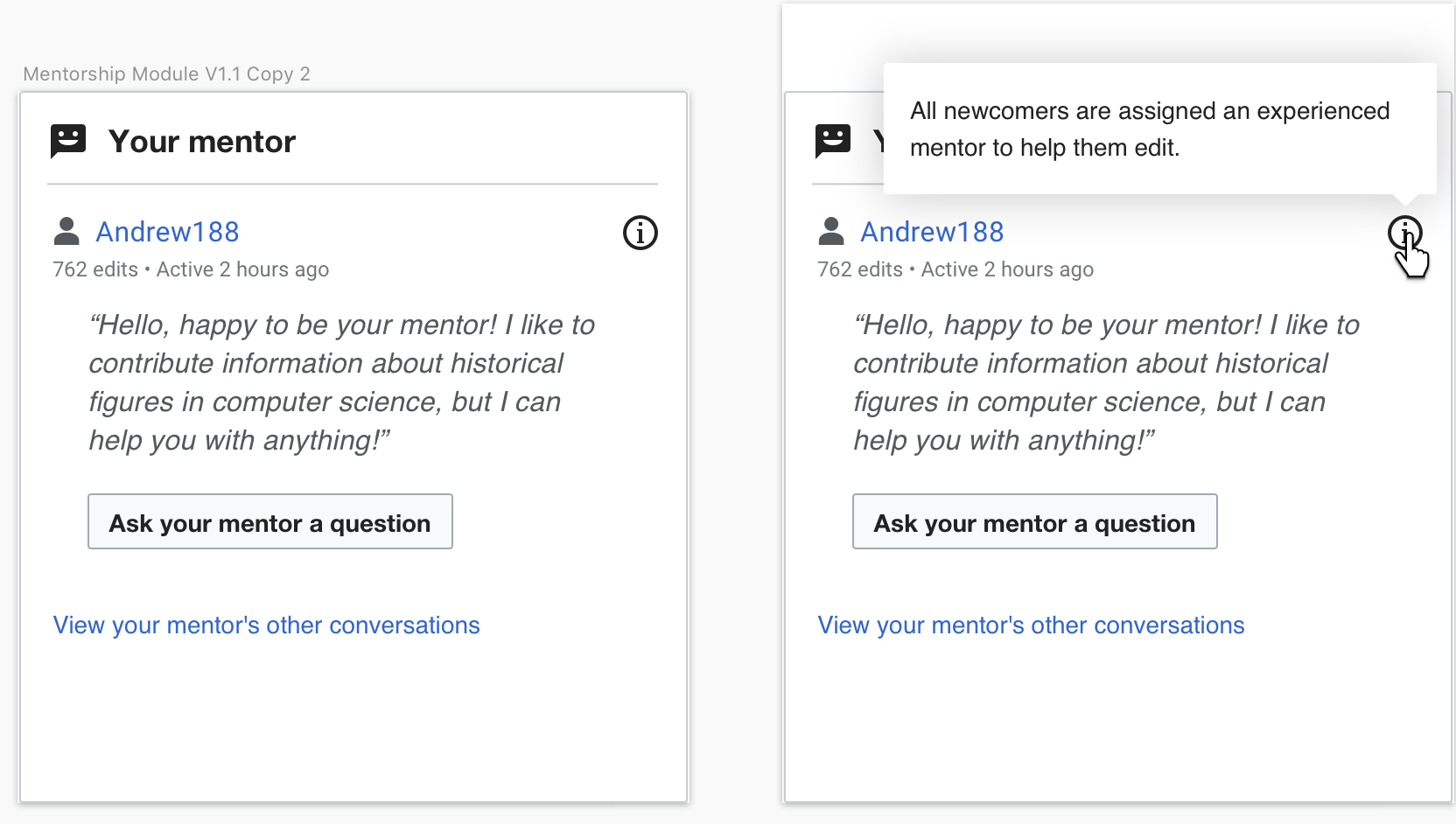
  • T229802 Add information about the how "mentorship" works to newcomers who are unfamiliar with this concept
  • T229805 Allow mentors to provide more information about their own contributions, experiences and areas of interest (helping newcomers get a sense of the mentor's own editor experience)

Related Objects

Event Timeline

why is this mentor assigned to them? is it self-assigned? is it random?

Assigning a mentor/mentee can be cool, for instance for newbies I came to contact in another way than the mentorship module (deleted an article they created, for instance).

@MMiller_WMF I have followed the updates on T220145, and designed two solutions:

  1. Less mentor's data
    • intro text
    • mentor pic or avatar icon (with green dot overlay if mentor is online)
    • mentor name
    • mentor number of edits
    • last time mentor was active
    • mentor's sentence

Screenshot 2019-05-21 18.50.12.png (1×1 px, 203 KB)

  1. More mentor's data (I noticed that more personal data is featured for teahouse hosts)
    • intro text
    • mentor pic or avatar icon (with green dot overlay if mentor is online)
    • mentor name
    • last time mentor was active
    • collapsible info (shown on first visit):
      • mentor's sentence
      • mentor's registration date
      • mentor's number of edits
      • mentor's badges

Screenshot 2019-05-21 18.50.24.png (1×1 px, 324 KB)

In order to also make the mobile homepage overview of the mentorship module more comprehensible, it's been slightly re-designed to display an intro text until the user has asked a question.

Proposed mockups:

Screenshot 2019-05-22 19.34.55.png (406×1 px, 77 KB)

Specifications:

  • The intro text will be removed after the user has asked their first question to their mentor

@MMiller_WMF Shall we make a separate task for this?

Thanks for exploring this space, @Cntlsn. Taking all this together, there's a set of things I think we should do in the near term, and we can leave the rest for future iterations (if the mentorship module turns out to be valuable):

  • Reword the explanatory sentence to say, "All newcomers are assigned an experienced mentor to help them edit."
  • Use the explanatory sentence in the mobile preview until the user asks a question.
  • Implement the indented, quoted, and italicized style for the work in T220145.

How does this sound?

One thing that looked strange to me -- having the explanatory sentence above the mentor's username and avatar. Do you think it might look better placed under the username, but above the mentor's quote?

@MMiller_WMF Ok, sounds good to me. Please see my comments below:

One thing that looked strange to me -- having the explanatory sentence above the mentor's username and avatar. Do you think it might look better placed under the username, but above the mentor's quote?

This is how the module would look like with the explanatory sentence squeezed between the mentor data area and the mentor quote

Screenshot 2019-05-30 14.36.28.png (1×942 px, 120 KB)

For a number of reasons I prefer the version with the explanatory sentence on top of everything:

  • in terms of meaning I see the explanatory sentence as an intro to the content of the module, hence it would make sense to place it as the first thing
    • this is also reflected by the fact that we use it as an intro in the module overview on mobile, where it would be weird to see it placed at the top in the overview and then within other content in the fullscreen version
  • layout wise I think having the explanatory sentence at the top makes things more readable -- when the users scan the module from top to bottom / left to right they see 1 what the module is about 2 who their mentor is 3 mentor's sentence 4 CTA -- whereas having it in between the content creates a contiguous block of text (== hard to read)
  • I think the new copy doesn't really work well with the placement in between content related to the mentor. Basically the user is already into mentor's specific content [micro scale], while the explanatory sentence refers to a global rule [macro scale].

@Cntlsn -- now that I'm looking at this design a week later, I'm worried that there is too much text in the module. What do you think about adding a little "i" to the module, that opens up a tooltip (desktop) or a dialog (mobile) saying, "All newcomers are assigned an experienced mentor to help them edit." The little "i" could be right-aligned with the mentor's name, or maybe even in the header of the module itself.

What do you think? Because we also had thoughts of doing something similar with the impact module in T220142.

@MMiller_WMF
I'm actually a bit divided on this. I like the idea of removing text in general, but considering the feedback we received from the user test (some users wondering why they got a mentor) I think in this case the intro text will actually be helpful on the first visit. And it would anyway be removed after the user has asked a question to their mentor, so the module would potentially display more text only on the first visit (or few visits, until there is user interaction).

Anyway, this how it would look like on desktop with the treatment you suggested:

Screenshot 2019-06-12 12.04.12.png (942×1 px, 169 KB)

Talking about reducing the amount of text, I would actually be more concerned about the mentor's sentence not being really relevant after the user has asked a question, and taking quite some space when there are questions listed under "Your recent questions". To solve that, I had previously designed this solution:

Screenshot 2019-06-12 12.04.39.png (928×1 px, 269 KB)

RHo renamed this task from Homepage: show more mentor info in the mentorship module to Homepage: Improve newcomer understanding of mentors.Aug 5 2019, 11:45 AM
RHo updated the task description. (Show Details)

@RHo -- tagging you here because this is the parent task that represents the change to the mentorship module you mocked up in this page while we planned for newcomer tasks. When you've settled on a design for this, we can make this task ready for development.

@RHo -- tagging you here because this is the parent task that represents the change to the mentorship module you mocked up in this page while we planned for newcomer tasks. When you've settled on a design for this, we can make this task ready for development.

Hiya, the change I mocked only really covers this child ticket T229802, so let's make that task ready for dev.

Resetting assignee as their email address bounces.

I think there is little value in keeping this umbrella/epic task opened. This was partially addressed in T292627, and other suggested solutions listed as subtasks here can be considered separately. Boldly resolving!