- Once merged in Vector copy the same rules across to the mobile equivalent for non-AMC users
Feed Advanced Search
Aug 3 2021
Aug 3 2021
• nray placed T287522: Implement max-width on user menu up for grabs.
• nray moved T287522: Implement max-width on user menu from Doing to Code Review on the Web-Team-Backlog (Kanbanana-FY-2021-22) board.
• nray added a comment to T287522: Implement max-width on user menu.
• nray added a comment to T287424: [Spike] Should the sticky header be an enhancement of the existing header or an additional header?.
^^ Please ignore, I accidentally attached the wrong patch
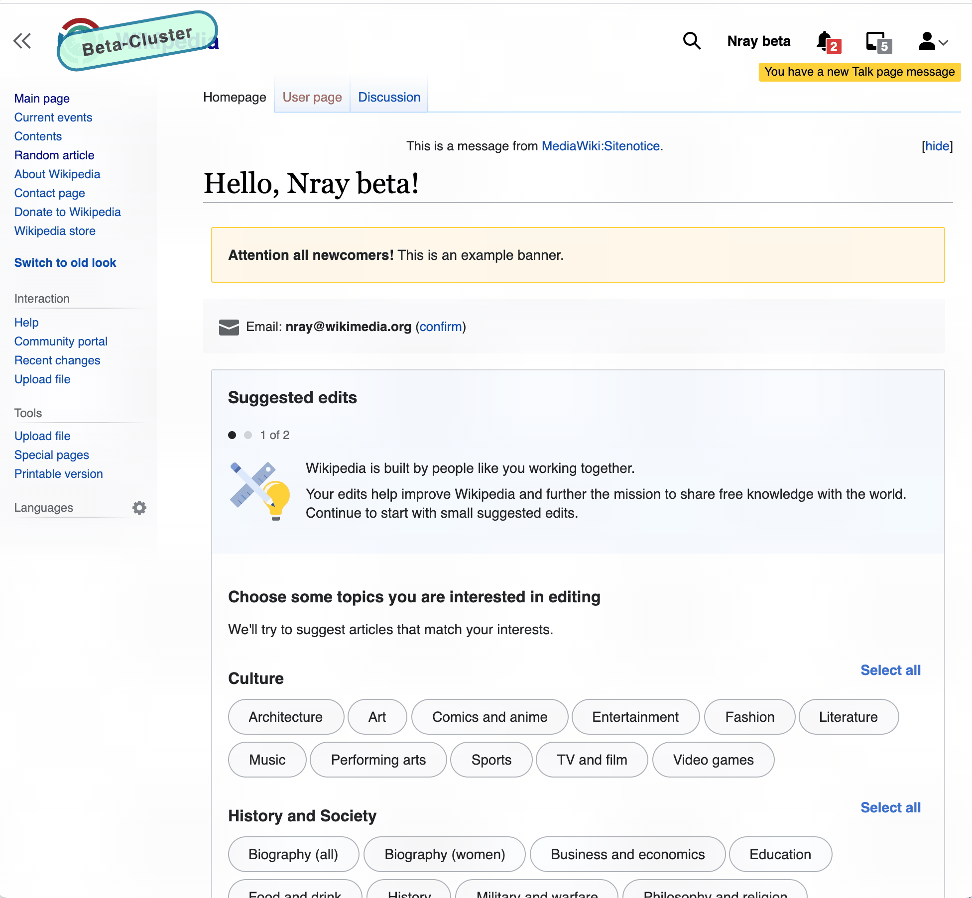
• nray added a comment to T287633: Adjust padding/positioning of orange talk notification in user links menu.
@alexhollender It's trivial, and I'm happy to change it to whatever value you prefer as part of this ticket, but if we go with the 85% are you okay with the hover state of the buttons overlapping with the OBOD?
• nray moved T287522: Implement max-width on user menu from Blocked on Others to Doing on the Web-Team-Backlog (Kanbanana-FY-2021-22) board.
• nray added a comment to T287522: Implement max-width on user menu.
Or I guess we could use a :hover:after selector to match the hover color to make it not look weird 🙂. Assuming this is what we want when hovered? :
Aug 2 2021
Aug 2 2021
• nray placed T287522: Implement max-width on user menu up for grabs.
• nray moved T287522: Implement max-width on user menu from Doing to Blocked on Others on the Web-Team-Backlog (Kanbanana-FY-2021-22) board.
• nray added a comment to T287522: Implement max-width on user menu.
After looking at this more today and unless I'm missing something, I think the fade out technique works better on elements that don't also have a hover state like our user menu links. Notice when the user hovers over the talk link, the gray hover state appears with the fade at the end which could be confusing:
• nray moved T287522: Implement max-width on user menu from Blocked on Others to Doing on the Web-Team-Backlog (Kanbanana-FY-2021-22) board.
• nray updated the task description for T287775: WVUI Search suggestions should have `aria-selected` attribute.
• nray moved T287522: Implement max-width on user menu from Ready for Development to Blocked on Others on the Web-Team-Backlog (Kanbanana-FY-2020-21) board.
Jul 30 2021
Jul 30 2021
• nray added a comment to T286729: Improve tabbing functionality for new search component.
The w3 accessibility recommendations for a combobox could be more explicit on how to handle the tab key, but given that the search component supports the recommended up arrow/down arrow key navigation [1], I'm not sure how necessary (or even desirable) it is for the tab key to navigate through the search results. It is also notable to me that in their example of a combobox, the tab key does not navigate through the results - it only supports up/down arrow key navigation [2]
Jul 29 2021
Jul 29 2021
• nray reassigned T286459: Turn off A/B test for language switching on pilot wikis from • nray to cjming.
• nray awarded T287622: Skin hooks should run after extension hooks a Like token.
• nray closed T256509: Remove BaseTemplateToolbox hook, a subtask of T282045: [GOAL] Deprecate and remove skin code in preparation for 1.37, as Resolved.
• nray added a comment to T285442: [Bug] Orange talk alert does not disappear in new Vector after clicking "Mark all as read".
Something interesting is going on here as it seems to work for me:
• nray updated the task description for T287540: MediaSearch not compatible with new WVUI search widget on Wikimedia Commons.
Jul 28 2021
Jul 28 2021
Jul 27 2021
Jul 27 2021
• nray added a comment to T287520: Regression: Some page previews show extra white space beneath the image.
@Jdlrobson I was just discussing with @cjming this morning my confusion around popups that have the .mwe-popups-no-image-pointerclass, the .mwe-popups-image-pointer class and popups that don't have either as their usage of those classes (or lack thereof) didn't make sense to me and still doesn't make sense to me.
• nray added a comment to T287520: Regression: Some page previews show extra white space beneath the image.
This was actually an issue I noticed before I7ca6c922b2f4615103e4162d96fd90d891deb1df, and I don't believe is a recent regression. E.g. If you checkout the commit before (1a62ae90cde931763c0fbbf06d1ecff98061ef9d you should see it:
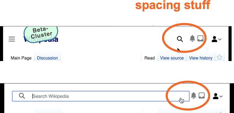
• nray added a comment to T287523: Remove extra padding above & below "learn more" in user menu.
@alexhollender I think I messed up the top spacing on this as well as for some reason there is 12px of top padding + 2px of top margin when T285786 clearly advises only 8px. It should only have 8px of top padding, correct?
• nray updated the task description for T285786: [User links] Design fixes.
Jul 26 2021
Jul 26 2021
• nray placed T285786: [User links] Design fixes up for grabs.
Jul 23 2021
Jul 23 2021
• nray moved T285786: [User links] Design fixes from Doing to Design Review on the Web-Team-Backlog (Kanbanana-FY-2020-21) board.
• nray added a comment to T285786: [User links] Design fixes.
@alexhollender Revisions done. Please check latest at https://patchdemo.wmflabs.org/wikis/e097002f78/w/
Jul 22 2021
Jul 22 2021
• nray moved T285786: [User links] Design fixes from Needs More Work to Doing on the Web-Team-Backlog (Kanbanana-FY-2020-21) board.
• nray moved T285786: [User links] Design fixes from Doing to Design Review on the Web-Team-Backlog (Kanbanana-FY-2020-21) board.
• nray added a comment to T285786: [User links] Design fixes.
@alexhollender Can you please check https://patchdemo.wmflabs.org/wikis/608ecb4afa/wiki/Main_Page, and let me know what revisions I need to make. Please note that I am aware of deviations from the spec on the following items and wasn't sure how important they were to you:
Jul 20 2021
Jul 20 2021
Sorry for noise, this is a duplicate of T286822
Jul 19 2021
Jul 19 2021
Jul 16 2021
Jul 16 2021
• nray placed T281170: Regression: Inconsistent inner top padding in all popup types up for grabs.
• nray added a comment to T281170: Regression: Inconsistent inner top padding in all popup types.
Moving to upcoming per my POC patch above
• nray added a comment to T281170: Regression: Inconsistent inner top padding in all popup types.
POC above. There are several issues going on here (one of which is the text's margin getting clipped as a result of clip-path which @thiemowmde pointed out).
• nray added a comment to T271763: Give Popups storybook instance some love.
Moving this back to code review per the above patch ^^
• nray moved T271763: Give Popups storybook instance some love from Ready for Signoff to Code Review on the Web-Team-Backlog (Kanbanana-FY-2020-21) board.
Jul 15 2021
Jul 15 2021
• nray updated the task description for T284242: Search: treatment at smaller resolutions.
Looks great!
• nray closed T280612: Remove Skin::makeNSUrl, a subtask of T282045: [GOAL] Deprecate and remove skin code in preparation for 1.37, as Resolved.
• nray closed T286040: "InvalidArgumentException: $key must be a string or an array" on beta login and vote wikis as Resolved.
Looks good!
Jul 14 2021
Jul 14 2021
• nray added a comment to T284242: Search: treatment at smaller resolutions.
we will need to address the spacing between the search (both collapsed & expanded state) and the user icons. should we address that here, or in T285786? cc @Jdrewniak
• nray added a comment to T284242: Search: treatment at smaller resolutions.
@alexhollender just a heads up - this has now been merged so it's best to do the design review on beta (https://en.wikipedia.beta.wmflabs.org/wiki/Main_Page) rather than the patchdemo
Jul 12 2021
Jul 12 2021
• nray placed T284242: Search: treatment at smaller resolutions up for grabs.
• nray moved T284242: Search: treatment at smaller resolutions from Code Review to Design Review on the Web-Team-Backlog (Kanbanana-FY-2020-21) board.
• nray added a comment to T284242: Search: treatment at smaller resolutions.
• nray moved T284242: Search: treatment at smaller resolutions from Design Review to Doing on the Web-Team-Backlog (Kanbanana-FY-2020-21) board.
• nray reassigned T284242: Search: treatment at smaller resolutions from cjming to • alexhollender_WMF.
• nray moved T284242: Search: treatment at smaller resolutions from Code Review to Design Review on the Web-Team-Backlog (Kanbanana-FY-2020-21) board.
• nray added a comment to T284463: Create basic sticky header feature flag.
How elaborate do we want the sticky header to be for this ticket? Do we want it to have all of the show/hide behavior that is in the prototype: https://people.wikimedia.org/~jdrewniak/dip/p4.html#/en/wiki/Moon ?
Jul 2 2021
Jul 2 2021
• nray placed T284242: Search: treatment at smaller resolutions up for grabs.
• nray closed T284950: Remove deprecated hooks with no usages, a subtask of T282045: [GOAL] Deprecate and remove skin code in preparation for 1.37, as Resolved.
Jul 1 2021
Jul 1 2021
• nray added a comment to T284242: Search: treatment at smaller resolutions.
@alexhollender can you please take a look at the above patchdemo and let me know if I've missed anything regarding the behavior or design? The icon spacing/sizes is another issue that I believe is being covered in another ticket.
Jun 29 2021
Jun 29 2021
• nray added a comment to T285442: [Bug] Orange talk alert does not disappear in new Vector after clicking "Mark all as read".
We estimated this a small based on the simplest option of changing the id to pt-talk-alert in Echo. If we want to instead change the default id for this in core, then we should reestimate this ticket as that work would likely be larger than a small.
Jun 24 2021
Jun 24 2021
• nray added a comment to T285442: [Bug] Orange talk alert does not disappear in new Vector after clicking "Mark all as read".
@Jdlrobson This bug will only surface on new Vector when $wgVectorConsolidateUserLinks = [ 'logged_in' => true ] . Given that $wgVectorConsolidateUserLinks is not enabled in production yet, I don't think it's currently affecting users
Jun 23 2021
Jun 23 2021
• nray moved T284242: Search: treatment at smaller resolutions from Ready for Development to Doing on the Web-Team-Backlog (Kanbanana-FY-2020-21) board.
• nray updated the task description for T285442: [Bug] Orange talk alert does not disappear in new Vector after clicking "Mark all as read".
Jun 22 2021
Jun 22 2021
• nray placed T284594: Userlinks: Remove SkinVector::ICON_USER_LINK_MAP up for grabs.
Jun 21 2021
Jun 21 2021
• nray added a comment to T250336: Revise schema and performance dashboards for Vue.js search.
It's not clear to me whether this task is focused on real user monitoring (RUM), but synthetic tests to measure search performance were added to the dashboard as part of T251544 . I will close this ticket under the assumption that a more focused ticket for RUM can be created in the future if desired
• nray moved T284594: Userlinks: Remove SkinVector::ICON_USER_LINK_MAP from Ready for Development to Doing on the Web-Team-Backlog (Kanbanana-FY-2020-21) board.
May 28 2021
May 28 2021
• nray added a comment to T283811: 'Talk' link should always be in user menu , even when new user messages bar is shown.
I think the next question to figure out is whether we want this to only affect modern Vector or whether we want this in other skins as well (e.g legacy Vector, etc). We could, for example, get rid of the transformation logic in other skins and always have the talk link show e.g. in legacy Vector it could look like:
• nray added a comment to T274428: User Links: Handling of talk page notification.
I've moved this back to code review because in the midst of writing up QA steps I noticed a bug involving modern Vector with the $wgVectorConsolidateUserLinks flag enabled (legacy/other skins aren't affected AFAICT) where the notification element has the wrong class (#ca-mytalk instead of #pt-mytalk) and the link is missing the title and accesskey attributes.