Since a few days (?) there are linebreaks/wordwrap within single words which make the diff view unreadable.
Example: https://de.m.wikipedia.org/wiki/Special:Mobilediff/167609483
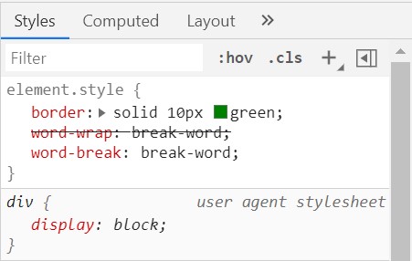
EDIT: This behaviour is inconsistent. Generally, in Minerva word-wrap:break-word is used to avoid overflow of long lines. That would work fine here as well, but for some reasons MobileDiff uses a strange combination of hyphens:auto (mw-mf-diffarea; generally fine, though there could be some misunderstandings about added/deleted hyphens or dashes in the content) and word-wrap:break-all. I do not see any good reason to use word-wrap:break-all, as it will unnecessarily justify the content of the diff while making the text very difficult to read. The simple and rather obvious solution to this would be to use
#mw-mf-diffview .mw-diff-inline-added ins, #mw-mf-diffview .mw-diff-inline-changed ins, #mw-mf-diffview .mw-diff-inline-deleted del, #mw-mf-diffview .mw-diff-inline-changed del { word-wrap: break-word; }(instead of the current word-wrap: break-all;). Ideally, I suggest to make it consistent with the rest of the diff (thus, either use hyphens:auto; for the entire area or only use word-wrap: break-word;).
EDIT 2: Chrome does not support word-wrap or hyphens:auto. Instead, word-break:break-word needs to be used.
QA steps
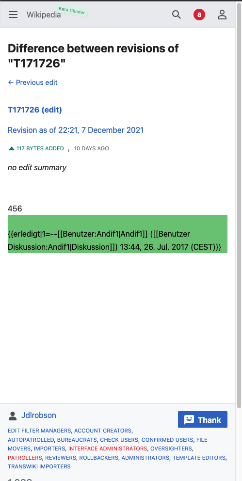
Shrink window and make sure the word Benutzer Diskussion:Andif1|Diskussion breaks after the word "Benutzer" not within the second word.
https://de.m.wikipedia.org/wiki/Special:Mobilediff/167609483
https://en.m.wikipedia.beta.wmflabs.org/wiki/Special:MobileDiff/530215
QA Results -Beta
| AC | Status | Details |
|---|---|---|
| 1 | ✅ | T171726#7579305 |
QA Results - Prod
| AC | Status | Details |
|---|---|---|
| 1 | ❌ | T171726#7579307 and T171726#7630640 |