This task is about implementing a new experience for not-yet-created/empty non-user talk pages.
Where "non-user talk pages" in this context means any talk page that exists in the following namespaces:
| Namespace number | Description |
|---|---|
| 1 | Main/Article talk |
| 5 | Wikipedia talk |
| 7 | File talk |
| 9 | MediaWiki talk |
| 11 | Template talk |
| 13 | Help talk |
| 15 | Category talk |
| 101 | Portal talk |
| 119 | Draft talk |
| 711 | TimedText talk |
| 829 | Module talk |
User stories
Understanding the purpose of the page
- As a Junior Contributor who has clicked a link to a non-user talk page that not-yet-been-created, I want to instantly understand the purpose of the page [i] I am now viewing, so that I can decide whether I should engage with the page more deeply or leave/go somewhere else.
- As a Junior Contributor who has clicked a link to a non-user talk page that not-yet-been-created and generally knows what the purpose of the page [i] is, I want to know where I can learn more about the page, so that I can feel more confident posting something to it.
Initiating a conversation
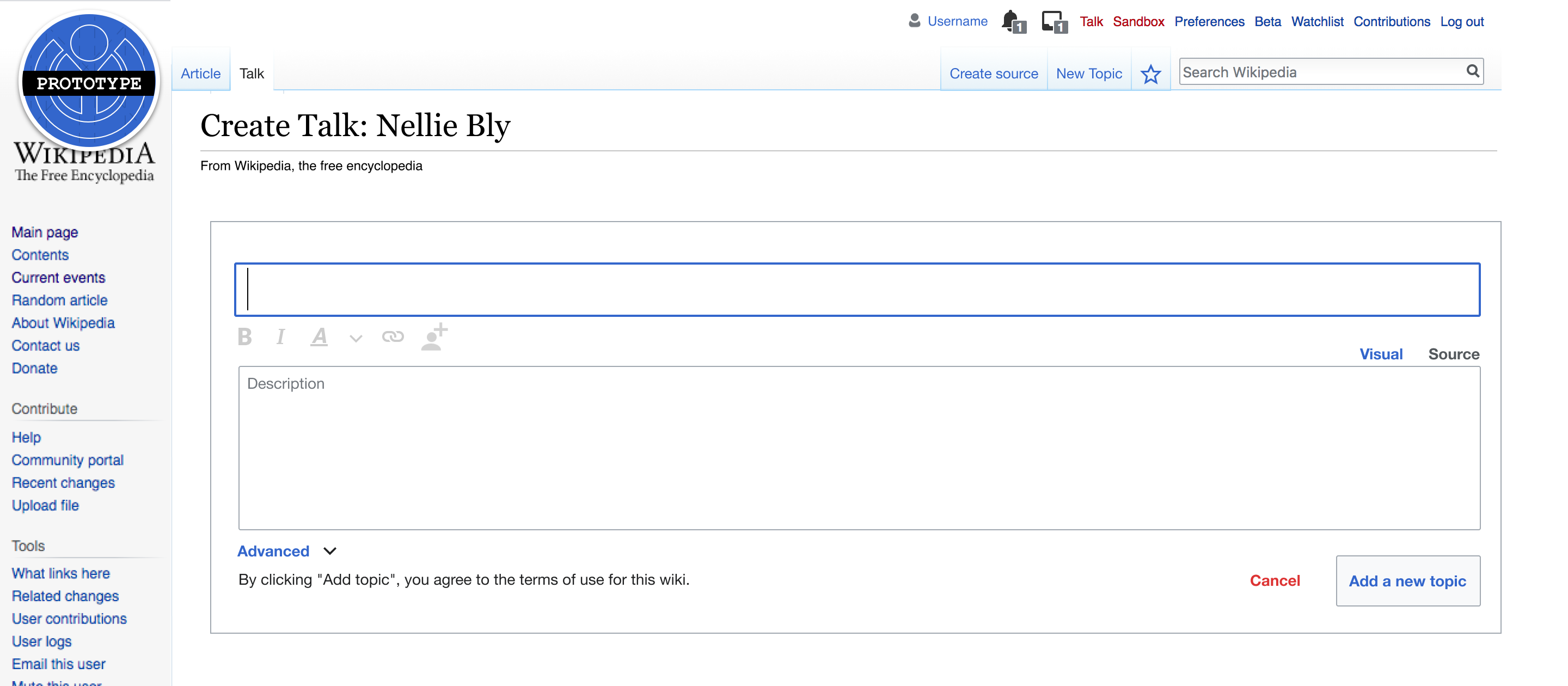
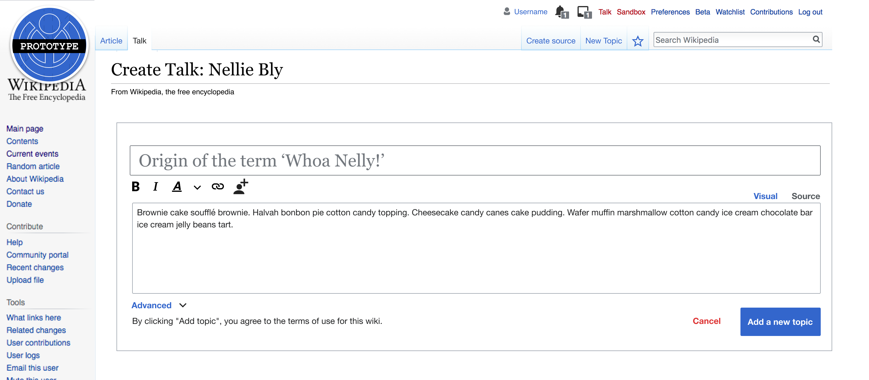
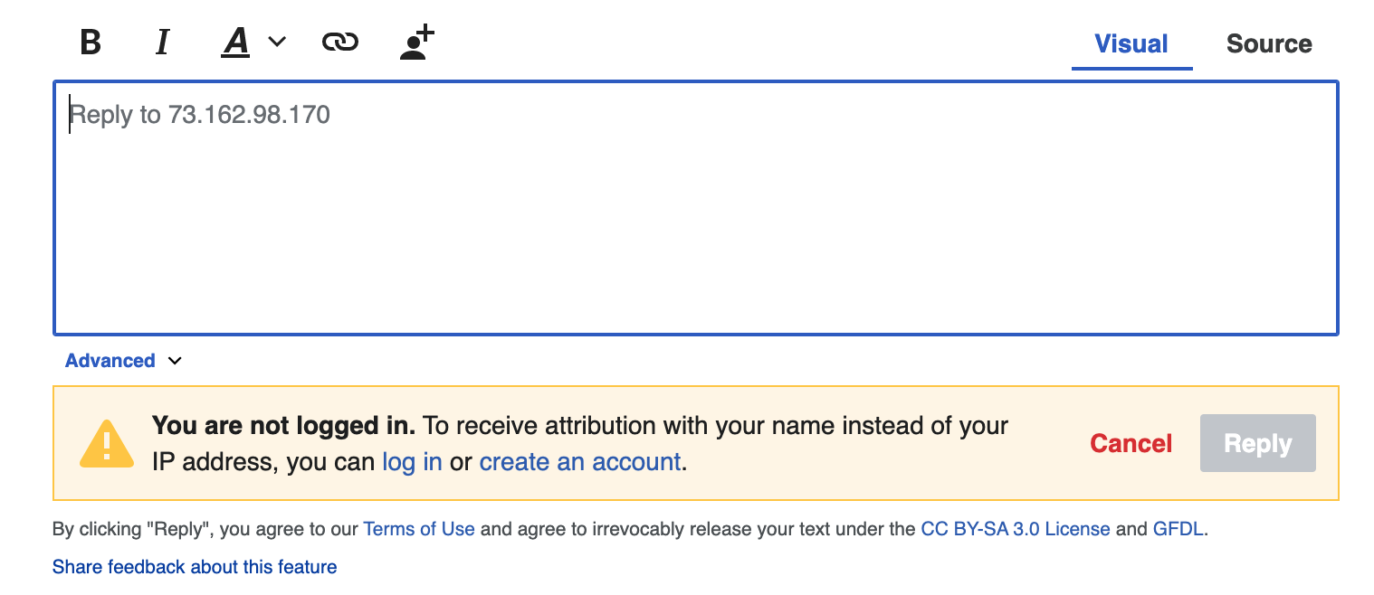
- As a Junior Contributor who has clicked a link to a non-user talk page that not-yet-been-created, understands the purpose of the page [i], and who has a question they would like to ask/a topic they want to discuss with others, I want to know what I need to do to draft and publish that question/thought in a way others are likely to see and understand so that I can receive the input/guidance/etc. I need to help improve the encyclopedia.
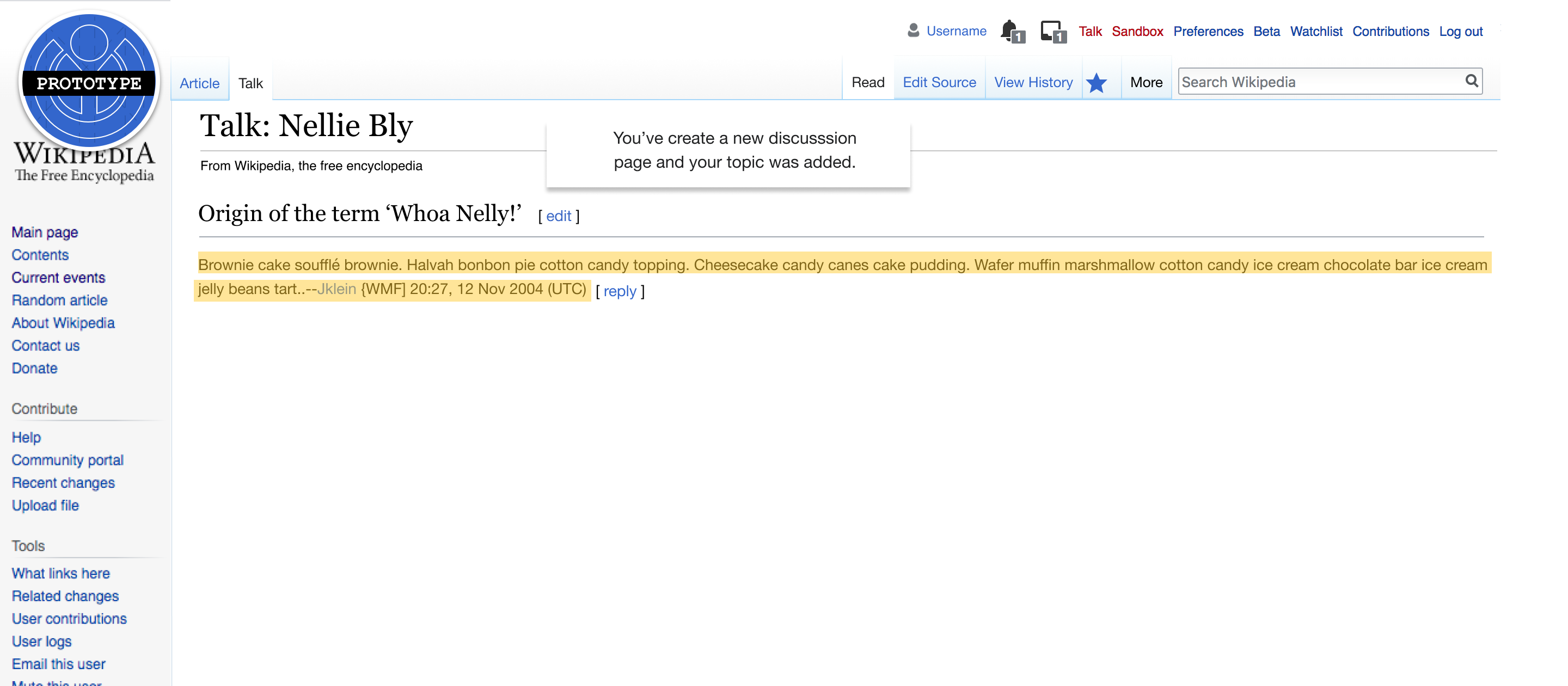
- As a Junior Contributor who has just published a question/thought to a talk page, I want to know I've done so successfully so I do not need to wonder if there are additional steps I need to take to ensure people will see what I have to say.
Editing the page
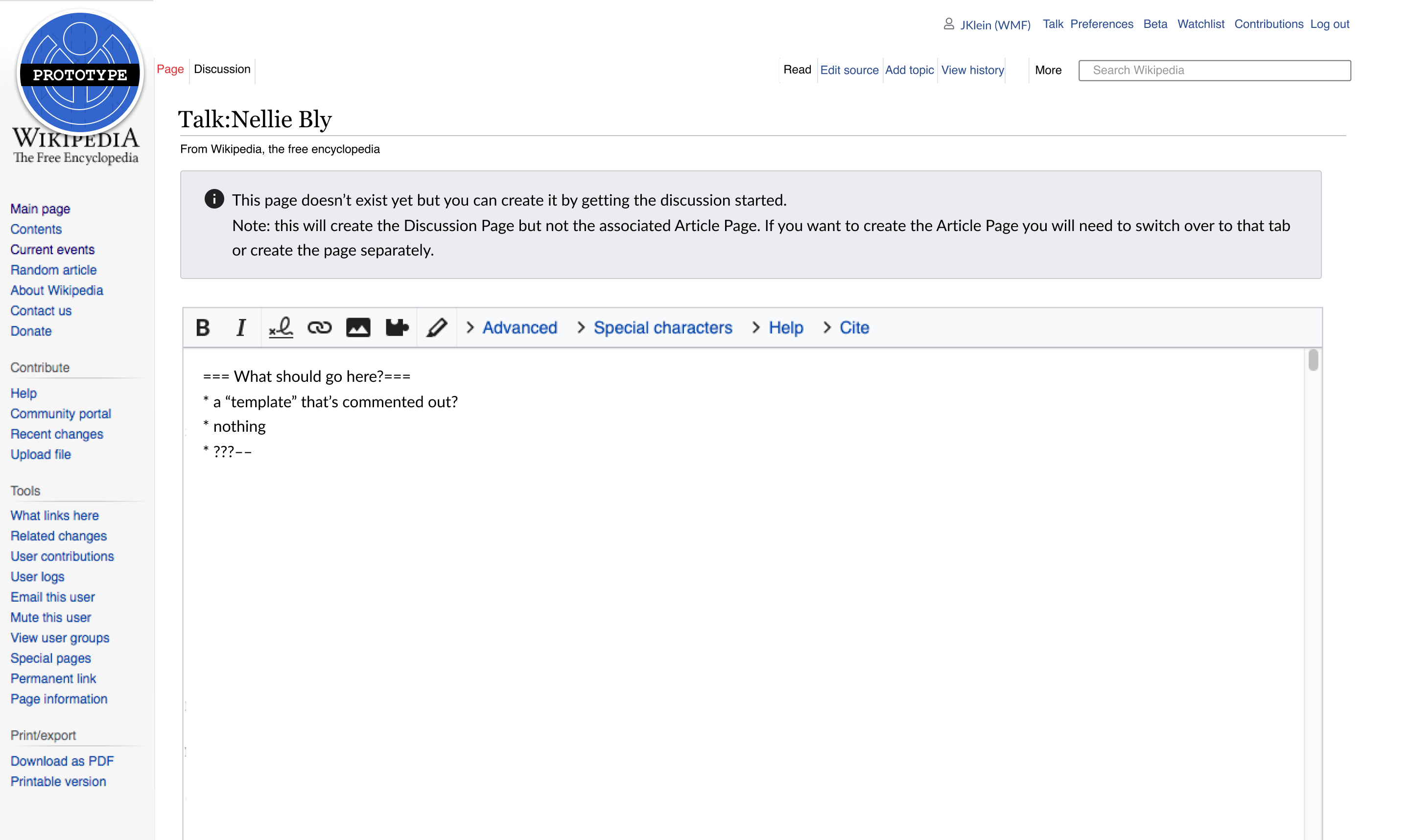
- As a Senior Contributor who has clicked a link to a non-user talk page that not-yet-been-created, I want to be able to add content to the page (e.g. add a talk page template without being constrained by the New Discussion Tool's Title / Description fields so that I can relate the talk page to others like it and/or signal to future visitors/editors information about the page to which the talk page is related.
- Example: adding a Wikiproject template, like {{WikiProject Jazz}}), to the page. Note: this behavior is most common at en.wiki.
Copy
This section contains the UI copy
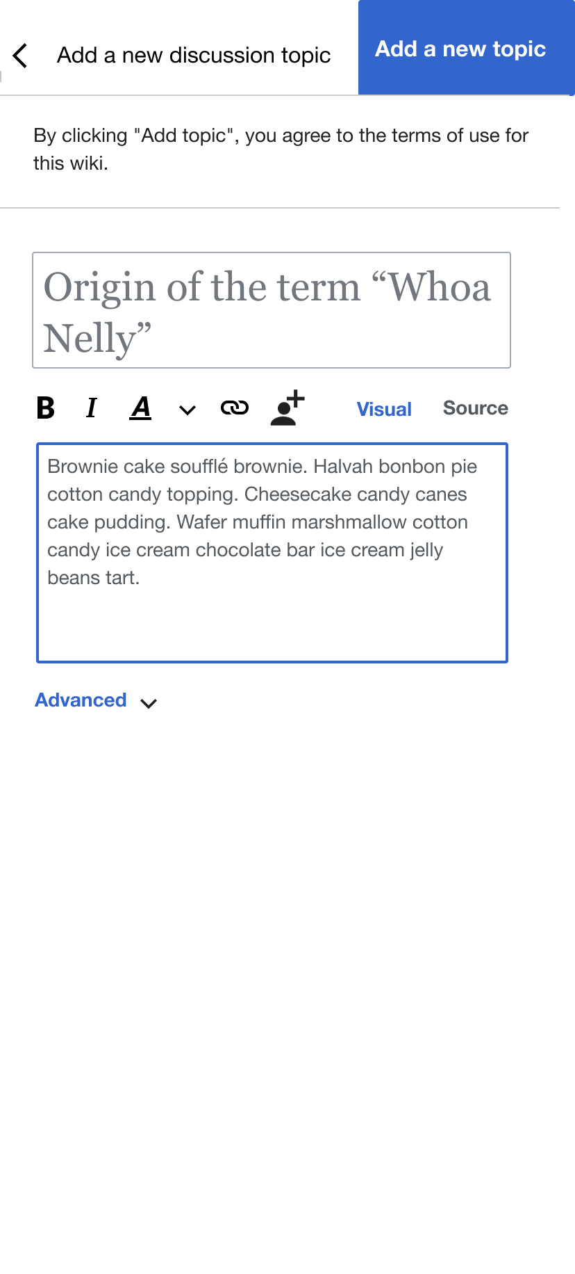
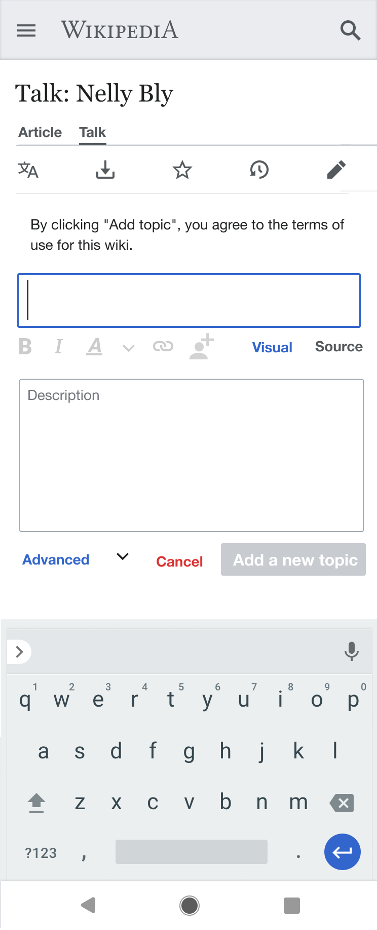
- Title: Start a discussion about [[PAGENAME|PAGENAME]]*
- *This should link to the page to which the talk page is related/attached/etc.
- Body: You can use this talk** page to start a discussion with others about how to improve [[en:PAGENAME|PAGENAME]].[[en:Help:Talk pages|Learn more about how these pages are used]]***.
- **This word should be the one used at the project (e.g. Talk, Discussion, etc.).
- ***This link should link to the local project's equivalent page: https://www.wikidata.org/wiki/Q4592157.
- Button copy: Start a discussion
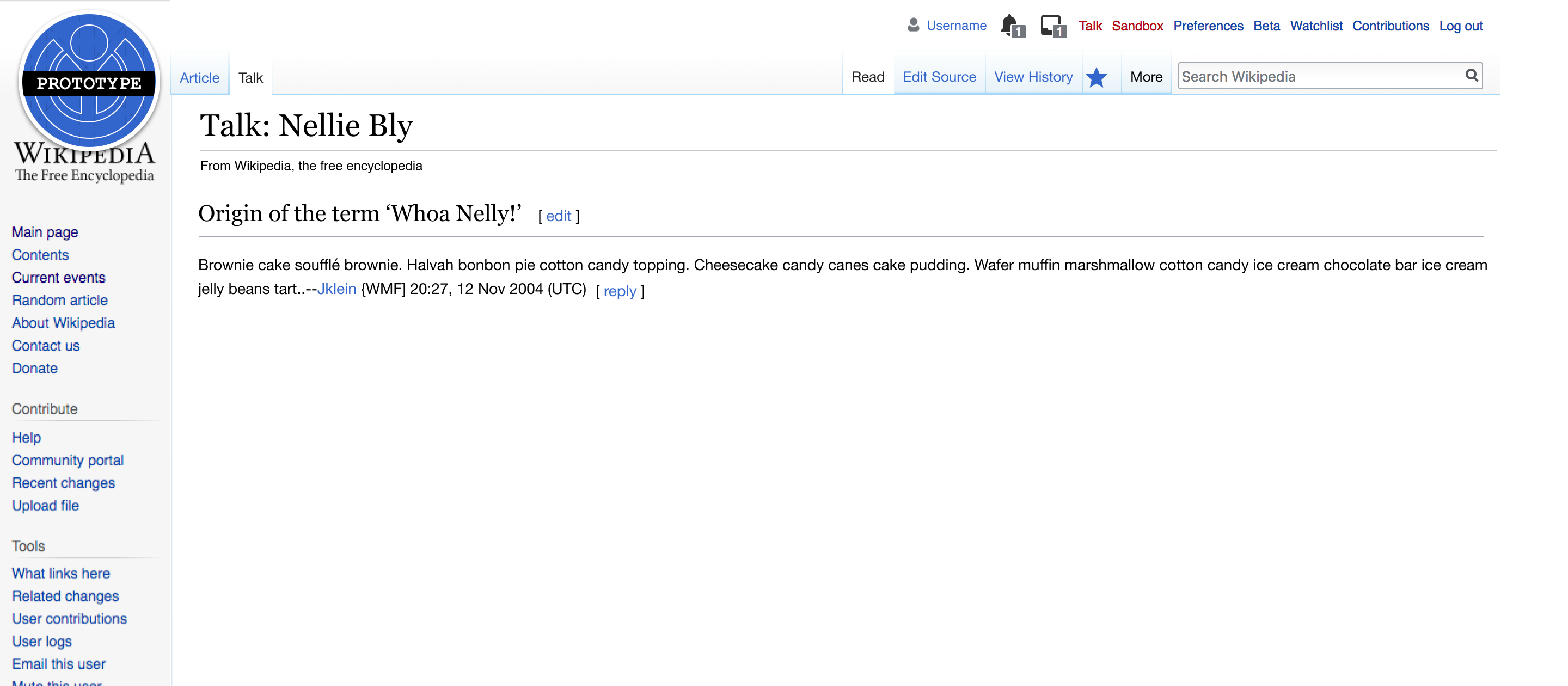
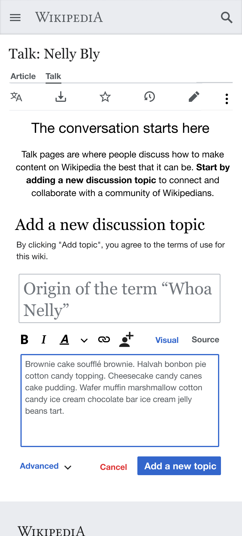
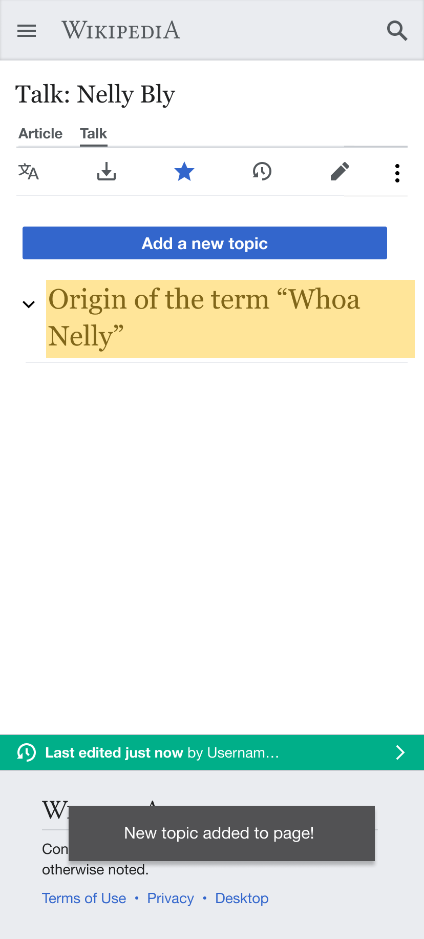
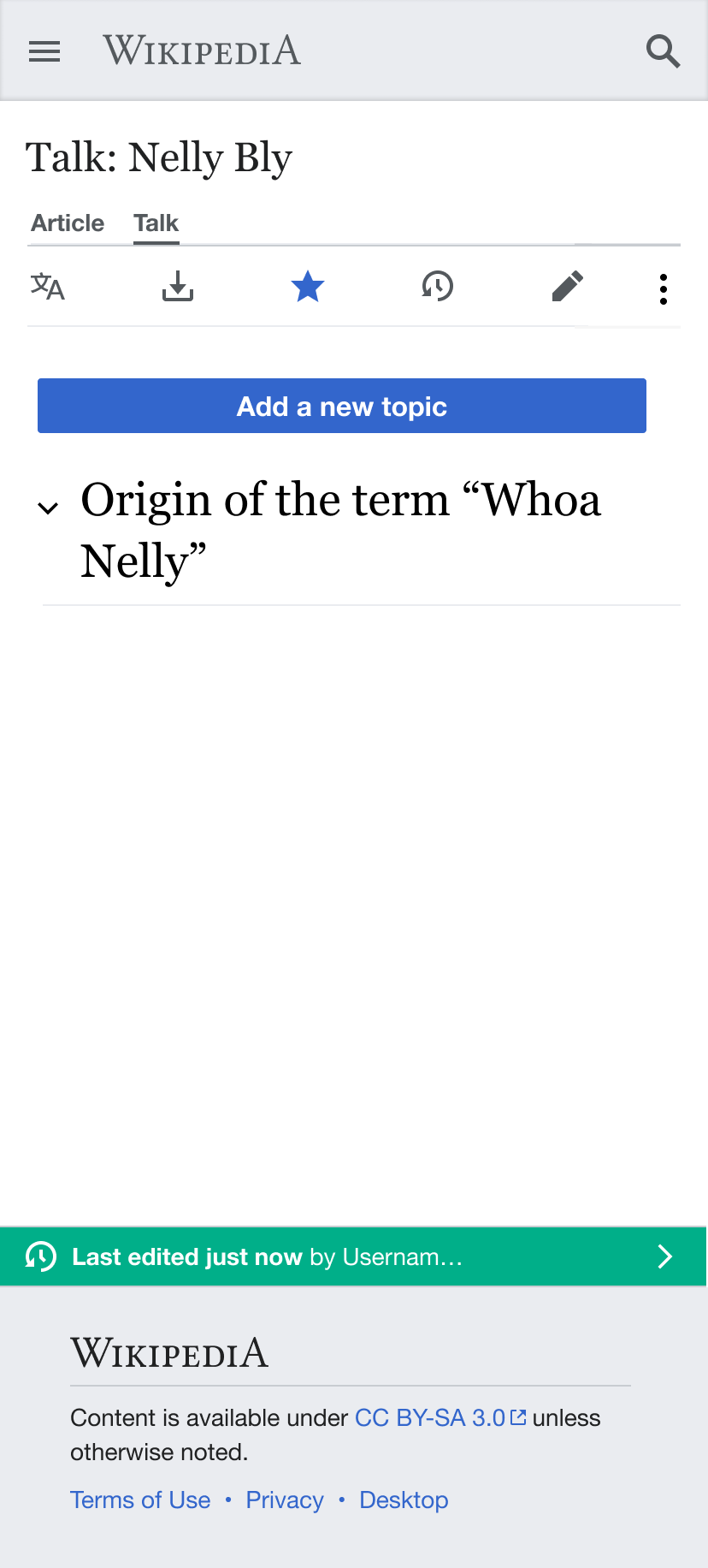
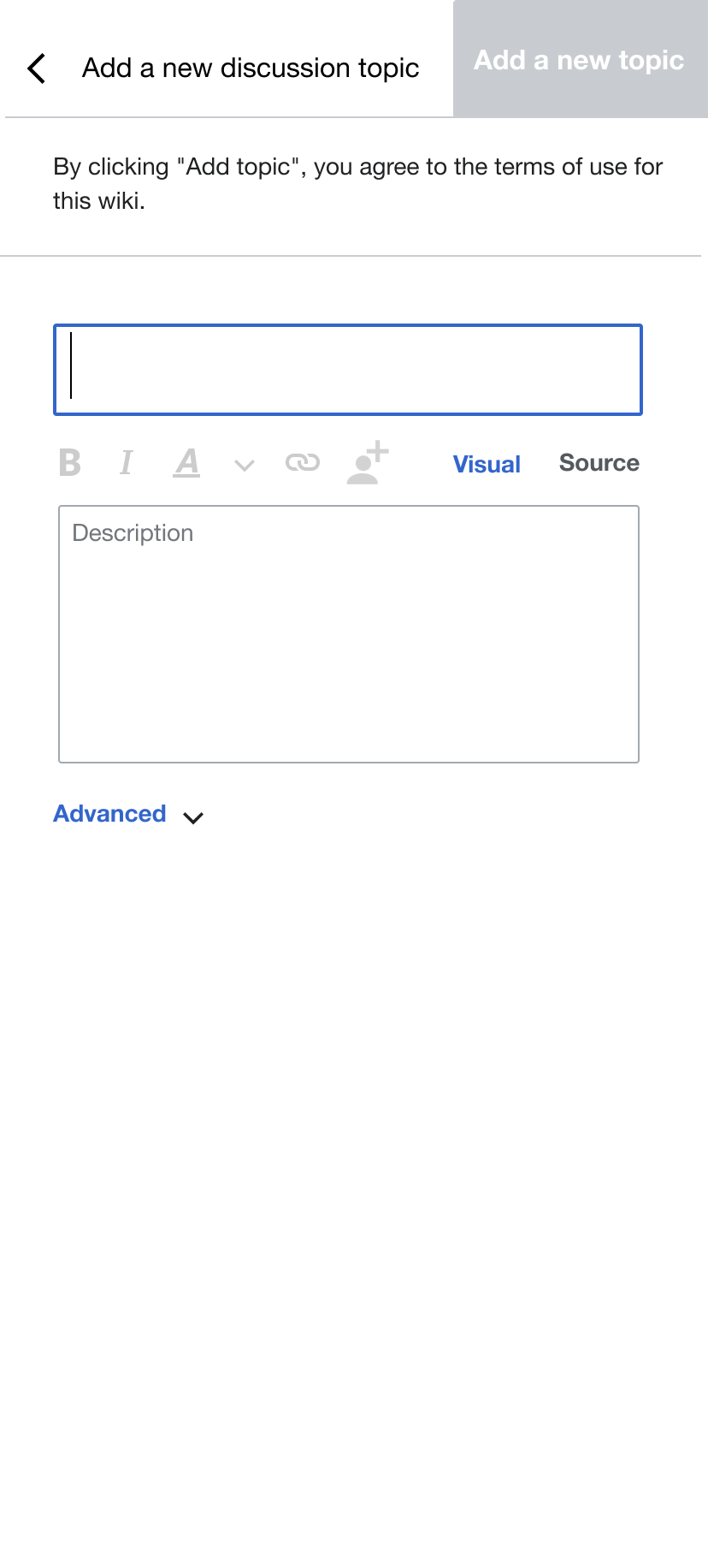
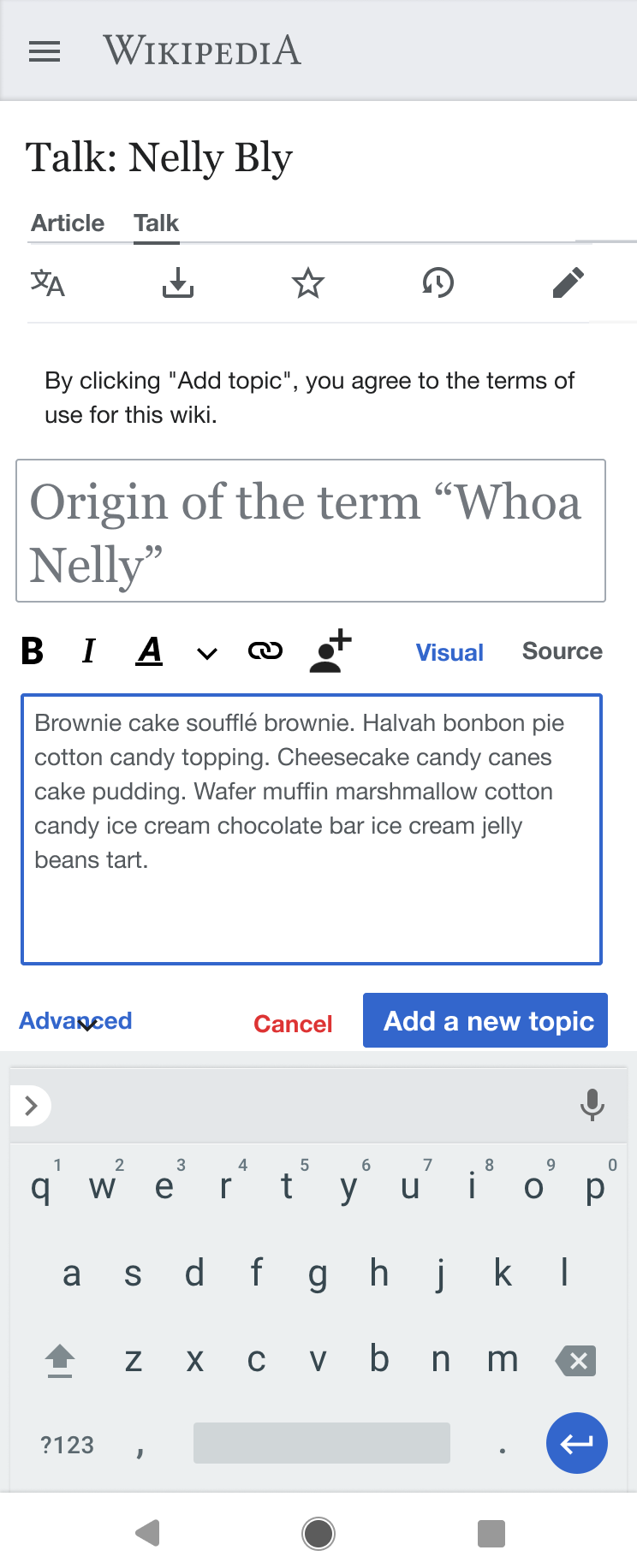
Mockups
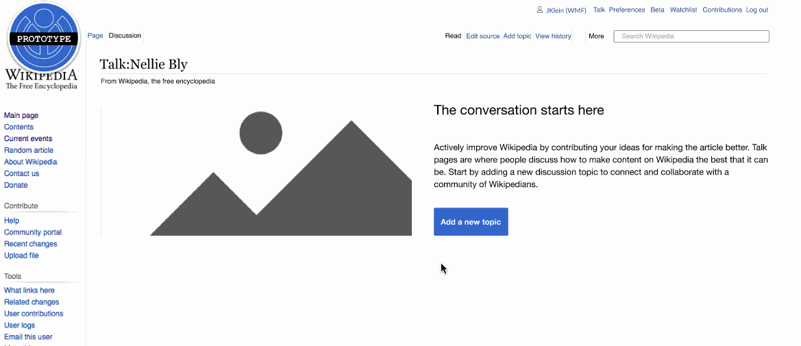
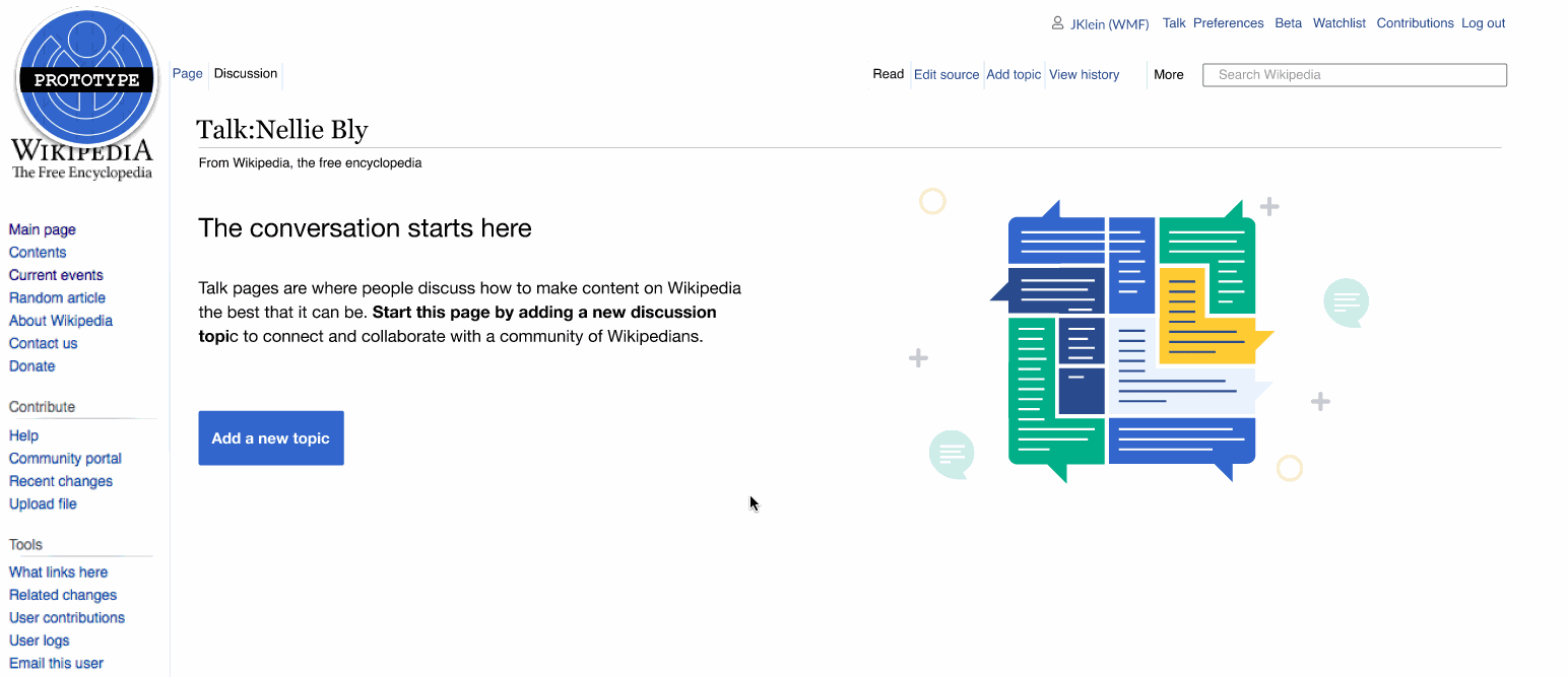
Desktop:
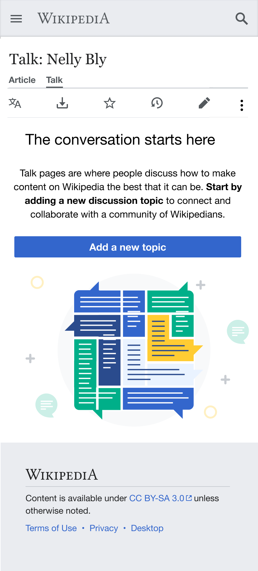
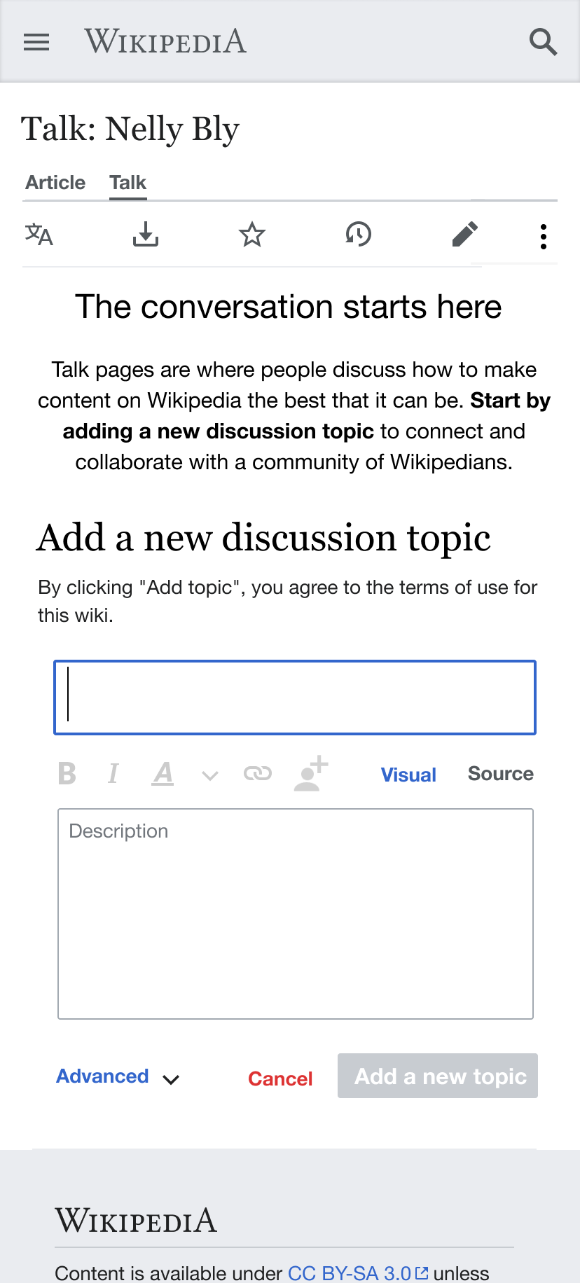
Mobile:
Tap new discussion button 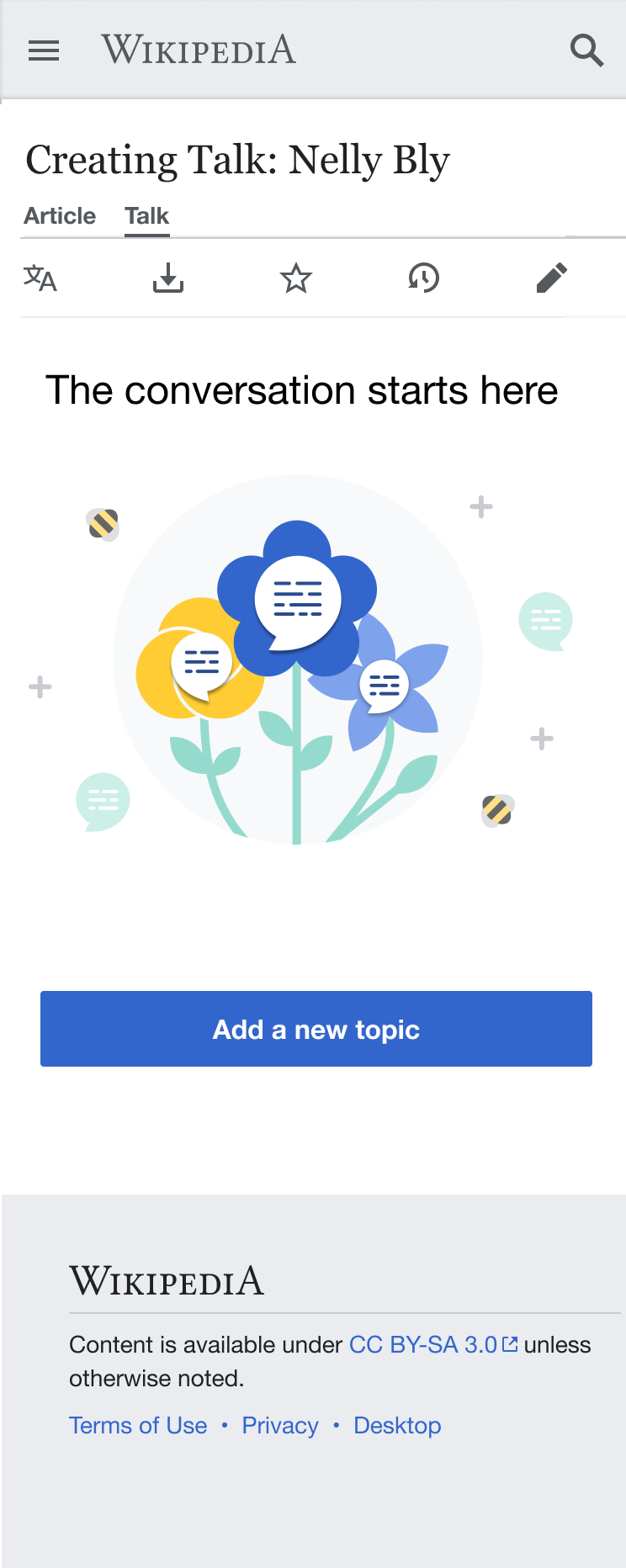 | New Discussion tool revealed 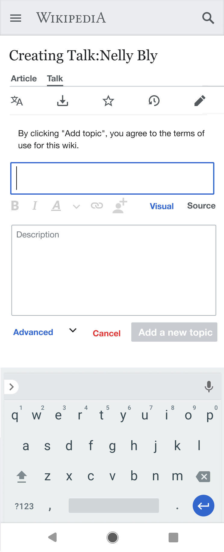 | Content entered and "add topic" tapped 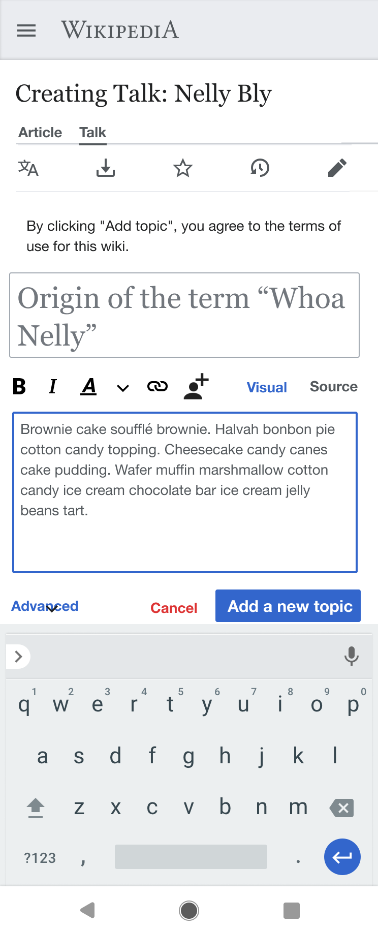 | Success messages 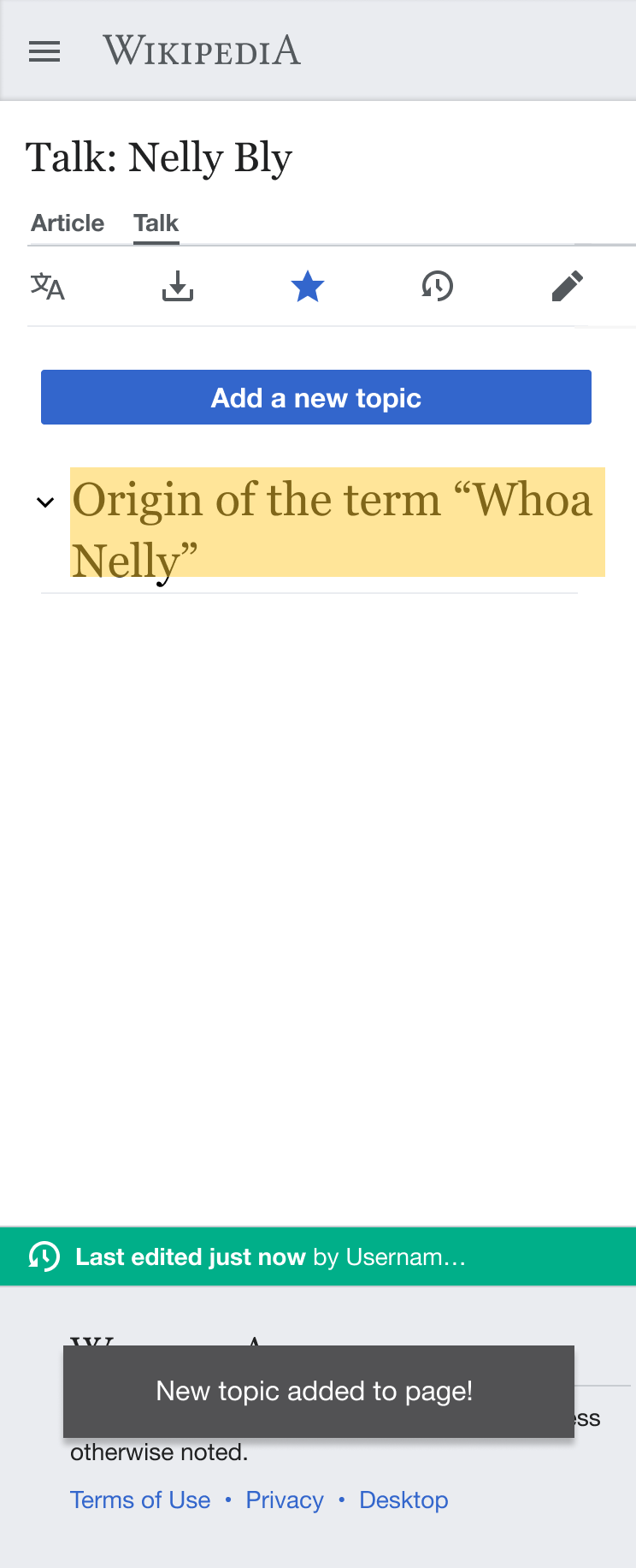 | Final state 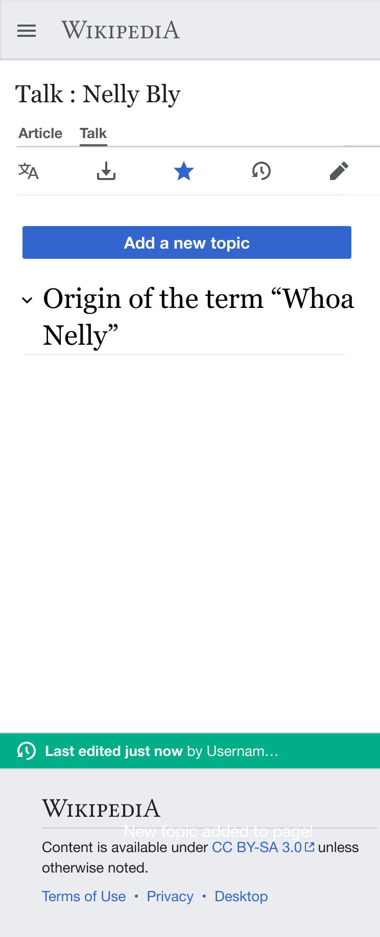 |
Illustration
Requirements
Mockups should be created for both desktop and mobile user experiences.
New specification as of 6/2/2021: Create some variations of the mock up to share with Editing team based on notes here.
Minimum test case
Meta
- Wiki: Beta Cluster
- Platform: Desktop
Steps
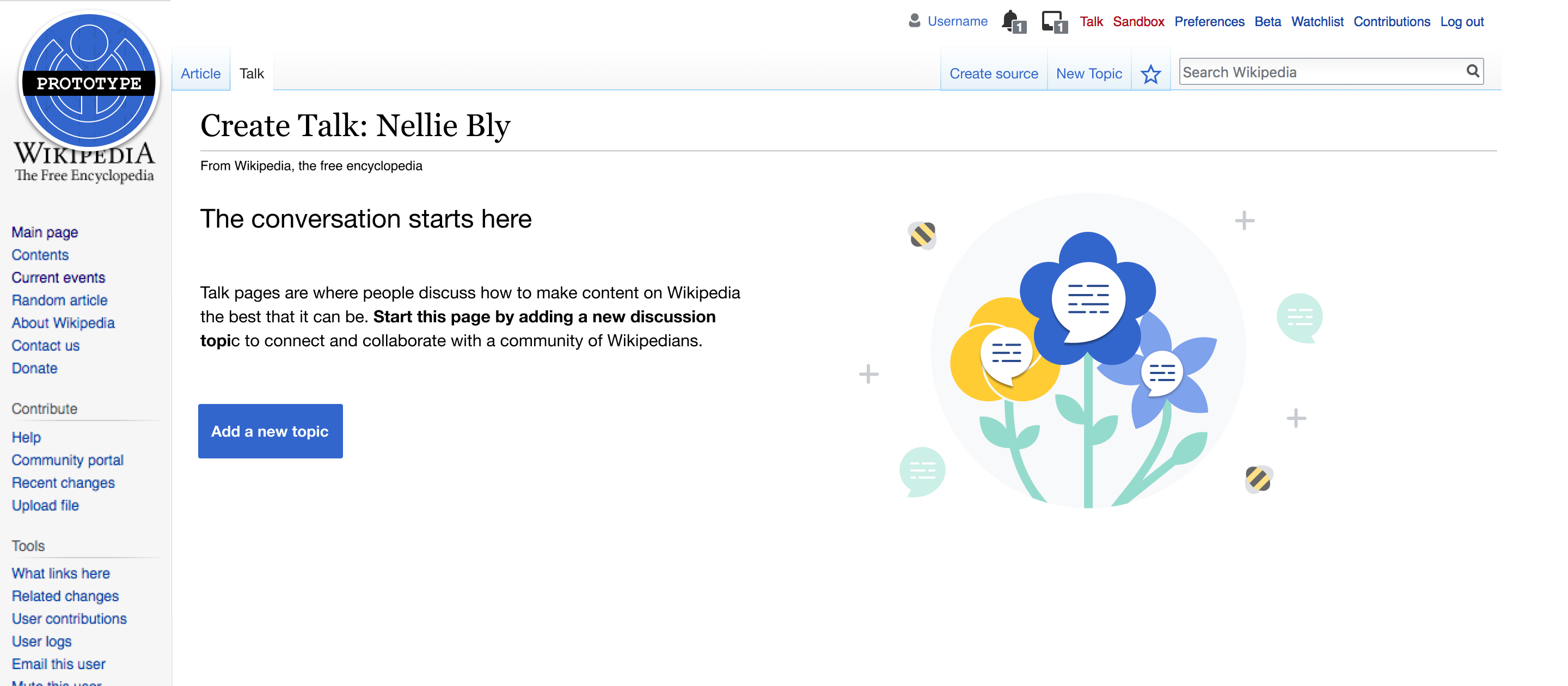
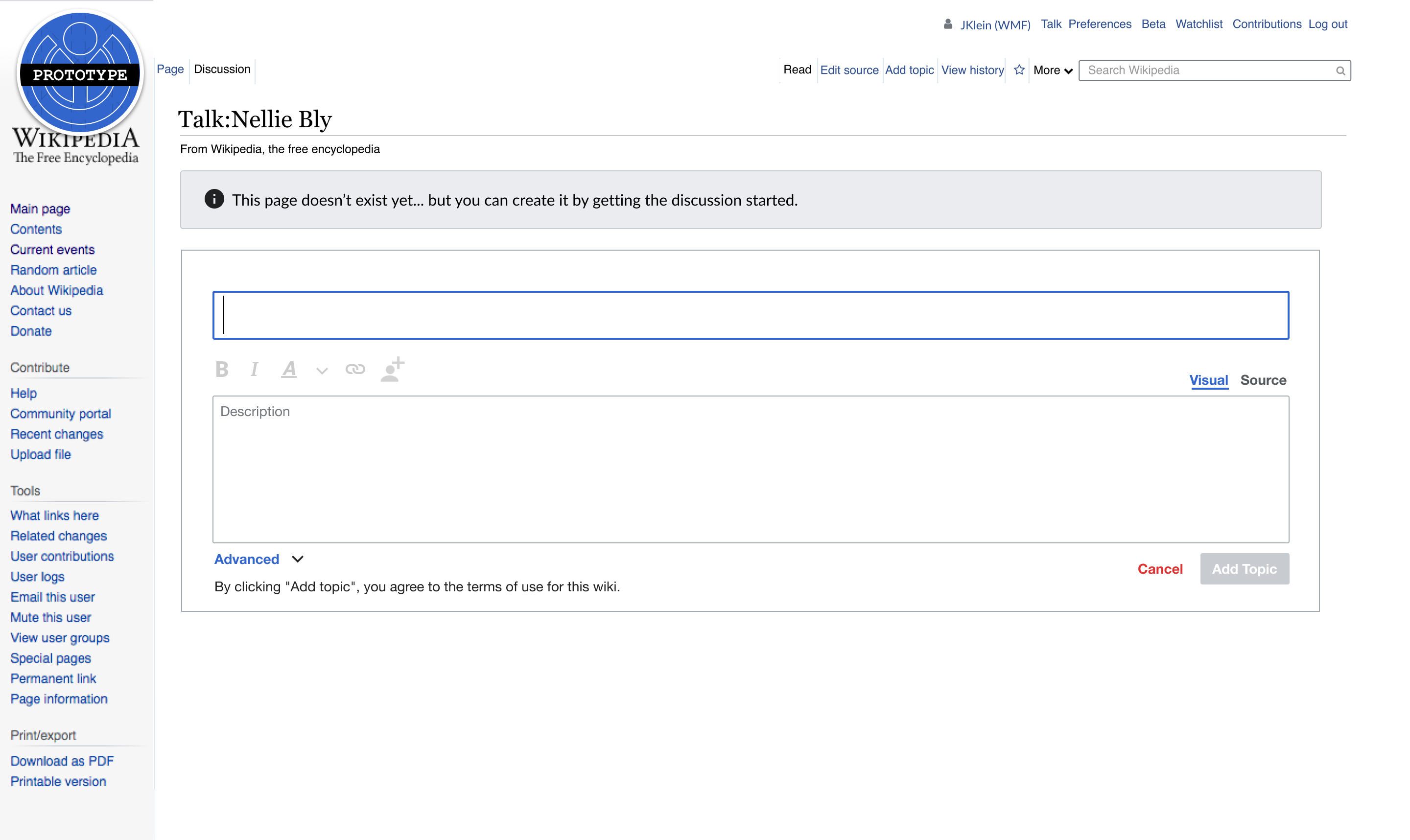
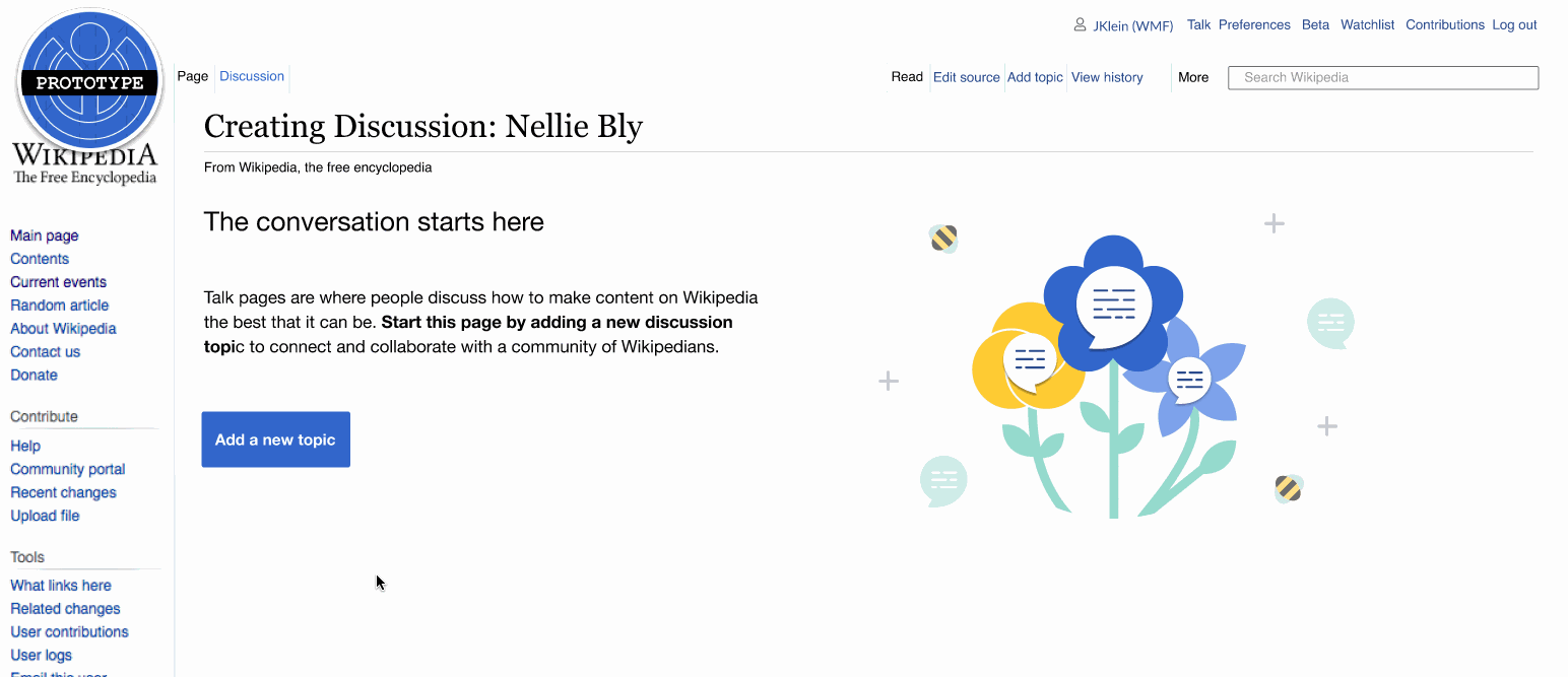
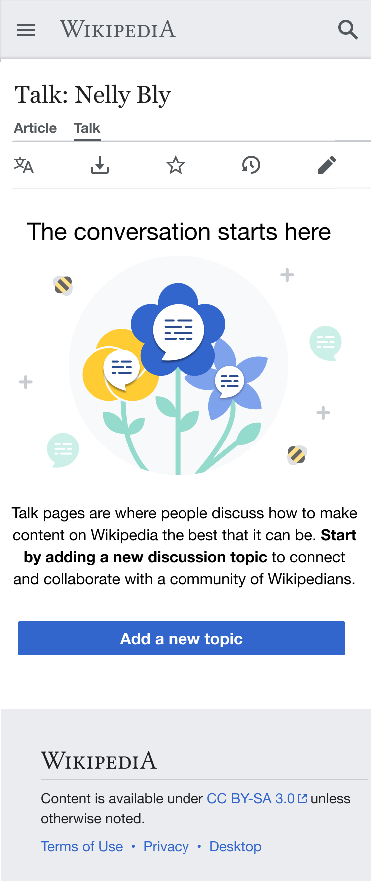
- On the beta cluster – while logged in OR logged out – visit a talk page in any of the namespaces listed above that has not yet been created (e.g. https://en.wikipedia.beta.wmflabs.org/w/index.php?title=Talk:Dog_health&action=edit&redlink=1)
- Note: the corresponding Article/Project/Template/Etc. will need to exist. We have an open ticket for cases where this is not the case: T288319.
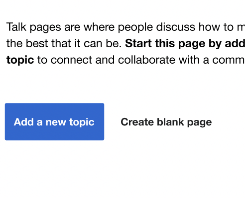
- ✅Notice the following appears on the not-yet-created article talk page:

Open questions
- What – if any – edit notices should people seeking to start a new conversation on a talk page that does not yet exist be notified about?
Done
- Designs for mobile and desktop that fulfill the stories defined above are posted to the Mockups section.
i. Purpose of the page: a space to communicate with other volunteers about the page to which the talk page is related/attached.