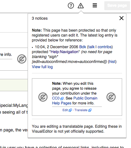
Here are a few examples of where they've been used:
Small ------------------------------------
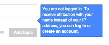
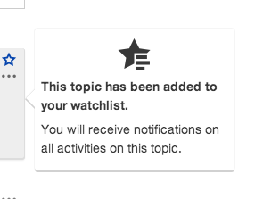
Large ------------------------------------
| • violetto | |
| Feb 5 2015, 12:15 AM |
| F1495645: Screenshot 2015-08-14 11.05.45.png | |
| Aug 14 2015, 8:36 PM |
| F14187: Screenshot_2014-07-28_08.43.27.png | |
| Mar 10 2015, 5:45 PM |
| F72760: Untitled.png | |
| Mar 10 2015, 11:15 AM |
| F37381: Screenshot_2015-02-04_16.16.32.png | |
| Feb 5 2015, 12:18 AM |
| F37371: Screenshot_2015-02-04_16.05.05.png | |
| Feb 5 2015, 12:15 AM |
| F37369: Screenshot_2015-02-04_16.03.40.png | |
| Feb 5 2015, 12:15 AM |
| F37373: Screenshot_2015-02-04_16.08.06.png | |
| Feb 5 2015, 12:15 AM |
| F37375: Screenshot_2015-02-04_16.10.55.png | |
| Feb 5 2015, 12:15 AM |
Here are a few examples of where they've been used:
Small ------------------------------------
Large ------------------------------------
| Subject | Repo | Branch | Lines +/- | |
|---|---|---|---|---|
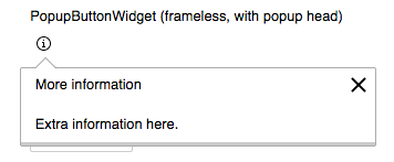
| PopupButtonWidget: Add hoverAction config to show popup on hover | oojs/ui | master | +54 -3 |
Hover seems to make sense for things like this as long as we also support click (for touch enabled devices)
I'm removing F37375 from the description because it is a tipsy.
Tipsy-ies are non-interactive. You cannot move your cursor into the tipsy. It moves where your cursor points. They're used as supporting description / info to an element.
PopupButtonWidget in comparison is interactive. It may contain links that user can interact with.
Another aspect to take into account is we support hover to show/hide those is to be careful not to accidentally hide them while the user is moving the cursor to interact with them. That is, make sure to provide a safe channel (active area, delay in time, etc.) between the trigger an the popup that makes sure it does not close when the user moves from one to the other.
@violetto it was a generic concern, similar to the one in the "hover tunnels" section about this article on hover menus.
For example, with Hovercards, if you move your cursor too slow through the red area I added in the mockup below, the card will close before you are able to reach it.
This is not a big concern for hovercards since (a) you don't need to click the card (you can just click the link your cursor was over), and (b) the timer for closing the hover card leaves enough time for you to reach the card (you need to move the cursor really slow).
However, for other uses we may want to consider additional mechanisms such as making the red area I illustrated to be an invisible part of the card so that moving in that area counts as hovering the card and does not hide it.
To add to what @Pginer-WMF said — even when Hovercards did not have any actions on the Popup itself, people wanted to be able to tweak the delay times. There are two delay times—
Deciding these values for everyone is a pain. We tweaked it a couple of times for Hovercards and then ended up letting editors change it themselves from their common.js.
I personally prefer click actions for opening UI elements that I'll need to interact with, like — menus, drop-downs etc; and a hover action for tooltip type things. So, I'd prefer to see a PopupButtonWidget only when I click.
Change 231547 had a related patch set uploaded (by Prtksxna):
PopupButtonWidget: Add hoverAction config to show popup on hover
I'm on the fence about this whether this should be hover or on-click. I see this having two options: Either have a slight delay on hover to reveal the popup, or make it so it's on click.
If we make it on hover with a reasonable amount of delay, I'd prefer we use it sparingly, which I don't think has been an issue. I looked around Wikipedia for examples but it was quite hard to find some, with exception of hover cards. For me, the advantages is that this is a small target for a potentially important information.
Just like tooltips, triggered by mouse hover, they carry supporting info that are potentially important. Granted, tooltips' use case is different and so is hovercards. Users get hovercards from in-line links that are littered everywhere within an article. I can understand if it gets frustrating especially when your mouse is wandering across the page.
Here's an example at the top of my head why clicking on each icon is more work for something so small that carry helpful info for users:
https://en.wikipedia.org/wiki/Special:Preferences#mw-prefsection-echo
Here's a proposal, do you have time to make a prototype? Perhaps with the same execution within Special:Preferences. If you can make me a prototype, I can find the users to try this out. I hear your point, and will be happy to follow what our users think feels best.
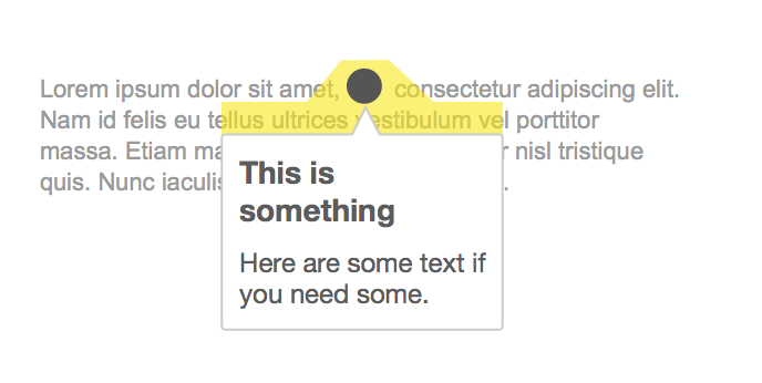
I share the same concerns about the small hover tunnels. We can give the illusion of a larger surface area with a bigger tapping space like indicated in yellow in the photo below. Moving the tipsy closer to the text/icon/target wouldn't be a bad idea.
I'm on the fence about this whether this should be hover or on-click.
For now, I am working on making it a config option, so that we can use the same widget for both use cases.
Here's a proposal, do you have time to make a prototype?
I am not sure if the patch will get merged, but testing this with different settings shouldn't be to much of a problem.
I think having both is going to be more confusing than picking one as we will end up with inconsistent behaviour between interfaces. I think we should stick with avoiding hover functionality.
Change 231547 abandoned by Prtksxna:
PopupButtonWidget: Add hoverAction config to show popup on hover
Reason:
As per discussion on T88630
That's where hoverIntent (vanilla JS version) could come in handy. From my experience it's a great addition to make the interface more easy-going for users.
As @matmarex points out in T117720: Remove use of jquery.tipsy from Wikimedia-maintained code, and @Perhelion in T147243: mw tooltip gadget/widget/plugin is needed, we really do need some way to do this in OOUI. Do you think it'd be better off as a separate widget then?
this is an old, practically abandoned story.
i suggest/request to prioritize it, since tipsy (marked as "deprecated" for the last 9 years or so), is actually going to be removed, and yet no appropriate alternative exists.
resolving this story will provide such an alternative.
peace.