Page MenuHomePhabricator

[EPIC] Add Chip component to Codex
Closed, InvalidPublic

Description

Background

  • Description: We need to add both InfoChip and FilterChip to Codex.
  • History: FilterChip was previously used in our system (check the OOUI demo) while InfoChip was no documented.
  • Considerations: list any known challenges or blockers, or any other important information
  • Known use case(s): all use cases have been captured in this Figma inventory
Info Chip:
Captura de Pantalla 2022-11-07 a las 11.21.43.png (1×1 px, 634 KB)
Captura de Pantalla 2022-11-07 a las 11.24.32.png (1×2 px, 1 MB)
Captura de Pantalla 2022-12-02 a las 11.43.58.png (1×1 px, 564 KB)
Info Chip in WikifunctionsInfoChip with feedback states in WikifunctionsLevel chips in Growth
Filter Chip:
Captura de Pantalla 2022-11-07 a las 11.21.53.png (1×2 px, 882 KB)
Captura de Pantalla 2022-11-07 a las 11.27.56.png (1×2 px, 1 MB)
Captura de Pantalla 2022-11-07 a las 11.29.18.png (854×2 px, 824 KB)
Captura de Pantalla 2022-12-02 a las 11.53.21.png (1×1 px, 903 KB)
Filter Chip in AW Function EditorFilter Chip in Recent ChangesError Input Chip with Filter Chip in user's preferencesChip with feedback dot in Recent Changes
Selection Chip
Captura de Pantalla 2022-11-07 a las 11.32.11.png (1×2 px, 955 KB)
Captura de Pantalla 2022-11-07 a las 11.32.19.png (1×2 px, 2 MB)
Captura de Pantalla 2022-11-07 a las 11.41.18.png (1×2 px, 2 MB)
Captura de Pantalla 2022-12-02 a las 11.55.54.png (1×2 px, 1 MB)
Newcomer HomepageWikimedia CommonsFilter tabs become selectable item with title and description in Wikimedia CommonsSelection chips in Language projects T113257 and T319181
Clickable / Link chip
Captura de Pantalla 2022-12-02 a las 11.50.19.png (1×764 px, 389 KB)
Clickable chip (with link?) in Special Search (Quick view) T306630

User stories

  • As a designer/developer I need to use InfoChip to inform the user about something with or without a feedback state (notice, success, warning and error).
  • As a designer/developer I need to use FilterChip to add chips in a ChipInput T280701

Previous implementations

These artifacts are listed for historical context. The Figma spec, linked below, is the source of truth for the new component.

Open questions

  • Will be InfoChip and FilterChip variants of the same Chip component? Or will we separate them into InfoChip component and FilterChip one?
  • Name of each Chip:
    1. InfoChip / FilterChip / SelectionChip
    2. LabelChip / InputChip / SuggestionChip
  • Could we create a prop to make the Chip fixed width? We should use it in cases where we have more than one chip in each column to avoid some chips to be wider than others:
    Captura de Pantalla 2022-11-09 a las 16.21.35.png (354×208 px, 14 KB)
  • Maximum example: do we want to use ellipsis or could the chip jump to a second line?
    Captura de Pantalla 2022-11-09 a las 16.22.18.png (1×2 px, 739 KB)

Codex implementation

Component task owners

Design exploration

Some solutions to unify all the different chip use cases with a systematic solution have been created in this exploration Figma file:

Captura de Pantalla 2022-12-02 a las 12.24.00.png (1×2 px, 947 KB)

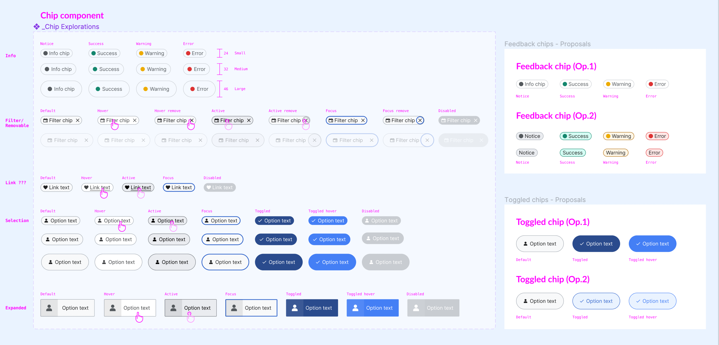
We could have the following chips:

  • Type
    • Informative (non clickable).
      • Feedback: this chip could also display a Feedback status for the user.
    • Filter (removable)
    • Selection (toggle)
    • Clickable (or link)
  • Size
    • Small: we'll need a 20-24px chip to be included within other components (e.g. chips included within Inputs)
    • - Medium / Large: we'll need a large size for toggled chips (e.g. the ones used in Growth)

Design spec

Once a component spec sheet has been created in Figma, remove the note stating that the spec is missing and link to the spec below.

A component spec sheet has not been created yet.

Component spec sheet

Stage 1: Minimum viable product (MVP)

MVP includes basic layout, default states, and most important functionality.

Acceptance criteria

  • Determine what MVP includes for this component and document this in a subtask. Assign task to designer.
  • Design MVP. Once complete, assign task to developer.
  • Implement MVP

Stage 2: Additional states, features, and variants

This might include a disabled state, framed/frameless designs, transitions, supporting different use cases, etc., which will be captured in separate subtasks.

Acceptance criteria

  • Document design and implementation of additional states and features in individual subtasks
  • Complete each additional state/feature subtask

Stage 3: Refinement

This stage includes any final touches or bug fixes needed before the component can be deemed complete, which will be captured in separate subtasks.

Acceptance criteria

  • Finalize docs: open and complete a subtask for any additional demos that need to be added or documentation that needs work
  • Add Chip in the DSG
  • Meet accessibility standards: open and complete a subtask for any necessary accessibility improvements
  • Meet internationalization standards: open and complete a subtask to fix any i18n bugs
  • Complete testing: open and complete a subtask for any additional unit or functional tests that are needed
  • During the collaboration, track any useful information about what is working well or what is challenging
  • After the collaboration, share that information and survey the collaborators:
    • What went well? What should we keep doing in future collaborations?
    • What was challenging or frustrating? What held back the collaboration from being as successful as it could have been?
    • What should we do differently in future collaborations?
    • Overall, how satisfied are you with the collaboration and its outcomes?

Related Objects

Event Timeline

Adding some comments during the meeting about this task:

  • Given that "info chips" are non-interactive labels (or 'tags'), should we consider this as a separate component type? It would also enable more colour/style variations to be introduced for this more informational component.
  • "Suggestion chip" is really a selection input (similar to checkboxes) so a better name suggested might be "Selection chip"
  • Relatedly, since the filter and suggestion chip are both interactive form elements, it may make more sense for these two to be variants of the same component type.

Adding some other open questions (with screenshots) after chatting with @bmartinezcalvo and @SWoodruff-WMF:

  • Is it possible to set a max-width limit for the chip component?

image.png (384×666 px, 38 KB)

  • What happens if the the container of the chip is shorter than the length of the chip?

image.png (536×1 px, 50 KB)

Re-posting @scblr's comment on T280681#8380172:

Examples from Android per “Design Practice & Systems + DS Office Hours” meeting:

  • Chips used in the 'Tag images' Suggested edits task (Zeplin | T240196)
  • Chips in 'Reading lists' search (Zeplin | T214506)
  • Chips design in the component library that is work in progress (Figma)
    CleanShot 2022-11-08 at 17.22.16@2x.png (1×1 px, 64 KB)

@RHo @bmartinezcalvo @Volker_E

PS: Also for reference: Material 3 Chips and its new Figma design kit are quite impressive (and extensive)

And on that note, should this other task be merged or made a sub-task to this one?

And on that note, should this other task be merged or made a sub-task to this one?

This epic task is to add the Chip component just in the Codex demo while T280681 is to add the Chip component in the DSG. Since currently we don't have the chip component page in the DSG I think we can maintain both tasks. cc: @ldelench_wmf should we merge both or should we separate them in different tasks?

Gotcha. As the person who wrote that other task before adding components to Codex existed I have no issues merging with this one.

Gotcha. As the person who wrote that other task before adding components to Codex existed I have no issues merging with this one.

I think it would be good to merge T280681: Add Filter Chip to the DSG and T309249: Add Tags/Chips component to Codex into this task, and then we can spin out an MVP sub-task here when ready. Are there still design questions that need to be answered before work on an MVP version of this component can start?

Google's Material Design system includes a well-documented Chip component that may be worth looking at: https://m3.material.io/components/chips/overview

Like us, they have identified a couple of different types of "chips": assist, filter, input, and suggestion

image.png (600×2 px, 39 KB)

It would be great if we could similarly identify a small number of "types" and make things as consistent as possible between our variations.

The expanded chip behavior in the Suggested Tags feature on Commons could be considered non-standard in my opinion – that future of that entire feature is somewhat uncertain as far as I understand, so I would not give too much importance to supporting that use-case.

Gotcha. As the person who wrote that other task before adding components to Codex existed I have no issues merging with this one.

I think it would be good to merge T280681: Add Filter Chip to the DSG and T309249: Add Tags/Chips component to Codex into this task, and then we can spin out an MVP sub-task here when ready. Are there still design questions that need to be answered before work on an MVP version of this component can start?

Google's Material Design system includes a well-documented Chip component that may be worth looking at: https://m3.material.io/components/chips/overview

Like us, they have identified a couple of different types of "chips": assist, filter, input, and suggestion

image.png (600×2 px, 39 KB)

It would be great if we could similarly identify a small number of "types" and make things as consistent as possible between our variations.

I wonder if the "info" use case could be considered more like a badge or tag as it is non-interactive and conveys status, and is an "appendage" on something. Atlassian calls theirs a "lozenge" when it is a text label (as opposed to badges being numbers only) but it is the same type separate from chips. In general, the info chip use case we have here seems to be commonly split out as a separate "badge" or status "tag" component in other design systems:

The expanded chip behavior in the Suggested Tags feature on Commons could be considered non-standard in my opinion – that future of that entire feature is somewhat uncertain as far as I understand, so I would not give too much importance to supporting that use-case.

We use the same chip on the Growth project for topic filters so I want to lobby for continued need for this use case :)
The intention is to allow someone to scan more easily and select multiple items in a group than if the items were presented as a checkbox group. Looking at the Material guidelines it maps to what they class as a filter chip.

Screenshot_20221114-230807.png (969×1 px, 247 KB)

@RHo do the Growth topic filters expand? It's the big expanded state in particular that I want to get away from. The general suggestion/filter chip behavior is useful I agree (complete with selected/unselected states).

@RHo do the Growth topic filters expand? It's the big expanded state in particular that I want to get away from. The general suggestion/filter chip behavior is useful I agree (complete with selected/unselected states).

Ahh do you mean the "detailed" states with title and description? Sorry I had completed missed that this was implemented on Commons after the initial chip type we share. Growth only uses non-expanded selected and non-selected states so would not need this, and completely agree that seems not a use case to prioritise (maybe more of a taco or potato wedge component for much, much later on...)

I wonder if the "info" use case could be considered more like a badge or tag as it is non-interactive and conveys status, and is an "appendage" on something. Atlassian calls theirs a "lozenge" when it is a text label (as opposed to badges being numbers only) but it is the same type separate from chips. In general, the info chip use case we have here seems to be commonly split out as a separate "badge" or status "tag" component in other design systems:

@RHo regarding Chip, Tag and Badge in each Design System they work them differently so we should decide which solution is the best for our particular system. In my opinion, Badge is the small dot or number that appears on top right of an icon when there is a new notification like in this Badge from Material.

Captura de Pantalla 2022-11-21 a las 10.58.30.png (310×752 px, 53 KB)

While in Shopify they call Tag to any non interactive or interactive component that helps organize and categorize objects.

Captura de Pantalla 2022-11-21 a las 11.06.01.png (1×1 px, 123 KB)
Captura de Pantalla 2022-11-21 a las 11.05.57.png (1×1 px, 474 KB)
Non interactiveInteractive

I like this approach where they work visually the same both non interactive and interactive Tag/Chip. I'm curious about what the rest of the team think about these component's categories as specified in the Open questions section in the task.

After the inventory created for this and the MVP tasks I've created these explorations trying to unify all the possible chip use cases with a systematic solution:

Captura de Pantalla 2022-12-02 a las 12.24.00.png (1×2 px, 947 KB)

We could organize the chip into the following variants and properties:

  • Type of chip or functionality:
    • Informative (also Informative with Feedback for the user): this type of chip will be just informative (non clickable).
    • Filter (removable)
    • Selection (toggle)
    • Clickable (or link)
  • Size
    • Small: we'll need a 20-24px chip to be included within other components (e.g. chips included within Inputs)
    • Medium / Large: we'll need a large size for toggled chips (e.g. the ones used in Growth).

The Design Systems team is removing the majority of our "meta" tasks like this one.
Followup steps:

  • create mvp tasks for selection chip, clickable/link chip
  • pull background info from this task into mvp tasks

The Design Systems team is removing the majority of our "meta" tasks like this one.
Followup steps:

  • create mvp tasks for selection chip, clickable/link chip
  • pull background info from this task into mvp tasks

On what task should we be marked as blocked, in these cases?