Page MenuHomePhabricator

New discussion v1.0: create mockups
Closed, ResolvedPublic

Assigned To
Authored By
ppelberg
Jan 20 2020, 10:16 PM
Referenced Files
F32417684: Publish.png
Oct 28 2020, 5:13 PM
F32417668: Initiate.png
Oct 28 2020, 5:13 PM
F32417679: Draft (1).png
Oct 28 2020, 5:13 PM
F32417690: Enter topic 2 (2).png
Oct 28 2020, 5:13 PM
F32417649: Enter topic 2.png
Oct 28 2020, 4:47 PM
F32417647: WYSIWYG - DRAFT.png
Oct 28 2020, 4:46 PM
F32417639: source.gif
Oct 28 2020, 4:42 PM
F32417642: Screen Shot 2020-10-28 at 12.42.09 PM.png
Oct 28 2020, 4:42 PM
Tokens
"Like" token, awarded by AdHuikeshoven.

Description

Rationale

T233446 contains the rationale for why this feature is prioritized.

Jobs to done

The high level "job" this intervention is intended to accomplish is as follows: Help Junior Contributors receive helpful feedback and/or guidance from other contributors.

With this "job" in mind, the design we come up with should fulfill the following stories.

When a Junior Contributor is seeking feedback and/or guidance from other contributors, they should intuitively..:

  • Know talk pages are used to, among other things, communicate/coordinate with other contributors
  • Know how to start a new discussion no matter where they are on the talk page, regardless of the namespace, without needing to read any instructions
  • Know how to write a title/subject for the discussion they are intending to start in a way others can easily engage with
    • In cases where people leave the title/subject field blank, they will see a warning of some sort when they attempt to publish the new topic they are drafting, but they will ultimately be able to publish the "subject-less" topic.
  • Know how to write a description for the discussion they are intending to start in a way others can easily engage with
  • Know how to write a description for the discussion they are intending to start in a way that makes it easy for others to know who to address/direct their responses to
    • Know how to post their comment such that their identity (IP or username) is properly attributed to their discussion
  • Know how to format the description of the discussion they are intending to start
  • Know how to cancel/discard the new discussion/section they are drafting
  • Know who the conversation they are starting will be visible to
  • Know how to find out when someone comments on/in the discussion they start
  • Be confident the new discussion they intended to start has been started/posted successfully
  • Be confident they are doing the right thing throughout the course of the workflow

Considerations

  • New design must be compatible with contributors' existing workflows for creating and inserting preloaded templates and edit notices[iii][iv]. For more information about preloads, see: T250768.

Open questions

  • 1. Should the "Jobs to be done" be addressed in multiple versions?
  • 2. How – if at all – should the full-page view that is presented to people after they click the "New section" tab be affected by the improvements we have planned?
    • For people who have the New Discussion Tool enabled, all existing "Add topic" / "New section" links will lead people to the new tool
    • For people who do NOT the New Discussion Tool enabled, all "Add topic" / "New section" links will function as they currently do
  • 3. Initially, where should the "New discussion" / "Add topic" affordance(s) appear on the page? [i]
  • 4. The new discussion workflow should help people understand how the talk page is structured. [ii] With this in mind, what should the relationship be between where the "New discussion" / "Add topic" input area is shown and where the new section someone will have drafted using it is ultimately published to the page?
  • 5. What – if any – opportunities are there in the new discussion workflow to help people understand the following:
    • What is appropriate to talk about on talk pages? Perhaps it's valuable to communicate to people starting a new topic for the first time on an article talk page what said pages are best used for.
    • Who is "this" talk page visible to? And by extension: who could potentially see the conversation you are in the process of starting?
  • 6. What – if any – opportunities are there in the new discussion workflow are there to increase the likelihood people are made aware when someone responds to a conversation they start? E.g. adding a prompt for people to add and/or confirm an email address to associate with their account post-publish.
    • This thinking and work will happen in: T262103.
  • 7. What is the relationship between the "heading" field and the "body" field? Asked another way: what – if anything – about the heading field changes when someone switches from source to visual?
  • 8. What kind of text should the heading field accept? Plaintext? Wikitext? Richtext?

Details

  • Platform: desktop
  • All talk namespaces

Links

User flow

This section will contain mockups of the user flow, once it's completed.

Done

  • "Open questions" are resolved
  • Mockups that satisfy the "Jobs to be done" are included in the "User flow" section above

i. We recognize the main calls to action, of which "Start a new topic" is one, will change as part of the work we have planned in T249579.
ii. E.g each section is a topic and the page is ordered from oldest topics at the top, to newest topics at the bottom.
iii. https://en.wikipedia.org/wiki/Wikipedia:Editnotice
iv. Notice the "HELLO AND WELCOME TO THE TEAHOUSE EDIT WINDOW!" box above the Subject/headline field: https://w.wiki/c3S
Related Objects

Event Timeline

There are a very large number of changes, so older changes are hidden. Show Older Changes
ppelberg updated the task description. (Show Details)
Esanders renamed this task from New discussion v1.0: create mocksups to New discussion v1.0: create mockups.Mar 17 2020, 5:59 PM
ppelberg added subscribers: DLynch, Esanders.

Update: 17-March

  • Adding the following question to the "Open questions" section of the task description. @Esanders and @DLynch surfaced this question during the team's prototyping session at our last offsite (November, 2019):
    • "How – if at all – should the full-page view that is presented to people after they click the "New section" tab be affected by the improvements we have planned?"

Preloaded templates
Adding the below to the task description's === Considerations section:

  • "New design must be compatible with contributors' existing workflows for creating and inserting preloaded templates. For more information, see: T250768."

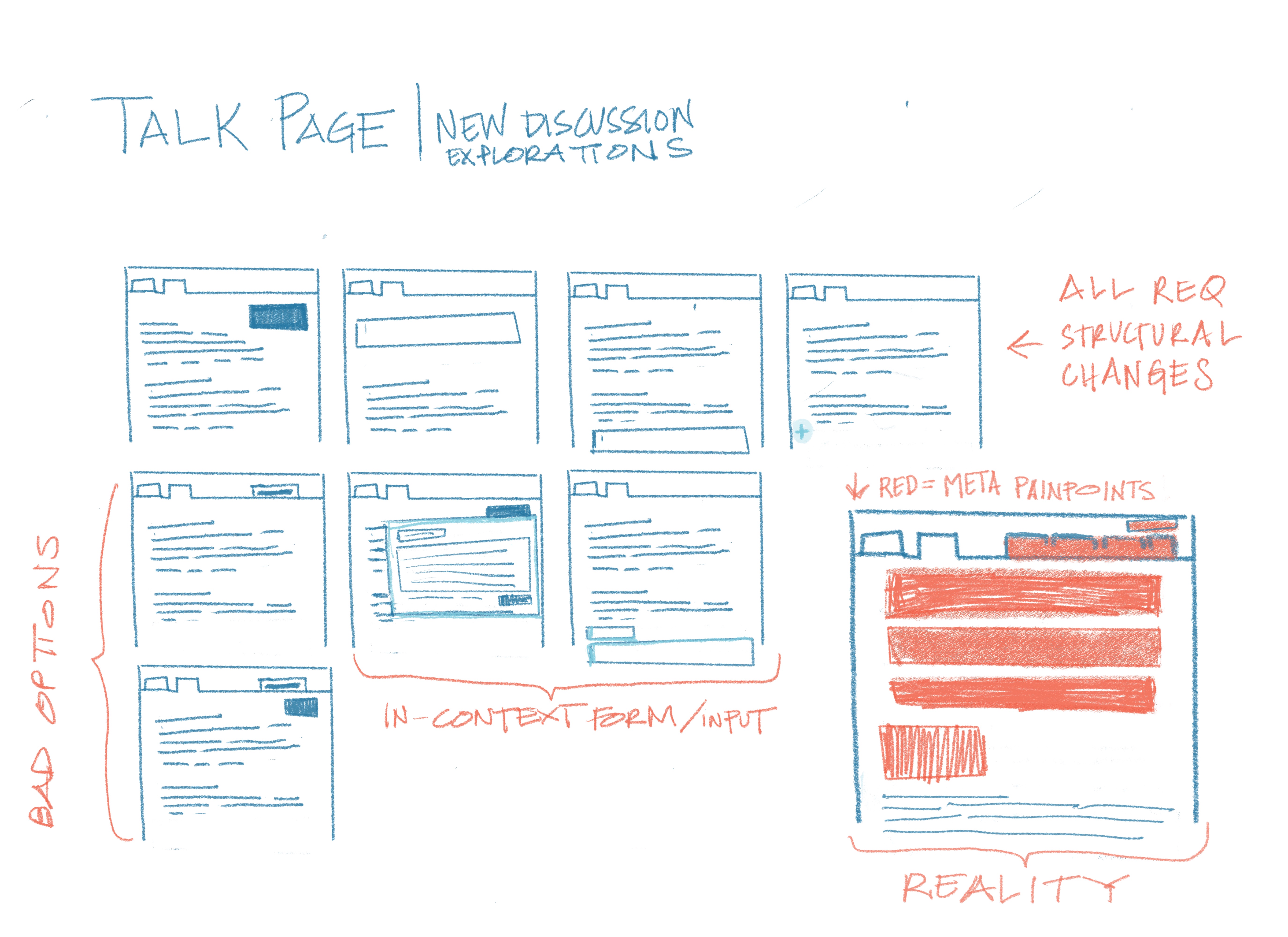
Dropping my sketching here so you can see and respond to what I'm thinking about in conjunction with new discussions.

  • Removing the "new topic" navigation button - I have this as trending theme and don't know how feasible it really is but the fact that this is a navigation element is confusing to people.
  • There's a tension between what new users expect (new convos to happen at the top of the page etc.) compared to current wiki conventions (add convos at the bottom) - I suspect any change that we make will have to be gracefully revealed so that we can ensure that we aren't unintentionally disrupting senior contributor workflows.

Untitled_Artwork 2.jpg (4×5 px, 2 MB)

Yesterday, @ppelberg and I discussed a design strategy for this work that would allow us to make improvements to user experience without initially touching or massively cosmetically improving the interface. The idea is to deprioritize the first touchpoint of the new discussion experience (finding the button). Of course, this will eventually be addressed but it will not be the first design intervention that we do to address the new discussion workflow.

Yesterday, @ppelberg and I discussed a design strategy for this work that would allow us to make improvements to user experience without initially touching or massively cosmetically improving the interface. The idea is to deprioritize the first touchpoint of the new discussion experience (finding the button). Of course, this will eventually be addressed but it will not be the first design intervention that we do to address the new discussion workflow.

The initial design approach we will be taking has been posted to the New discussion project page: https://www.mediawiki.org/w/index.php?title=Talk_pages_project%2FNew_discussion&type=revision&diff=3871225&oldid=3817687

Task description update: 12-August
Below are the open questions that surfaced in the conversation @iamjessklein and I had today about the design of the New Discussion Tool.

Note: the task description's "Open questions" section has been updated to include the questions below.

Open questions:

  • Initially, where should the "New discussion" / "Add topic" affordance(s) appear on the page? [i]
  • The new discussion workflow should help people understand how the talk page is structured. [ii] With this in mind, what should the relationship be between where the "New discussion" / "Add topic" input area is shown and where the new section someone will have drafted using it is ultimately published to the page?
  • What – if any – opportunities are there in the new discussion workflow to help people understand the following:
    • What is appropriate to talk about on talk pages? Perhaps it's valuable to communicate to people starting a new topic for the first time on an article talk page what said pages are best used for.
    • Who is "this" talk page visible to? And by extension: who could potentially see the conversation you are in the process of starting?

i. We recognize the main calls to action, of which "Start a new topic" is one, will change as part of the work we have planned in T249579.
ii. E.g each section is a topic and the page is ordered from oldest topics at the top, to newest topics at the bottom.

ppelberg updated the task description. (Show Details)

One additional thing that @ppelberg @Esanders and I discussed was looking at how Convenient Discussions handled starting a discussion in context and scrolling the user to that position so that they can see where conversations are placed within the page. We want to take a closer look into what is working/not working about this affordance.

4-September update
The conversations @Esanders, @iamjessklein and I had this week helped produce answers to some of the task description's "Open questions" and open new ones.

Those "answers" and "new questions" are documented below. The task description has also been updated to include them.

Answered questions

  • 2. How – if at all – should the full-page view that is presented to people after they click the "New section" tab be affected by the improvements we have planned?
  • For people who have the New Discussion Tool enabled, all existing "Add topic" / "New section" links will lead people to the new tool
  • For people who do NOT the New Discussion Tool enabled, all "Add topic" / "New section" links will function as they currently do

New questions

  • What is the relationship between the "heading" field and the "body" field? Asked another way: what – if anything – about the heading field changes when someone switches from source to visual?
  • What kind of text should the heading field accept? Plaintext? Wikitext? Richtext?

Initial Ideas


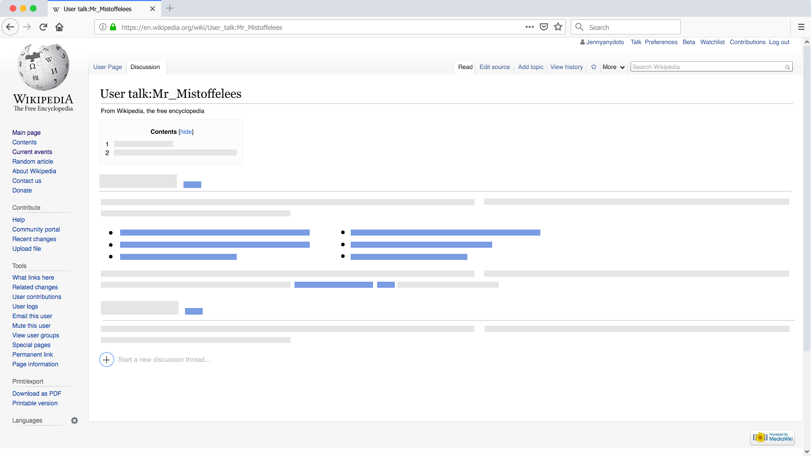
I did explorations for the purpose of conversation and brainstorming. For this first round, I didn't touch the existing tab/button for new discussions. There are a few touchpoints in the workflow that we need to consider:

  1. Point of entry - What does the contributor click to get started making a new topic?
  • Option 1a: click the button/tab for the first iteration and don't add any new buttons or calls to action (aka play it safe, improving on the other areas of the interface while relatively not touching the look and feel of the top level navigation.
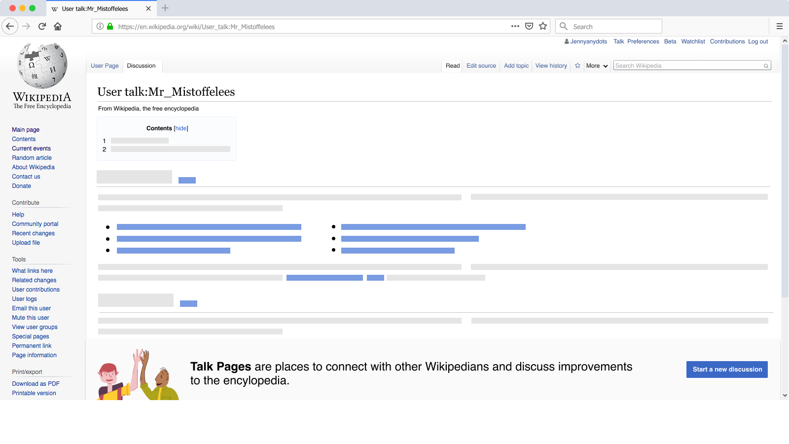
  • Option 1b: Big button at the top of the page

bigbutton.png (900×1 px, 107 KB)

  • Option 1c: Contextual prompt and button

contextualpromptandbutton.png (900×1 px, 107 KB)

  • Option 1d: Sticky at the bottom of the page

sticky.png (900×1 px, 125 KB)

No matter which option we ultimately choose, we should adjust the language throughout the workflow to make it more discussion-specific.

  1. New Discussion input - Where does the contributor do their drafting and how are they prompted?
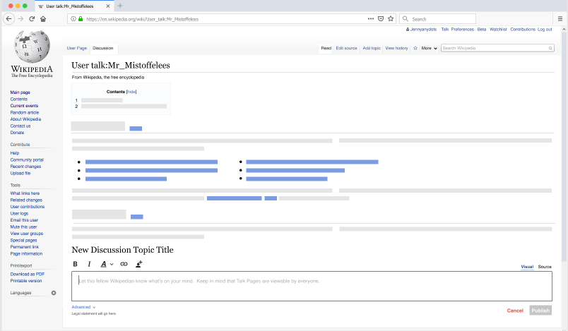
  • Option 2a: In context "form"

Screen Shot 2020-09-07 at 7.12.24 PM.png (469×804 px, 59 KB)

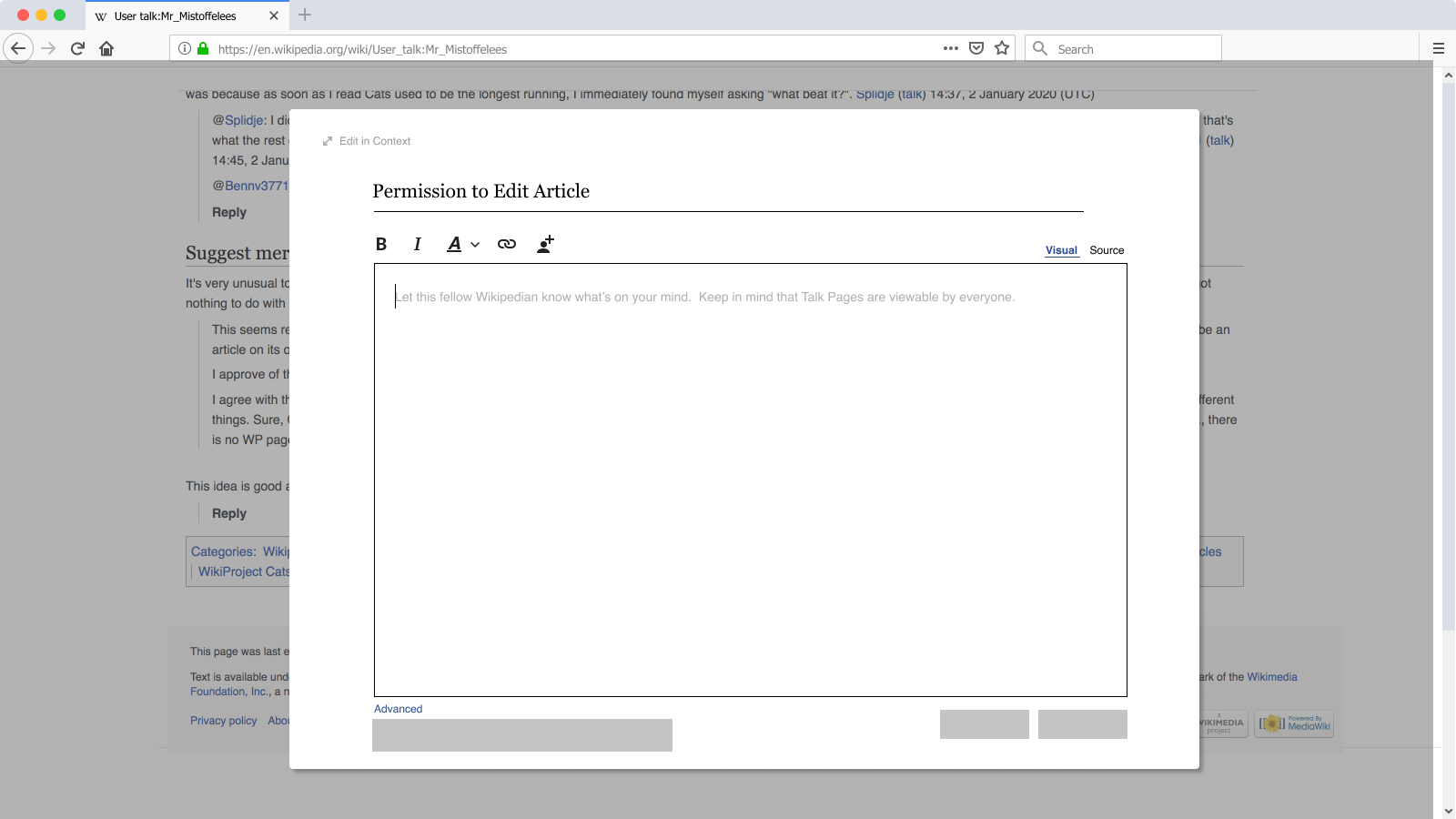
  • Option 2b: Modal, that will "publish" discussion in context and scroll contributor to the section

Exploration.png (900×1 px, 114 KB)

  1. Drafting - What does the contributor see/do in order to draft their new response?

We should enhance the editing tool so people can write what they want to talk about without needing to learn or know about wikicode. It would be great to introduce subtle automations that guide people towards writing and posting topics that make it easy for others to understand and engage with. That said, this touchpoint will be informed by our decisions on the first two touchpoints.

  1. Publishing - What happens when a contributor clicks publish?

This touchpoint will also be informed by our decisions on the first two touchpoints.

I did explorations for the purpose of conversation and brainstorming. For this first round, I didn't touch the existing tab/button for new discussions. There are a few touchpoints in the workflow that we need to consider:

It's helpful to see the kinds of questions you are thinking through – thank you for visualizing them, @iamjessklein.

Some comments and questions the explorations brought to mind below.

Meta

  • Can you think of analogous products/services that append new posts/content to the bottom of the page? I ask this wondering how these products/services negotiate making it so people can clearly identify the "point of entry" call to action while also presenting the composition experience (read: "New Discussion input") and publishing moment in ways that leads people to understand how the content on the page is organized.
  • Are you able to explore how the form might be expanded to accommodate edit notices? [i][ii]
    • This is on me for not making this explicit in the task description's "Considerations" section. Now it is.

  1. Point of entry - What does the contributor click to get started making a new topic?
    • Option 1b: Big button at the top of the page

bigbutton.png (900×1 px, 107 KB)

This direction is looking good. By "looking good" I mean, I like how noticeable the affordance appears to be. This, coupled with its location (within the "page" vs. its "frame"), leads me to wonder whether it will contribute to people more quickly recognizing the page as a place to talk.

  • Option 1c: Contextual prompt and button

contextualpromptandbutton.png (900×1 px, 107 KB)

I like how the drafting step [to me] looks/feels "close to" the publishing step by way of the text input appearing in line . This leads me to wonder whether this "closeness" could help people:

  • A) Feel more confident they did what they set out to do (say something for other people to see)
  • B) Develop a better understanding of how talk pages work ("Ah, the newest posts appear at the bottom of the page.").
  • Are you thinking this affordance will be sticky? Related: see question beneath Option 1d.
  • Do you have a sense for how we might "get people" to the bottom of the page? Meaning: if there's an affordance at the top of the page to initiate the workflow, what might the experience look like for brining peoples' focus to the bottom?

The above spoken with this in mind, "✏️ For many participants, hunting and not finding their post signaled to them that they didn’t actually complete the task as they had intended." | T243251#5933544.

  • Option 1d: Sticky at the bottom of the page

sticky.png (900×1 px, 125 KB)

Hmm, the "stickiness" is interesting. I wonder whether that could resolve the, "People can quickly recognize where/how to add a topic while also developing an understanding for how the pages works (e.g. new content is posted at the bottom of the page)."

  • Are you able to travel down the "sticky" path a bit further? The current treatment looks, to me, like an informative/guiding element as opposed to a core part of the experience.
  1. New Discussion input - Where does the contributor do their drafting and how are they prompted?
  • Option 2a: In context "form"

Screen Shot 2020-09-07 at 7.12.24 PM.png (469×804 px, 59 KB)

  • Is this what you're imagining people will experience once clicking the affordance in Option 1c?
  • Option 2b: Modal, that will "publish" discussion in context and scroll contributor to the section

Exploration.png (900×1 px, 114 KB)

  • Are you imagining this as a secondary experience? The "Editing in context" text leads me to wonder whether people would have arrived at this modal via another, initial, experience.

i. https://en.wikipedia.org/wiki/Wikipedia:Editnotice
ii. Notice the "HELLO AND WELCOME TO THE TEAHOUSE EDIT WINDOW!" box above the "Subject/headline" field: https://w.wiki/c3S
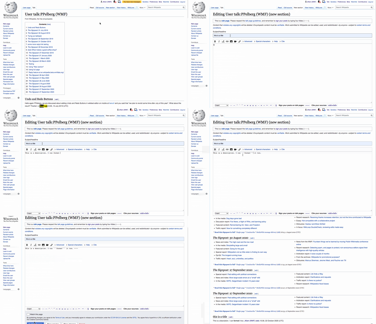
From https://www.mediawiki.org/wiki/Topic:Vpxmgw1ysjhqwdaf:

Ad Huikeshoven:
Here are examples of how to start a discussion on other sites, which might be examples for how to do it onwiki with reply tool:

  • On Flow, it is an already opened text input box on top of the talk page with gray text 'Start a new discussion', just click in the box to put a cursor in it
  • On Facebook, it is an alredy opened text input box on top of wall with gray text 'What is on your mind?', just click in the box to put a cursor in it
  • On Twitter, there is both an adready opened text input box on top of the page with gray text 'What keeps you busy?', and a big blue 'Tweet' button in the left side bar. On mobile there is a plus button in the lower right corner when you follow the stream for a specific hash tag
  • On LinkedIn, there is an already opened text input box on top of the page with gray text 'Start a post', and an icon of a pen in a box next to it.

So, these examples all lead the way to having an already opened input text box on top of the page. For on wiki talk pages the new discussion should end up at the bottom af the page. Or you are bold, break convention, and start top posting of new discussions, just like all other sites. Several of the above mentioned sites, but not all, will pop up a dialog box to enter the new discussion, which naturally blocks doing anything else on the page, including replying to existing comments. Specific for on wiki discussions will be to require a head line or title, and Flow is an example of doing that.

Thanks for linking to that @Esanders - I responded to that on mediawiki - I will post an update here with mockups detailing those exploration topics I referenced.

We should probably also consider the empty subject scenario as described here:
https://www.mediawiki.org/wiki/Topic:Vm2gujq6xcju96h4

Task description update
Per the great suggestion from @Parkywiki at mw.org here, I've added the following to the task description:

Links

As I've been building out the prototypes of these workflows, one thing that comes to mind is that the taxonomy scheme feels inconsistent. I believe that we brought this up as part of T257764 already, but it's really becoming evident in two places as I click through the designs:

  • UI element names (Reply buttons vs. Publish (Submit? Post?)
  • Success messages ( Your "edit" was posted)

Good call, @iamjessklein. As we decided during the meeting we had today, you are going to document and make said UI copy decisions in this ticket: T264220.

Update: 30-Sep
During the meeting @iamjessklein had today, we decided the following next steps.

Next steps

  • @iamjessklein is going to prototype proposals "B" and "C" [i]
  • Once Figma prototypes for proposals "A," "B" and "C" are created, we'll discuss them as a team and on Talk:Talk pages project/New discussion
  • As these conversations are happening, @iamjessklein will extend the prototypes for proposals "A," "B" and "C" so we can all see how they behave in the following contexts:
    • User and article talk pages that contain many ongoing conversations (this will help us develop an opinion on what transition/interaction should be like when someone clicks on the "New topic" affordance and the tool's text input areas (heading/body)).
    • A talk page that contains a custom new discussion call to action [ii] (this will help us understand how the new discussion tool relates to/affects these custom workflows. See T263710 for more context.)

i. See slides 54-58: https://docs.google.com/presentation/d/17cK5qAQIEnEHUzundShESWOd_US0PrOPT3wgfugq5og/edit#slide=id.g99cdfdebdb_0_11
ii. E.g. https://en.wikipedia.org/wiki/Wikipedia:Teahouse

Task description update: subject field validation

This week, @Esanders and @iamjessklein talked about a cases where pages specify that new discussion topics' Subject/headline field be left blank. [1]

To accommodate this case we decided: in cases where people leave the New Discussion Tool's Subject/headline field (the field's title could change) blank, they will see a warning when they attempt to publish the new topic they are drafting and ultimately be permitted to publish the "subject-less" topic. Exact implementation TBD.

(the above has been added to the task description's "Jobs to be done" section)


  1. See Create its FfD subsection section here: Wikipedia:Files_for_discussion#Instructions_for_discussion_participation

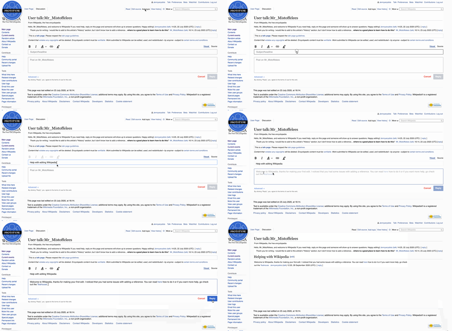
I made a first round of prototypes which I am putting gifs of here for the purpose of documenting the thought process that went into them. That said, I have since chatted with @ppelberg and @Pginer-WMF on them and am going to move forward with another round of iteration. I made the first 3 prototypes trying to gain a better sense of what the following touchpoints might look like:

  • instigation
  • drafting
  • publishing

I made the three prototypes one after the other and tried to iterate immediately using the lessons that I learned from creating the prior prototype.

Attempt 1: "The meet them where they are at approach" - Let’s not go too big too soon. We will use the buttons in the navigation, rename them and move the experience to happen in the context of the page. This will match treatment for “Replying” to messages.

ND-UserA.gif (725×1 px, 1 MB)

Lessons Learned:

  • I had no clue what to call different elements of the interface here and it hurt the experience
  • The form fields felt clunky in relationship to the toolbar

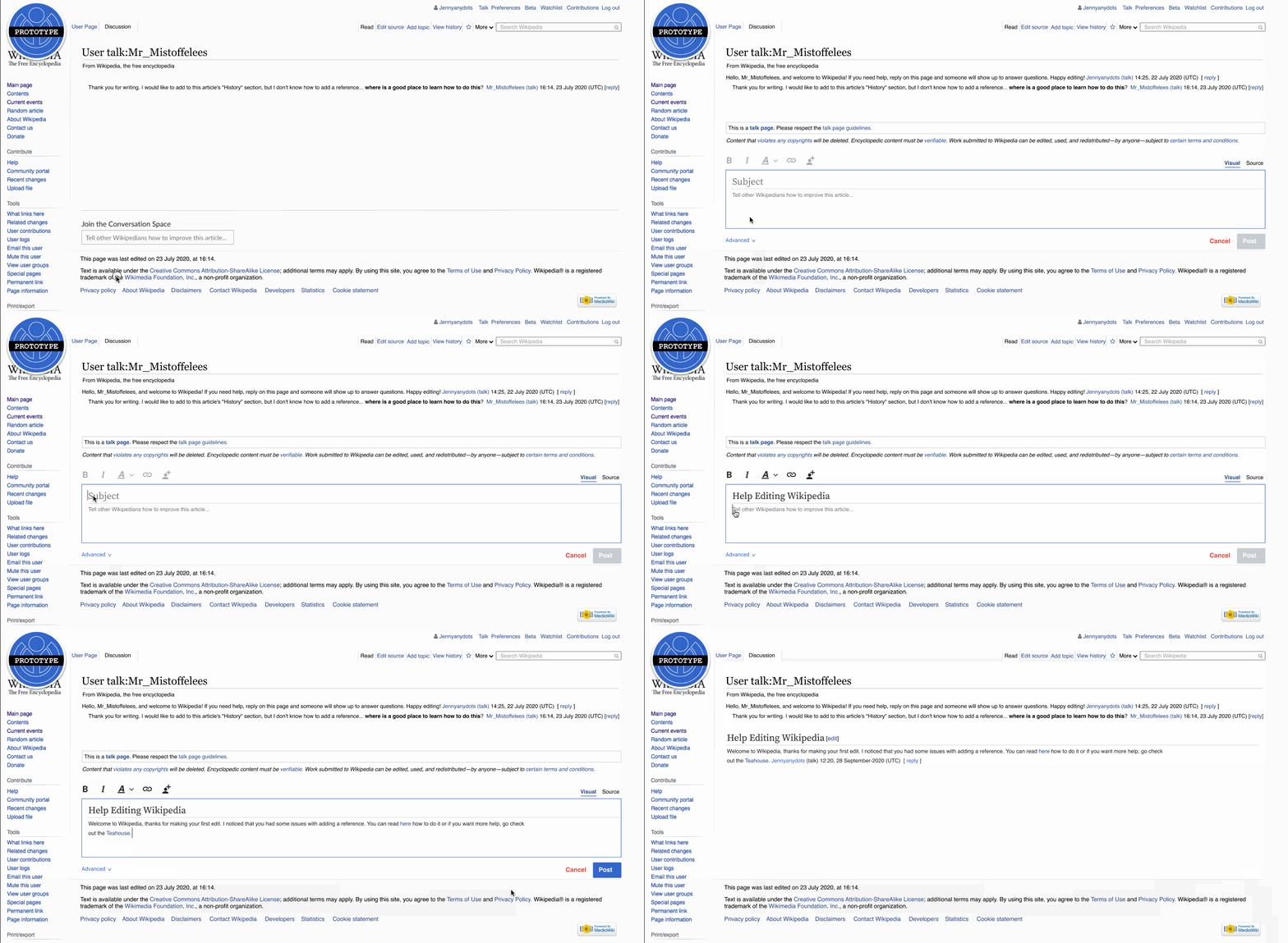
Attempt 2: "The down and low approach" Utilize the paradigm of chatting frameworks by providing a footer sticky that on click reveals a more sophisticated interface for text input.

ND-UserB.gif (725×1 px, 671 KB)

Lessons Learned:

  • The document model like way of formatting the data entry makes it clearer to contributors what everything will look like
  • The language here was better but possibly unexpected to contributors who are familiar with the current terminology of "add topic" and update the "description"

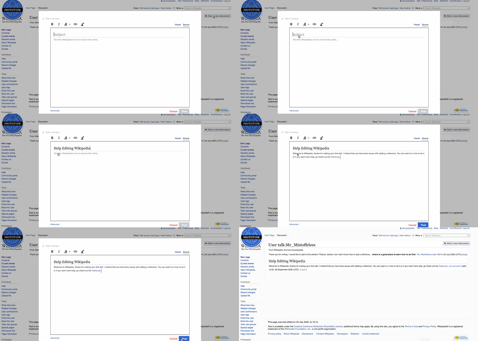
Attempt 3: "The heads high approach" Leverage the navigation at the top of the page, and add a unique button for “New Discussions” which will reveal a flexible modal interface amplifying the idea that every comment on Wikipedia is an artifact. This will highlight in context after posting. This approach will easily adapt to the direction of the new desktop refresh.

ND-UserC.gif (725×1 px, 330 KB)

Lessons Learned:

  • This approach can be considered an "expanded view" of attempts 1 or 2
  • The toolbar works as is here because there's a bounding box
  • This approach seems to be valuable to keep in our pocket to keep exploring because the patterns developed here could at some point be applied to the Talk Pages as well as the New Article pages

For my next iterations I will:

  1. Keep all the language from prototype to prototype CONSISTENT AND GENERIC: Add Topic, Post Topic etc
  2. Use the Add topic button in the navigation as the instigating touchpoint (as seen in the first attempt) because for this first iteration we aren't planning on touching the navigation and therefore whatever exploration we create would compete with that.
  3. Explore ways to make it more evident that contributors are creating a new topic. Consider: toolbar placement, helper text, interface copy
  4. Use the highlight, success message and animation as the publishing touchpoint (as seen in the second attempt)

Keep thinking about the following questions that came up:

  1. Should we add a UI element to communicate that this content is public?
  2. Should we treat User Pages differently from Article Pages?
  3. Is our metaphor a “document” or a “chat”?
  4. Should we take an incremental approach knowing that changes to other parts of the product will shift so our designs will need to be open to change or go all in with big changes now?
  5. The prototypes make it so that you can’t post unless there is content in both the subject and message - how should this change to accommodate non-traditional workflows?

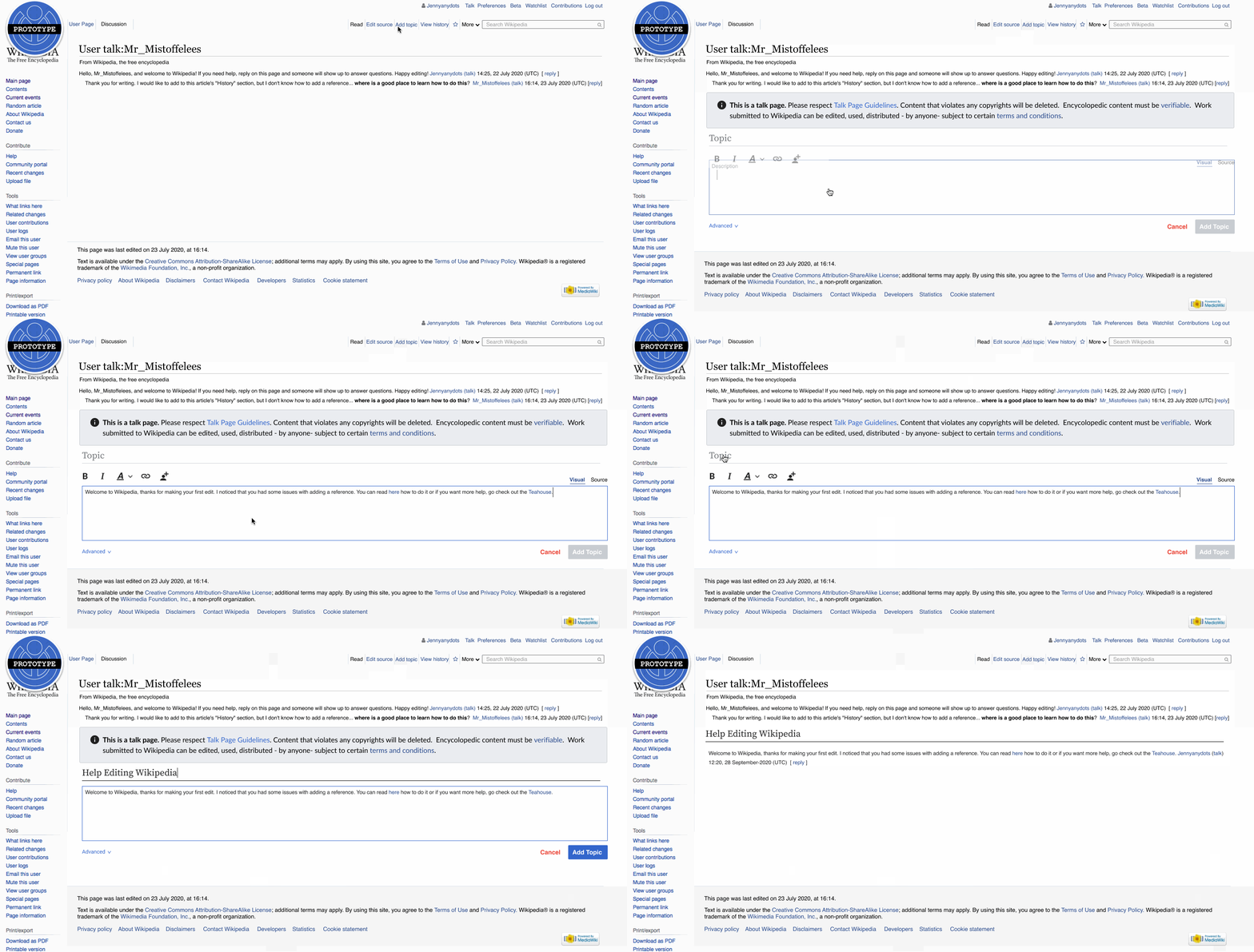
Through iteration, I've come to two versions that you can see below. For these explorations I:

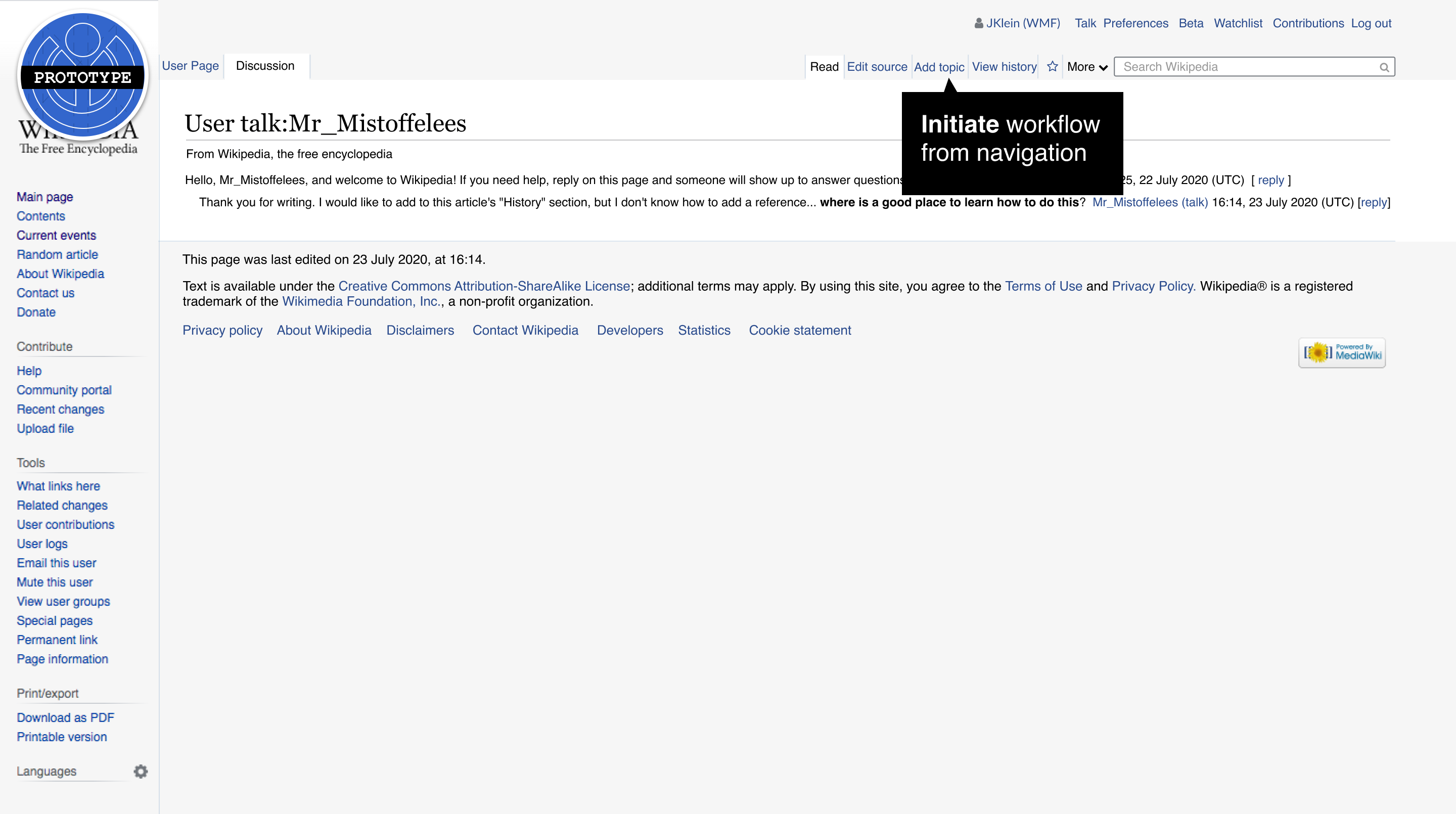
  • provided a consistent instigation touchpoint: the "Add Topic" button in the navigation
  • provided a consistent publish touchpoint: the success message, highlight and scroll to position
  • offered two different possible experiences for drafting:
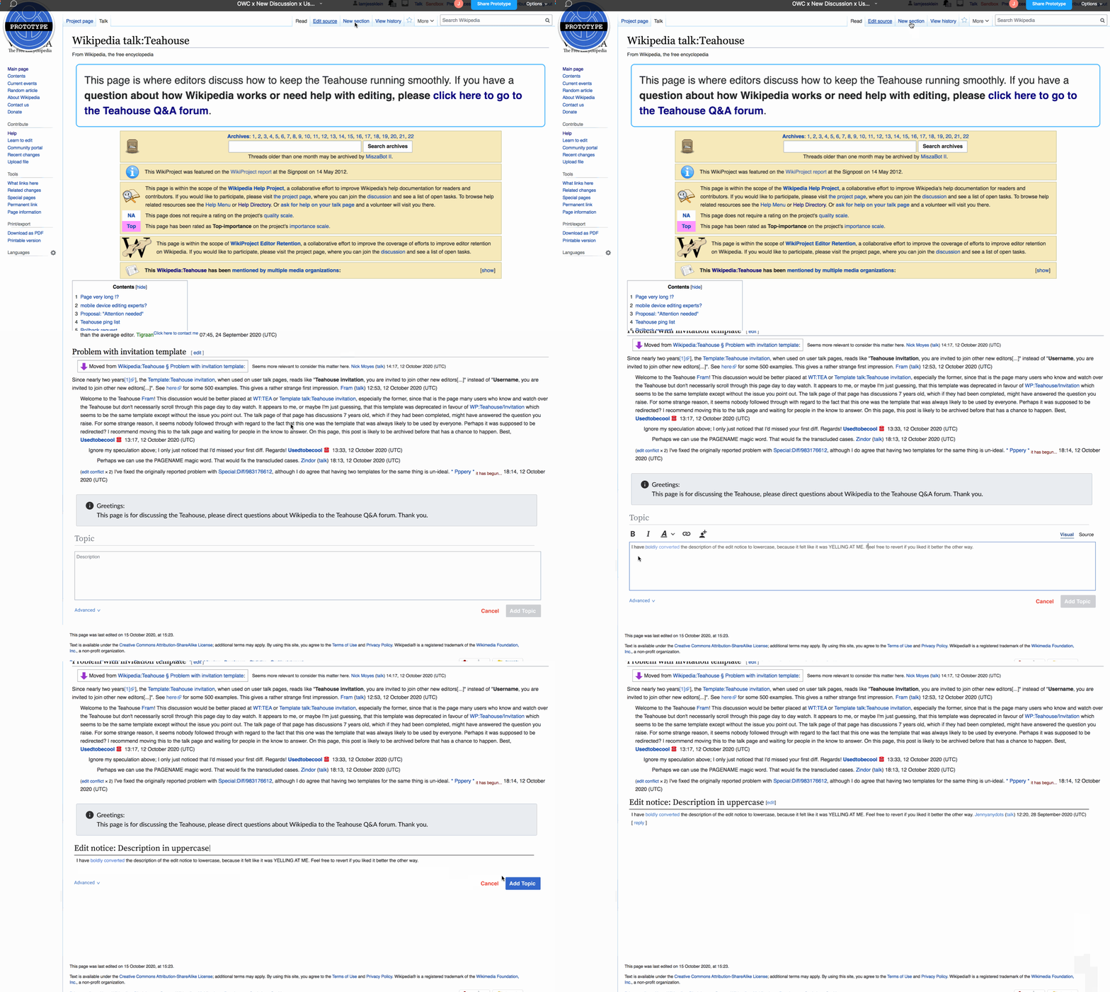
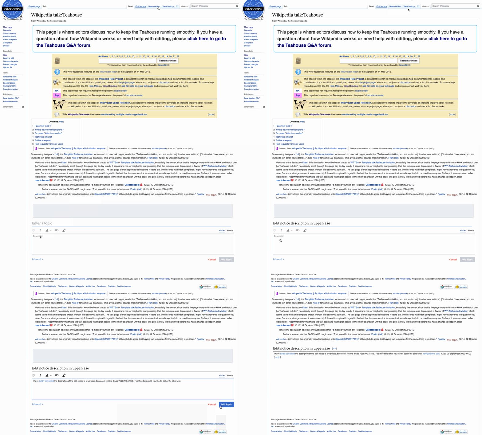
  1. WYSIWYG:
    WYSIWYG.gif (725×1 px, 613 KB)
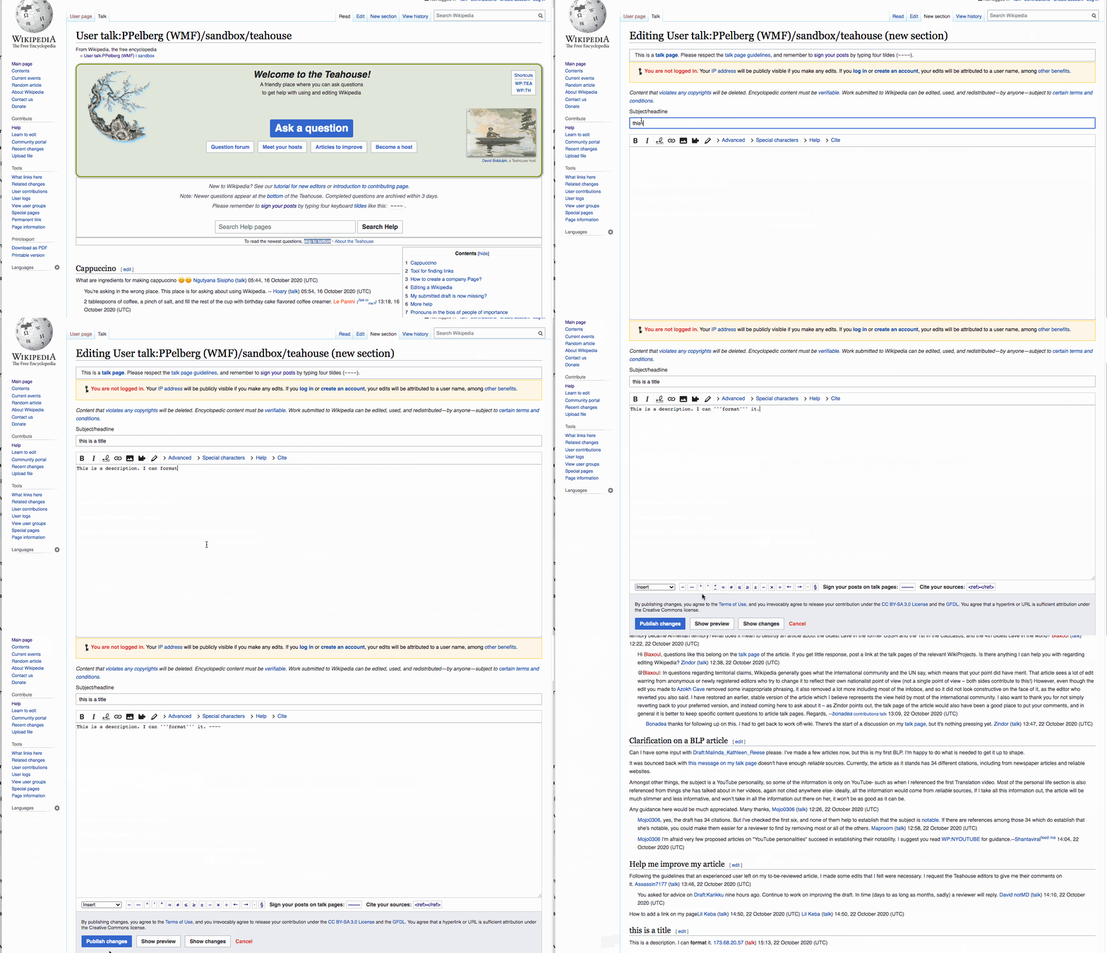
  1. Form:

form.gif (725×1 px, 667 KB)

And here's what it might look like on Teahouse:

wysiwyg-tea.gif (935×1 px, 2 MB)

Notes from the Prototyping Journey:

  • I think we should consider having an autofocus after the contributor clicks the "Add Topic" (or whatever it is called in your local instance) button on the Topic field
  • As a limitation of my prototyping skills I wasn't able to correctly communicate that there is a quick automated scroll to the part of the page where the new topic or section will post (in context).
  • I'm still not sure about the limitations of having this form work by default where it doesn't let you post until both fields have been filled with content. It would be amazing if this could be the default and then on pages where contributors are instructed to not fill out a field we could supply a template for that instance. This would put the onus on the Admin of those particular Discussion Pages rather than the junior or senior contributors.
  • I am still tinkering with how much of the interface should be seen without clicking - so for example the input box here could potentially only display on click.

@iamjessklein All your prototypes have a huge blank space at the bottom (we can’t see it before opening the tool in the Teahouse example, but I imagine it’s there). This is not present with full-page editing and neither when using the reply tool. Is there any reason to have it? I think it looks ugly and the page could easily grow and shrink dynamically.

Thanks @Tacsipacsi are you referring to the description field or the space below that?
If it's the field, I'm trying to communicate the general amount of space needed for a discussion (for example it's not a line, but probably a paragraph). If it's the later, that's probably a misrepresentation of the space between the content and the footer that I can clean up before I put this on wiki.

I’m referring to the space outside of input fields, which is especially huge before starting the discussion and after posting it (when there’s no input field at all).

form.png (725×1 px, 141 KB)

Thanks yes, that won't be on the final version of the prototypes, but thank you for pointing that out @Tacsipacsi

For the purposes of documentation, I've gotten a bunch of feedback from designers, engineers and product folks that I want to summarize here as I am working towards the next iteration (to share with community).

I like:

  • the clarity of the WYSIWYG approach
  • the consistent experience between replies and new topics (how it feels like a "natural" extension of a tool/interface people seem to like/value)
  • how explicit the form feels (you are adding a new topic to a page filled with conversations)

I wish:

  • to consider how much value we would get from hiding the toolbar (instead of having it always visible but disabled when not usable)
  • that we did an exploration of preview in source
  • that we took time to rethink the language used throughout the interface (taxonomy)
  • that the ‘this is a talk page’ message was shown at the top of the talk page in the WYSIWYG version, or alternatively somehow felt more attached to the text area
  • that "Topic” in WYSIWYG variant should be an active wording: “Enter topic”
  • that the placeholder options could be more a11y-friendly somehow

My next step will be iterating and making gifs to share on wiki. T265956 I need to make the following screens (10) for both prototypes:

  • User talk (Visual)
  • User talk (Source)
  • Teahouse (Visual)
  • Teahouse (Source)
  • Teahouse (Ask a question)

I also am going to provide the following screens (3) for context:

  • Current experience of User talk
  • Current experience of teahouse
  • Current experience of teahouse ask a question

I am going to remove the animation from the toolbar to see what that's like because I received an overwhelming amount of mixed views on it.
I am not going to touch the taxonomy at all for this iteration. I want to keep it generic so that's not part of the feedback. The language used in the interface now mirrors the language that is in the current experience.


Tagging all those who gave feedback in case they want to follow along here:
@Pginer-WMF @RHo @alexhollender @lucyblackwell @cmadeo @Prtksxna @mwilliams @Volker_E @schoenbaechler
@Esanders @marcella @matmarex @ppelberg @JTannerWMF @Whatamidoing-WMF @DLynch @dchan

I just chatted with @ppelberg and we are going to prioritize showing the following on wiki :

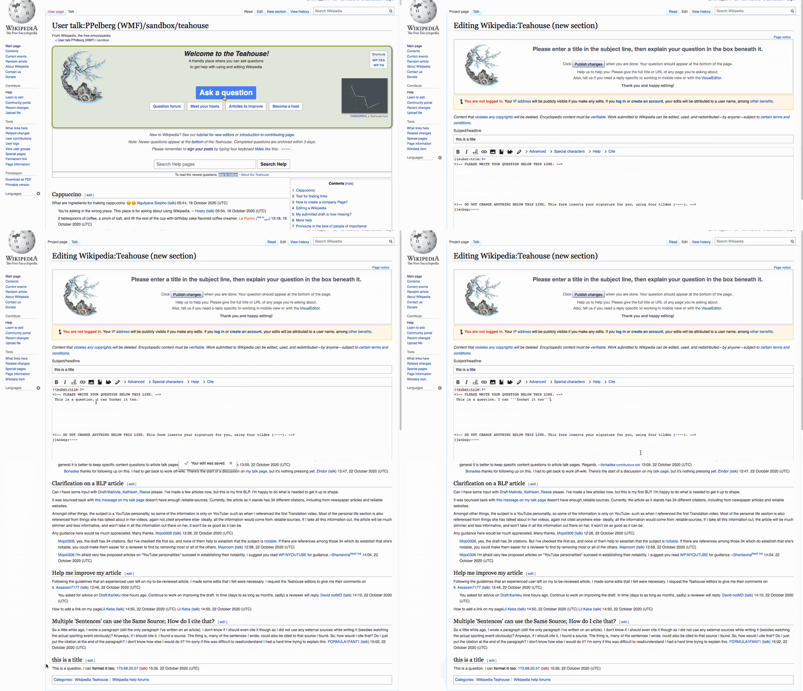
  • Current Experience - teahouse (click to ask a question and click to add topic) (2)
  • Teahouse (click to ask a question) - this is source with a preload (2 prototypes )
  • Teahouse (click "Add topic") - this will be initiated with the add topic button and displays visual mode (2 prototypes)

Once I've posted here, @ppelberg will review, approve and then post over on T265956 and wiki.

I wish:

  • to consider how much value we would get from hiding the toolbar (instead of having it always visible but disabled when not usable)

This would probably mean that when one clicks within the main text box, it jumps away, which is pretty bad UX in my opinion. We have enough '''Bold text'''s and the like from the full page editor caused by the jump of the toolbar. The writing of a new discussion is similar to composing an email, so I checked the email clients I use regularly—Mozilla Thunderbird deactivates the toolbar when the focus is in the subject field (but doesn’t hide it); Outlook Web App doesn’t even disable it (clicking a toolbar item brings the focus in the body text area).

  • that the ‘this is a talk page’ message was shown at the top of the talk page in the WYSIWYG version, or alternatively somehow felt more attached to the text area

Maybe I’m biased by the full page editor, but what about moving it below the text field, near the Add Topic and Cancel buttons, probably above the Advanced dropdown?

Thanks @Tacsipacsi - yes I removed any animation that I was experimenting with in previous versions. Additionally any edit page notices will definitely be on the page, but we haven't settled on the style just yet (and I believe that's out of scope of this feature).

For sharing on meta wiki, I made the following mockups:

Current User Talk

usertalk.gif (777×1 px, 532 KB)

Current Teahouse

CURRENTTEAHOUSE.gif (777×1 px, 589 KB)

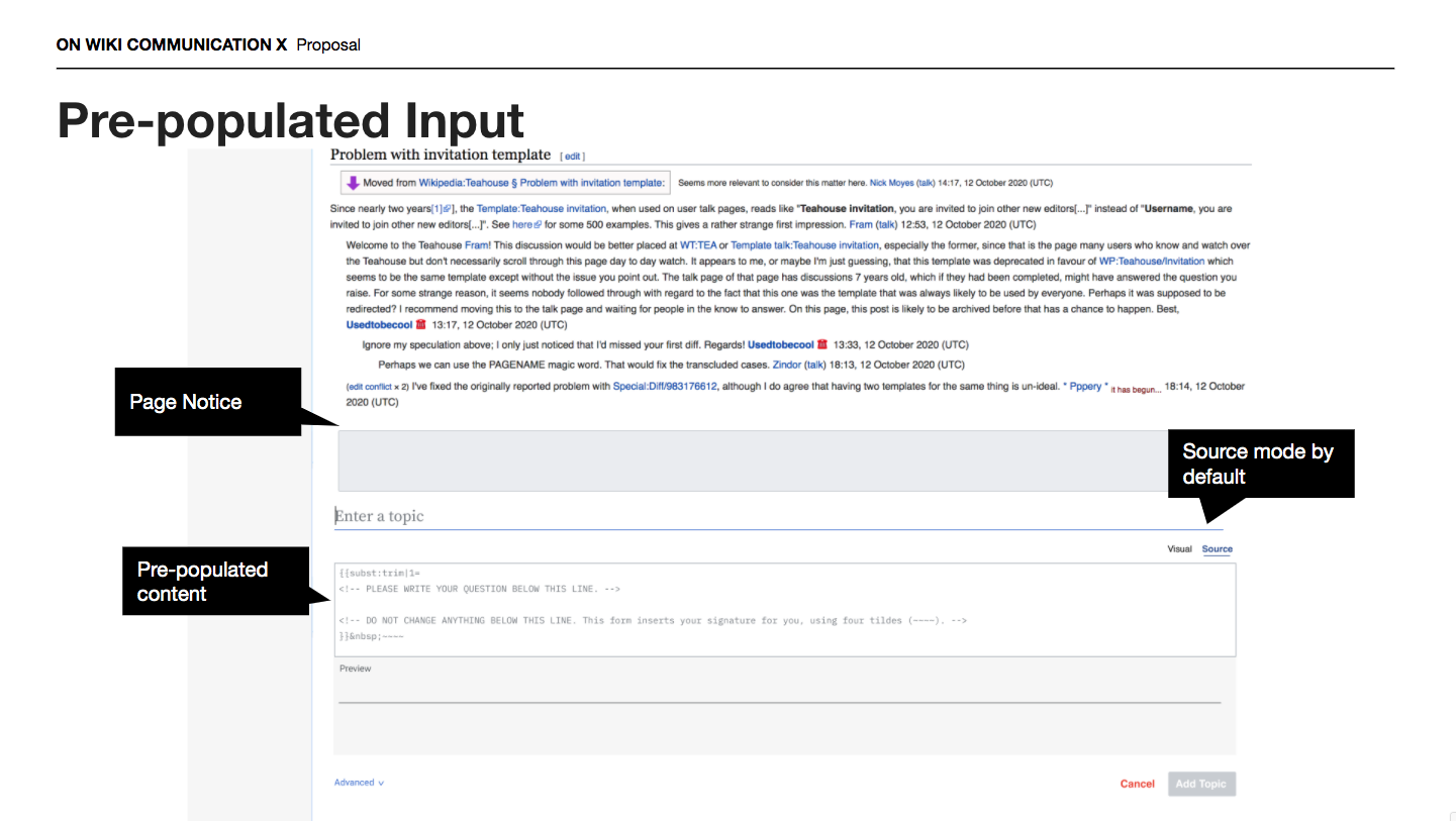
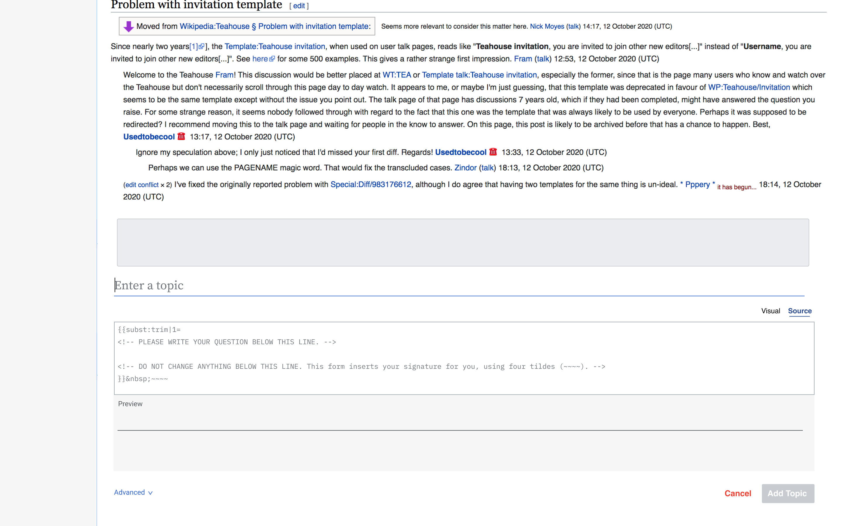
Current Pre-populated input

PREPOPULATED.gif (777×1 px, 1 MB)

Proposal Walkthrough:

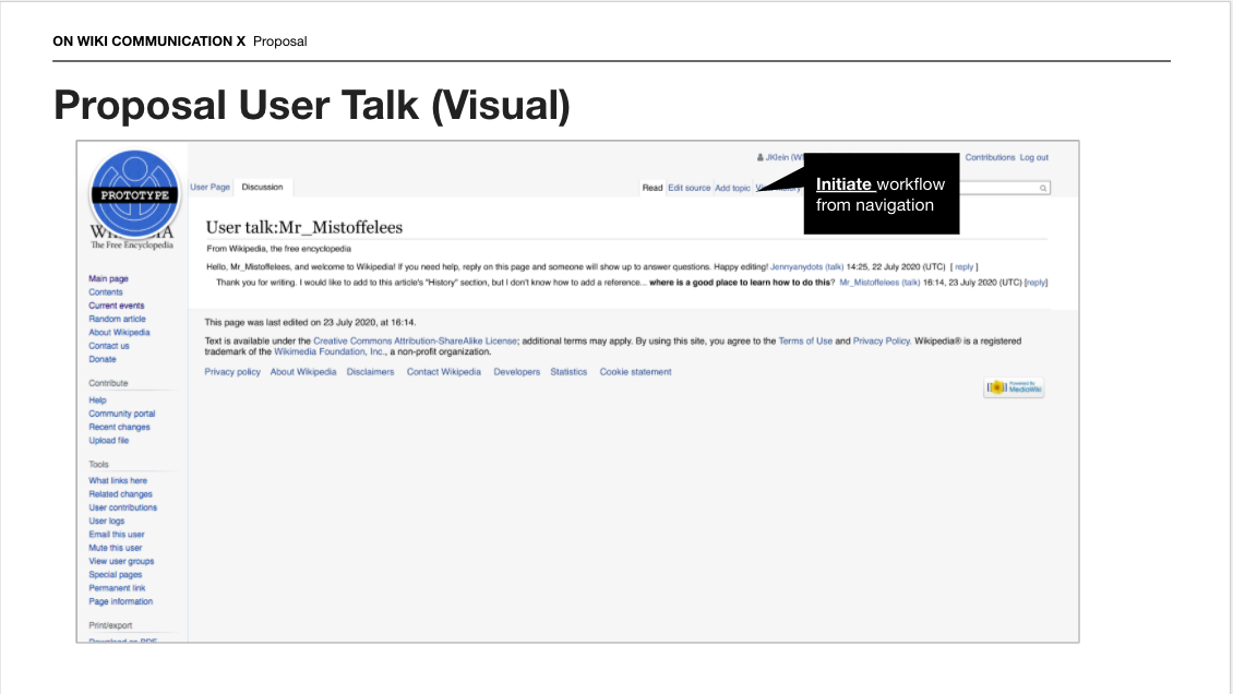
Initiation

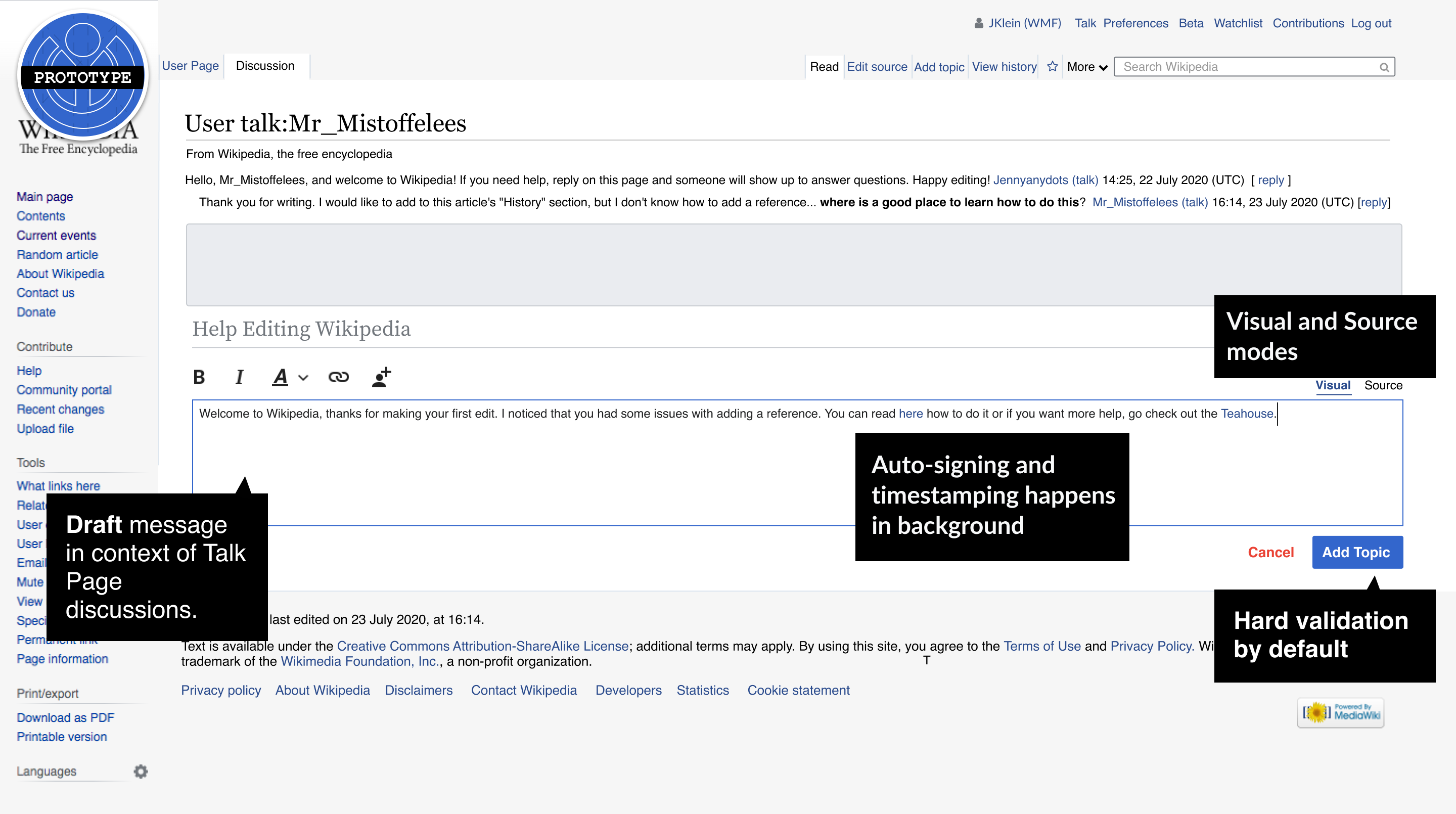
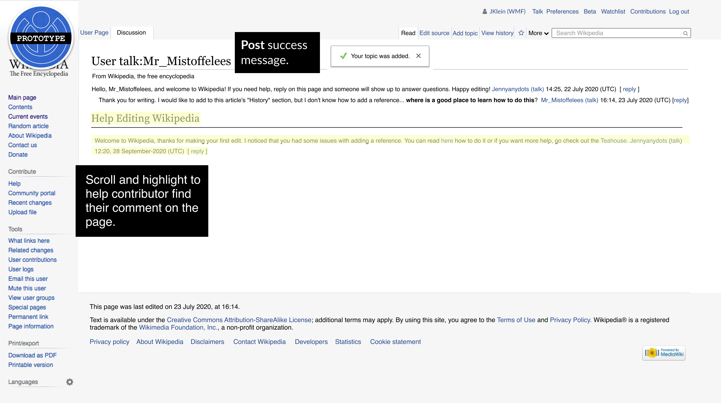
Screen Shot 2020-10-28 at 11.17.12 AM.png (636×1 px, 146 KB)

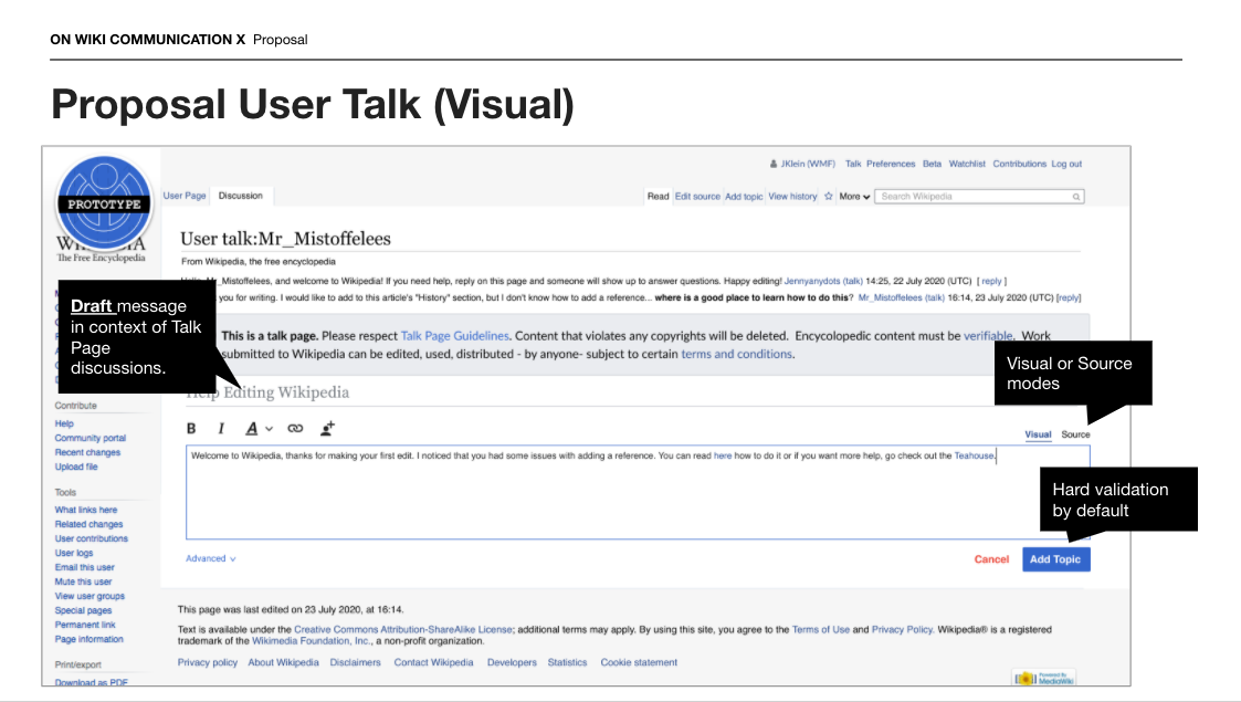
Drafting

Screen Shot 2020-10-28 at 11.20.24 AM.png (635×1 px, 211 KB)

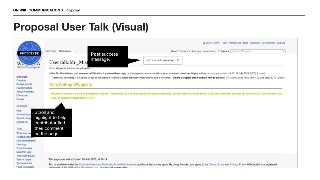
Posting

Screen Shot 2020-10-28 at 11.20.35 AM.png (631×1 px, 175 KB)

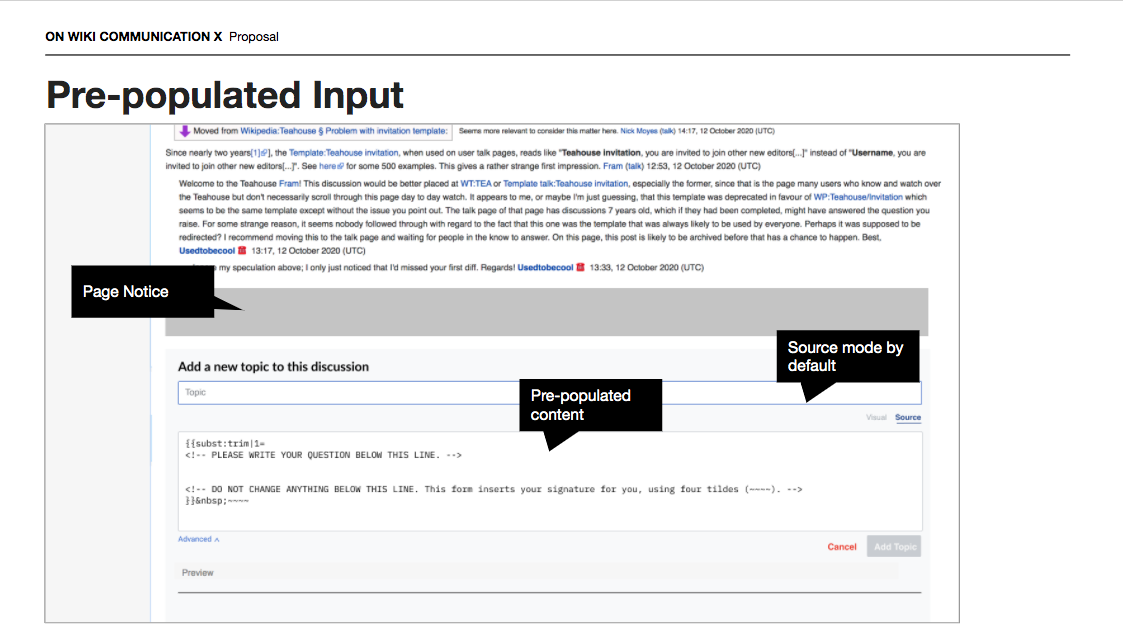
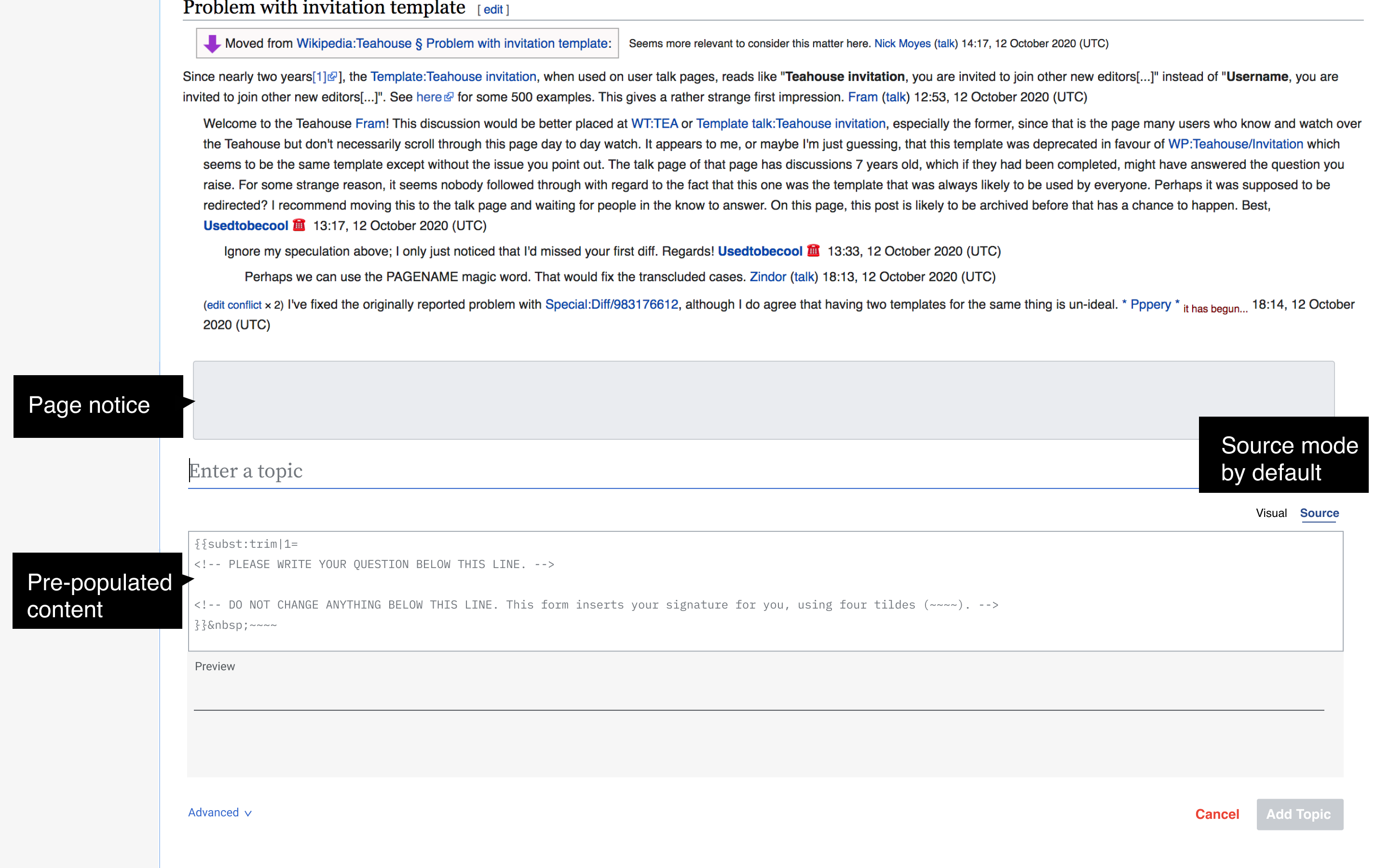
Pre-populated Content

Screen Shot 2020-10-28 at 11.21.47 AM.png (634×1 px, 215 KB)

A few revisions:

Source and Visual gifs (with page notices wireframed)

visual.gif (817×1 px, 1 MB)

source.gif (817×1 px, 1 MB)

Pre-populated input with WYSIWYG

Screen Shot 2020-10-28 at 12.42.09 PM.png (813×1 px, 329 KB)

Enter topic 2.png (1×2 px, 876 KB)

Here's just the image (not screenshot of pre-populated content

Thanks for all of your help and feedback @Tacsipacsi - I'm sure you are aware of it, but the discussion on this is happening here on mediawiki.

I am going to close this megalith of a ticket now and will file any issues that come up related to the on-wiki feedback separately.