NOTE: Please do not reopen this ticket.
NOTE: if your project has coordinates overlapping content in the top, you need to convert the coordinates of the project to indicators using the information here:
https://www.mediawiki.org/wiki/Reading/Web/Desktop_Improvements/Frequently_asked_questions#How_to_fix_the_coordinates_displaying_incorrectly_near_the_languages_button%3F
NOTE: If you are reading this because of an existing issue on your project, and you have problems after following instructions in the FAQ please create a new ticket "Support updating coordinates on <wikiname>" tagged with Web-Team-Backlog and we'll help you.
Description
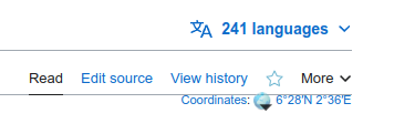
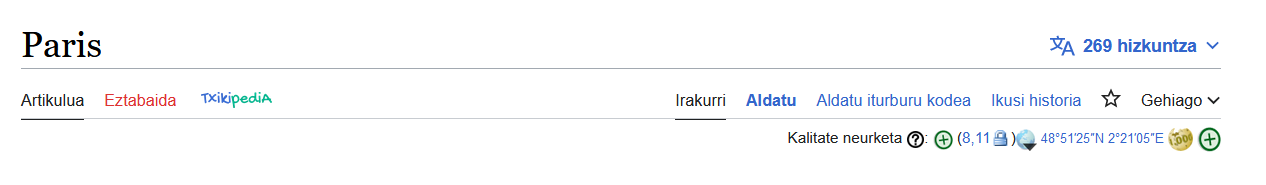
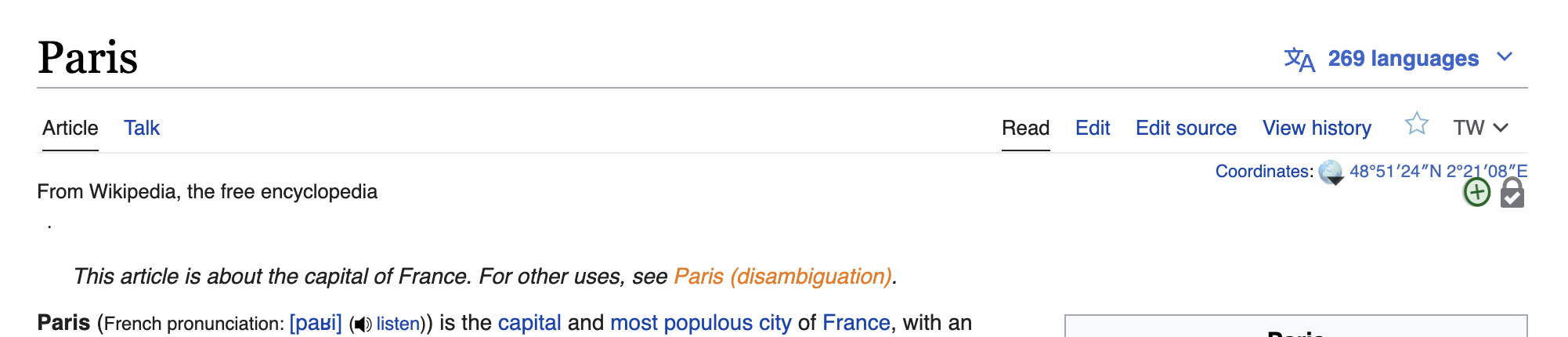
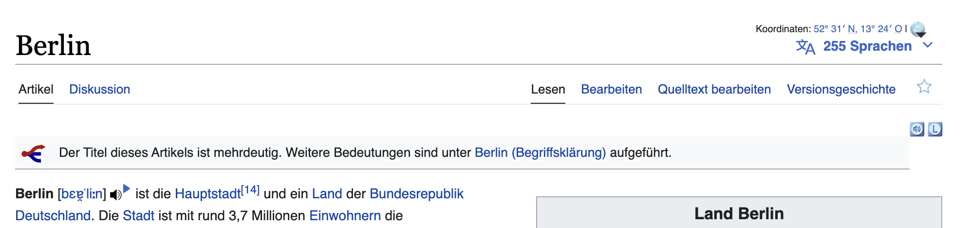
As part of the desktop improvements project we moved the language switcher to the page titlebar (opposite the page title). This is the location that coordinates and page indicators were previously displayed. The purpose of this task is to share a design spec that describes where coordinates and page indicators should be displayed, and how to add coordinates and indicators to pages so that they display as expected.
| Design spec |
|---|
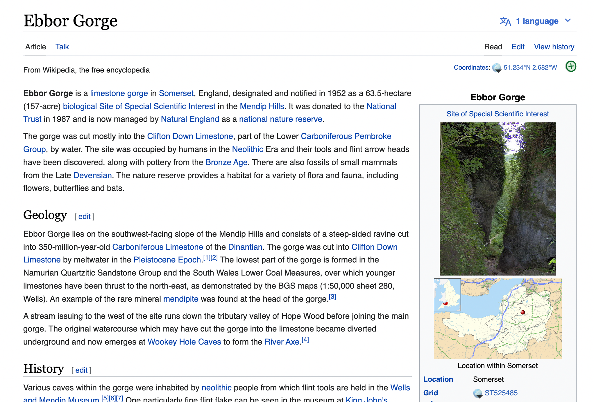
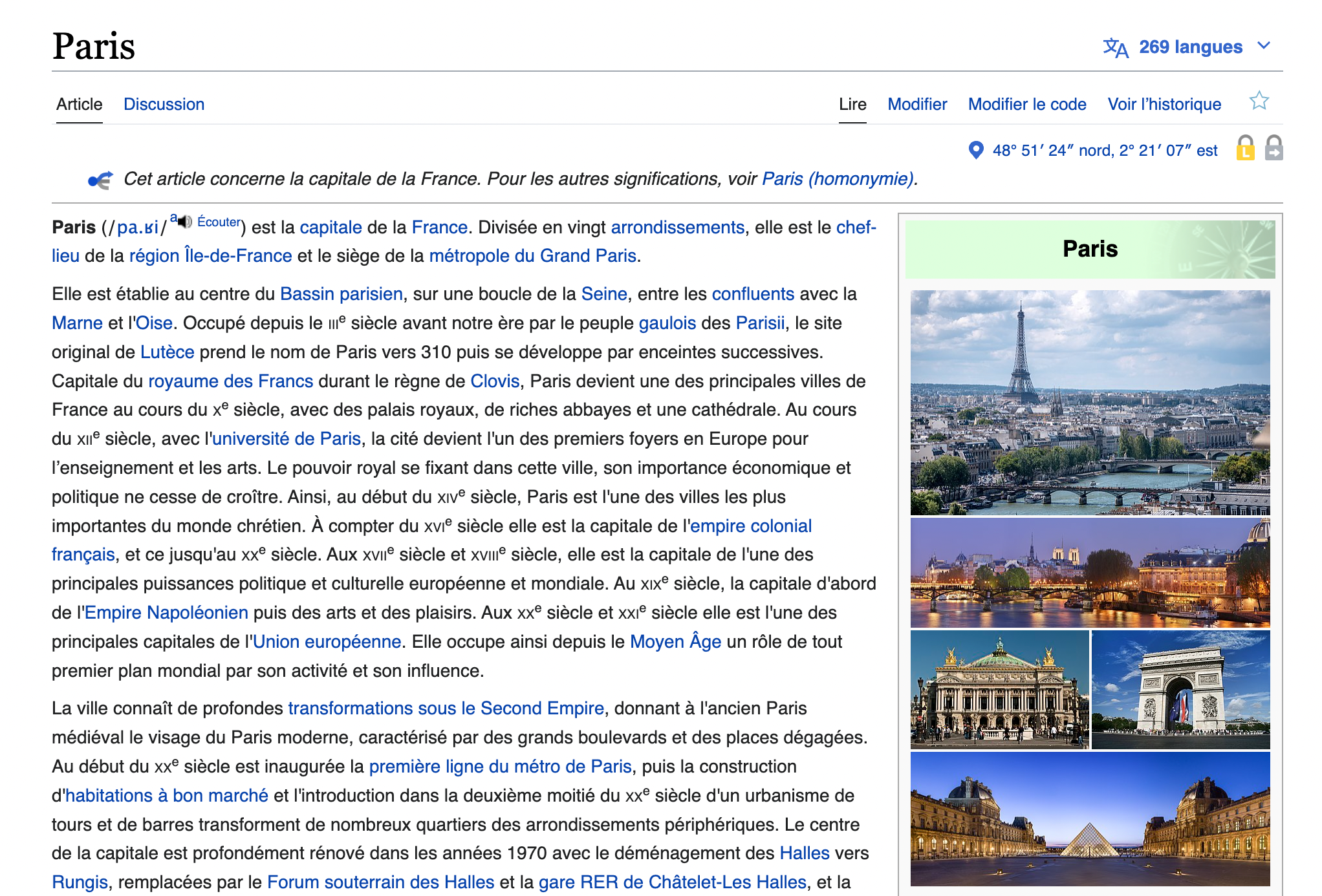
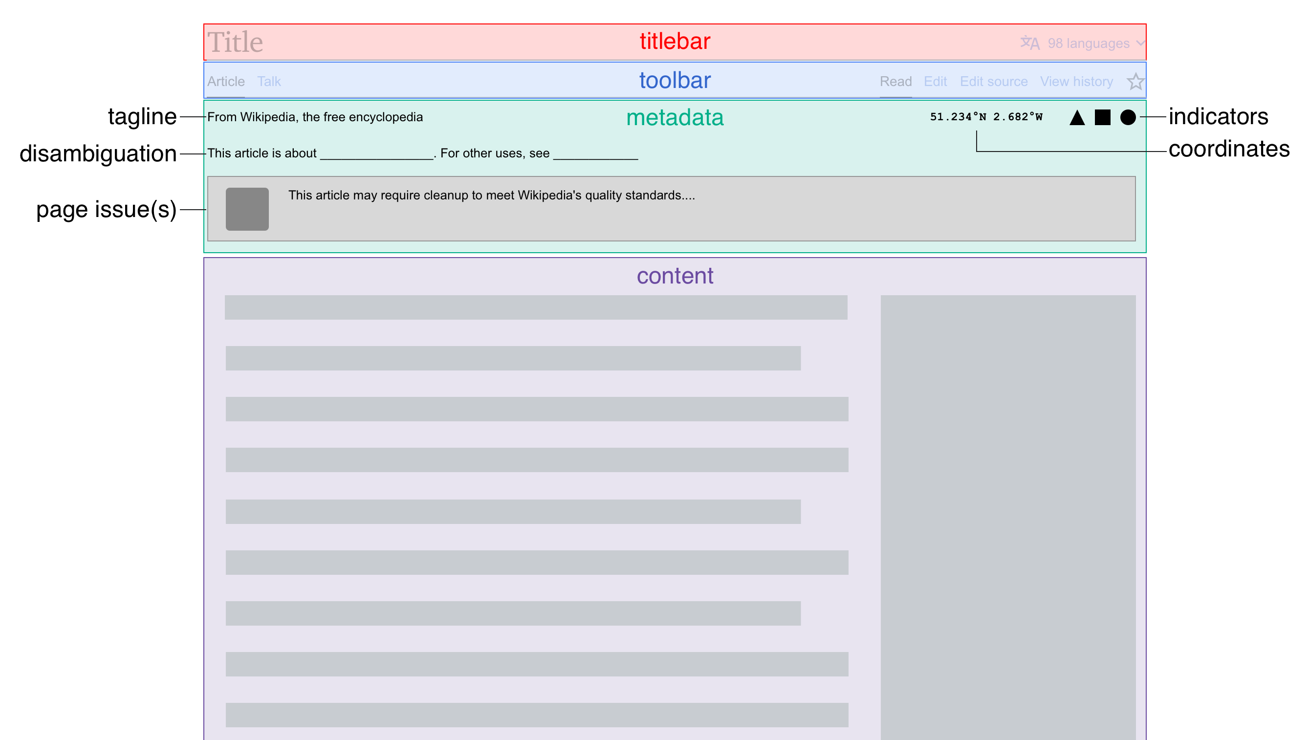 |
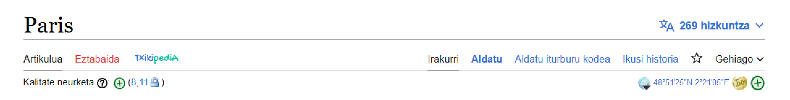
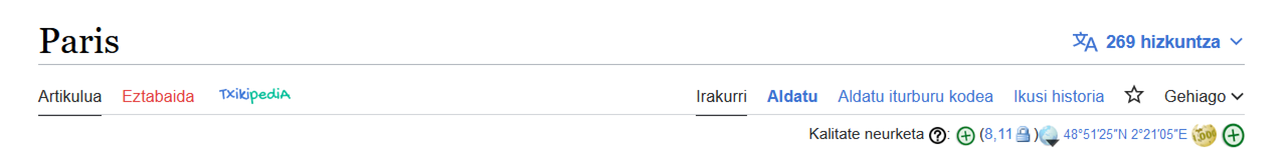
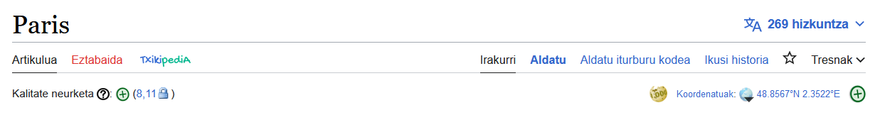
| Examples of how coordinates and page indicators | should look on various wikis |
|---|---|
 |  |
 |  |
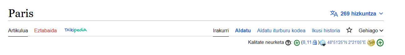
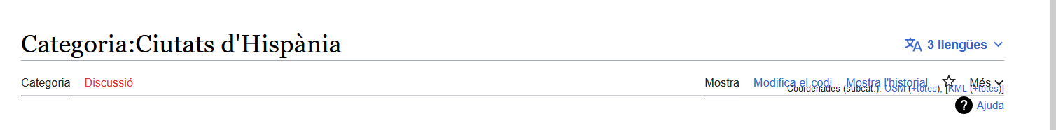
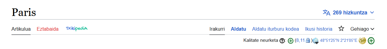
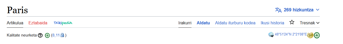
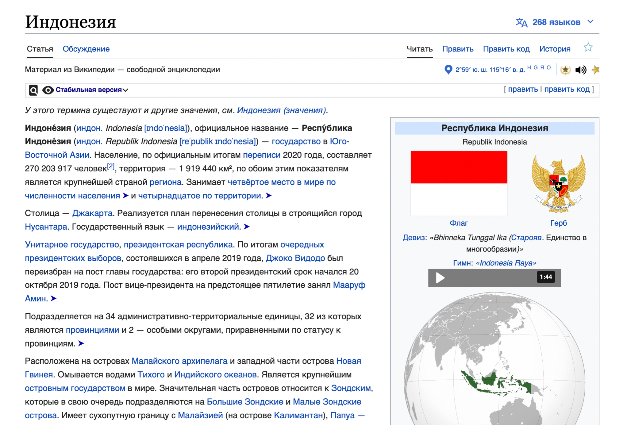
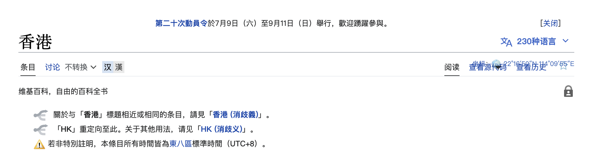
Current issues
With the Vector 2022 skin, on some wikis the coordinates and/or page indicators overlap with each other and/or other content. Coordinates and page indicators are community-maintained templates, so fixing these issues requires collaboration between the WMF and template authors/editors/maintainers.
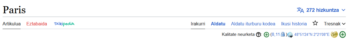
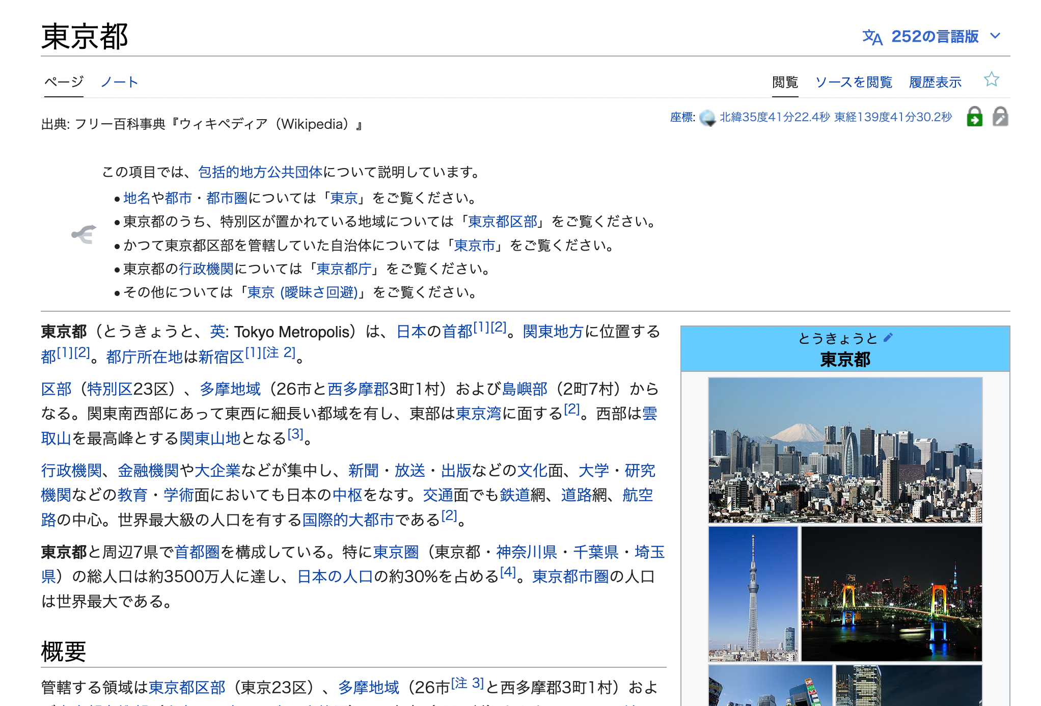
| Examples | |
|---|---|
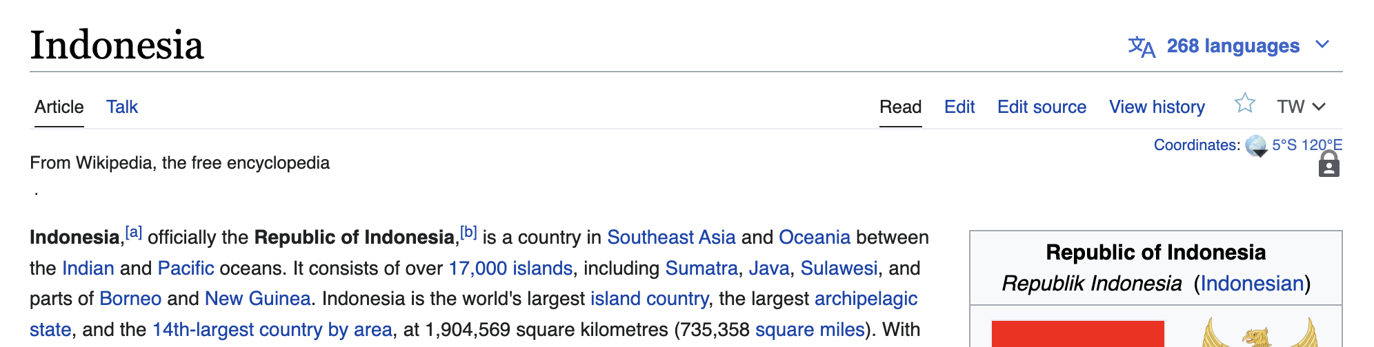 |  |
 |  |
 | (please add more) |