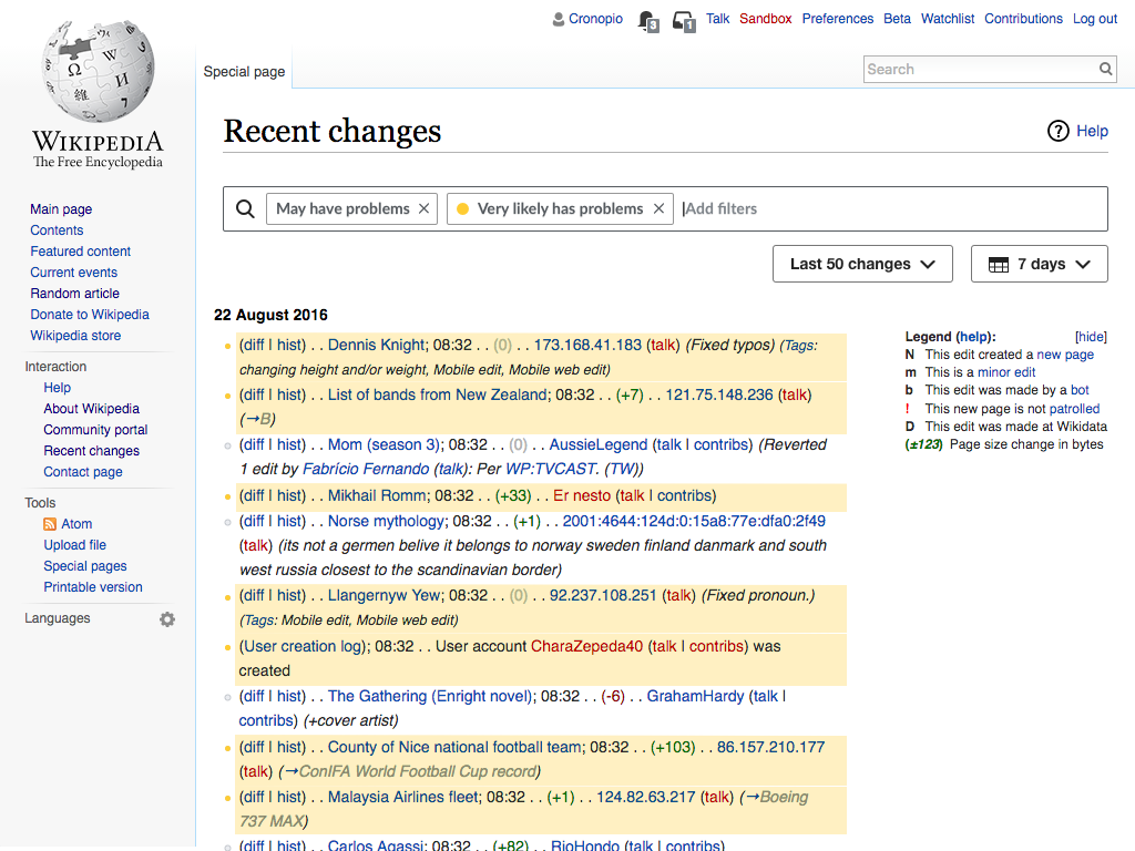
As part of the new designs proposed for the Recent Changes page (T142785), users can highlight the results in the list of recent changes to better focus on specific aspects as they process the list. For example, users may want to use filters to list only damaging edits but when processing them they may found useful to signal also which contributions are form newcomers in order to deal with them with extra care.
The problem
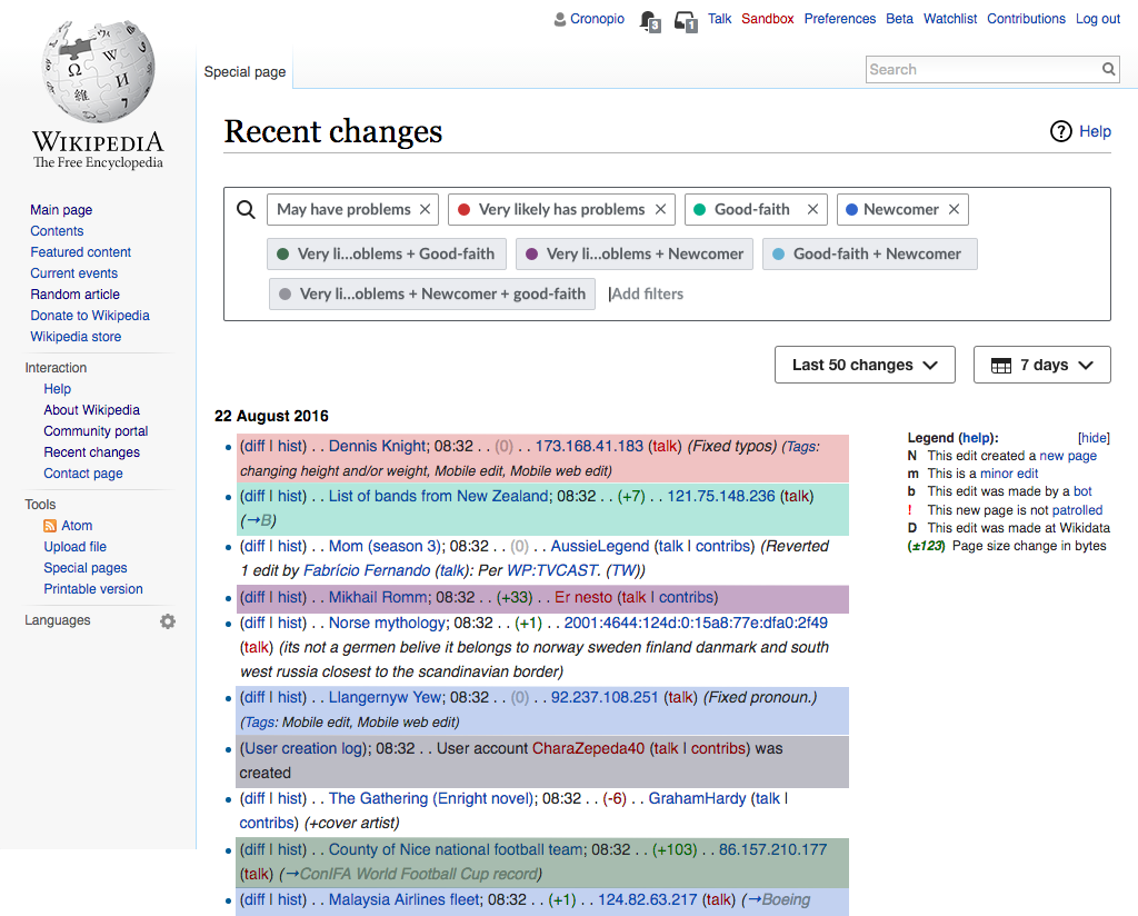
When multiple highlighting criteria is used, some elements may require multiple colors to be applied. As illustrated in the prototype we experimented with the idea of applying a single color to the affected rows, blending multiple colors if needed.
During research we observed both users getting positively surprised of colors blending as well as uncertainty on which colors were combined in some cases. The problematic cases seem related to (a) when more than two colors are combined and (b) when one criteria is a subset of another resulting in two colors where one of them is always blended and does not match the color selected by the user.
Although we don't expect many different highlights to be applied at the same time, providing more clarity about which criteria is applied to each row will be helpful in general to both (a) understand the status of a given contribution in the list and (b) easily locate those contributions of a given kind.
Design goals
When exploring possible solutions we want to take into account the following aspects:
- Keep the list familiar. The list of recent changes provides information in a text-based format that editors got used to visually parse over time. As part of the changes to Recent Changes we don't want to disrupt these processes, and significant changes to the list are out of the scope for the current project.
- Avoid distracting from content. Each row in the contribution list, provides many pieces of information. Highlight should help to focus on certain rows, but it should not get in the way of reading such content.
- Keep simple cases simple Whichever support we provide to improve the cases where multiple highlights are used, they should not get in the way of the most common cases where one highlight criteria or no highlight is used.
- Ease to scan. Proposed solutions should make it easier to go through the list of contributions looking for those meeting a certain criteria or combination.
- Ease to recognise. Proposed solutions should make it immediately obvious to identify which criteria or combination is a given contribution representing.
- Make it accessible. Relying only on distinguishing different shades of colors is problematic for accessibility. Although scenarios can be supported using just filtering (or with no more than one highlight criteria), we should aim for making it easier to recognise the elements that meet one or several criteria.
Solutions explored
Possible solutions are listed below based on the following scenario: A vandal fighter is interested in reviewing all possible problematic edits (filtering "may have problems") but she is especially interested in spotting the most obvious vandalism (highlighting "very likely have problems" in red). She wants to take especial care when reviewing problematic edits by newcomers (which highlights in blue) and those made in good faith (which highlights in green).
A) Blend colors and label them
A simple way to clarify the different colors is to add them to the list of filters to be used as a legend.
This solution has the advantage of not reusing existing concepts, but presents several limitations:
- Tags are reused, but those added for the intersection of highlights are not regular tags, which also requires the user to figure out their purpose.
- Mapping colors between tags and rows may not be obvious. A lighter version of the colors is used in the rows to avoid affecting readability, making the connection between the colors shown in the tags and the rows not to be exact.
- Scalability. As more colors are added the number of intersections grow, populating the the general list of filters. This could encourage users not to use many colors at the same time, but it also add friction when those colors may be needed.
B) Color bullet points

We can use the list bullet points to signal the highlight colors:
- When a row is highlighted it shows a bullet point for each color that applies. Colors are presented in the same order they appear in the filters.
- When highlight is active for any criteria, the bullet points for rows without any highlight will become greyed out. That will help to focus on the rows with any highlight. When highlight is not used, all bullet points are presented as usual.
This approach allows for quick vertical scan, it is noticeable but without causing distraction from the main content and does not consume much extra space even when several highlight criteria is used.